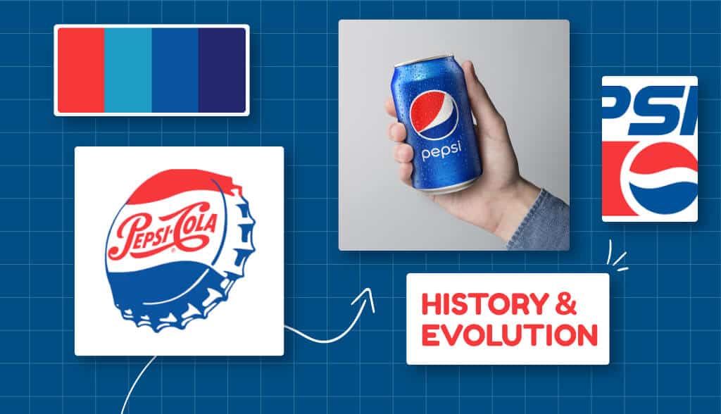
Interestingly, the Pepsi logo has gone through a number of redesigns, with a complete change in concept and feel as the brand evolves over time. However, even non-soda drinkers (and Coke lovers!) can instantly recognize the Pepsi logo and know what it stands for.
Let’s take a look at how the Pepsi logo has evolved from its first iteration in 1898 to the current mark the world has come to know and love.
A Brief History of Pepsi
The original Pepsi product was created in 1893 by Caleb Bradham for his drug store in North Carolina. It’s made with water, sugar, caramel, nutmeg, lemon oil, and cola nuts, and the mix has been dubbed “Brad’s Drink.” In 1889, Bradham renamed the drink “Pepsi” after the enzyme pepsin—which aids digestion—in order to advertise it as a “healthy” cola.
The drink was originally designed to provide the same benefits as Coca-Cola, which first debuted in 1886. However, it was almost 100 years later that the brands really entered the head-to-head battle.
Pepsi is currently valued at more than $11 billion , and PepsiCo generated more than $70 billion in net sales in 2020 . Their current product portfolio includes 23 brands that bring in more than $1 billion in annual sales and snacks, beverages, water and other products sold in more than 200 countries.
The Evolution of the Pepsi Logo
Pepsi’s logo has had a pretty drastic change over the years, in an attempt to set itself apart from the competition it originally emulated. Its style has also changed to keep up with the times and take on a more trendy – though still classic – style.
That said, the brand chose to keep the original colors and overall feel of the logo intact, although the fonts and images gradually morphed into what we know and love today.
1893: Pepsi’s first name – “Brad’s Drink”

Before Pepsi was called Pepsi as it is now, Brad’s Drink was the first name of the company. The word Brad is taken from the name of Caleb Bradham , the pharmacist who invented this famous Cola drink.
Brad’s Drink logo is a blue font on a white background, bold and ornate font.
1898-1940: Twisted red Pepsi-Cola logo
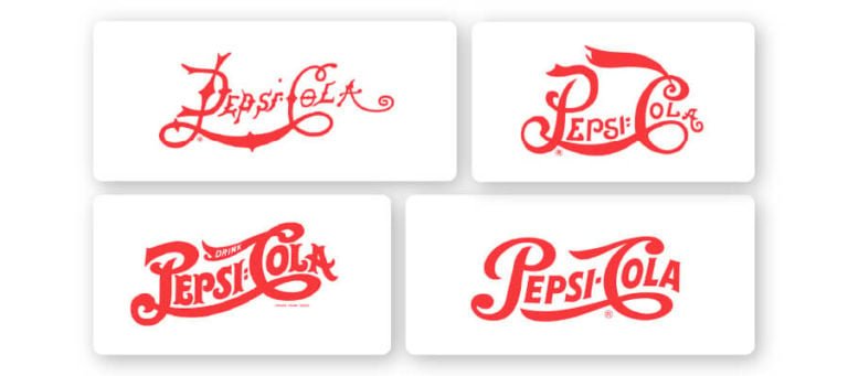
The original Pepsi-Cola logo came with a very strange font that was more popular back in the day. Thin letters with uneven kerning (space between letters) are the first attempt to create an overall sense of the brand. The drink is marketed as a healthy digestive aid, and the corresponding tagline is “Suspense, Invigorates, Digestive Aid”.
Over time, the words in the logo began to become softer and less wild, where the letters began to display much more evenly spaced.
By 1940, the logo was stitched together into a concise banner with smooth words. It has a very Art-Deco-era feel. The letters are cut clean and slimmer than the 1906 version, where the font creates a bit of a festive vibe. And, the lines from the letter ‘C’ have grown to accentuate the rest of the word, without the awkward connection it had previously tried to share with the ‘P.’
Note that with all of these logo styles, the Pepsi-Cola name was written on a wave—an element that continued throughout the life of the Pepsi brand. The words above are slightly upward, creating a sense of movement and energy.
1950: Pepsi logo with 3rd dominant color

With its red logo and similar font to Coca-Cola, Pepsi-Cola has always struggled a bit to break out of the shadow of its competing brand. This was a case where brand confusion led to some defining moves on the part of Pepsi. In 1950, the brand introduced the iconic blue for the bottle cap—and the logo—for the first time.
Although the banner’s wordmark remains the same, its wavy lines are emphasized in the gradients of the background color. “More bounce to the ounce” has become the drink’s tagline, promising more fun than the competition’s offering.
1962: When Pepsi became Pepsi
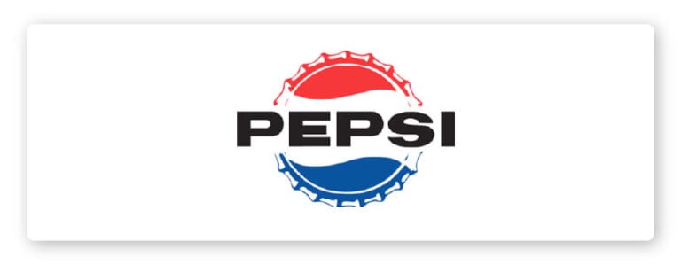
Entering the early 1960s, Pepsi launched the campaign “For those who think young” aimed at young people, the “Pepsi generation” who were not stuck in the old mindsets, lifestyles and cultures. Pepsi shows us that they don’t just sell soft drinks, they also sell lifestyle.
To strengthen and increase the effectiveness of the campaign, the Pepsi-Cola logo has had a big change. “No more mutants” is mistaken for “No more Cola” as the most accurate description of what happened in 1962. Pepsi completely removed the word “Cola” from the logo that has followed them for nearly a century. From now on, Pepsi is the Pepsi we all know. In addition, the word Pepsi with the fiery red font “dragon flying phoenix dancing” has been replaced with a minimalist sans serif font , black and all capitalized.
Then in 1965, Pepsi-Cola combined with Frito Lay Inc. to form PepsiCo Inc., which still exists to this day.
1973 – 1990
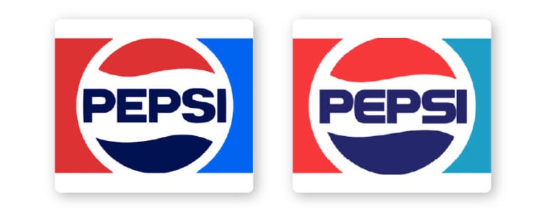
Sensitivity to market trends may be what has brought Pepsi to its incredible success. Realizing a flat design with simple, clean shapes and delicate lines will bring great benefits. Most typically, your logo can be easily applied to any type of mock-up and it is easy to distinguish them from countless other logos on the market.
Specifically, for the first time in the brand’s history, the Pepsi logo has a colored background with red on the left side and blue on the right side. The logo in the middle has a circular shape with the word Pepsi reduced in the center, the red and blue parts are divided into two upper and lower halves separated by white, implying the brand’s development orientation . global” by Pepsi.
In 1975, Pepsi launched the campaign “The Pepsi Challenge” to show which between Pepsi and Coca was the most preferred soft drink by consumers. The campaign is quite simple, consumers will do a taste test between Coca and Pepsi to see which they prefer. And as a result, the majority of people prefer the taste of Pepsi.
Originally a forerunner, but Coca seems to have been “smothered” this time. Very quickly, Coca launched a New Coke version (also Coca but it’s new :v) bringing “new” things like Pepsi did. But this is also one of the failures that are included in the marketing teaching case studies later.
The Pepsi word in the Pepsi logo has been slightly tweaked to bring its own unique features. You may find that the font has been redesigned to look like it was “digitally designed” instead of a built-in native font. The belly of the letter “P” is stretched longer, the letter “E” is curved, the letter “S” is also lengthened and flattened like the “S” in STAR WARS. This typeface was in use for over a decade until the next change.
1991: Pepsi logo splits in half
In 1991, the company decided to split the text and shape of the logo into two separate parts. The word “Pepsi” is placed at the top with a slight tilt to the right and the globe is placed below the right corner of the word Pepsi. To create balance for the logo, Pepsi added a red stripe in front of the globe.
Since the word Pepsi has been separated from the globe, the white stripe in the middle is narrowed to balance the red and blue shapes.
1998 – 2005: Pepsi’s 100th Anniversary
On its 100th anniversary, Pepsi announced a new logo design. There were a lot of changes to the 1998 version of the logo, but overall Pepsi has completely reversed everything before:
- Blue Pepsi word on white background -> white Pepsi word on blue background
- The flat globe is filled with a gradient that looks more 3D and shaped into a separate circle, not blending in with the background color.
Pepsi used this version for another 10 years before paying $1 million for the 2008 logo design. But before jumping to 2008, the Pepsi logo had two changes between 1998 & 2008.
To look more modern and 3D , Pepsi made a slight tweak to the logo. The globe has white gradient shapes placed at different angles that look like they’re illuminated. Along with that, the background color is also filled with gradient from light blue to darker from left to right. As for the word Pepsi, serif strokes are added back in some strokes. Light gray lines are also arranged to create the buoyancy of the Pepsi font.
2006: Pepsi logo “wet”

For Malu personally, this is the version that Malu likes the most, looking very “thirsty”. That’s right, a refreshing drink, how does it look so cool to look at, you want to drink. By adding details such as drops of water on the globe, Pepsi made its logo fresh and sweet.
The details are also slightly modified, but nothing has changed too much, keeping the design features of the 2003 version.
2008: $1 million blueprint
Somehow, Peter Arnell of the Arnell Group got Pepsi $1 million for the 2008 design.
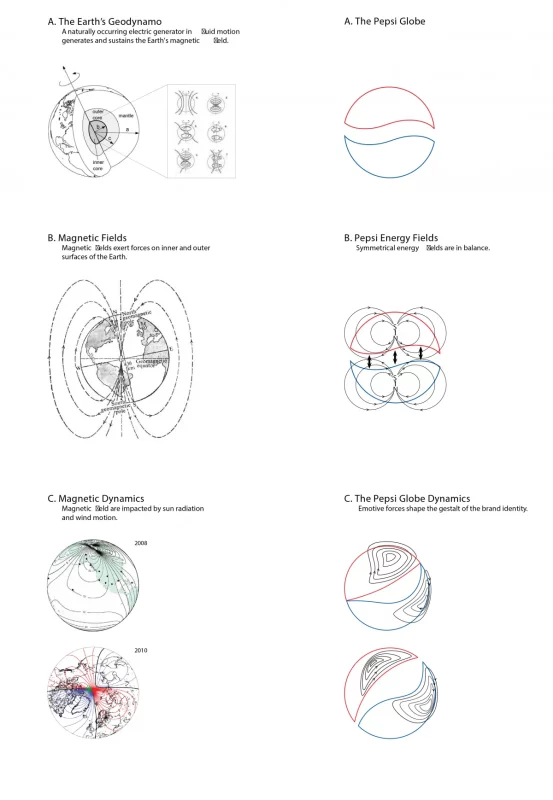
Completely stripped of the previous 3D details, the Pepsi logo becomes as flat as it once was. The globe with 3 red, white, and blue shapes like the US flag is shaped according to the rules of “brain hacking”. As Newsweek revealed, Arnell sent a 27-page presentation to Pepsi explaining what was in the design. In short, it is related to a lot of things such as the earth’s magnetic field, feng shui, dynamics, theory of relativity, golden ratio, expansion rate of the universe, Mona Lisa, Parthenon statue, ..
The new logo also evokes a smiling, youthful and fun face wrapped in blue lines.
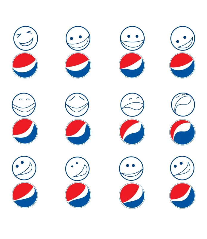
This line was present for a period of time before being completely removed in 2014. As for the word “Pepsi”, although it is still a sans serif font, now the letters are no longer capitalized and the strokes are thin as well. The main font color is white because most of them are located on the blue background of cans and labels. If you notice, the “e” in “Pepsi” has the same shape as the old logo.
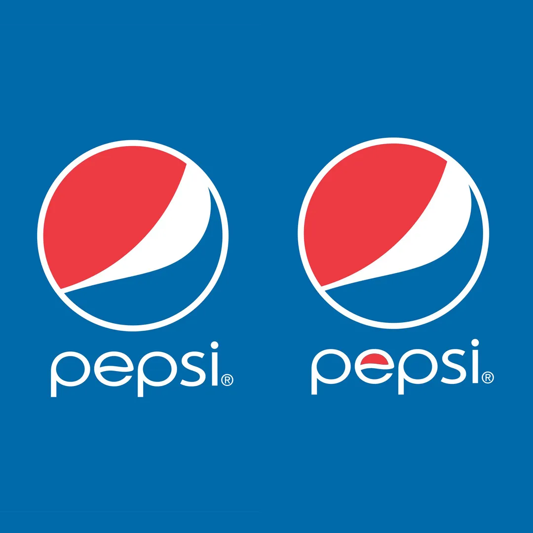
2014
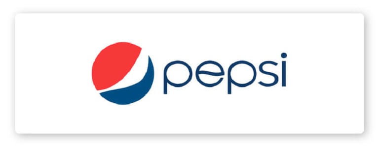
A slight tweak in 2014 moved the logo to be borderless globally, the logo still represents the brand today. Now, the waves are minimalist design elements that imply keeping the structure of the circle.
The overall branding is ideal for modern platforms and packaging. It is easy to read and presents Pepsi’s brand elements in the most obvious way.
While the thin, lowercase sans-serif font is a bit confusing for those familiar with the brand’s historic look, it feels fresh and more relevant to the younger generation. And, sticking with young people is Pepsi’s way right from the early days of the brand’s establishment.
Epilogue
Pepsi logo has undergone many transformations associated with historical milestones and strategic business orientations of the company. No one knows what the Pepsi logo will look like 10, 20 or 50 years from now. But believe that no matter what happens in the beverage industry, Pepsi will still be there, reinventing itself to please the taste of its fans.
Logo is one of the important elements of brand identity. If you are looking for a company specialized in logo design , please refer to Malu Design !


![[Case Study] – How Did Apple Build a Brand? 7 cach apple xay dung thuong hieu](https://maludesign.vn/wp-content/uploads/2021/03/cach-apple-xay-dung-thuong-hieu-500x500.jpg)
![[Case Study] – VPBank Rebrand – Deciphering the rebranding strategy and new communication model 8 AbjH708dSCSzsfW9A07o00SgNvGHl5GyqgernVB1](https://maludesign.vn/wp-content/uploads/2022/08/AbjH708dSCSzsfW9A07o00SgNvGHl5GyqgernVB1-500x500.jpg)