With screen sizes increasingly changing and getting smaller with the advent of new advertising channels, a brand problem arises before the eyes of businesses: One size for a logo is not enough!
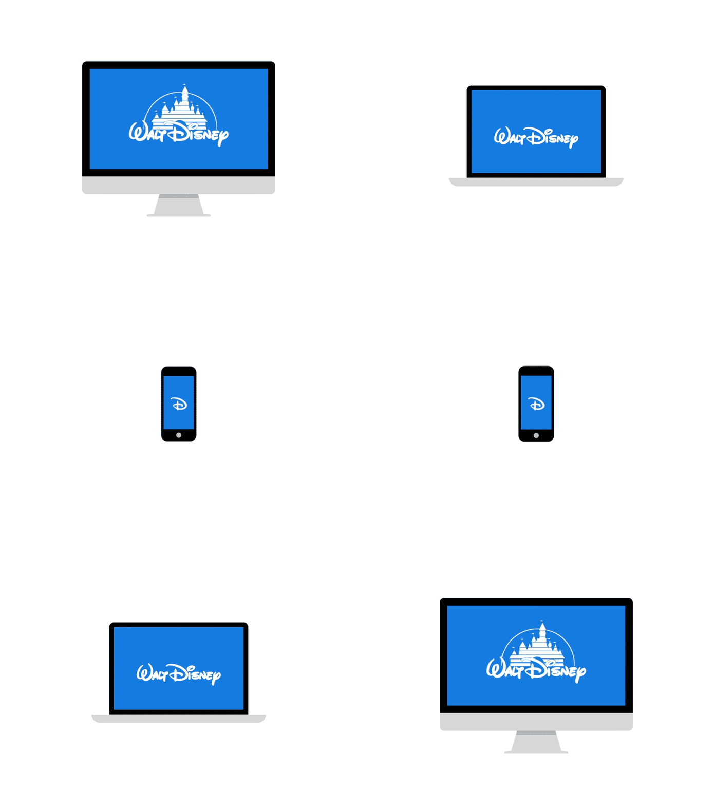
So responsive logos appeared to solve all of the above problems. Responsive logos are logos that can change shape and size, complexity or even color to fit wherever they are used.
Initially, responsive logos were seen as a design trend, but it didn’t seem like a fad but more of a practical and practical need. Nowadays, logos are pasted everywhere and they are all different sizes. The old rule “Never change the logo” – standard for decades, will probably make you “outdated”!
The development history of responsive logos
You may have heard about “responsive” many times? The term was originally coined to describe how a website adapts or can respond to different screen sizes. The goal is for websites to appear anywhere, regardless of desktop, tablet, or phone. The logo was also quick to “borrow” the word to describe its resizable capabilities.
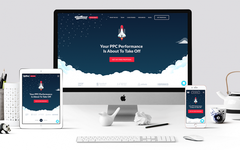
But the truth is that responsive logos have appeared much earlier than responsive websites or even the internet!
For centuries, companies have experimented with different logos in different contexts to suit a particular location or print medium. Sometimes companies have to “sacrifice” the color of the logo to print black and white newspapers. Other times, they shrink and simplify the logo to appear in advertisements or they often decorate it for an impressive headline.
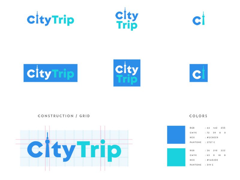
As marketing and advertising evolved, one idea was that logos must be consistent in order to increase brand recognition. That’s quite true (consistency is also important with responsive logos), but being too rigid about changing the logo can completely turn out to be “offensive”. It makes more sense to optimize the logo for each situation than copy and paste a logo designed for a small business card.
We need responsive logos!
The advantages of a responsive logo are obvious. Considering all the different places a company needs to use a logo, it’s of course not possible to use the same version of the logo everywhere without leaving something out.

Digital
Let’s start with the screen sizes. The popularity of mobile browsers necessitated that there should be at least one alternative version of the logo.
But now, we’ve moved from smartphones to smaller devices: smartwatches, smart bracelets, and soon, smart glasses. If you think the full-size logo looks smudged on a phone, wait a few years, it can be tucked neatly into the corner of your AR app’s screen.
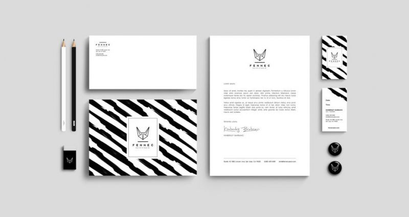
Fennec – Black Ink
In addition, we also have small ads inside small screens. Even ads on a website (for desktop use) can be minimized. The double (or more!) effect is pretty bad on mobile.
Printing and other environments
Beyond the digital space, companies are exploring new and diverse avenues for advertising work. For traditional methods like promotional swag (t-shirt, pen, bag, hat, etc.), you need to consider not only the size of the logo, but also pay attention to whether it is printed on different materials such as how.
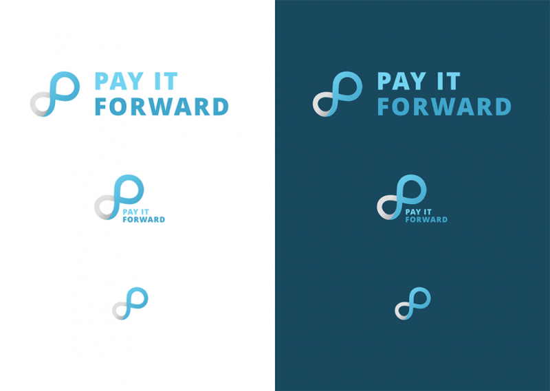 Pif logo responsive – Andrew Verboncouer
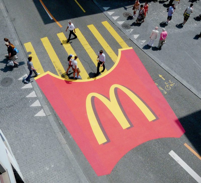
And let’s not forget the popularity of guerrilla marketing, where logos can appear anywhere in public, as graffiti murals in place of billboards. In other words, even strictly non-digital brands need flexibility in their logos.
Video also allows for a style of logo that is largely underused: animated logos.
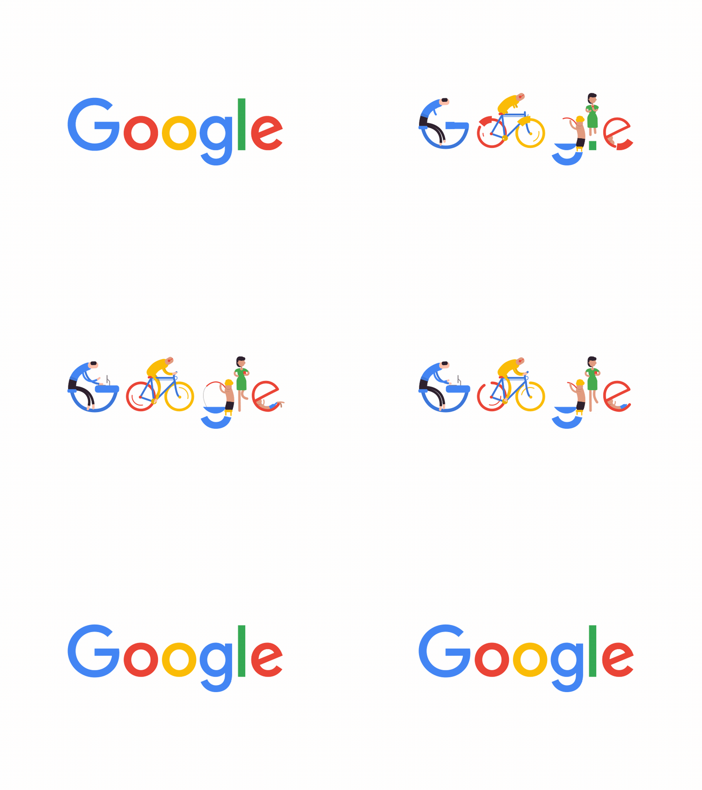
This is the moment for responsive logos, for brands big and small. Large businesses with a foothold in the hearts of customers began experimenting with simpler and abstract logos as long as their logo was recognizable.
How is a Responsive Logo created?
Start by reducing details
There hasn’t been much detail around responsive logos lately. However, one must always be prepared. Start with simplifying the logo, reducing the number of details will make the logo more attractive.
Take a look at the Binder Pro responsive icon example:
Logo #1: Full Version – Full of brand logos + slogans.
Logo #2: Mid Version – Just the logo.
Logo #3: Simplified version – A stripped-down version of the logo.

Organize your Logos
Move a mark from above the logo to the side. Check out the Case-Mate icons:

Step by step remove small marks
Removing small details step by step is a great solution for Responsive Logos. As an example take a look at the picture below. Logos go from huge logos to the name of a company just a sign.
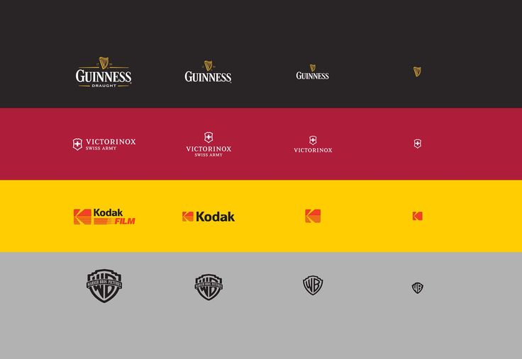
Don’t stop at logos
Once upon a time, Logo was the only means for us to identify a product from the advertisement on the radio to the shelf. But that era is no more.
Today’s modern brands imitate and study human behavior very closely. And just like people, the image of these brands doesn’t last from day to day. They evolve and adapt to the context. These brands are so powerful that they don’t need a rigid standard of visual cues to express their personality. Today there are brands we can recognize through just an image, or even a sound is enough.
A responsive logo is truly capable of mutating to adapt to the medium in which it is expressed, and the display on the screen, where we can customize everything, is a promise, how can we leave out? via. This has been cleverly done by the big names by creating a moving version of the logo, opening up many new layers of meaning for the logo as well as the brand’s values.

