We encounter logos of famous brands every day, but few know the meaning of their logos and what is the story behind it?
We are influenced by so many visual stimuli that we often neglect to pay attention to details like hidden symbols.
Many logos are designed with hidden or double meanings to influence our perception. Hidden meanings that we may have missed.
Whether you’re thinking about creating your own company logo design or even if you’re looking for logo design inspiration, let’s take a look at some of these popular brand logos and maybe you have one. What can be learned from them?
How to create a logo with hidden meaning
Logos with hidden meanings can sound abstract and confusing to apply to your own logo design, but they are usually done in the following way.
Negative space
Negative space is the void or empty space left around an illustrated object and ultimately helps define it. In other words, it is the “unused” space in a painting or design.
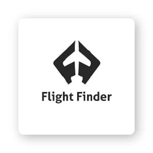
Negative space can leverage a business theme to add meaning or create various types of optical illusions associated with text or logo branding. This is exactly what Flight Finder did for their logo. The 2 ‘F’s are arranged together to form the shape of an airplane between them.
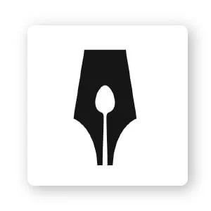
Icons that use negative space are a fun and easy way to engage consumers. Also direct them to your brand. Viewers are forced to stop and look closely to understand. Like the logo of The Guild of Food Writers. Look — do you see a spoon inside the tip of an old pen? Smart, right?
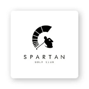
Most importantly, using negative space in your logo makes it stand out. The Spartan Golf Club logo is a perfect example of this. At first glance, it appears to be a golfer in the middle of the swing. But look back from another angle and you’ll see a Spartan warrior’s helmet. Now, negative space is a great way to create a unique “twist” of a so-called standard design.
Typography
Typography is an often overlooked design element that, when used intelligently, can take your logo to the next level.
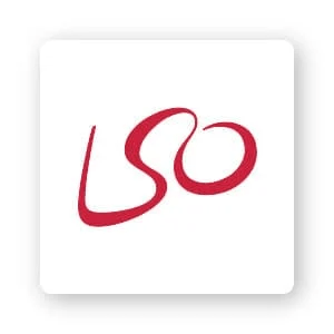
Experimenting with the arrangement of letters in a logo can add a lot of depth to your design. Look at the logo of the London Symphony Orchestra. The first thing you’ll notice are the letters LSO (an acronym for its name), but if you look a little closer you’ll be able to notice a conductor holding a baton in his hand. .
But the typeface you use can be even more subtle than that, to build deeper meaning in your logo. The Gillette Razor Company is a great example of this. The precise cut in the letters ‘G’ and ‘i’ looks as if they have been shaved off with a sharp razor.
Ultimately, typography can be based on the actual purpose of the brand. Pinterest got its name from the physical act of pinning things to a cork board. To hone that concept, the ‘P’ in the logo represents an actual pin, perfectly connecting the entire business concept together in a simple and creative logo.
Icons
Icon is the main focal point of the logo, representing a business and what you do.
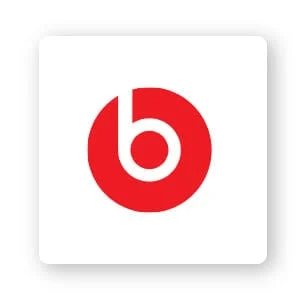
Using a logo icon can do more than just your business name. It can grab people’s attention and elicit an emotional response related to your brand. Or, a logo icon can let customers feel they are using a product or service. Check this out. The Beats by Dre symbol is a simple letter ‘b’ wrapped in a circle. However, as you might have guessed, that circle is not just a circle it represents the head of the person and the letter ‘b’ represents the earphones. This personal touch reaches their target audience in a powerful and unique way.
Another company that applies a similar customer outreach concept is Evernote. This app helps you memorize and organize your notes, and that’s why they chose the elephant icon. As the saying goes, “An elephant never forgets.”
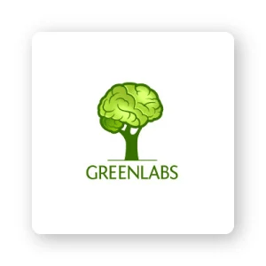
In other cases, an icon emphasizes you as a business. Check out Greenlabs – a web solutions and digital marketing company. They want to convey to their customers that they are a smart team ready to help you grow your marketing. So it’s fitting that the canopy simulates a brain.
Color
You may already know that humans have strong reactions to certain colors . Soft blues, passionate reds, and so on. This is why logo colors can say so much about your brand personality.
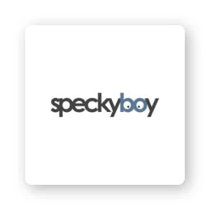
The mission of design magazine Speckyboy is to serve as a hub for designers. With that in mind, their logo is a pair of eyes in glasses that keep an eye on all the new design trends. Blue color tells customers the prestige of the business.
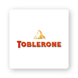
The famous Toblerone chocolate company is one of my favorites because there are so many undertones of creativity. The mountain is painted a yellow color to symbolize the unique honey flavor in their chocolate. And also, spot the bear inside the mountain? It represents Bern, Switzerland, which is the city in which Toblerone is manufactured.
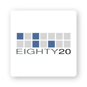
When choosing colors for your logo, a general rule of thumb is to always keep your target audience in mind. What do you want to tell them? As South Africa’s analytical consulting firm. Eighty 20’s logo has chosen blue and gray colors to represent reliability and professionalism.
More favorite logos with hidden meanings
1. Malu Design
Brand identity design agency . The logo itself consists of symbols that represent our brand: the eye, the infinity symbol, and the whole as a cosmic black hole.
2. Cisco
As a major networking equipment company from San Francisco, the dashes in the logo represent magnetic waves and pay homage to the pillars of the Golden Gate Bridge.
3. Yoga Australia
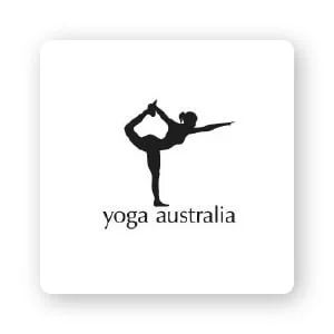
Yoga Australia’s logo uses noticeable negative space. In the space between the character’s arms and legs, it is holding onto the contours of the Australian continent.
4. Continental
The Continental automaker’s logo is subtle yet effective. The letter ‘C’ and the letter ‘O’ make up the shape of a tire, they are best known.
5. Tour de France
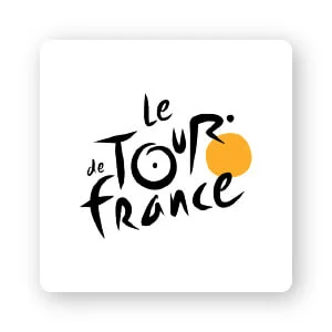
Did you know that the logo of Le Tour de France has 2 hidden messages? The first is a hidden cyclist made up of the letters ‘R’ and ‘U’. The cyclist is riding a bicycle, the letters ‘O’ form the wheel.
The ‘O’ is yellow, the same color as the shirt given to the event winner.
6. Roxy
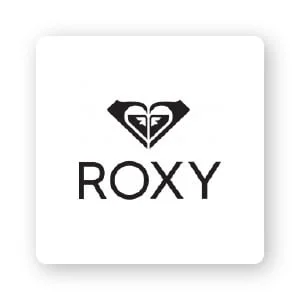
Roxy’s logo has a lot of elements, but it suits them. The logo that looks like a stylized heart is actually 2 copies of their parent company. The logo consists of an interlocking wave and a snow-capped mountain. Mountains and waves symbolize excellence and authenticity, as do surfing and snowboarding — the two sports they cater to the most.
7. Dominos Pizza
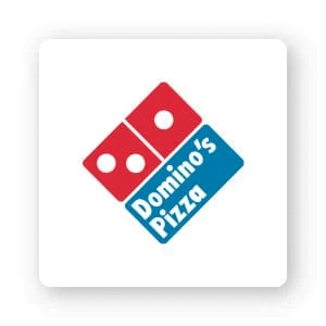
Now, on every street corner, the 3 dots represent the 3 restaurants, where the pizza magic begins. The restaurant’s founder originally planned to add a new dot every time a new chain opened, but (fortunately) the business grew too fast for that to happen.
8. Levi’s
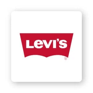
You ask what can be hidden about this logo? I’ll tell you: Below the simple shape is an example of negative space being used effectively. The space here mimics the shape of classic Levi’s bags, fashioned into a bat wing on every pair of pants they produce.
9. The Bronx Zoo
It’s a bird, it’s a giraffe, it’s – New York City skyline! One of the largest zoos in the world, the Bronx Zoo can be found in midtown Manhattan and that is the subtle focus of its logo. Between the feet of the zoo animals, the outline of the Big Apple stands proudly, inviting zoo-goers to explore the city and to see its animals. (Click to see more inspirational animal logos.)
10. FedEx
Another good example of using negative space effectively, the delivery service sneaked an arrow between the “e” and “x” of the logo – a reference to the speed at which its packages it will be delivered.
11. Hyundai
Embedded in a logo widely recognized on cars on the road is a secret surprise. The “H” that people assume stands for “Hyundai” also symbolizes two individuals meeting in the middle with a firm handshake – ostensibly representing a satisfied bond between the brand and its customers. .
12. Hershey’s Kisses
Chocolate, chocolate everywhere; Sugar lovers can’t wait to open that Hershey’s Kisses pack and see what’s inside – so the logo gives us a preview! Embedded in the letter, between the “K” and “I,” is an additional, sideways chocolate kiss. If only each pack came with an extra kiss!
13. Goodwill
All nonprofits are about making people happy, as evidenced by the smiley face in the lowercase “G” on their logo. For the weak among us, the organization exaggerated the smile to claim an important part of the design.
14. Vaio
This (formerly) SONY computer brand is clever with its abstract logo design , but viewers may miss the meaningful part. ‘V’ and ‘a’ together represent an analog wave, while ‘i’ and ‘o’ are reminiscent of digital signals (via the binary numbers 1 and 0).
15. Amazon
The e-commerce/cloud computing giant is represented by a simple logo with a single color patch in the arrow. However, the arrow contains most of the logo’s message; it symbolizes that Amazon takes it all — from ‘a’ to ‘z’ — and puts a smile on customers’ faces for that reason!
16. LG
The phone company’s logo that combines the ‘L’ and the ‘G’ is strategically placed, but what you might not realize is that it also creates a face — ultimately humanizing the brand . Do you see that little dot in the left corner of the logo? That will be the eye of the face!
17. NBC
Why are there so many colors in this peacock logo? The logo was created at the same time as color television and NBC wanted to emphasize their stake in the market. The 6 feathers represent each part of the net, and the peacock is generally meant to remind customers that the network is “proud as a peacock” of their color program.
18. Baskin Robbins
Do you see it as ‘BR’ or is it number 31? The answer is – both! This iconic ice cream chain has grown into a strong brand over the years and is easily recognizable by name, but that hasn’t stopped them from reminding customers of the original promise in their logo. : 31 great flavors, one for each day in a month.
19. Tostitos
People come together over fries – at least that’s the idea behind the Tostitos logo. The ‘T’ in the wordmark looks like a human figure, and they’re happily dipping the same tortilla chip in the salsa pot represented by the ‘i’.
20. Spartan Golf Club
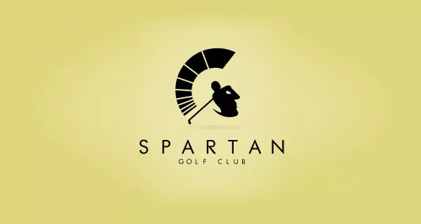
Not only a golfer, but also the face of a Spartan warrior wearing a helmet
21. Night Golf
Night golf club
22. Handy Dog
Dog head from the shadow of the hand
23. Flight Finder
The 2 “F”s of the flight finder shape an airplane
24. Coffee Night
A cup and the image of a crescent moon from the foam of coffee
25. Lion Bird
This is how the designer put a bird and a lion’s face together
26. Black Cat
In the dark there are 2 cat eyes
27. CodeFish
Surely you recognize the fish, but it is assembled from programming language symbols
28. Shift
“Shift” in English also means to shift
29. Frankenstein Movies
Frankenstein’s plastic film and holes face
30. Magic Coffee
Cup of coffee is also the extraction of hats of magicians
31. Horror films
Horror films is a horror movie, the logo is an image of
a film tape but also a face with a gaping mouth
32. BarCode
A beer made from a set of barcodes
33. Boundary
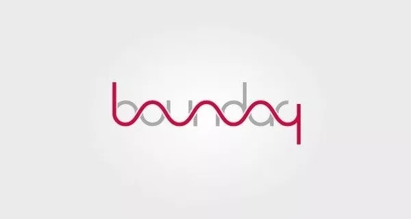
We see in the word ‘Boundary’ there is a clear line of demarcation
34. Bearhanded
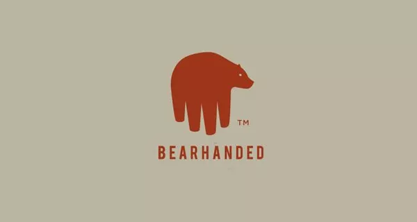
The bear and the five-fingered hand
35. Art Sharks
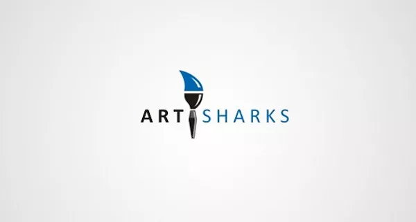
Drawing of a paintbrush (representing the word Art)
and a shark’s fin
36. Freedom
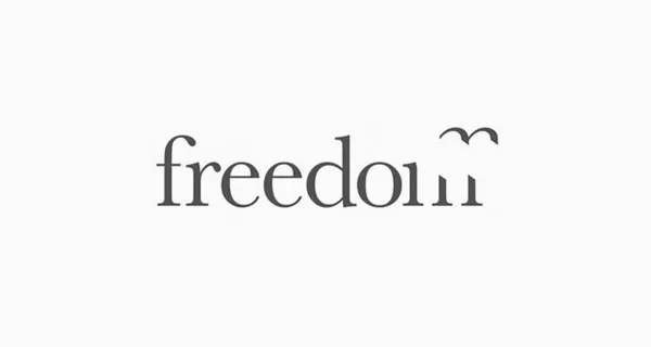
“Freedom” is freedom, a bird’s wings fly away
37. THE PILGRIM
Map of Africa with 2 educational faces
38. Blade
There is a knife in the word Blade
39. Killed Productions
The letter i lying dead of the word killed
40. Circus of Magazines
The magazine, with its pages on both sides, also evokes the image of a circus hut
41. Piano Forest
A combination of forest and piano keys
42. Eight
How many “8s” are there in this eight?
43. Formula One
The number 1 is made up of the letter “F” and the red wave array
44. Cologne Zoo
Park logo at night with animals and stars
45. Mister Cutts
Barbershop logo for men
46. The Guild of Food Writers
Do you recognize the image of a spoon nested in a writing nib?
47. London Symphony Orchestra
The letter LSO poses a conductor with a joystick
48. Ninety Percent
The number 90 is also the % sign.
49. Northwest Airlines
The letters “N” and “W” form an arrow to the northwest (northwest)
50. Pittsburgh Zoo
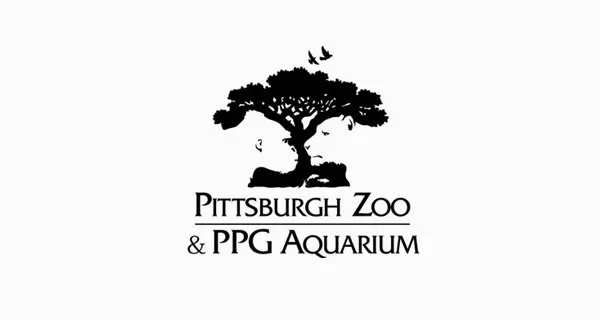
Zoo logo with giant tree gorilla and lion
51. Portrait Pictures
Both the camera icon and the portrait mode icon in photography
52. Sun Microsystems
The logo is in the shape of a chip, but you can see the word SUN from every angle
53. Toblerone
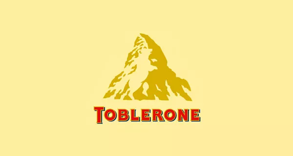
In the looming mountain there is a bear
54. Newcastle Food & Wine Festival
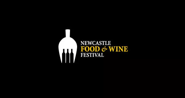
Fork and pitcher and 3 bottles of wine
55. Twins
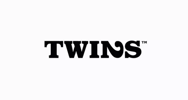
Do you see the number 2 in the word Twins?
56. Elefont
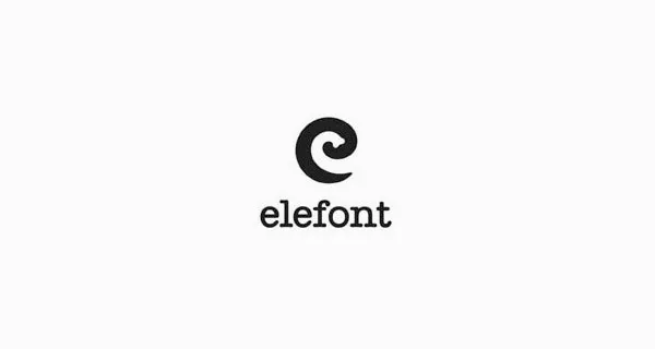
The letter e and the trunk
57. New Man
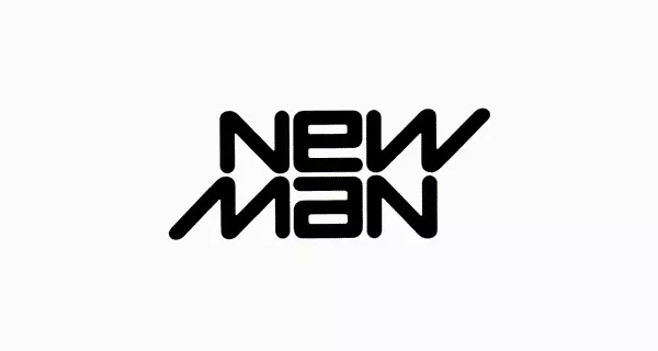
The word New and the word Man, one casts a shadow on the other
58. BirdLove
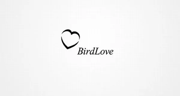
2 bird wings forming a heart shape
59. Ed’s Electric
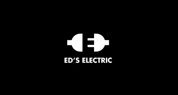
Plug and the letter E in the middle
For you
As you work to create your own logo, you may decide to incorporate hidden meanings.
Which of the above logos do you feel is effective? What message do you want to send to your audience?
As you begin to design your logo, consider the tips we mentioned and these examples, and think about how they help bring your logo to life.
If you are looking for a reputable and experienced unit to be able to design a professional and impressive logo and brand identity system , then please contact us immediately by phone. 0988 622 991, or leave your information and requirements, Malu Design ‘s consulting department will contact you right away to answer all your questions!
————————
Malu Design – Branding Identity Agency
Hotline: 0988 622 991

