Great, maybe your marketing campaign has been extremely well prepared. You already have paid advertising channels, your landing page design has been optimized for SEO standards for google, the amount of traffic to the website through the search channel remains stable, Facebook ads reach users with low cost. good fee..
However, the large amount of traffic flowing to the landing page is not compatible with its conversion rate. Is it a good idea to rush to the conclusion that your marketing campaign is a complete waste?
Wait ! The first thing you should check and analyze right away is what users do on your landing page from advertising channels. Not having a good landing page is like going fishing and forgetting to bring a net: you can catch a really big fish with a rod, but you can’t get it on your boat.
Understanding and Doing Digital Marketing – What is Digital Marketing?
What is a Landing Page?
A landing page is a website created for a certain audience, accompanied by a detailed conversion goal, for the products and services the business is offering. Or to put it in a more understandable way: “One page – one purpose only”.
The video below is an extremely easy to understand explanation of a landing page, along with specific examples for you to understand how to recognize a good landing page.
Refer to some other definitions of Landing Page:
According to Unbounce’s definition of Landing Page:
In digital marketing , a landing page is a stand-alone website, created for marketing purposes or specific advertising campaigns. This is where users will access through Google Adwords ads or similar format.
Landing pages are designed to focus on a single specific goal – known as a call to action – CTA.
It is the emphasis on single-targeting of landing pages that makes them the first choice for increasing conversion rates in each campaign running Google Adwords ads.
To really understand the difference between landing pages and other pages on your website, you need to first consider which pages you will focus on optimizing to the top by SEO, and which pages will you use to run ads . fox.
According to the definition of Landing Page by Searchenginepeople.com:
According to Searchenginepeople.com, a landing page is a place that will provide more information after potential customers click through ads displayed on other websites or by Google. Landing Page is an effective tool to help you increase the conversion rate of each of your sales campaigns.
The Formula for Beautiful and Effective Landing Page Design
You don’t want users to just glance at your landing page. More than that, they need to take action while on the page. So check out these 8 tips as a great way to increase the conversion rate of visitors on landing pages.
Convert = CONVERTS
C = Clear Call to Action : Clear Call to Action Button
O = Offer: Deliver Benefits
N = Narrow Focus: Keep it Minimalist
V = VIA: Very Important Attributes: Bring Out Your Product’s Most Outstanding Features Or Service
E = Effective Headline: Effective Headline
R = Resolution-Savvy Layout: Standard Layout, Size
T = Tidy Visuals: Neat, Clean Image
S = Social Proof: Use feedback
Discover which colors have the highest conversion rates
Professional Landing Page Design Guide
C – Call to Action: A clear call-to-action button when designing a Landing Page
A call-to-action (CTA) button is what you want customers to do: Buy now. Register now. Try it now. Contact. Watch now….
Selling to a customer is like going from A to B. If going from A to B is too difficult, build points C, then move customers from A to C and then from C to B. CTA is the key point C in that difficult process. CTA helps users continue to follow your intended navigation on the page.
So your call to action should be clear and engaging. Don’t distract them with countless offers, the best landing page should have only one CTA.
Advice:
You should test continuously to get the most effective CTA button. Test the color, size, position of the button so that it is reasonable. Most importantly, test words like “Help us” sound much better than “Donate now”
Considerations for landing page design:
1. Make sure that when designing the landing page, the CTA button is placed in the most visible, central, most eye-catching position, and resembles the button like any other button. That last one may sound silly, but the truth is that quite a few websites are making this mistake by leaving customers guessing what this is, whether they should click on it or not.
2. Use icons like arrows or images to direct the user’s eye to the CTA button.
3. If you have extra CTA buttons on your landing page, make it a little less prominent than the main CTA.
4. If you have extra content near the footer, repeat the CTA one more time. This repetition will make it less time consuming for the user to scroll up, thus making it easier to click the button.
Note:
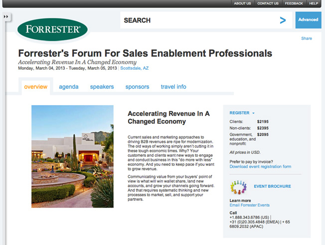
On this landing page, the purpose of the CTA does not seem to be very clear. “Do an “advanced search” The only plus is that there is an arrow pointing to the CTA button but personally I am not sure that this CTA will help them in sales.
For example:
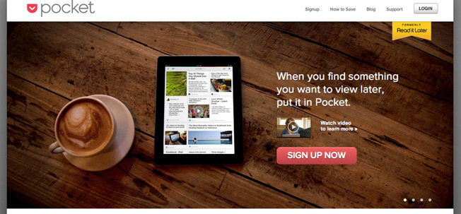
Our eyes are immediately drawn to the CTA. More specifically, the way the video above is scaled down, this shows the designer’s deep research because, the “play” button of the video easily distracts the customer’s attention with the CTA button.
O – Offer: Provide benefits to customers
It’s easy to understand, you want customers to do what you want, give them benefits. Be it coupons, discounts, or free trials, free trial of new features, something extra, etc.
Advice:
When customers feel they are being profitable, it is easy to increase the conversion rate on the landing page:
1. An online payment website can offer users $10 for the first payment, provided they have to register for the service and connect their bank cards.
2. A consulting company offers users 60 minutes of free consultation.
Whatever benefits you offer, come with specific deadlines to make users feel rushed and eager to sign up now.
Considerations for landing page design:
Just make sure it doesn’t affect the CTA button.
Note:
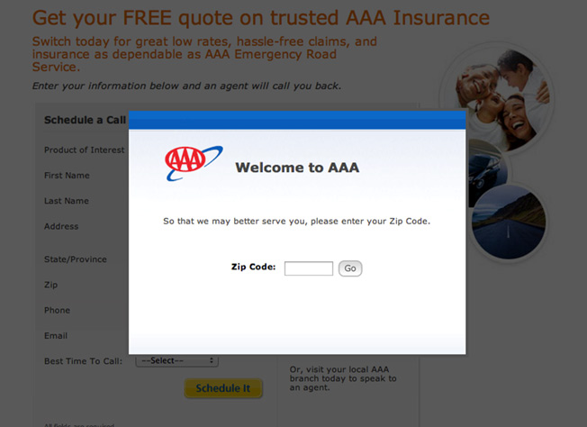
There are a lot of things that don’t make sense here. Insurance sites offer free quotes, and they need very little information from the user (most only need a ZIP code). Here AAA has been more demanding than providing benefits, preventing users from continuing to view other things on the landing page until they get the zip code. This will easily make customers feel uncomfortable, increasing the bounce rate.
For example:
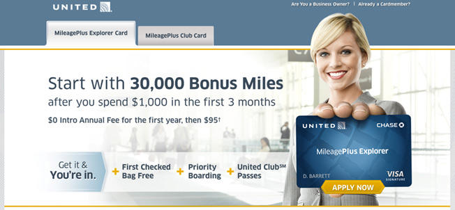
Bank cards always come with usage benefits – and the example below provides additional bonuses when customers use them. The more you use it, the more bonuses you get. There are also 3 more benefits. The CTA button is also very prominent and attractive.
N – Narrow Focus: Keeping the Landing Page Minimalist
Have you heard the term “KISS- Keep It Simple, Stupid”. Research shows that the more options you offer, the longer it takes customers to make a decision. So the landing page keeps the simplicity and clarity, the customer conversion rate will be much better.
1. Do you really need that navigation bar? Get rid of it, or make it even more minimalist, and remove the things that make customers click instead of clicking on the CTA.
2. Do you really need to talk about the company philosophy? Please move it to the “About us” section and being so rambling on the content of this section it won’t help much in getting users to continue viewing the sections below.
3. Do you really need to collect all the information about the user? Build customer portraits as carefully as possible, but if you force customers to fill out forms with too many things. They will be “lazy” and won’t do it.
Advice:
1. Keep the information short and make sure everything on the landing page has a clear purpose.
2. Test the content in the form, the time to fill out the form, balance to have the best form for the customer and for his company!
Considerations for landing page design:
1. Use images to direct the user’s focus on the most important things on the landing page
2. Leave the necessary white space when designing the landing page for users, don’t make them feel confused and afraid to read .
3. Make sure that headings and sublinks don’t distract users from the main purpose of the landing page
Note:
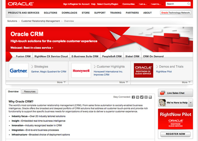
How many things can you click on this landing page? Thirty-nine JUST . That’s more than 39 possibilities that the customers on your site will do before doing the right thing you set out to do. After spending countless advertising dollars to put on a landing page with clear goals set from the beginning. You don’t want the user to jump somewhere else.
For example:
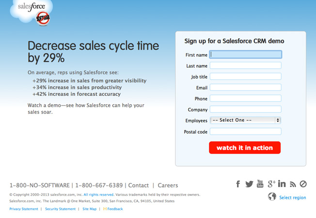
This is probably not a good aesthetic landing page. But for a software business, it’s acceptable. There are no toolbars at the top, some navigation away from the landing page below, and the social links (Facebook, Twitter, Youtube, ..) are small and discreet by using gray. Fill out the request form with just the right amount of information and accordingly the benefits that come with a prominent red CTA button.
V – VIA: Very Important Attributes: Give the most outstanding features of the product or service
We’ve all heard anecdotes about landing pages with very “cry” links that are “eye-catching and stimulating”, but there is no information inside the landing page, and yet it can be collected. Get more than 1 million email addresses right after running the campaign.
Condolences to you, 99% of that will never happen to your company.
Instead, you should give the customer reasons for VIA – The most outstanding features of the product or service.
But, customers will not want to read all the information about the product on the first page. Come up with the first two to five characteristics that you think are most important to the customer, and then let the customer explore the rest later.
Advice:
Describe the product from the customer’s point of view and stance. In other words, explaining what user problem this product can solve. This may or may not be true depending on the product or service you provide, so it is advisable to test and test a lot. In summary, you should describe:
1. Features – List of outstanding and interesting features of the product or service
2. Benefits – What these features will help the customer
3. Vulnerability – If not used, the customer What will the goods lose?
Try different approaches, which feature should be included, which feature should be bold, and how you would describe it.
Considerations for landing page design:
1. Make sure that the landing page design has these characteristics that don’t conflict with the CTA.
2. Should show characteristics with icons or images to attract customers to read more.
For example:
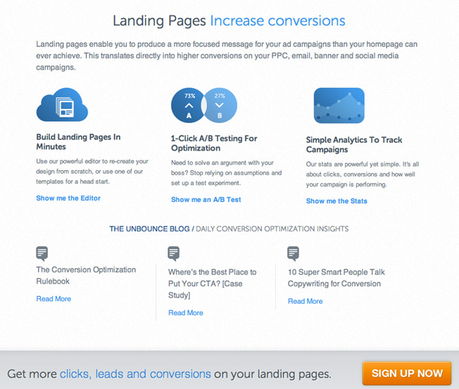
A few brief descriptions of the 3 features (with links for those who want to learn more). At the bottom of the landing page, there is a CTA button for those who are about to leave the page.
E – Effective Headline: Captivating headlines
Customers will easily be attracted by smart, creative, witty or curious headlines. This is already done in the ads, and the customer is already attracted by the title (so they clicked it), so on the landing page, you don’t need to draw any more attention.
The goal now is just to encourage them to stay, and keep learning more. Use “Plain language” to describe your site
Sell Marketing consulting services? “How to do better marketing.”
Sell location finder app? “Finding friends nearby.”
Advice:
Customers are all “busy”, so make them “less busy” rather than “busy” by coming up with clever, short, and concise headlines.
Considerations for landing page design:
Make sure the title is clearly separated and stands out.
For example:
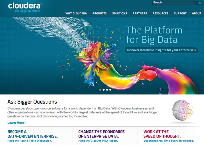
Okay, takes exactly a second to get the hang of it: this is the platform for big data. The CTA (could do better) tells us that this product is for businesses.
R – Resolution-Savvy Layout: Standard layout and size when designing Landing Page
Did you know that there are still a lot of people out there who are still surfing the web using 800×600 screens? And the screen takes up the majority of the 1024×768 aspect ratio?
That is to say, what you see on your laptop’s HD screen may be far different from what your customers see. Keep the essentials – Logo, Title, CTA, and supporting images – in the center or top of the screen, and supporting content at the bottom of the footer.
Advice:
Make sure your landing page designer knows which element is most important and places it at the center of the page.
Considerations for landing page design:
If you can customize the screen display, make the page screen suitable for many different machines, enough to show the title, CTA when viewing the page. And of course on phones and tablets too
Note:
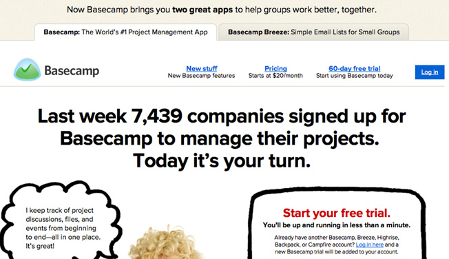
This is Basecamp on a 1024 screen. This landing page at the top has links that look like Google ads, the title font is too big to be unpopular, and too long, too many words on one screen.
For example:
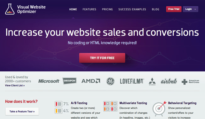
And here’s the Visual Website Optimizer on 1024 screens. Clear title, outstanding CTA, past customers, and a few features. Even on smaller screens, the most important components will still be visible.
T – Tidy Visuals: Neat and clean images when designing Landing Page
If you spend more than 30 minutes on the Internet, you are more likely to see horrible animated ads. Don’t let your landing page look like the ads
1. The design is clean, neat and makes use of white space so that the user does not have eye strain, and easy to access the CTA.
2. Large fonts will make it easier for users to read and understand your landing page.
3. Using Video Increases Conversion Rate by 80%
Images and videos related to products and customers will help convey the message of the landing page better
Advice:
This is also something you have to test a lot. Do customers interact better with real photos or more illustrations? People or things better?
Considerations for landing page design:
1. Speed . A landing page with a fast loading speed will get more responses. Make sure your design doesn’t increase page load time.
Note:
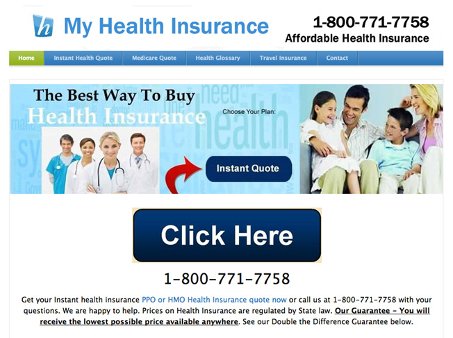
A landing page with bad images, bad layout and lack of professionalism, arrows pointing to a button but not clickable, distracting from the main CTA. The purpose of the CTA button is not clear.
For example:
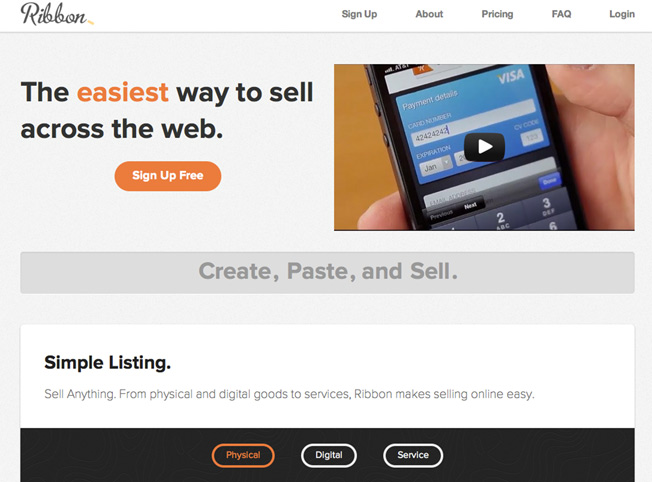
The use of color here makes the CTA stand out more. The design is simple and clean, and the product is showcased through a video.
S – Social Proof: Using Feedback when designing Landing Page
People tend to put more trust in products that have been tested by others. Therefore, you should consider including your landing page design including the following:
1. List of customers
2. Get promoted to newspapers
3. Users increase
4. Certificates
Advice:
Collect good feedback and comments from customers and put them on your landing page. Update more every time the product users increase, are mentioned in the press or famous people..
Considerations for landing page design:
Design the logos of your partners and customers in a light color tone (gray is best) small enough to not distract customers.
Note:
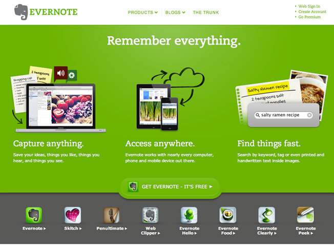
This is a very clean and aesthetically pleasing landing page, the product features are shown. But the CTA button disappears behind the background, and there is no evidence or feedback.
For example:
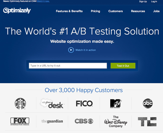
4 proofs on one screen: “provided by CNN”; “#1”: “3000 customers”; “logos”
5 tools, software to design and create the best online Landing Page
While there’s no one-size-fits-all formula for creating a successful digital marketing campaign , there are a few factors that can help you increase your chances of achieving that goal. Having a beautiful, effective website with dedicated, purpose-built landing pages can help generate more traffic and improve their overall experience on the site.
However, building and creating landing pages is not an easy task. Landing pages are usually designed to be simple, with the goal of getting visitors to take a certain action. For example sign up for a form, click on a specific area or even make a purchase.
1. Unbounce Landing Page Builder
Cost – $79 per month, billed annually
Unbounce is a very famous name in the world of digital marketing. They focus on building products, providing solutions to increase the effectiveness of customers’ online marketing campaigns. Their landing page creation software is extremely easy to use, compatible with WordPress, making it possible for any marketer to design their own.
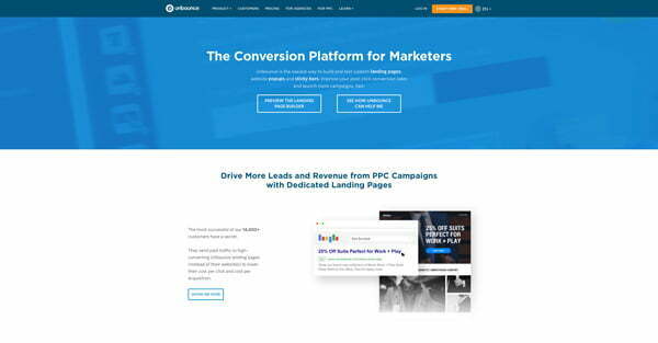
Hosting
Hosting is included in Unbounce’s service plan, but you can also choose to have your landing page hosted on your own server.
Features and characteristics
Unbounce has a slightly different approach, and focuses primarily on reducing user bounce rates on landing pages. Some of the features and characteristics include:
1. Forms and CTA
2. Editing tools
3. Fast page loading
4. 125 beautiful landing page templates to choose from
5. Standalone analysis features
6. A/B testing
7. Can integrate with WordPress
Customizability
Creating a landing page with Unbounce becomes extremely easy because it allows users to have great customization capabilities. In particular, Unbounce does not use a grid system to arrange the layout during the design process.
Analytical ability
With a variety of metrics, and the ability to combine with Google Analytics, you already have all the necessary parameters for your landing page.
Some unique points
1. One of the best drag and drop software
2. SSL encryption support
3. Change keywords for PPC campaign
4. Designed to optimize conversion rate
2. GetResponse Landing Page
Cost – from $15/month for the basic plan and $49 for the premium plan
GetResponse is one of the fastest growing digital marketing platforms available today. Offers a full range of services including: email marketing , marketing automation, and of course landing page creation.
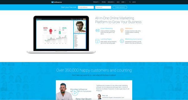
Hosting
You can choose to host your landing page on GetResponse or your own personal server
Features and characteristics
GetResponse also offers a number of outstanding features and features including:
1. Beautiful, professional landing page templates
2. Free stock photo library
3. Ability to post through many different domains
4. A/B testing
5. Warehouse of forms, registration forms
6. Can be integrated with many other platforms
Customizability
GetResponse offers maximum customization, from the layout of the landing page, down to every detail of the object. At the same time you can add links to your social networking sites to increase awareness.
Analytical ability
You will gain access to GetResponse’s internal analytics tool. You can also connect to Google and receive campaign information by email
Some unique points
1. Ability to customize on mobile
2. Customize professional registration forms
3. Integrate with many other social networks and platforms
4. Provide a full range of marketing service options
3. InstaPage Page Builder
Cost – from $69/month
InstaPage quickly became popular with users, although it can be a bit difficult for inexperienced people at first, but you can copy both existing website layouts and turn them into a template to use.
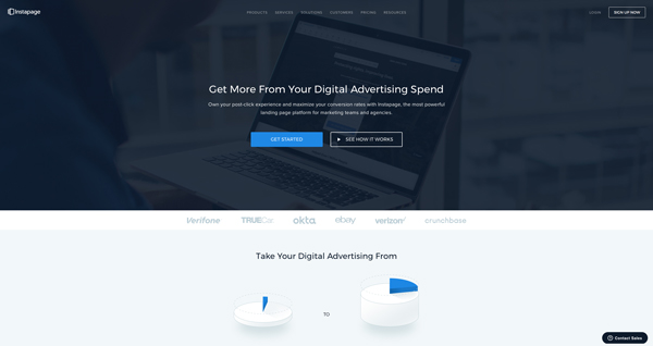
Hosting – for business plan only
If you want to place a landing page on InstaPage’s server, you will have to choose the business plan or pay a small fee. But you can also put it on your own hosting.
Features and characteristics
For search engine optimization, InstaPage offers complete testing and measurement capabilities. Some of the features can be mentioned as
1. Convenient drag and drop, easy to use, less restrictions
2. Integrates with 20 different platforms
3. Tracking with Pixel
4. Real-time
5. Visitor heatmap
6. Replace change text
7. A/B testing
Customizability
InstaPage offers amazing design and customization capabilities, making it easy to create an impressive, creative landing page.
Analytical ability
You can also use InstaPage’s analytics tools as a whole or connect them to other tools for more effective measurement.
Some highlights
1. Visitor Heat Map
2. Tracking Pixel Code
3. Real Time
4. Excellent Customer Care
5. SSL Encryption Support
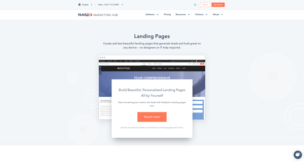
4. Hubspot Landing Pages
Cost – from $200 a month
One of the most popular digital marketing solutions providers for large and small businesses. Hubspot is a brand that helps companies automate their marketing activities by providing a variety of tools, including landing page design and creation.
Hosting
Hubspot users can choose to place a landing page on Hubspot as they please.
Features and characteristics
Hubspot offers a full range of tools, focusing on many different areas of marketing campaigns. This landing page creation software can:
1. Perform A/B Testing
2. Optimize content based on location, features
3. Insert images and links
4. Add CTA
5. Load landing pages quickly
5. Integrate with most tools and other platform
Customizability
The purpose of a landing page is designed to create conversions. And creativity can play a role in those conversions. Hubspot offers great customization that you can’t afford to miss.
Analytical ability
With Hubspot’s landing page, you can track analytics through Google Analytics. What’s more, you also have access to and data collection at Hubspot’s tools.
Some unique points
1. Connect to Hubspot CRM
2. Display content based on location, device, etc.
3. Track metrics through Google Analytics
4. A/B Testing
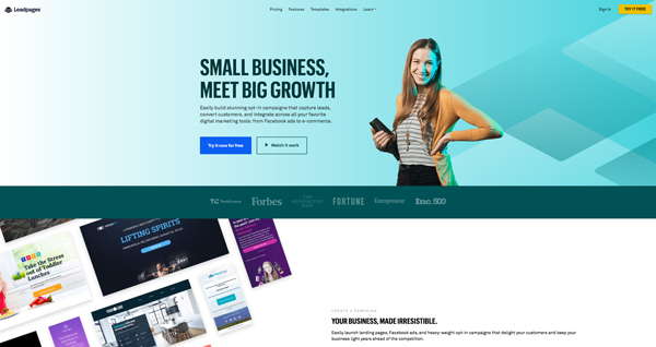
5. LeadPages
Paid – from $25/month, paid annually
When it comes to quality and value, not many landing page creation software can compare to LeadPages . Focused on optimizing contact templates, the platform allows you to choose from over 100 different templates. And if you choose to pay by the year, you get a small discount.
Hosting
LeadPages like the 4 software above allows you to put on their own hosting or your own.
Features and characteristics
Some features and characteristics of LeadPages can be mentioned as:
1. Compatible with ad creation software
2. A/B testing (not for basic plan)
3. Search engine optimization
4. Integration with most email marketing platforms
5. Customization form
Customizability
If to talk about the downside of LeadPages is the ability to customize, this software is relatively difficult to use when you are new to it. However, you get access to HTML code, the ability to design beautiful will be easier if you know a bit of programming.
Analytical ability
You will have all the parameters you need to make the right decisions with quite complete analysis features.
Some highlights
1. Ability to analyze data
2. LeadBoxes
3. Focus on conversions
4. Optimize for target customers
Experimenting with Different Landing Page Designs
All of the above advice can be summed up in one sentence: stay clear and coherent about what you want your client to do, and make the process simpler for the client. You will design a landing page with a higher conversion rate than ever
AND DON’T FORGET THE HOMEWORK TESTING – TEST!


