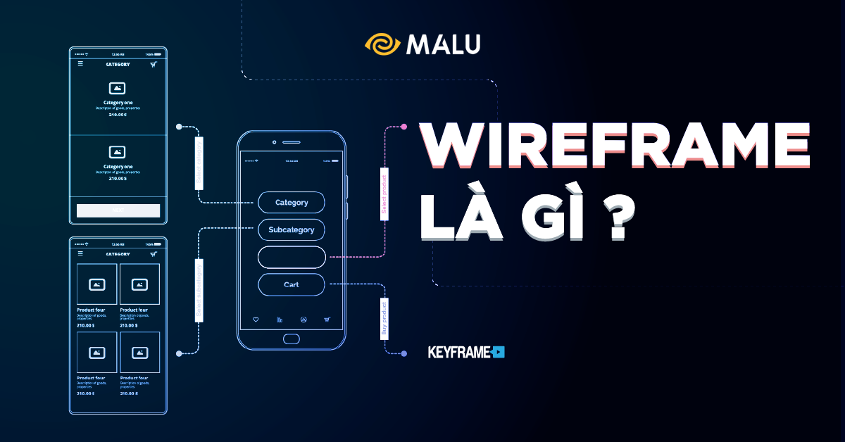
What is wireframe ? Where does wireframe stand in the entire UI/UX design process? Are wireframes really that important to focus on? Let’s find out through the article below.
If you don’t know what UI/UX Design is, read this article first and then come back here, no need to rush
>>> What is Ui Ux? Why Ui Ux Design is Important
The basic explanation for the question “What is Wireframe?
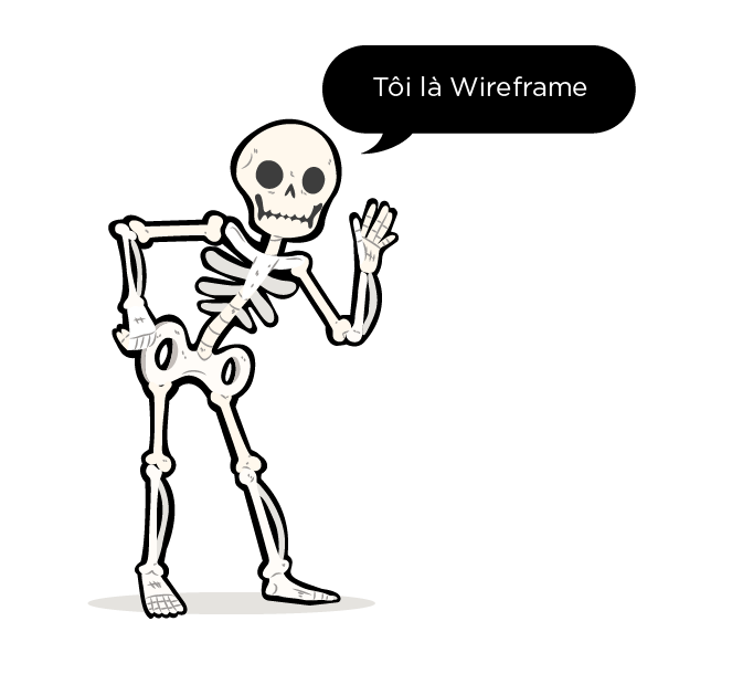
Wireframe roughly translates to wireframe structure – a skeleton is a tool intended to aid in development, design demos and create a finished product. Simply put, you can understand that Wireframe is the backbone of a design in general and web and app design in particular, containing the most important and basic components of the final product.
Wireframe is a great tool for you to use and help customers get the most basic understanding of what their product will be like. If they have changed requirements, you can easily redo it and do not spend too much time and effort. At the same time, you can work with other departments in web design such as programming department, content creation department more effectively…
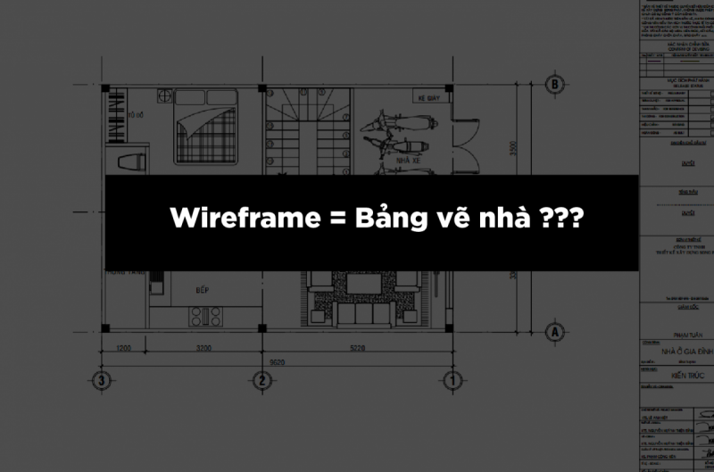
The house drawing board can’t tell what color the house is built, what color the picture is, how beautiful or ugly the picture is, similar to wireframe focusing more on UX than UI (note: I used the word “concentrated”, not not having to do wireframe is not related to UI, don’t worry too much about beauty at this step).
Tóm lại, wireframe tập trung show “How it will work, not how it will look”
Why use Wireframe?
Not only for things like website design, you can also apply Wireframe to almost any design in general. From the initial sketches , you can add more user action flows on the website, how groups of information structure …
These data will help customers and other departments work with you to create products with the most intuitive, overview. This helps everyone to better understand the final design and create a uniform product.
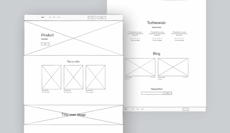
For example, for a website, you will have a structure consisting of 3 main parts:
- Header : will have information such as logo, menu and things belonging to the brand identity of the website.
- Body : here, you will show the main content such as introduction, blog post or products…
- Footer : will usually contain information such as newsletter subscriptions, social media icons or copyright information …
In addition, you will need to see more about content such as: how the functions work, what clicks will jump out, and research more about user behavior when interacting with your website on the computer. computer, phone…
From the information provided in this section, you can see that, Wireframe is one of the necessary tools / stages to create a complete end product.
How should I wireframe?
It always depends on the task depending on the project we choose to do lo-fi or hi-fi. Even in the same set but with screen/page or block, I draw hi-fi, where it doesn’t matter, I do lo-fi. In short, as long as the whole team is in agreement, as long as you focus on the important things, as long as you understand what you are doing and why you are doing it, then choose the appropriate way.
In some web projects, I combine wireframes with moodboards, and there are times when I will capture the appropriate template that I add quickly.
In some app projects, I combine wireframe with flow, roughly called wireflow, so that the whole team can grasp the problem quickly, fix it quickly, quickly test the prototype at this step so that the flow is not broken.
Which is not a wireframe?
Wireframe is not a sketch, a draft… Those are not called lo-fi wireframes, it’s just a sketch, it hasn’t finalized anything, hasn’t made sure that the whole team agrees on a common plan, it can’t be. considered as wireframe.
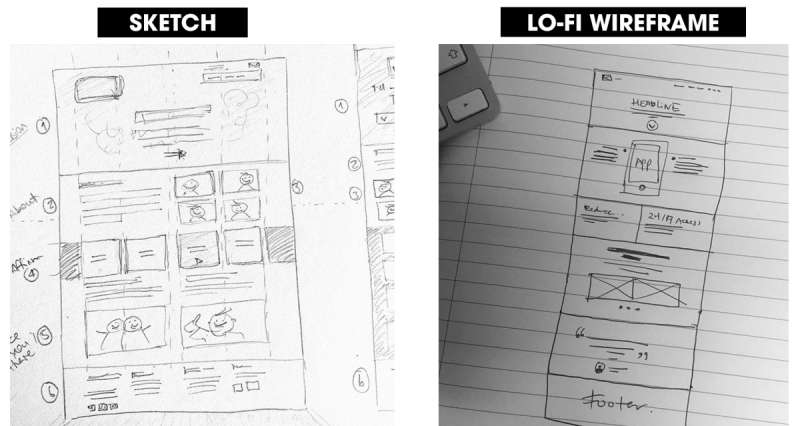
The image on the left is considered a sketch, because looking at it, people do not understand the specific intention of the UX to do. The picture on the right is also scribbled on paper, but understanding the function, position, and role of the components, is considered a lo-fi wireframe.
Most people easily confuse this place, thinking that discussions and then drawing together on the board or on paper the functions and maps to discuss are considered lo-fi wireframes. That’s not correct. It’s still just a sketch. As long as the whole team understands the direction of UX implementation, what is the specific agreement, that is the wireframe step.
Wireframe is not even a fancy show-off show-off. Don’t search on Dribbble, you will see pictures of wireframes that are colorful, icons, images that are too earthy, they’re “open”.
A few small notes from personal experience of wireframe making
- Although the wireframe does not matter how beautiful or ugly the UI will be in the future, try not to draw the wireframe in black and white, because that color looks boring and lowers the mood. Try to give it a little emotional color, make the wireframe look more pleasant so that you can focus on browsing carefully.
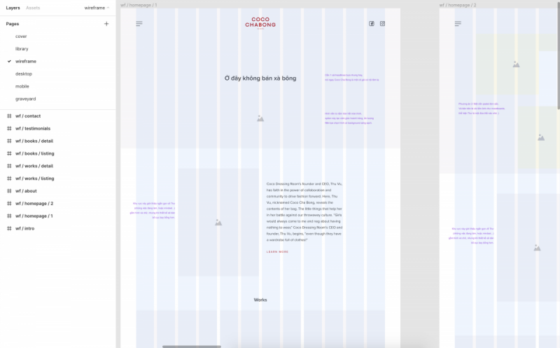
- Try to take extra notes to make sure both the team and the guest understand what you mean by important elements. I will use the purple note so that my team can easily distinguish it.
- Even if the wireframe is lo-fi, you have to take careful notes: where is the button, where is the link, where is the image, where is the icon, where is the text. In particular, the link and button must clearly state where it leads.
- Wireframe: from my point of view, thinking carefully accounts for 80% of the effort, and the remaining 20% is drawing and writing.
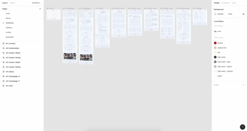
Advantages and disadvantages of Wireframe
Nothing is perfect, so Wireframe also has its own advantages and disadvantages. In this pros and cons, Malu only focuses on the value Wireframe brings to website design!
Advantages of Wireframe
- Creating a Wireframe is quite simple, just pencil and paper, you can make a simple Wireframe already.
- Wireframe gives your customers an idea of what the end product will look like for them. If there are any changes to the interface or features during this period, you will also be able to easily meet them (price changes if any).
- Help your teammates who work with you understand what they will need to do and agree on the end product.
- Save time on Prototype and give customers product testing before starting official development.
- Helps you to identify and focus on a specific content, thereby building a product with the most user-friendly interface.

Disadvantages of Wireframe
- When you’re done with a wireframe and show it to your client in black and white, it’s unlikely they’ll have an accurate view of the final product. Therefore, you will have to spend more time to “Photoshop” a final interface template for them.
- A complete Wireframe will bring high efficiency, accuracy to the end product. However, the implementation process will need to have a consensus on the implementation ideas of many different departments.
- Wireframe only shows the most basic functional blocks on the interface, sometimes confusing other members or your customers; force you to explain in detail.
Revealing some Wireframe design tools
Before going into the introduction of tools for designing Wireframe, we will need to learn a bit about the following concepts and find out how they differ: Sketch, Wireframe, Mockup and Prototype.
Why learn these concepts? Because each of the above concepts will correspond to a development phase of the project, as well as have different tools to do it.
How are Sketch, Wireframe, Mockup and Prototype different?
You can understand quite simply and briefly as follows about the process of developing a design product: Draft – Sketch => Skeleton – Wireframe => Mockup => Interaction prototype – Prototype.
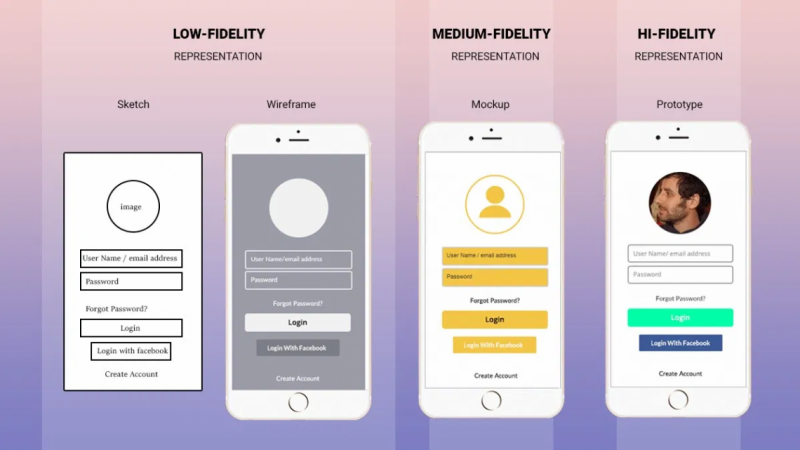
- Sketch : or draft, is the version you can use any material, any method to create the most basic structure of the product.
- Wireframe : continues the basic structure to create a “slightly more detailed” structure and adds basic functions and operations, but for the most part will still use basic lines, black and white .
- Mockup : at this stage, designers will use graphic techniques such as colors that are more beautiful, closer to the original product, and fine-tuned to match the nature of the final product.
- Prototype : you will be able to hear many people talking with different meanings such as: most basic usable product (for physical product), product used to interact but not equal to the final product for digital products.
Some Wireframe Design Tools
There are many design books you should read, most of the book’s authors recommend working with paper and pen prototypes; as well as things you can handle with your hands, but not a keyboard, mouse, and monitor.
But there are also many software / applications that can help you do the design and construction of Wireframe as the names will be mentioned next.
Tools specialized in layout
Balsamiq : a strange name, but Balsamiq is a tool that tends to focus on the layout of the web/app. From these basic layouts, you can create more beautiful designs.
The tool can take care of the whole process
Sketch : if you are already a designer, you are probably not familiar with this “magical” software, right!
Figma : a very famous name in recent times with the ability to meet many design purposes, easy to get acquainted and use.
InVision : This tool has a strange name for many of you. However, up to 100% of Fortune 100 companies use InVision for their designs.
“Design Ecosystem”
Referring to design without Adobe “ecosystem” is a huge omission!
You can design layouts with Adobe Illustrator, create prototypes with Adobe XD, you can also use Photoshop to make your products shimmer…

Conclude
Finally, Malu wishes you to have designs that make everyone admire!


