When we think about logos for big brands, we usually just remember the color scheme they use. For example, YouTube’s play button is red and white. The McDonald’s logo has a dome shape and a fun yellow color.
That’s because color psychology plays an important role in branding. Color affects human perception. They direct us to certain emotions.
However, it seems that not many brands nowadays care enough about color for their logo.
The personality of the logo comes from its color – do you have a deep navy blue or maybe a soft yellow-white? By learning how to combine colors, you can create a logo design that tells your audience exactly who you are.
Monochromatic color scheme
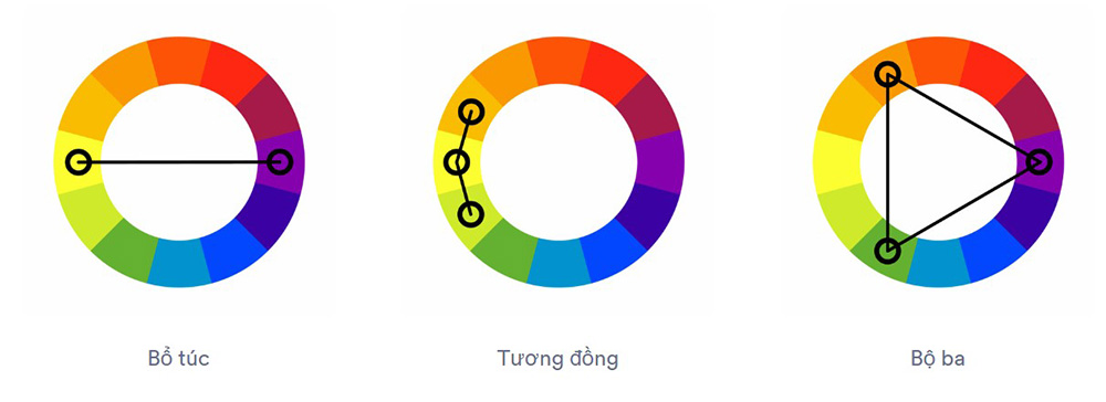
Monochromatic color scheme is the simplest color scheme, you just need to use a single color or different shades of the same color so they can resonate with each other. This style is suitable for minimalist designs, simplicity will help readers not be distracted and focus more on the content of the design. However, this is also a double-edged sword because if you do not know how to combine skillfully, your design can be monotonous and boring.
Similar color scheme
Similar color scheme is to use colors that are adjacent to each other in the color palette, creating elegance and sophistication. Of course, similar color schemes will create more variety than monochromatic color schemes, these colors are close together so that your design is not too confusing or eye-catching. You should start by choosing a dominant color, then choose 1 or 2 other colors to create accents and distinguish parts of the design.
Contrasting color scheme
Use symmetrical colors in the color palette to create dynamism and personality for the design. If you want to go for a gentle relaxing style, you should skip this option.
You can also mix 3 opposite colors in the color wheel to create balance. However, this combination is often quite difficult, if you do not know how to create accents, it can cause a feeling of monotony, safety and lack of creativity.
Check out some of the best logo color combinations with Malu Design below!
>>> See more Logo colors: which color is best for your brand?
How to mix colors effectively?
First rule of thumb: Don’t abuse – Less is More.
With logo color combinations, 2 to 3 colors is recommended as a maximum – or of course, a single logo color.
Let’s start with the basics:
Combine two colors
The two-color logo is the standard ladder. Brands often use 2 colors with contrasting shades.
Here are some effective two-color combinations that Malu has put together:
1. Yellow and Green: Joy and Power
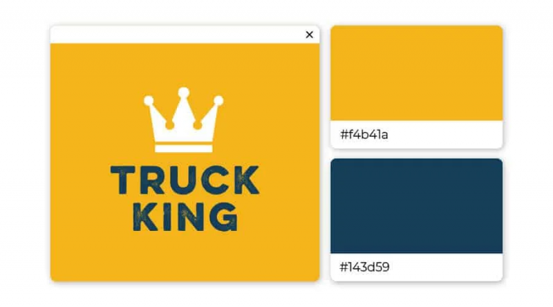
Yellow is the ultimate attention-grabbing element, and it lends youthfulness to the mighty navy. The color combination of this logo is playful yet confident, giving the impression that the company behind the logo is a trustworthy company.
2. Navy and Teal: Light and Outstanding
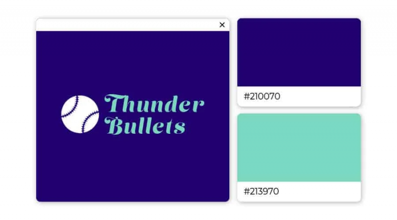
This berry-teal color combination can have two different effects, depending on how it is used. Place teal on a berry background to make your logo stand out; Apply a darker green over teal for comfort and calm.
3. Black and Orange: Vivid and Powerful
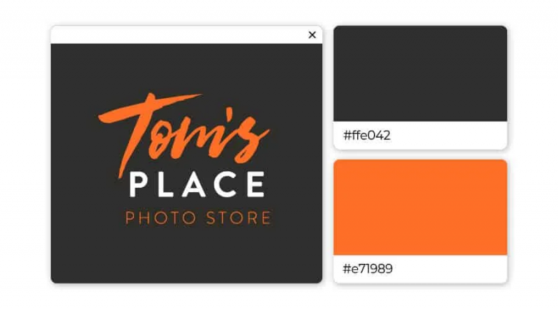
The seductive orange color interacts nicely with the strong black, creating an overall feeling of mystery and suspense. This logo color combination is especially suitable for activities such as extreme sports, escape rooms or nightclubs.
4. Chestnut and Peach: Elegant and Quiet
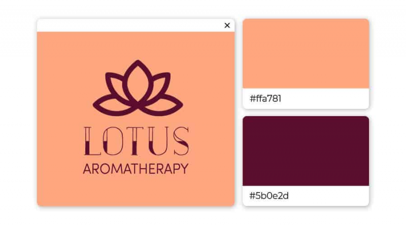
This unique color pairing isn’t often seen together, but it adds an element of charm to any logo. You may want to think about using this color combination if your brand is in the fashion, home decor or lingerie sector.
5. Dark Purple and Light Blue: Cool and reliable bar
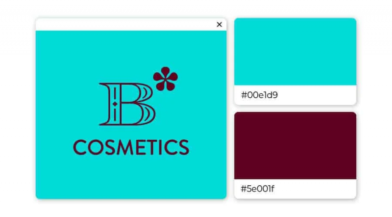
Nothing says more reliably than the combination of light blue and mulberry purple (bordering brown). Consider using this pair as a brand for cosmetics or high-end retail.
6. Navy Blue and Orange: Entertaining yet reliable
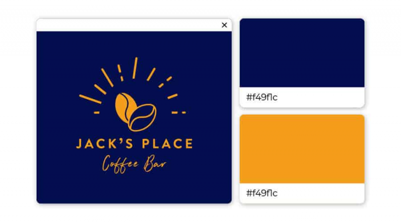
The sense of security of blue underpins the vibrant orange color. It also evokes feelings of excitement and trust. Highly entertaining, this navy and orange pair promises to create the sense of fun needed for logos.
7. Sapphire Blue and Blue Gray: Prosperity and Elegance
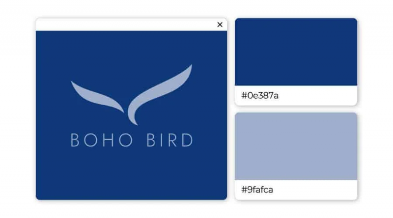
These two shades of blue create peace of mind and calm. You should use it for your logo if you want to be taken seriously but still attractive.
8. Powder Blue and Chetwode Blue: Open and Inviting
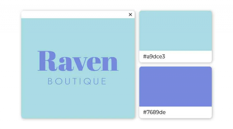
Two different shades of blue combine beautifully, creating an open and inviting impression. The palette is great for services like spas, boutiques, and consulting.
9. Royal Blue and Yellow: Trustworthy and Optimistic
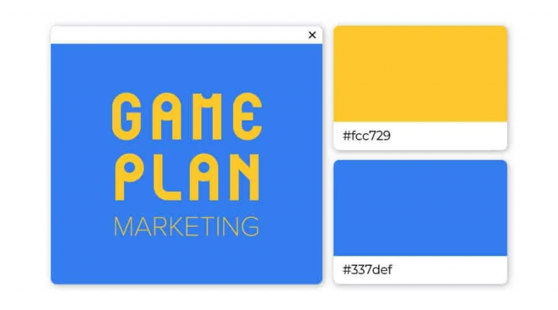
If you want a logo that customers associate with optimism, then you should choose yellow. It has the advantage of being bright and bold at the same time. And when combined with royal blue, you have a wonderful combination.
10. Desert Sand Beige and Emperor Gray: Tradition and Reliability
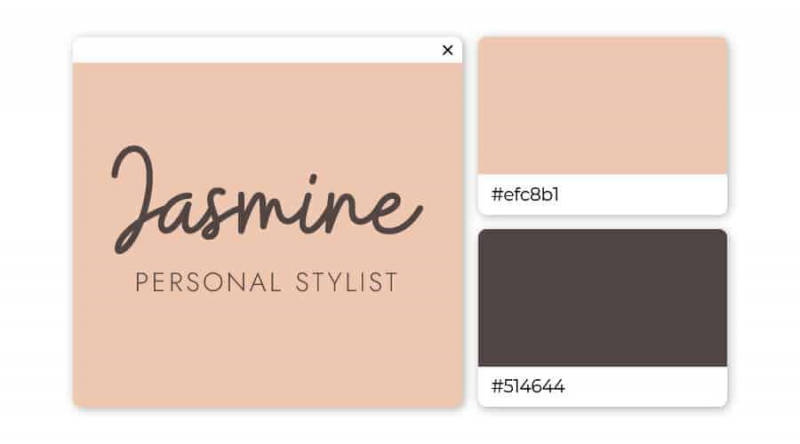
Although brown is one of the least used logo colors, if you choose it, you will definitely stand out. The tones of desert sand and imperial gray work well together for fashion brands or interior design.
11. Indigo and Lavender: Intuitive and Unique
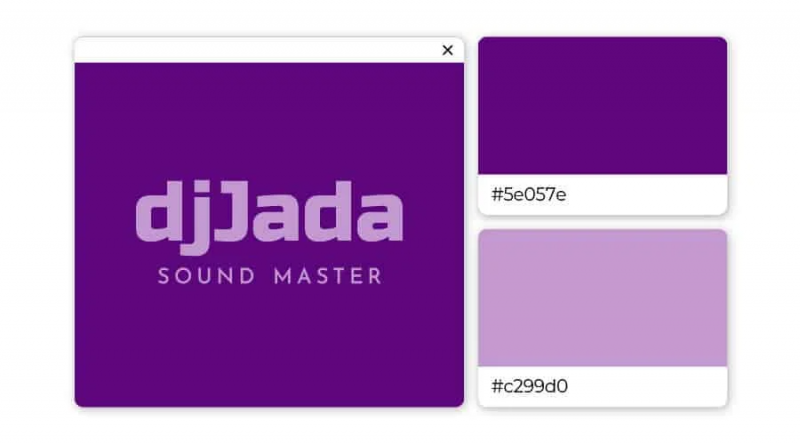
Intuitive and powerful, indigo is a dramatic color associated with the art world. It sets up a unique backdrop for the softer purple color.
12. Purple and Water Leaf: Flight and Reality
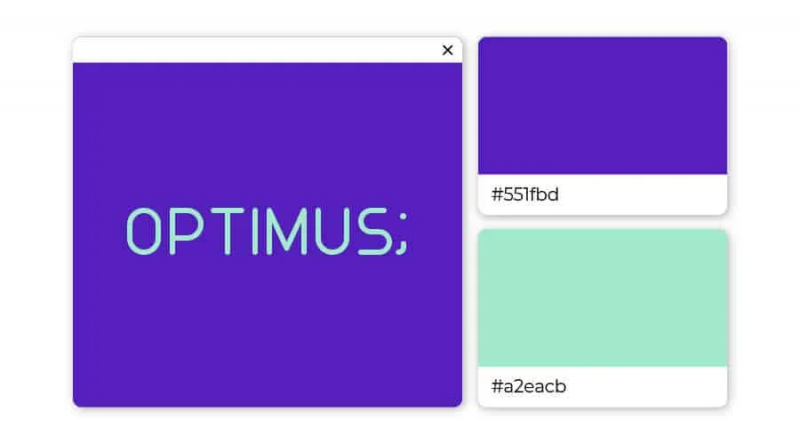
The fantasy purple blends beautifully with the turquoise green of the water leaves, creating an overall sense of endless possibilities. These colors are great for any media-related business, including teachers, lecturers, and media.
13. Sundown Pink and Burgundy: Charm and personality
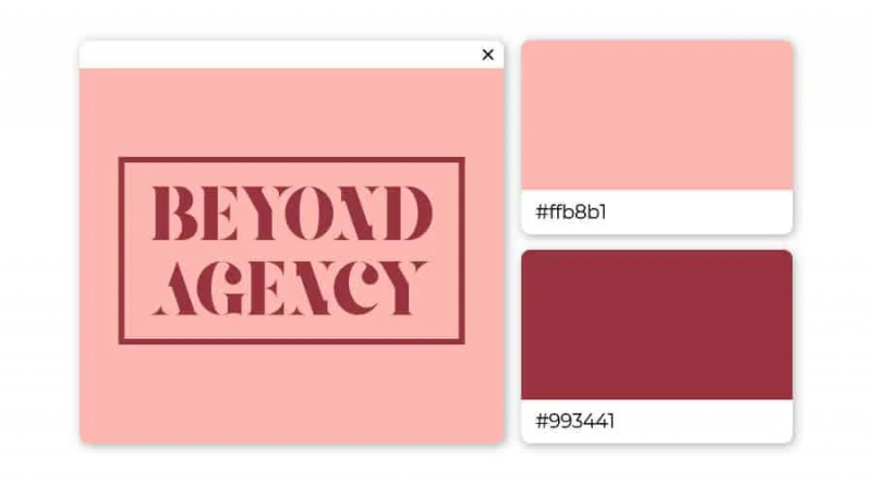
The soft, seductive pink color captures your heart instantly. When combined with the intensity and individuality of burgundy, you have a real winner!
14. Light Blue and Crimson Pink: Friendly and Outstanding
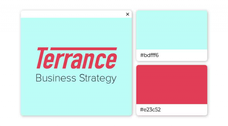
Choosing one of these two colors suggests a desire to stand out, but still be subtle about it somehow. Both are warm colors that encourage us to express our emotions and be more outgoing
15. Purple and Bitter Lemon Green: Creativity and Confidence
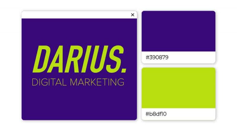
If you need a logo to exude creativity and confidence, look no further. This high energy color pairing creates strong vibes.
16. Bistre Brown and Olive Green: Simple and Natural
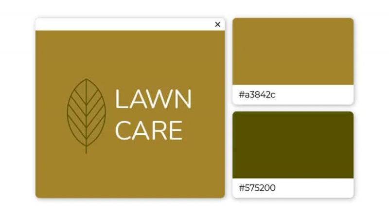
Brown and green tones always go well together. Here, the fawn almost naturally harmonizes with the dark olive green.
17. Jungle Green and Turquoise: Renewal and Openness
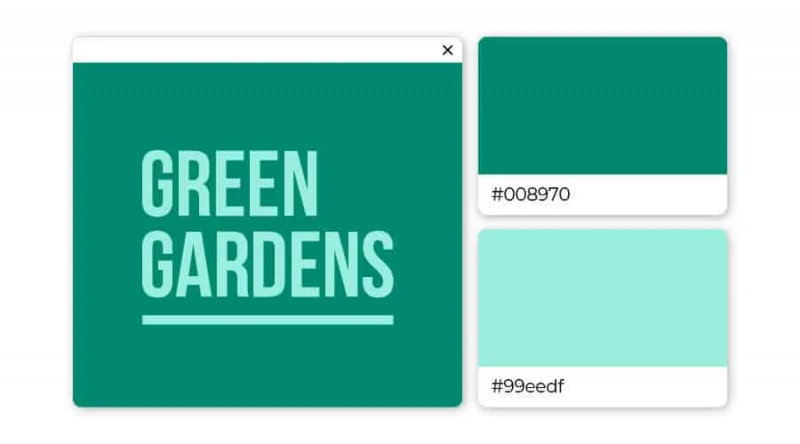
Turquoise is a color that encourages reflection and openness. Deep forest green is a popular color in the natural world that speaks of renewal, renewal and rebirth.
18. Desert Sand and Grizzly Brown: Elegance and Longevity
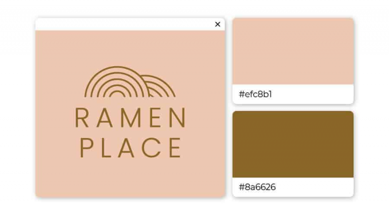
Versatile and elegant colors strike a balance between light and warmth. Trending passive and neutral, the gray shade brings a state of peace and relaxation.
19. Deep Forest Green and Dark Sea Green: Growth and Revival
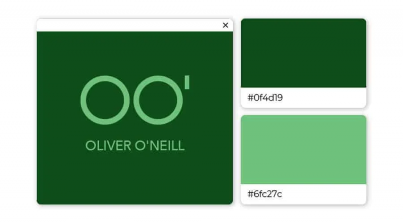
The green of the forest is reminiscent of nature – as its name suggests. This versatile color is associated with growth, and combined with lighter sponge green creates a feeling of coolness and freshness.
20. Cornflower Blue and Orioles Orange: Balance and Strength
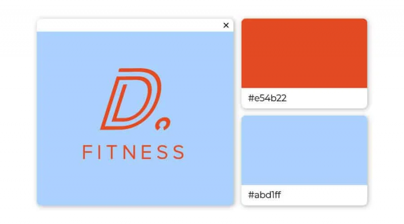
All stereotypes aside, these two complementary shades look amazing together. Crispy oranges and cool blues create balance and style.
21. Blue and Deep Peach: Professional yet sophisticated
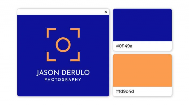
Training blues and pinks make for a dynamic color scheme. This blend of cool and warm tones works well in modern and traditional contexts.
22. Acid Green and Blue Pantone: Breakthrough and Stabilization
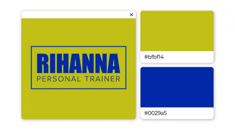
This complex green is completely unexpected, youthful and fresh, which is exactly what attracts the eye. Vivid sapphire blue evokes deep calm and a sense of stability. Combining these two colors creatively can be a powerful statement.
23. Marigold and Dark Brown: Spontaneity and Reliability
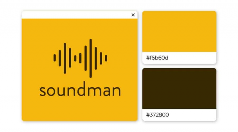
If you need a logo that looks natural and believable, you definitely want this cool color combination. The last group of cards, the marigold color grabs the attention while the dark brown holds it.
24. Royal Blue and Green Lizard: Reliable and Vibrant
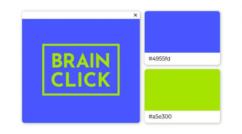
When used in professional settings, royal blue encourages concentration while providing peace of mind. For a striking and striking look, pairing these two colors together creates a bright, lively, trendy and attention-grabbing vibe.
Logo combination 3 colors
These logo color combinations can be a little more difficult to identify, because the options are numerous, but not all of them are good.
In general, two contrasting colors with a complementary color is also a way to go – but there are exceptions to every rule.
To give you a feel for what works and doesn’t work, here are some of our favorite three color combinations:
25. Beige, brown, dark brown: Warm and reliable
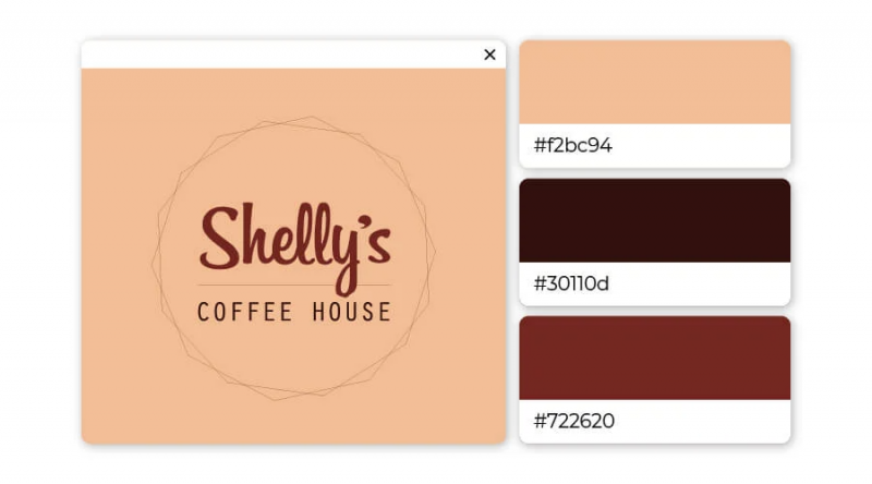
In fact, the smell of coffee emanates from this logo. The light brown color is reliable, while the cream background keeps the logo from fading. This could be a solid color combination to use if you work in the food industry or want to be considered family friendly.
26. Blue, yellow, green: Young and wise
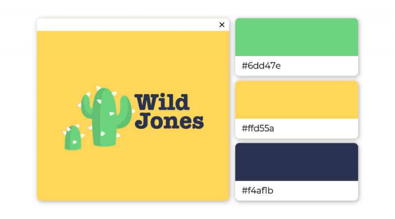
This one takes two primary colors and throws their second into the mix – a perfect combination! The mostly buttery yellow with a hint of lime keeps the logo playful and youthful, while the blue lettering gives an intellectual heir to the table.
27. Dark blue, turquoise, beige: Confident and Creative
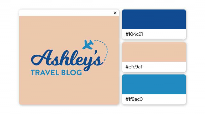
These two shades of blue complement each other and reaffirm the brand’s credibility. Combine them with a beige backdrop and you get a payoff that’s safe to explore and pursue. This logo color combination is great for brands in the travel, life coaching and wellness sectors.
28. Blue, red, yellow: Fun and bright
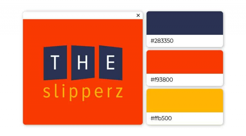
Contrast superimposed contrast in a three-color combination. Different shades of each primary color merge into an interesting and striking logo.
29. Light Pink, Hot Pink, Maroon: Friendly and innocent
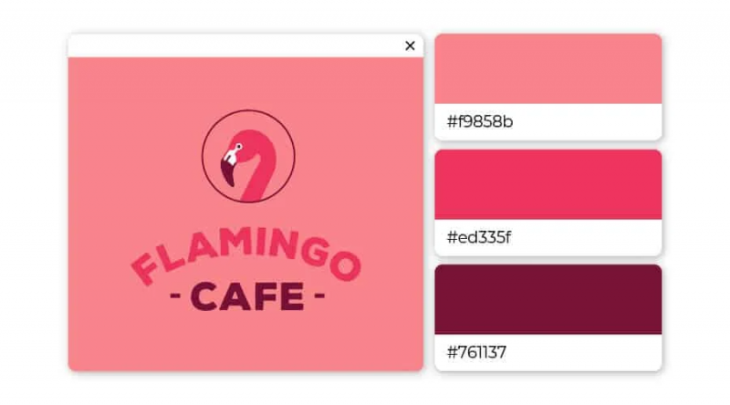
If you are looking for a logo that stands out, pink is the best choice. However, the pink shades need to be different enough to create an aesthetic highlight for the logo.
30. Navy blue, yellow, beige: Professional and optimistic
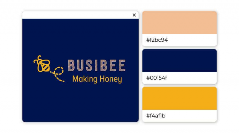
Blue is the most used color in the logos of the top 100 brands worldwide (see IKEA, AT&T, Walmart and NASA for reference).
Here, beige-wheat acts as a subtle bridge between the two primary colors. No reduces the severity of blue and brings out the vivid side of yellow for a balanced, professional feel.
31. Blue-Violet, Green, Purple: Smart and creative
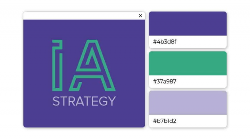
This is not the typical blue color. Gigas is a cool blue that represents creativity and intelligence. This is a popular color when combined with green and light purple that express creativity and reverence.
32. Blue and brown: Energetic and healthy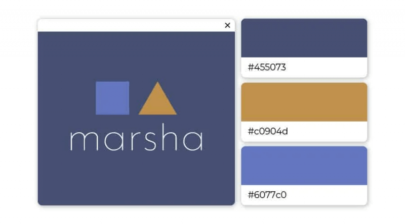
As you can tell at this point, blue is a default color for designers. The combination of two shades of blue and brown (bordered by yellow) is a professional and modest color scheme.
33. Brown, light brown, orange: Trendy and comfortable
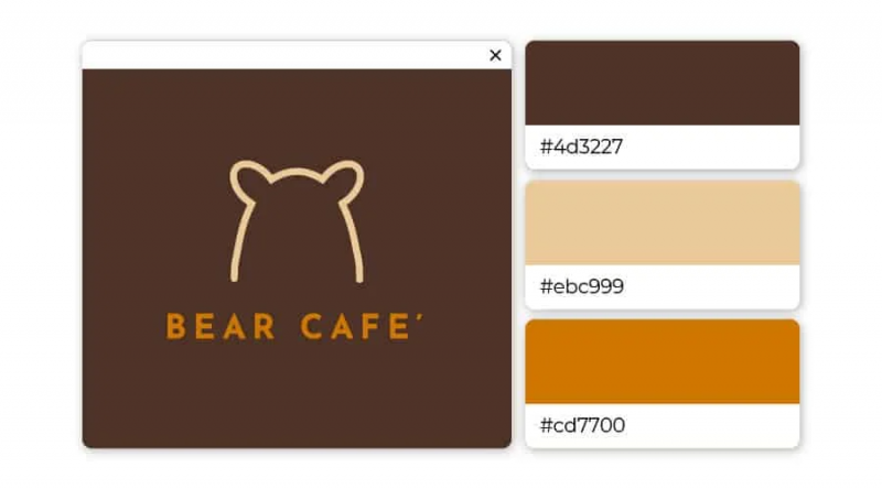
Orange is an extremely match color when compared to brown. Add a brush or tan and you have a trendy, hipster-inspired look that’s going to attract big attention.
34. Green and Gray: Business and serious
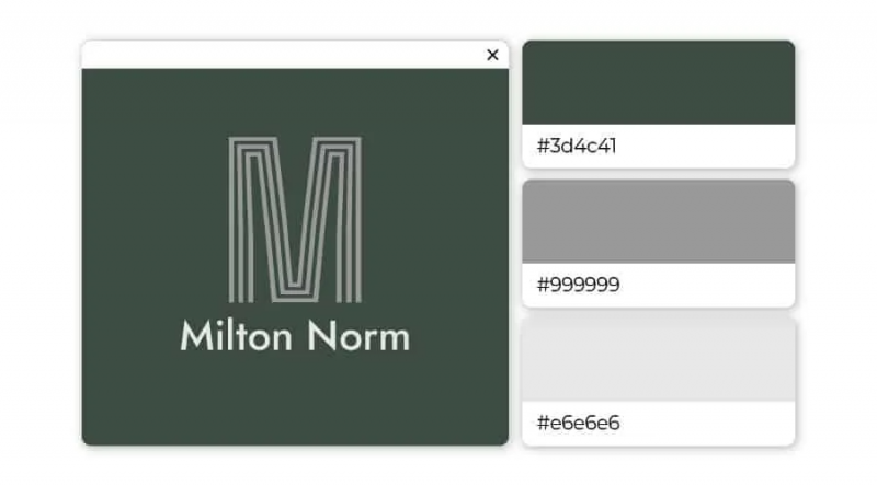
Green is the color of balance and harmony, while gray represents seriousness, demanding attention. Use this palette to exude the right professionalism while remaining welcoming.
35. Blue and Purple: Delicate and Real
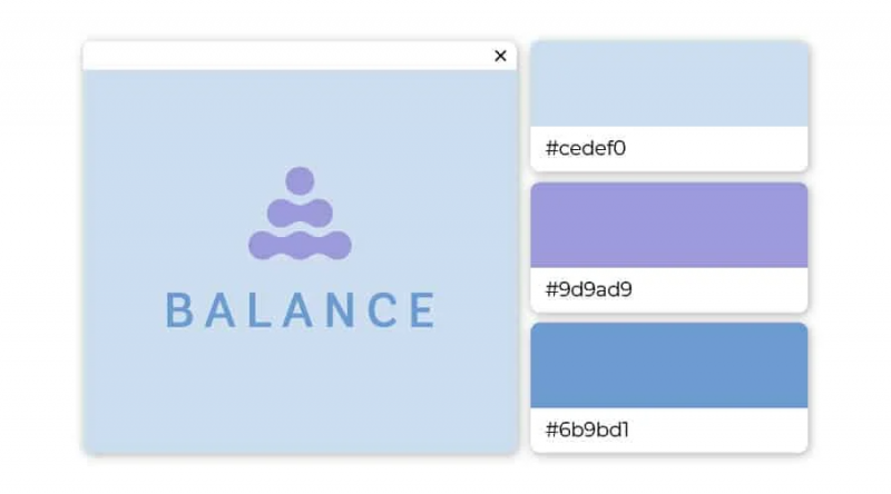
Let your logo speak for itself by using two shades of blue and a dash of purple. Here, lighter stony blues and darker blues balance each other, while purple adds a unique touch that will separate your brand from the crowd.
36. Lotus Red, Pink, Blush Pink: Soft and alluring
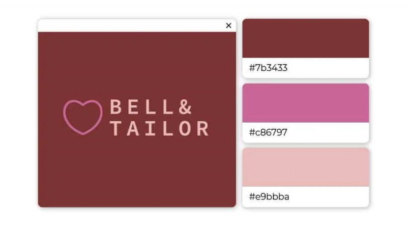
Varies from deep red (with a hint of brown) to pale pink. This trio is different enough to add a unique touch to the logo, while also presenting a soft feel.
37. Soft Gray, Blue Gray, Dark Gray: Formal and timeless
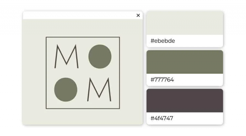
This trio is suitable for a brand that wants to convey an elegant, contemplative feel. Examples include art galleries, museums and upscale hotels.
38. Plum Purple, Viola, Seafoam Green: Calm and Relax
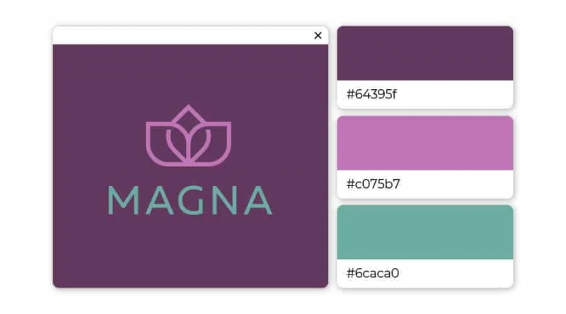
Nothing says relaxation like the combination of deep purple, purple pink with a hint of surprise and blue of soft sponge. Consider using this trio to brand yoga studios, spas, and wellness centers.
39. Brown, Mustard Yellow, Green: Natural and Genuine
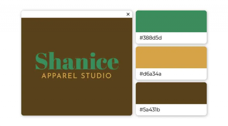
The brown backdrop perfectly complements the green and yellow fonts. This trio works for any business in the design sector, boutiques, flower shops and the like.
40. Black, Coffee Brown, Bone: Reliable and Luxurious
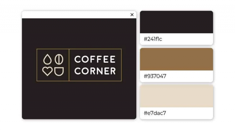
This design has a cozy, curled-up feel with the vibe of a steaming cup of coffee. While these colors can be simple and boring, together they create a warm and inviting feeling.
41. Gray, Baby Blue, Canary Yellow: Responsible and Modern
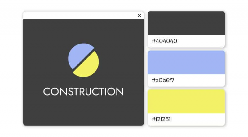
The lighter colors stand out against the solid gray background giving the impression that this is a trustworthy business but also very modern. Types of businesses that use gray are real estate agents, technology websites, and architecture firms.
42. Dark, Medium, Light Blue: prosperity and elegance
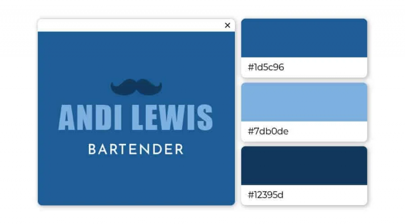
When choosing a logo color scheme, it is difficult to mistake it for blue. Varied shades of blue pair well with almost any color.
For you
Color is an important aspect of a brand’s Brand Identity . After choosing the type of logo you want to use, you should take a moment to consider what each color will say about your company.
Think about the emotions you’re trying to elicit and how you want consumers to respond to your brand. By choosing the right color combination, you can help your brand leave a lasting impact that helps shape a stronger connection.
If you are looking for a reputable and experienced unit to be able to design a professional and impressive logo and brand identity system , then please contact us immediately by phone. 0988 622 991, or leave your information and requirements, Malu Design ‘s consulting department will contact you right away to answer all your questions!
————————
Malu Design – Branding Identity Agency
Hotline: 0988 622 991

