assets Blue logos

We hope you enjoy the color blue, as this article will tell you all about what blue logos mean and how to use it in design.

Have you ever wondered how hundreds of companies use blue as the primary color in their logos? For example, Facebook, Ford, Skype, Twitter… and many other famous brands.

These companies understand the psychological impact of the color blue on their customers, and it’s all based on scientific research.

Brands prefer to use blue because it is a color that represents trust. It’s a safe design choice if you’re having trouble choosing a color for your logo. It will highlight your positive traits, such as confidence and intelligence.

Let’s take a look at successful companies using blue in their logos to convey specific messages and learn from your logo design.

The Meaning Behind the Blue Logo

bullet list

Color has a significant effect on our behavior, mood, and even physiological responses. That being said, color associations rely heavily on culture, personal experience, and upbringing — the meaning of color is not a box of crayons that fits.

If you want your logo to convey trust, maturity, dependability, intelligence and a sense of calm, then blue is the color for you.

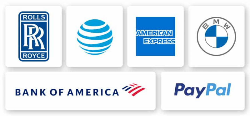
Many businesses require the trust of their customers, none other than banks. PayPal and Bank of America both require customers to share important and valuable information, thus establishing a high level of trust and commitment. It is no coincidence that both logos use blue as the main color.

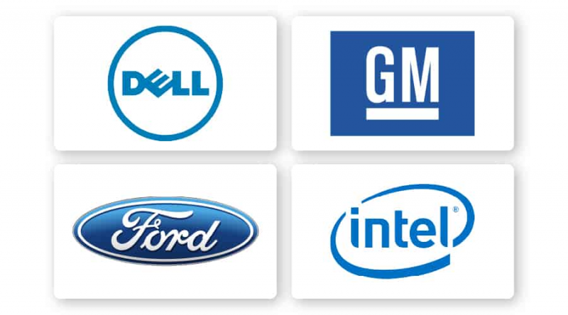
For example, modern and innovative technology companies like Intel use blue in their logos to represent intelligence and constancy.

blue logo

How to combine blue with other logo design elements

blue logo elements

When it comes to blue logos, there are some design elements that mix well and those that don’t.

Font

Choosing the right typeface in your logo can strengthen your overall brand. Review the 5 main font families  to determine which one best suits your brand.

Serif – Great choice for brands that want to be seen as trustworthy, long-standing and trustworthy. For example, Whole Foods fonts have rounded edges to evoke things made from the earth or by hand. For example, Gap’s font is famous for its iconic white capital letters that convey these characteristics.

Sans serif  – Modern, legible and simple, sans-serif is a popular choice among startups, tech businesses, and even aerospace companies like Boeing.

Slab serif  – Slab serif font bold and dramatic are often used by technology and automotive companies.

Script – Great for businesses that want to show off luxury and add a personal touch, such as photographers, coaches or any home brand.

Decorative  – Big, fun and entertaining, these fonts are versatile enough to allow companies to decide which emotions to focus on.

Of course, these are just general rules, but by no means are they fixed. Feel free to experiment with different font combinations .

blue logo

Shapes and symbols

In your logo design, different shapes can help create an emotional and psychological connection between your brand and the consumer. It’s important to understand what each shape says about your brand and how you can effectively incorporate them into your design.

The circular logos combined with blue are designed to be calming, symbolizing reliability and friendliness. Walmart’s logo embodies these characteristics through its blue logo, bold white font, and round light bulb symbol.

Businesses choose iconic logos to create a classic feel and at the same time appear prestigious and age-old. This type of logo is a great choice for modern businesses that want to convey confidence, trustworthiness, heritage and tradition. For example, the Royal Bank of Canada (RBC) uses an iconic logo to pay homage to tradition.

blue logo

Is the blue logo for you?

As I mentioned before, color is subjective and there is no right or wrong way to use blue in logos.

With that said, you can use blue if it fits one of your brand messages/values. Or, you can use blue to set yourself apart from your competitors’ logos.

If your brand is in one of these industries, here are some ideas on how to use blue:

Blue logos for financial brands

Everything you want in a financial services company—stability, integrity, trust, reliability—is tied to the color blue. Banks, investment firms, credit unions, and other organizations in the financial industry have chosen the blue logo to build on these core attributes.

When people see blue symbolizing a financial company, they will have a feeling of reliability and certainty. Visa, PayPal, Bank of America, and American Express are some of the biggest names in the banking industry. It’s no coincidence that all of their logos use blue as the main color!

Blue logo for health brand

Blue is associated with smart, professional, clean, calm and modern. That’s exactly what you want in a healthcare setting, right? The color blue brings a sense of serenity, relaxation letting you know that you are in good hands, everything will be fine. That’s what has helped make blue a mainstream color in the healthcare industry.

Blue logos for tech brands

Tech companies lean towards the constancy and safety of blue. It is a great color for technology because it connotes intelligence and modernity. Blue will make sure your tech business is taken seriously.

The most famous tech companies like Facebook, Twitter and Skype all use blue in their logos and they are all instantly recognized and trusted by millions of people worldwide.

Blue logo for air service

When you step into a machine that takes you up into the air at 36,000 feet, you’ll want to trust the airline. That’s why United Airlines, JetBlue, Spirit Airlines, British Airways, etc. choose blue. It is a color that conveys confidence and trust, which is extremely important to those in the aviation industry.

Blue logos for auto brands

BMW, Subaru, Ford, and General Motors—to name just a few companies in the auto industry with blue logos. These companies that sell cars, in addition to being an expensive investment, need to be reliable, safe, and dependable. No wonder some of the top auto companies in the industry have blue logos!

Blue logos for hotel brands

What are some things you look for in a hotel? A clean room, safe to sleep, professional and reliable staff, peaceful and comfortable feeling. Companies in the hotel industry know that these are the key characteristics that customers are looking for.

Whether you are a hotel guest looking for a peaceful and quiet environment in a big city or are looking for a small cabin in the woods to serve bread and breakfast, a blue icon will Show off those features to make you feel at home.

The right color combination for blue

Blue can be quite versatile depending on the color you combine it with. Let’s take a look at some examples of logo blue color combinations:

color combination 3

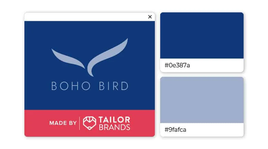
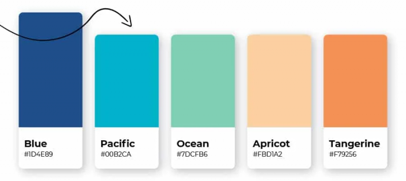
The combination of dark blue and gray green creates a sense of peace and calm. The contrast between dark and light blue creates a sense of balance that is suitable for healthcare professionals, spas and those in the hospitality industry.

color combination 2

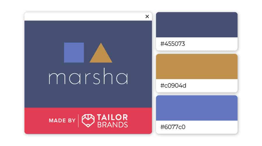
Blue can be used a lot for logos, but that doesn’t mean it has to be boring! Try combining 2 shades of blue with fawn for a professional, unpretentious, unique and memorable color scheme. This color scheme would work well for consultants, tea or coffee brands and even clothing.

color combination 1

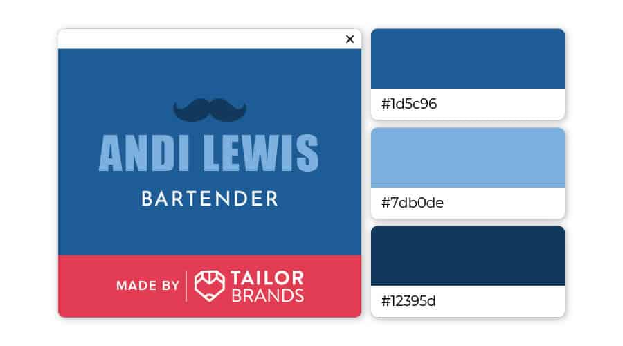
Don’t be afraid to layer blue on top of blue! Here, the 3 shades of blue balance each other out, while adding a unique touch that sets your brand apart from the crowd. This color combination would work well for auto or technology companies, as well as accountants and other business professionals.

The message behind the blue logo 

Trustworthy
Artboard 1 copy 18 100 1

Without thinking too much, what are some products and apps that you use every day? Phones, cars, computers, and messaging apps are probably just some of the items you use for work and play every day. The companies behind always know that reputation is what consumers are looking for in their products.

An important part of their branding is associating their name with the idea that their product won’t break, become obsolete, or stop working when you need it.

They may not be the most exciting names and products in the world, but they are reliable and stable.

Honest

Artboard 1 copy 17 100 1

“Trustworthy” may sound like “honest”, but there is always a big difference between them that not everyone knows.

Banks are a trusted place to make transactions, but do you trust that they are in your best interest?

Industries like banking, healthcare, and several others require you to share important and valuable information in order to achieve a high level of trust — trust them to protect your data from thieves nor sell your information to other companies.

Visa, PayPal, Bank of America and American Express are some of the big names in the banking industry. Do you feel coincidental that all their logos use blue as the main color?

If you want to brand your company as trustworthy and honest, consider using dark blue in your logo.

Professional

Artboard 1 copy 23 100 1

An important characteristic of many brands (whether large or small) is professionalism. Your company’s ability and skills to help customers are a valuable brand trait to promote.

This will make your customers more confident in you and feel comfortable every time they contact you for support — especially if your business provides services like IT, financial services, or marketing to companies. company and business owners. Getting bad results from working with unprofessional companies is every business owner’s nightmare.

Having a professional look is the key to all branding issues. Goldman Sachs – one of the leading investment banks today has used a subtle blue background in their logo to create a calm and professional look. IBM, on the other hand, covered the text in dark blue in their logo. Both companies have strong brand identities that focus on professionalism and craftsmanship.

Calming

Artboard 1 copy 22 100

Like green and brown, blue is a natural color that we can see everywhere.

Many people often imagine the clear blue sky, or the image of waves lapping gently on the blue ocean to relax when under pressure.

That is why blue is used by airports to help passengers relax and used on platforms to reduce feelings of excitement while waiting for a train.

Companies want their customers and users to feel relaxed by including blue in their logo design. That’s why dental clinics always have blue as their main color — to help calm you down before your exam and treatment!

Modern

Artboard 1 copy 19 100 1

Today’s high-tech companies often favor blue because it can combine many of the above characteristics into one. On social networking sites, companies want to convey an image of a brand that customers can trust and rely on.

Software companies and some startups use light blue to convey these feelings in a softer way. Twitter, Facebook and Skype all use blue as the main color in their logos, then their brands are famous worldwide and trusted by millions of users.

In addition, modern companies have a recent emerging trend of combining blue and white together. White text or white icons on a blue background look great and draw customers’ eyes to your brand.

Colors to combine with blue

Artboard 1 copy 16 100 2

Blue is a versatile color, so you can take advantage of them by mixing colors between blue and different colors. A lot of logos you’ve seen up until now have a combination of blue and white. Here are some color schemes you can choose from:

Colorful

google

Microsoft and Google use a variety of colors in their logos – including blue – to signify innovation and show that they have an out-of-the-box mindset.

Navy blue and red

Artboard 84 copy 2 100

This is a simple yet very eye-catching combination of 2 tones – hot and cold! The contrast between blue and red seems to infuse excitement and stability into a design.

Green and orange

Artboard 84 copy 100

Walmart’s logo cleverly creates the impression of a sunny day against a clear blue sky, using blue letters with a simple sun symbol.

Blue and yellow

Artboard 84 100

Royal Bank of Canada uses 3 colors in their logo. By combining blue with yellow and white, the logo has a lively, upbeat feel, yet exudes prestige and professionalism.

For you

It is no coincidence that the color blue appears in nearly half of all famous logo designs today. In short, you can use it to convey messages about:

  • Intelligence
  • Reliability
  • Professionalism
  • Guarantee
  • Protect
  • Mature
  • Modern

To easily brand your company with a strong identity, choose blue as one of your primary brand colors. However, you need to make sure that the layout and fonts of the logo match the main colors to avoid making them complicated and confusing.

banner 1280 x 800 shame 04

If you are looking for a reputable and experienced unit to be able to design a professional and impressive logo and  brand identity system , then please contact us immediately by phone. 0988 622 991, or leave your information and requirements, Malu Design ‘s consulting department  will contact you right away to answer all your questions!

————————

Malu Design – Branding Identity Agency

Hotline: 0988 622 991