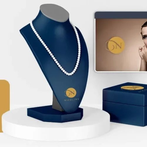
Sometimes simplicity does the trick – like the iconic one-letter logos of big brands.
Though often overlooked by small and medium-sized businesses, a single letter logo can leave a deep impression on a brand if handled correctly.Article table of contents
Mục lục bài viết
ToggleAdvantages of Single Character Logo:
Here are 5 reasons why a one-character logo could be the right choice for your brand:
Simple and compact:
Instead of distracting customers with distracting images, a one-character logo makes the design cleaner and more intuitive. The hidden power of a streamlined logo is great – because they are easy to remember and identify.
Flexible size:
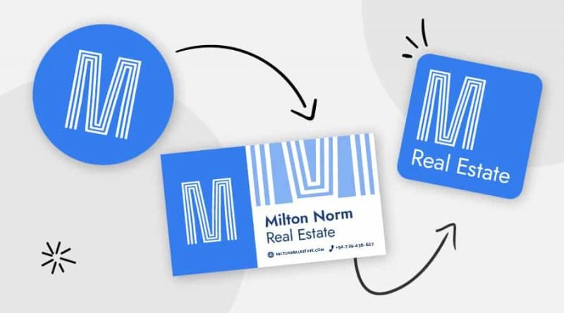
In this era of massive app stores, having a simple logo is essential. Users when searching for applications on the phone interface also want to recognize the brand faster. In addition, one-character logos are suitable for small publications without disturbing the design.
Modern look:
Brands that want to show the classic, traditional often use the form of logos, emblems ( Logo Emblems ) or take the brand name verbatim into the design. Modern applications and some other businesses prefer to use one-character icons or logos, giving a sharper, more modern and creative feeling.
Easily identifiable:
When finding the right logo style, a brand has the ability to make customers instantly remember them even at a glance. Because when the logo consists of only one letter, the brand is easier to recognize. This requires businesses to research carefully to make sure that the logo is different from the brands on the market.
5 things to consider when designing a typeface logo
As simple as it looks, one-character logos take as much time to edit and design as any other type of logo.
Because it only consists of a single letter, the design balance for this type of logo is extremely necessary. Here are some tips to help create a unique and memorable one-character logo:
Choose the right color:
Color has many meanings behind it that can help a brand stand out in the market. Even if the brand name is duplicate, the color and design style will prevent the logo from being confused with a similar logo. Like McDonald’s, Monster or Motorola all use the letter “M” in the logo, but no one can not distinguish these 3 brands.
Bright, youthful colors can be motivating and attract attention. Soft and gentle colors suggest a natural, thoughtful look. And monochrome designs are highly practical, while gradients look more modern and creative.
Take advantage of the background and negative space :
The background and negative space are also part of the design. Some brands choose to keep the background white. The rest take advantage of the background and add color or texture to the design.
When designing, think about how negative space can be manipulated to make the logo more attention-grabbing. Many brands use negative space to create meaningful shapes. Others focus on developing an eye-catching layout (like the Adobe logo).
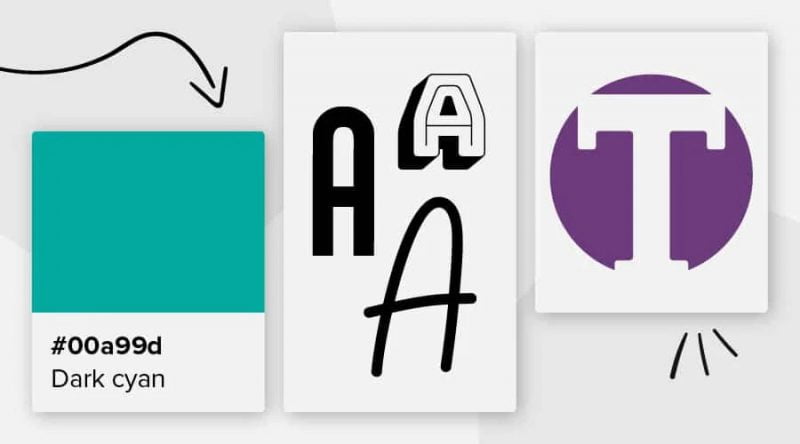
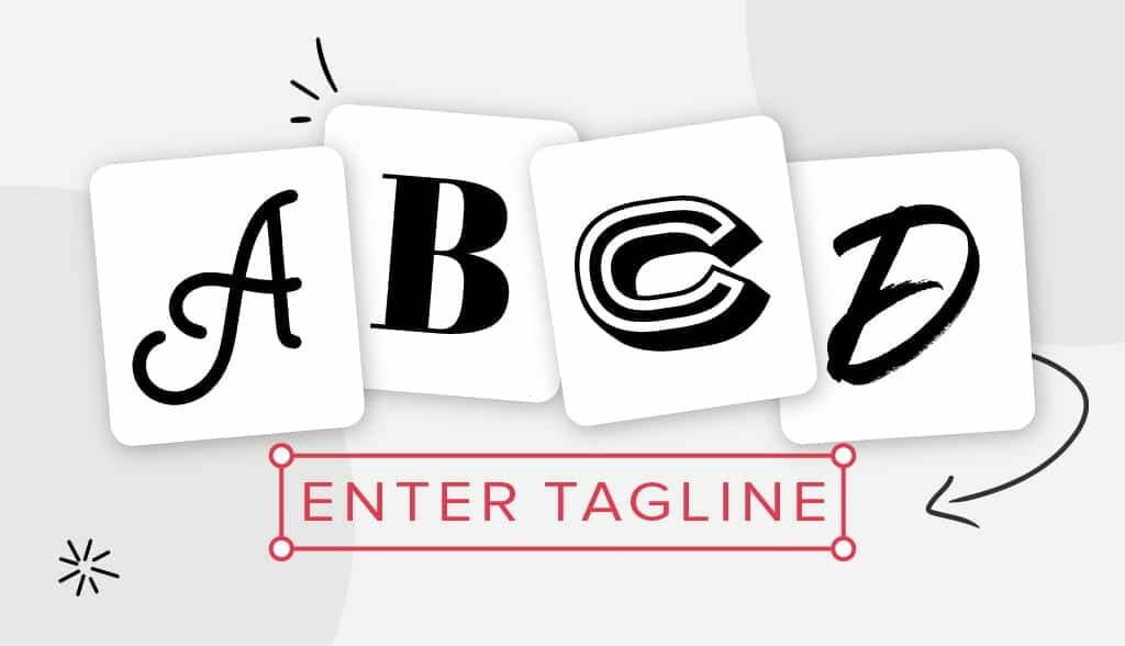
Font set and weight:
Fonts also have many meanings:
Font Script expresses creativity and sophistication
Modern, authentic Sans Serif
Block Fonts and Slab Serif are angular and sharp
Bubble Fonts and other Decorative Fonts evoke fun and playfulness
Classic Serif font has timeless beauty and elegance
With each set of fonts, the thickness and thinness of the text also create a different style for each design.
Implicit Meaning:
A good example of the hidden meaning in a logo must refer to Pinterest. The letter “P” is stylized as an image of a pin to indicate that users will pin their favorite content on this site. Implicit meanings are not always easily expressed through letters. Customers also need time to ponder to fully understand the logo.
Specific pictures:
Using a few visual images also helps to better show the brand voice and information about the products/services the business provides. Some brands prefer to use illustrations, others use letters directly to create images.
18 Inspirational one-letter logos :
Adobe
Not only using a single letter, the Adobe logo doesn’t even have a specific font format. The logo is a combination of many shapes combined with negative space to form an abstract letter “A”.
Airbnb
According to Airbnb, the “A”-shaped logo connotes images of people (human head and arms), places (teardrop-shaped icons) and love (upside down heart).
Audio Now
Audio Now’s logo is a combination of both “A” and “N”. This is a simple but effective concept. The slight upward curvature on the “N” shows movement as well as helps distinguish it from the “A”.
Beats
The seemingly simple “b” accurately describes the image of a person wearing headphones. The logo also feels like a musical note that helps customers to associate themselves with the brand.
Bentley
Bentley’s Monogram logo combines several surrounding images to create a badge. With wings is a symbol of speed, freedom and luxury of this car.
Bluetooth
Combining the Nordic letters “H” and “B” makes the logo of Harald Bluetooth.
One of the world’s most recognizable logos with just one “F” is very intuitive.
E Channel
The brilliant idea behind this logo is to transform the letter “E” into a “!” Expressing excitement, full of energy.
History Channel
The eternal gold color combined with the classic Font Serif makes this logo consisting of only the letter “H” attractive. In addition, the 3D format of the design also makes viewers more excited.
Honda’s motobike
The familiar “H” is used in every Honda typeface. However, the surrounding badge is what creates the highlight for the logo.
Internet Explorer
A simple halo over the lowercase “e” depicts the movement around the globe, well suited for an Internet-connected brand from the 1995s.
Kellogg’s
Although often appearing with the entire brand name, the iconic “K” of Kellogg’s has had a strong foothold in the design scene over the years.
Monster
The letter “M” is made up of 3 claws with a vibrant, energetic blue gradient.
Gmail
This is a classic example of a clever use of a one-character logo. The letter “M” reminds the viewer immediately of the envelope combined with the color of the cube with the colors of the Google logo.
Unilever
With 25 unique cubes symbolizing sustainable life, Unilever’s large “U” is designed in detail and rich in meaning.
Venmo
The overall design is extremely simple, but a little dot at the end of the “V” creates a sense of movement for the logo.
Xbox
The “X” in the logo is the perfect representation of the power button on the controller.
9GAG
The logo resembles the number “9”, as well as the letter “g” of 9GAG – a social networking platform based in Hong Kong that uses an abstract logo style.
Message for you:
There are still many one-character logos to inspire the brand, such as T-Mobile, Skype, Yahoo, Champion, etc. Professional sports teams like Green Bay Packers or Los Angeles Angels also favor this type of logo.
Think slowly about what the logo will look like and don’t forget to pay attention to carefully choosing colors, fonts and making use of every possible space in the design.
If you are looking for a reputable and experienced unit to be able to design a professional and impressive logo and brand identity system , then please contact us immediately by phone. 0988 622 991, or leave your information and requirements, Malu Design ‘s consulting department will contact you right away to answer all your questions!
————————
Malu Design – Branding Identity Agency
Hotline: 0988 622 991

