Did you just buy something from an e-commerce platform? E-commerce (any business activity that buys and sells goods or services online) has become an important part of our lives.
According to eMarketer , global e-commerce retail sales will surpass $5 trillion for the first time, accounting for more than a fifth of all retail sales. Total spending will exceed $7 trillion by 2025 even if growth slows.
That’s good news for those of you who are in the e-commerce business! There are a lot of opportunities and it’s very exciting. But before setting up a store, you need to design a logo. This post will guide you through everything you need to know about logo design for your ecommerce store.
Mục lục bài viết
ToggleWhy you need a logo for an ecommerce store
There are many reasons why you need a logo for your ecommerce store.
The first is that there is no face-to-face interaction, which means a certain level of trust is required that is inherently lacking in the e-commerce business model. That’s when the logo appeared. Your logo acts as the face of your online store. It can connect with your customers in an emotional way, instilling trust. And trust is crucial to brand loyalty and a successful ecommerce store.
On another note, your logo will not only appear on your website, but also on products, emails, business cards, etc. Every time you use your logo, it reinforces your online presence. your online and thus create brand identity. Brand recognition is the extent to which consumers can identify a reputable brand.
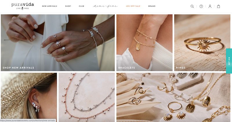
2 Southern California friends come to Costa Rica to travel and love the liberal lifestyle. The friends collaborated with a local artisan, who designed bracelets that capture and celebrate the simple things in life, and thus, Pura Vida (or “pure life” in English) Spain) was born. The brand’s logo conveys their personality and values perfectly, in the tagline (“live free”), the logo (pineapple), the typography and the layout. Customers can learn a lot about the brand just from the logo; they can also connect with the values of Pura Vida on an emotional level.
Consider other businesses in your industry (Pura Vida is certainly not alone in the jewelry market). It’s important to separate yourself from the market, and logos are one of the top ways to do that. Your logo shapes your brand personality, and that’s what drives customers to you.
Best Practices for Ecommerce Logo Design
For a logo to be effective, it must be well designed and executed. Follow these design guidelines to create a winning logo.
Simplicity
Straight to the point, neat and clean—that’s what your logo should be. A simple logo gives your target audience an immediate sense of who you are as a brand and—although it may seem counterintuitive—quite memorable. The eBay logo takes this point home:
Ratio
Your logo will be used on multiple platforms in different sizes and formats. If your logo has too many design elements, details will be lost or completely unreadable when zoomed out or zoomed in.
File Format
The type of your logo file is an important consideration, even though it’s an often overlooked file type. Your logo might be 10, but if it’s in the wrong file type, it won’t be obvious. The most important file format for your logo is a vector. Without going into the technicalities of vector graphics , it is important because they can be easily resized without affecting the quality of the image.
That means vector files can be increased or reduced in size without any pixels or distortion. So when you shrink your logo to put on a sticker or enlarge it to use on a banner, create it as a vector file.
Unique
Try to create a 100% unique logo. Good advice, hard to follow, right? Start by looking for logos in your industry. Which patterns keep popping up? For example, banking and financial services (Visa, PayPal, and American Express) often use blue as their primary color tone. To stand out, Mastercard and Ally Bank chose red/orange and purple, respectively.
Don’t be afraid to change the standard in your industry, or you may not be noticed.
Tips for Designing a Good Ecommerce Logo
Let’s talk about some tips to keep in mind when designing your ecommerce logo.
Understand your target audience
Your logo should reflect your brand and appeal to your target audience. The target audience is the expected demographic that your ecommerce business intends to serve. If your audience is plant parents who don’t necessarily have green thumbs, your logo should be designed to appeal to them. Take the Lazy Gardens logo as the perfect example:

Take the time to understand your audience’s interests, income level, location, age, gender, values, occupation, etc. to help you design your logo.
Do competitor research
E-commerce is a super competitive space, which means you need to check what your competitors are doing. After all, you don’t want to create a logo that is almost a copy of all the others.
Determine what works and what doesn’t for your competitors. How can you improve various design elements to create an e-commerce logo that stands out? Maybe it’s different from an overused color scheme or using a different font than your competitors.
Match your product
When it comes to ecommerce logo design, it has to be unique. A great way to do that is to incorporate your business name into the design. It’s a subtle yet effective way to strengthen your brand and increase brand recognition.
Jeweler Anchor & Crew is known for their signature anchor bracelet, which inspired the brand to use the anchor symbol to represent the “&” in their logo.
Choose colors carefully
The color you choose for your ecommerce logo depends on what you want to convey to your target audience and how you want to be perceived. Certain colors send subconscious messages : Blue is relaxation, red is passion, green is earth, etc.
Popular colors found in e-commerce depend on the market you’re in. So again, check out what colors your competitors use and see how to make your logo stand out.
Choose the right font
While there are no set rules for choosing a font for your ecommerce logo, there are a few guidelines to keep in mind. First, if you’re using an icon, use a font that’s simple, easy to read, and doesn’t attract attention. Artisaire’s clean, crisp sans-serif font is the perfect balance with the abstract logo beside it. On the other hand, a text-based logo can take advantage of more complex fonts.
Next, you should understand your niche, your target audience, and the general feeling you’re trying to convey. Check out Bebemoss, a woman-owned business that crochets toys entirely by hand using organic cotton yarn and stuffing from recycled bottles. The font looks like Comic Sans MS, a sans-serif typeface for animated speech bubbles and children’s material. This particular font choice was a well-thought-out decision by Bebemoss as it relates to their target audience and conveys a warm, casual feel.
Look at the layout
Layout may not be the first (or second) thing you think of when designing your logo, but it is very important. Your logo doesn’t have to be perfectly symmetrical, but it should match its surroundings. You will encounter situations when your logo is on vertical or horizontal borders, so you need to consider the layout for both layouts.
Think about variations
Your logo can appear on everything from t-shirts and waist bags to business cards and investor cards. That means the way your logo shows up on a smartphone is not the same as how it appears on a laptop. For a solid ecommerce store logo design, create a logo that works in any situation.
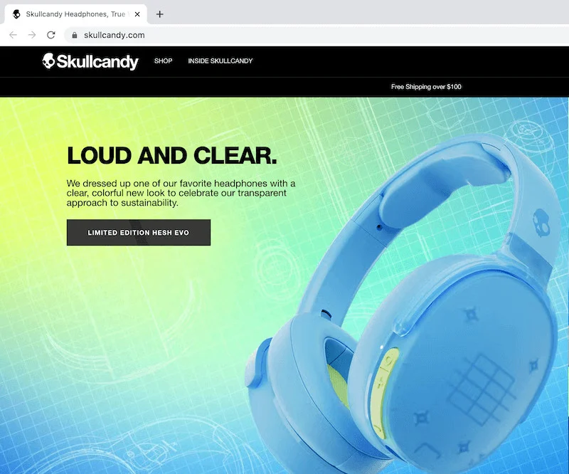
Also, consider what your avatar will look like. A favicon is a small icon found on browser tabs, bookmarks, and the search bar. Skullcandy, a company that makes headphones, uses the skull symbol as their favorite symbol so that viewers can clearly recognize the brand.
Considerations when designing an e-commerce logo
Now that we’ve covered almost everything involved when designing an ecommerce store logo, let’s touch on some other design considerations.
Consistent color palette
You need to have a consistent color palette…and everything else. People want brands they can rely on. You need to meet their expectations by maintaining brand consistency to ensure your customers are satisfied.
Consistency lets your customers know you’re trustworthy, driving trust, loyalty, and sales. The more consistent your brand image is, the more customers will resonate with your business. It’s really simple.
Using a consistent color scheme in your logo is a must. Think of it this way: What if you used a yellow and orange logo on your website but then changed it to red and pink on your social media? Inconsistency leads to confusion and distrust.
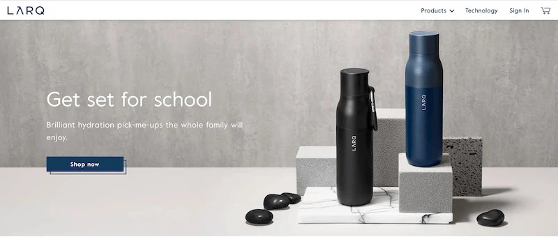
Plus, keeping your color palette consistent is aesthetically pleasing. Just look at Larq’s gray, black, and blue color scheme — mellow, modern and sleek.
Font
When it comes to fonts, it’s best to use no more than 3 different types. Otherwise, your ecommerce store will look unprofessional and confusing. There are 5 font families; limit the number of font families you use at most to 2.
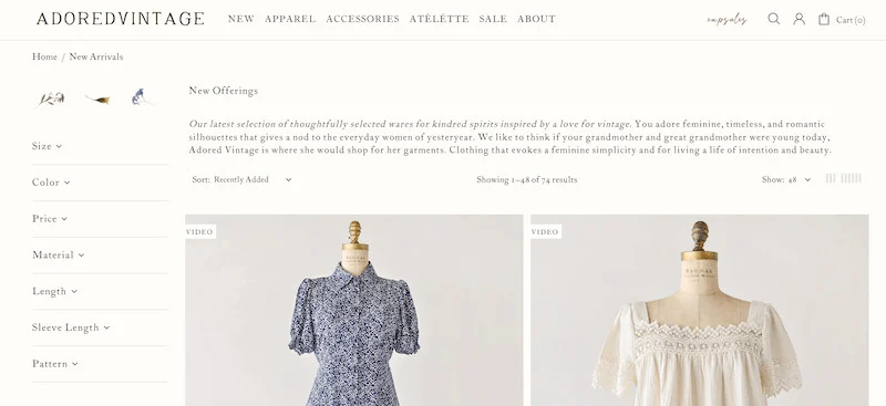
If you use multiple font families, make sure they complement each other based on their character widths. Combining a serif font with lettering will create harmony (e.g. Adored Vintage ), while a bold font combined with lettering will look wrong.
About brand image
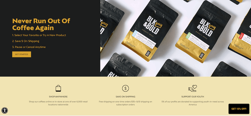
From your website banner to social media, every image should relate to and support your brand. BLK & Bold Specialty Beverages does a great job of coordinating their visuals on both their website and social media profiles to match their overall image. What’s particularly true about BLK & Bold is that they never use stock photos. Each of their product images is an authentic photo, inviting viewers to feel the same welcome as you feel when you walk into a coffee shop.
End
E-commerce has a lasting stronghold in our lives, so you’re in good company. As Paul Rand (famous graphic designer for IBM, UPS and ABC) said: “If in the media business, ‘image is king’, then the essence of this image, the logo, is the is the jewel in its crown.”
That’s a lot of responsibility for a single graphic designer, isn’t it? Creating an ecommerce store logo is a big undertaking, but this article covers all the important principles that can help guide the process.


