You don’t have to limit yourself to a specific type of style when creating your logo. In fact, some logos are most powerful when they combine multiple elements together.
While a simple illustration can sometimes be the most concise logo, many brands have successfully combined various design elements with their text to create a logo that has a strong impact on the audience. target.
If you’re struggling to find the right unique logo image or want to combine an image with a powerful logo, a hybrid logo could be the perfect solution.
What Is Combination Mark?
There are two main types of logos: Image or icon based logos and name based logos.
The combo mark has 2 different elements:
- Text (Logotype): Brand name or initials written in specific font
- Symbols (Illustrated Elements): Shapes and objects that help represent the company
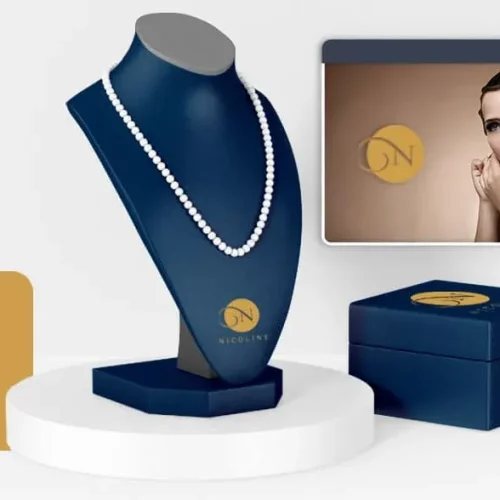
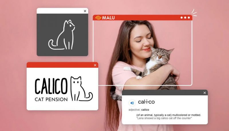
While some businesses use either of these elements in their logo, other brands combine the two to create a combined logo. This type of logo can be very effective because it combines the impact of two powerful design elements together.
How to combine text and symbols in a combo logo
There are many ways to combine your logo with text. Here are some of the most common ways to create a combination logo, along with examples of popular combination logos to give you visual inspiration for your own designs.
Horizontal combination logo layout
Side-by-side layout is probably the most common way to combine 2 separate logo elements, as it doesn’t require any special arrangement or stacking. To achieve the horizontal combo mark, most designers will create text that is related to the size of the icon. The font must not feel too heavy or too light for the icon in this design layout, or you will end up with a visually deviant design.
Freelancer

This platform connects freelancers with businesses. So for their logo, the brand combined an origami paper hummingbird with a bold sans-serif logo. The hummingbird represents the strength, positivity, and resilience of freelancers, while the blue color imparts confidence that pairs nicely with the confident black font face.
Microsoft
Microsoft’s logo has undergone some profound design changes over the years. The current version has gone from just a logo to a combination of 4 colorful squares (window boxes) next to the font.
Timberland
This vintage shoe and clothing brand uses a bare tree to illustrate the wood. On the website, the iconic logo is placed right next to the bold Timberland name. However, Timberland quickly changed it when they wanted to stack their elements or just use one (like their shoe-only logo).
Ralph Lauren
In between “Ralph” and “Lauren” is a fully active polo player. The body and rider take up most of the illustration and align with the font to keep the weight balanced.
Bumble
Bumble is another brand that often stacks up their logos or just uses their logos. However, this logo is designed to sit right next to the honeycomb illustration with a very similar height. Yellow also adds a feeling of sweetness and happiness to the overall look.
City Pantry
This company uses a cute illustration of a house with a fork and knife combined, with typed words next to it. The warm yellow color pairs well with the soft sans-serif font and the rounded corners of the illustration for a friendly appeal.
Stacked combo logo layout
Stacking your logo on top of a logo can create a more condensed logo that’s better suited to square or circle formats (like social media profile pictures). Businesses with shorter names can more easily stack their combined logos.
Often times, stacked logos also allow the iconic portion of the design to be much larger than a horizontal layout. While this is not a hard and fast rule, the icon part should correspond to the width of the name or fit the letters somehow to create a concise design.
Huawei
This large information and communication technology (ICT) brand uses a sun-like symbol with a bright red color. The petals exemplify the Chinese word “hua”, which means petals or extravagance, while the second half of the name is the Chinese word for achievement or accomplishment.
Lacoste
This logo design hasn’t changed much since the 80’s. Using a defensive alligator to represent the founder’s nickname (René “the Crocodile” Lacoste), the brand used a simple way of being Stacking animal icons right on the logo is very simple.
Converse
When you first think of Converse, you may recall the old star logo sticker that appeared on the face of classic Chuck’s. However, the newer logo shows a star and chevron mark positioned almost like a drawn reverse bow and arrow. The logo shows the brand moving forward and is placed above the classic converse typeface — simple sans serif, all caps.
Drunk Elephant
The biocompatible cosmetic and skin care brand uses a whimsical and abstract elephant logo placed above a very streamlined serif font.
John Deer
Iconic tractors and tractors company John Deer uses a deer wrap for its recognizable logo, which is placed directly on the standard sans-serif typeface. Green and yellow represent plant life, harvest and energy.
Satorisan
For a shoe brand, Bigfoot’s silhouette is fun and appropriate. The all-black monochrome logo is eye-catching in its use of details and negative space.
Built-in combo logo layout
For an even more cohesive look, create a logo that incorporates the font within the icon. When designing your logo, make sure the logo doesn’t get lost in a too busy logo. Here are a few examples so you can understand what I mean:
had
Creative and fun, the online TV brand Tivo uses their logo for the face of an alien-like vintage television.
The ball
This line of black skin care products for dark skin tones uses a combined symbolism to demonstrate their commitment to natural beauty. The letter “O” in Bolden is creatively combined with the leaf symbol for a creative design detail in the logo.
Dear Me Podcast
This evocative “record the past” podcast uses an envelope and notes to encode a handwritten logo.
Lay’s
Nothing calls “chips” more than Lay’s logo. A red banner on a yellow sun (or a potato or potato chip) attracts attention. The bright colors of this logo combo convey a sense of convenience and excitement.
Burger King
To create an illustrated burger, Burger King used a logo placed between two buns. Recently, the King decided to get rid of the blue circle and use a flat inverted icon similar to the versions introduced in the 60s and 90s.
Alvarez and Marsal
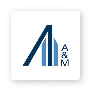
This combo mark uses an illustration like a building next to the initials of ‘A&M’. Working with global businesses, the company chose structural colors and shapes to convey confidence and stability.
For you
The cool thing about logo design is that there aren’t any strict rules you have to follow. It depends on what works for your business.
Now that you know what a combined logo can do, it’s time to start dreaming of your own! Logo Design – Malu Design
If you are looking for a reputable and experienced unit to be able to design a professional and impressive logo and brand identity system , then please contact us immediately by phone. 0988 622 991, or leave your information and requirements, Malu Design ‘s consulting department will contact you right away to answer all your questions!
————————
Malu Design – Branding Identity Agency
Hotline: 0988 622 991

