Are you trying to create logos with personality but are feeling a bit stuck?
Don’t hate – just animate!
When talking about what makes a good logo , we often discuss color psychology, fonts, and different layouts. But there’s another element of movement – so we’re ready to change that.
Animation logo design is an indispensable element for businesses who want to lead the trend, stay on top of the 4.0 game.
It is because the “difficulty” is much higher than normal static logo designs, accompanied by attractive and attractive visual effects, that moving logos have continuously been at the top of design trends. logos in recent years.
When to use Motion Logo?
The advantage of moving logos is that any business in any industry can use them! However, there are a few things to consider before using this type of logo:
First of all, motion logos are geared towards digital branding efforts, if you want to design a logo primarily to stand out on a storefront or business card then motion design will not be suitable for you. Friend.
(However, since an online presence is such an important part of branding, create a website or fan page first.)
Another thing to keep in mind is that a dynamic logo needs to contain the company’s message, so as not to detract from its value.
If you already have a static logo for your brand, you can create a moving version of it. This will help your brand become diverse. You can use your static logo on print materials and official communications, while the animation pops up on your website and social media pages.
Prepare a few ideas on how to make moving logos come to life. Here are some interesting logos that you should check out.
1. Bold Studio

2. Game Geek

As a game logo, I think the design stands out. Games often revolve around finding twists and turns, both literally and figuratively. This logo captures that focus, as it starts from a single point and curves to unfold the entire Game Geek design.
3. Sim Smith
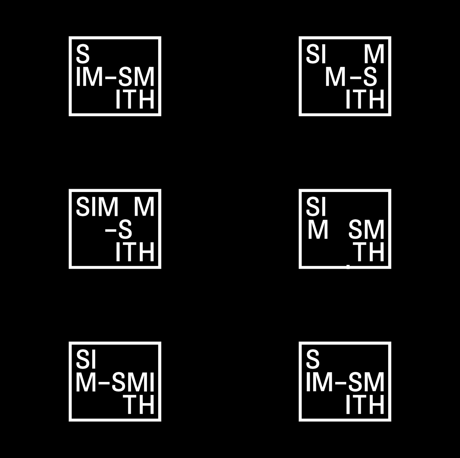
Is this a logo or an art exhibit? That’s the question the designer asked you to answer when looking at it. The moving letters are based on the idea of a point of view that changes art – this is the message an art gallery wants to send to its audience. The border around the shifting letters adds uniqueness, making it look like an exhibition.
4. Shazam
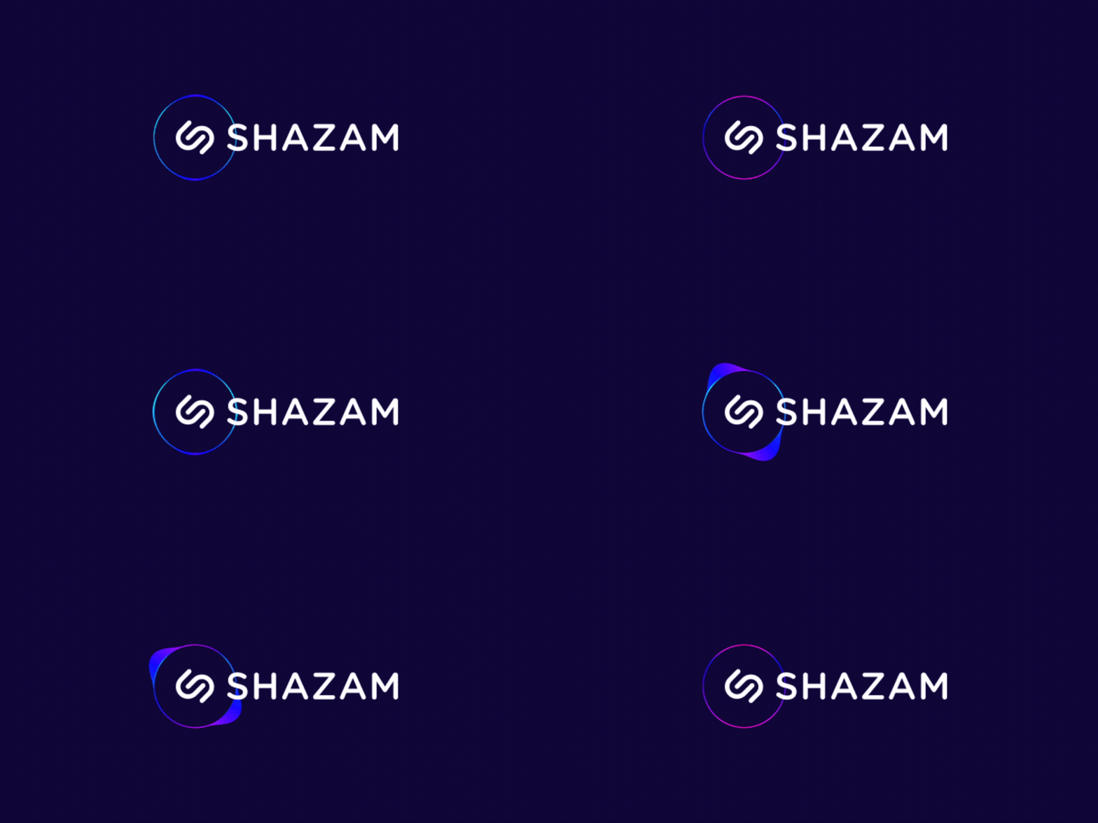
This moving logo uses a pulsed speaker to represent ever-changing sound levels – the message means that with Shazam, the music never stops.
5. Lotus Aromatherapy
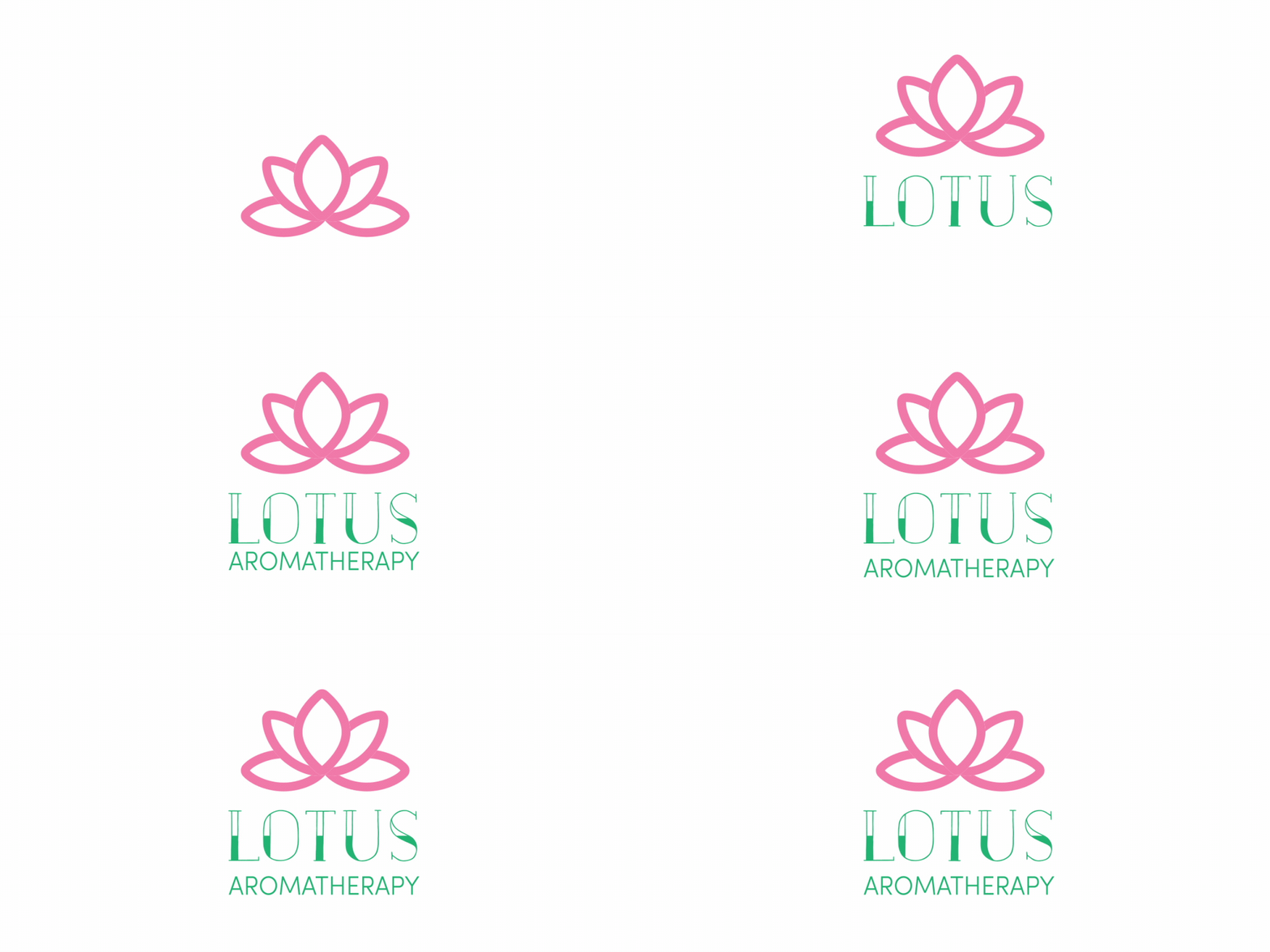
Nothing speaks to personal growth more precisely than a flower in bloom – ideal for an aromatherapy center. The animation looks pretty simple, but it’s eye-catching when a single petal “sprouts” the logo’s name and turns into an entire lotus plant.
6. Sky Construction
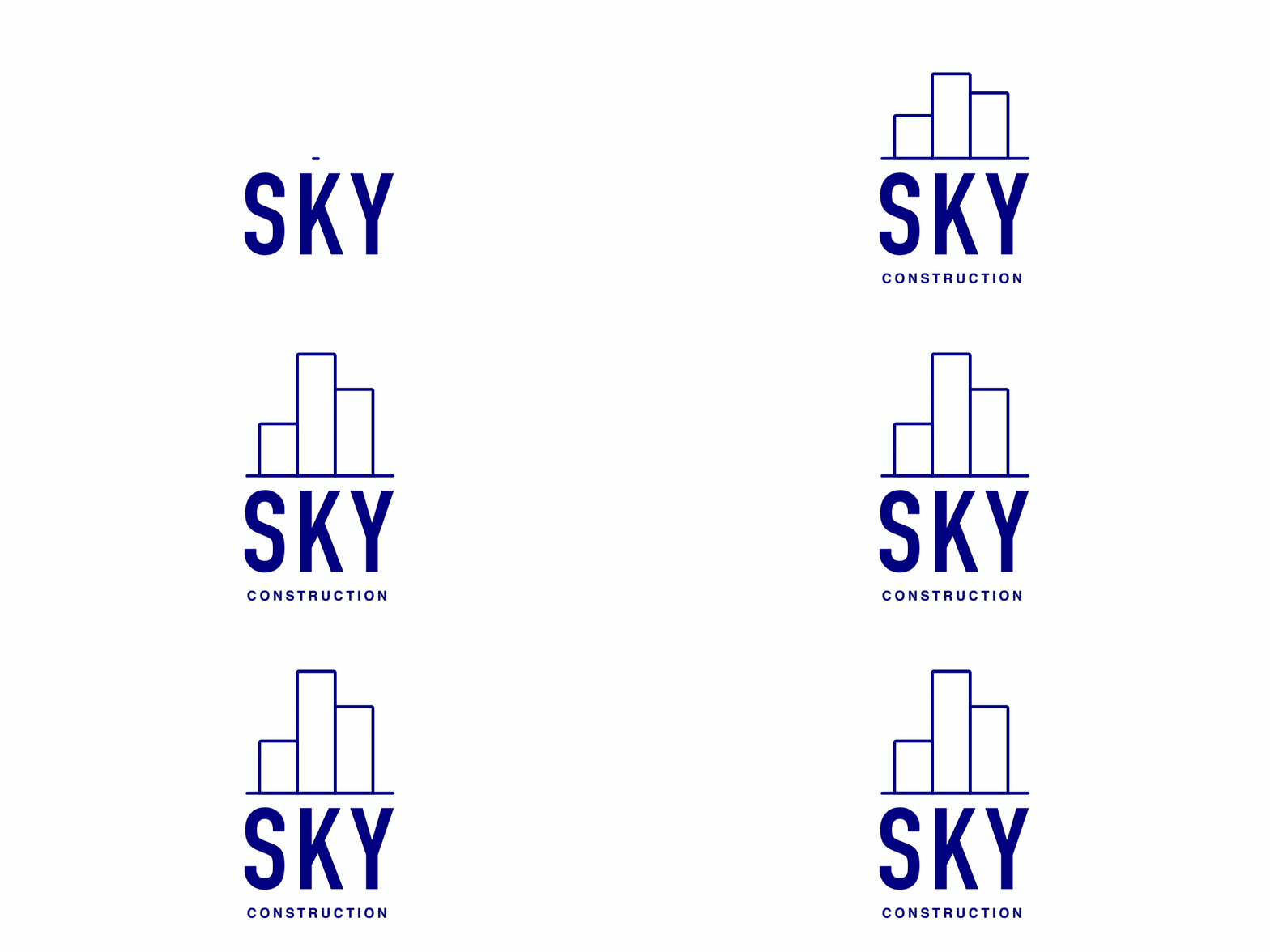
On the topic of growth, what better way to showcase a brand that builds using growing buildings? This construction logo uses simple geometric shapes to form the horizon line – representing both the brand name and their own message.
7. Puzzles Creative Studio

This studio is a combination of all the different elements to create the art and they use a moving logo in hopes of emphasizing that to their audience. In addition to looking extremely eye-catching, the movement in the logo also helps to illustrate the brand message of “pieces of the puzzle”.
8. FedEx

Have you seen the moving version of the FedEx logo? It plays arrows on the hidden space between the “EX” in their static logo, the arrows move all the way to indicate direction. FedEx ships around the world, and the logo embodies that idea through the sharp movement of each arrow.
9. Brick
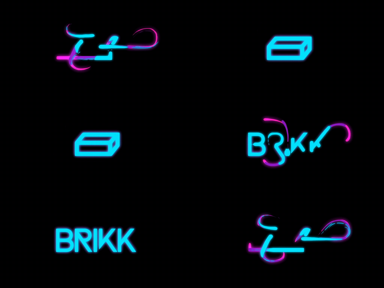
Not sure what type of logo you want to use? Don’t worry! Designer Gun Karlsson did just that with Brikk, using animation to turn text into its eponymous image.
10. Twisted Brewery

This motion design gives a whole new meaning to “handwritten” logos – a well-known style commonly found in vintage logos as well as breweries. Using a strong decorative font, the pacing of the animation makes it look like someone is drawing the name of the brewery – giving it a personal and nostalgic touch.
11. Lux
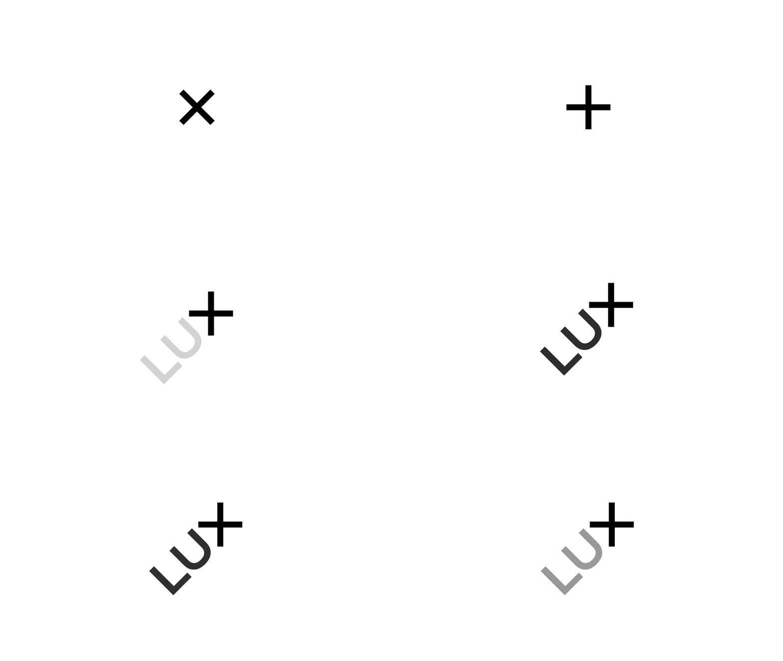
This investment firm wants its clients to know it’s going to make them money, and it’s talking to a niche group of clients — namely, the group that invests in science and technology ventures. To illustrate that point, the Lux logo rotates to form symbols in mathematics – both alluding to these principles and demonstrating the common ground between the two fields (science + technology).
12. Sparkle Cleaning Service
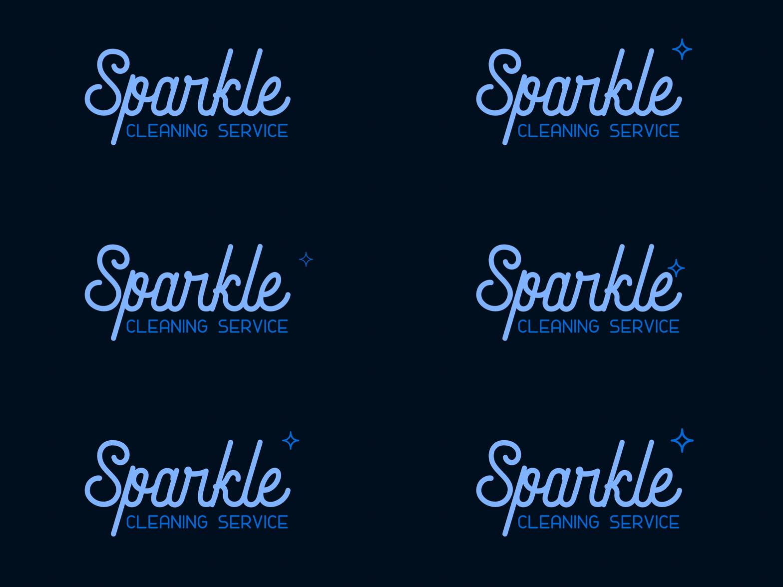
Instead of using flash and subtlety, this logo uses light animation to create realistic sparkles. Like its name suggests, it carries a clean message and is always ready to go.
13. Giant Owl Productions
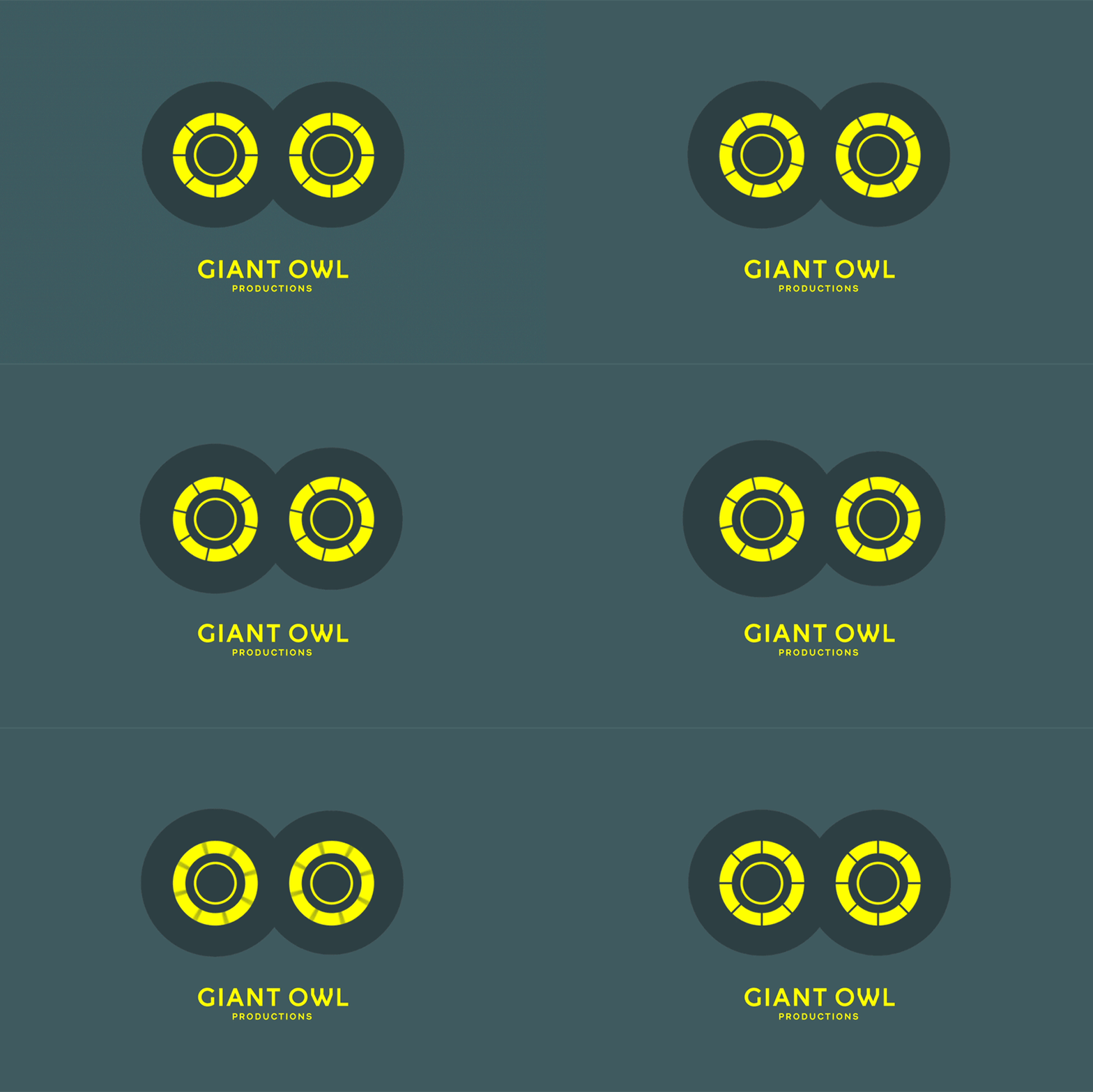
Are those reels spinning or just a pair of blinking eyes? Thanks to movement, we can think of both! It’s an interesting but no less complicated logo, certainly meant to distinguish the studio from others in a heavily saturated market.
14. Pious

For motorcycle company Vrooom, emphasizing precise movement is a kind of advantage that brings the brand closer to customers. The speed at which the logo moves in and out of the frame indicates the agility of the product they offer, the moving rectangles above the business name are reminiscent of the handlebars – an important part of a motorcycle. .
15. Tangles
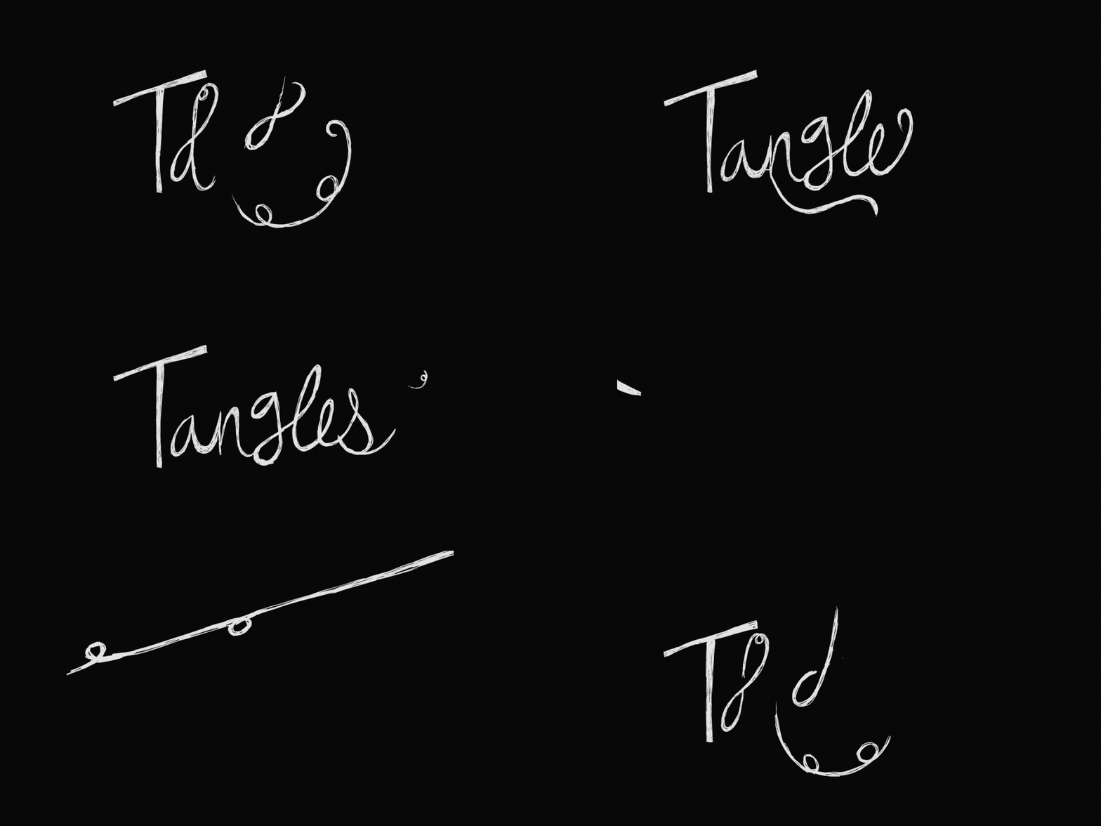
Here’s another hand-drawn logo, Tangles uses a handwritten typeface as a base to “mess up” the letters in the logo as a testament to their name.
16. Hand Craft

It is not necessary to design complex movements into the logo to make them more interesting. Taking a vintage logo and letting it slide into the frame is enough to give it the edge it needs to stand out.
17. Ugmonk
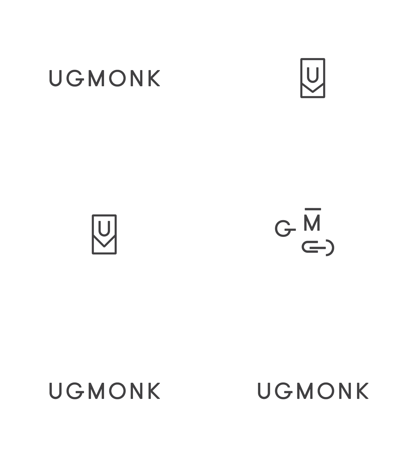
In transitioning from just selling t-shirts to being an entire modern lifestyle brand, Ugmonk rebranded and used a moving logo in the process. It’s minimal, quirky and light – just like their clothes. Hidden in that icon is a t-shirt-like image that sits in the middle of every movement.
18. Eat
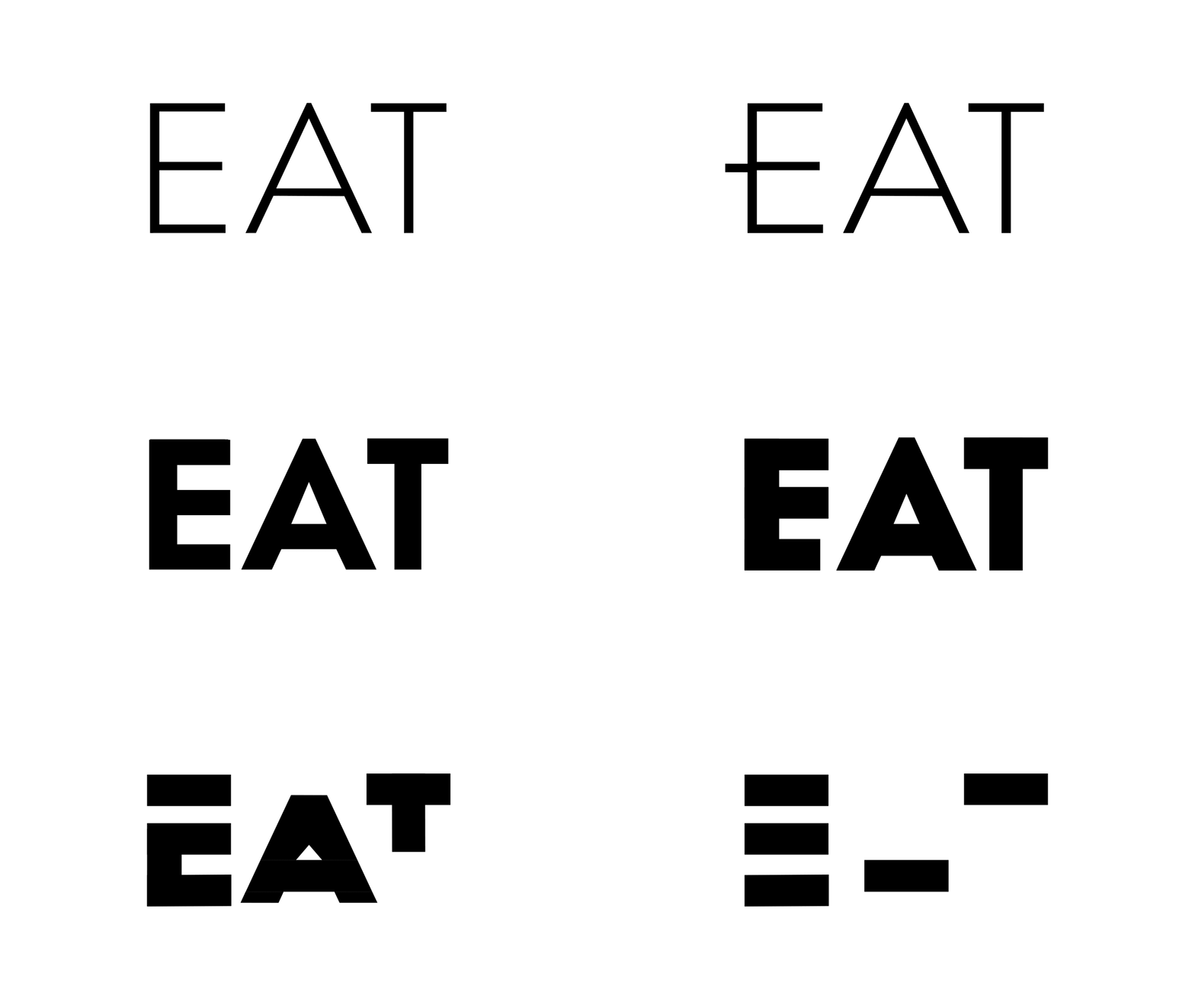
The symbol itself is a font, Eat is a living embodiment of its own meaning – the logo is “eroded”, giving us the impression that the font is getting heavier and heavier. The designer interrupted the feeding process so that the original “eat” became the word “fat” in a short time, you can apply this style to your logo.
19. Echo Capital Group

As a brand that caters to millennial entrepreneurs, Echo needed a logo that could convey values to their target audience – and they chose to embrace their digital acumen. Sleek, sharp yet professional design – with forward movement of details that seem to resonate
20. Common Lot
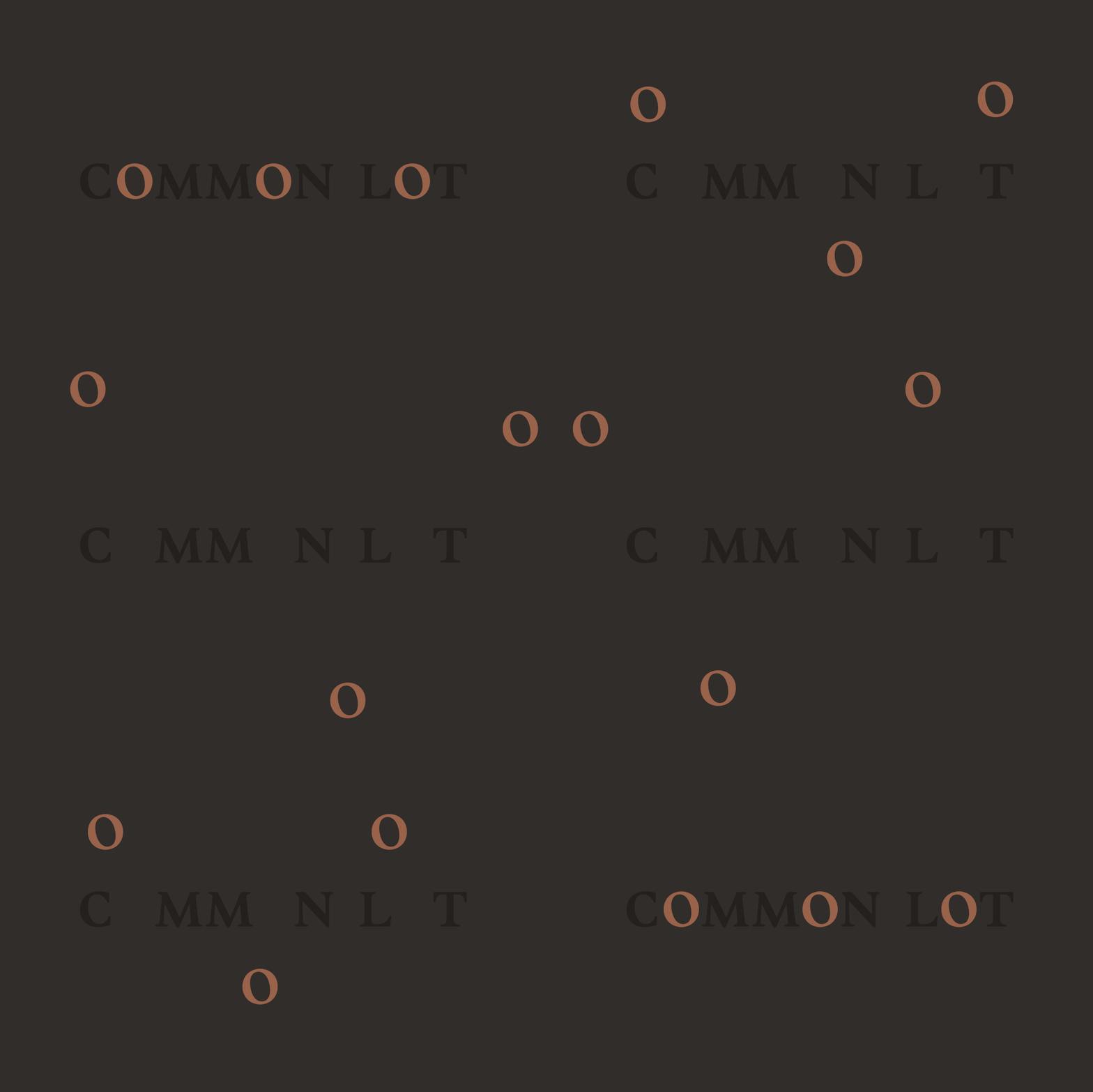
This restaurant aims to comfort, freedom and unite its customers through its open kitchen and communal dining space. They used a moving logo for personalization but still community. Although the ‘o’s move around in the frame, they always manage to find their way back to where they belong – a pretty good adage for group eating.
For you
Do you have enough logo design inspiration to bring your brand to the next level? Whether you’re a motion designer yourself or a small business owner trying to make your mark, a motion logo could be just what you’re missing in personal branding. Use these 21 logos as a starting point and start figuring out how to turn movement into meaningful work!
If you are looking for a reputable and experienced unit to be able to design a professional and impressive logo and brand identity system , then please contact us immediately by phone. 0988 622 991, or leave your information and requirements, Malu Design ‘s consulting department will contact you right away to answer all your questions!
————————
Malu Design – Branding Identity Agency
Hotline: 0988 622 991


