Logos are an important part of branding for small businesses. Every company, school, or nonprofit will use a logo to make its name stand out on all its signs, products, promotional items, marketing materials, and more. The perfect logo should be simple enough to get the message across right away – even if it’s printed at a smaller size.
Black and white logos are not usually favored by small businesses and startups, but they are a great choice to represent your brand.
If you learn about this logo design style, you might be surprised at how effective it can be for your brand.
Features of the black and white logo
When creating a black and white logo, business owners often have to think more about their design elements. That said, black and white logos are used to convey powerful messages about the values of the brand they represent.
Here are the key messages a black and white logo can send to your customers:
Minimalism

Many company owners make the mistake of wanting their logos to “stand out” by overusing design features. Colorful logos are often difficult to put into practice — especially on t-shirts and limited-color products.
With a black and white logo, minimalism is clearly expressed when the main colors are defaulted to white and black. You can simplify layout and font details to give viewers a powerful visual of your brand.
There are many popular logos that use a minimalist design to emphasize their value to customers. You can see this in brands like Apple, Sony, Nike… When you wear a pair of shoes or a Nike shirt, just a small Swoosh logo is enough to affirm the brand of that item. . A complicated headline doesn’t make your brand any easier for customers to recognize. The same holds true for Apple’s iconic logo.
Elegant and sophisticated
There are many luxury brands that use only black and white logos to make a strong statement about their power and value in the market.
Black and white logos usually have a simple and clean look. Some famous fashion brands have used this monochromatic tone to create their logos.
When thinking about Bentley, Gucci and Chanel, people immediately think of their sophistication in each product design. All these brands have something in common – their logos come in only two colors – black and white.
Black designs on a white background often bring a sense of luxury and impression.
Authority


The black and white logo also exudes the authority and class of the brand. Businesses use B&W design for the purpose of “ordering” customers to know who they are. Many news agencies and websites that want to be industry leaders also use the B&W logo to represent their ambitions.
The simple nature of the black and white logo represents sophistication and respect. But when using bold fonts, the logo will appear more powerful and definitive. Contrary to many amateur logo designs filled with images, colors and confusing fonts that do not go together, black and white logos focus on minimalism and make the message clear.
With a black and white logo, you will be forced to make bold decisions and choose fonts that really match the monochromatic tone.
Brands like Forbes, New York times and Inc. Magazine all use b&w logos made up of their names or initials.
Reality
For example, Lowes only allow PMS 280 (or color #004990) for their primary blue color. They can use a different secondary color (PMS 299 or color #15B6E5) or just use black. Blue color is very susceptible to discoloration during printing and editing. When it comes to printing, it’s very difficult to get the color right on the photo — especially on shirts, logo colors, etc.
It may sound like an exaggeration, but if you accidentally use the wrong color, it will be a nightmare for your branding. Some brands are extremely strict about logo standards in an attempt to protect their brand image and create a cohesive user experience.
So, a black and white logo is a solution that makes everything much easier.
You’ll never have a hard time implementing your product’s black and white logos, because they’re cheaper and less time consuming to print than color printing.
Classic
Black and white logos have been around for a long time, they are versatile in size and have timeless value – this is not always the case with color logos.
While other logos can change colors to keep up with the times, black and white logos rarely have to.
Taco Bell is a testament to a brand that has undergone many color changes. In 1985, it was trending very “fiesta” with orange, yellow, green and brown colors. In 1994, the logo changed to pink, purple and yellow. More recently (2016), Taco Bell seemed to fit a logo with a darker tone – only purple, black and white.
A black and white logo won’t make your brand look cheap or outdated, reducing your chances of having to rebrand.
Now that we know what the benefits of using a black and white logo are, let’s learn how to create your own!
Black and white logo design tips
When it comes to creating the perfect logo, there are many design elements that you need to consider. Even though you’re eliminating color theory from your design, understanding the other aspects will also help you create something powerful and memorable.
Font
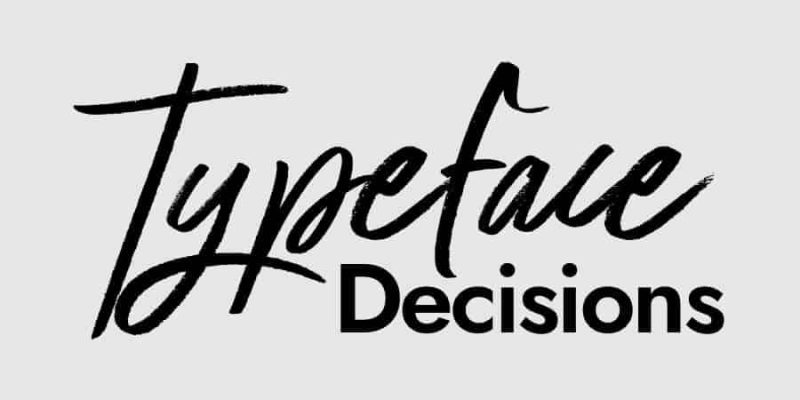
The role of fonts in logo design cannot be underestimated. Most brands now consider fonts an integral part of their logo. But there are a few exceptions, for example: Nike has a specific logo that it uses to brand their goods. This swoosh can be used as a logo without any additional fonts.
It is difficult to find the right font that still conveys enough message to the customer. A suitable typeface should be:
- Easily recognizable and legible (avoid thin fonts that don’t scale well)
- Your own exclusive (don’t just use Arial or Times New Roman without any changes)
- Quality fonts (DO NOT use Comic Sans or Jokerman unless you want to look amateur)
- The font conveys something about your brand and isn’t similar to your competitors’ fonts.
One of the hardest parts of logo design is choosing the right font . Choosing the wrong font will make it difficult for you to properly target your logo.
Famous black and white logos with beautiful fonts include Braun, Vans, Shark, Ninja, Walt Disney and more.
Icon
Each logo should have a specific symbol. Many brands use circles or other simple shapes to frame their logos (squares, triangles, etc.)
Not only does this make printing easier, but the logo is also used for creating social media profiles and creating apps.
You can refer to the Starbucks logo or the image of an Apple apple. When it comes to black and white logos, icons can be an effective way for customers to instantly identify a brand.
Geometric shape
We’ve got an analysis of shapes in logo design . You can use them to subtly convey specific messages about your brand.
- Circle: Represents stability, positivity and unity
- Square or rectangular: Represents safety, reliability and professionalism
- Triangle: Can convey action, strength or instability
- Horizontal line: Steady and calm
- Vertical line: Show action, noise, and growth
Here are some shapes you can incorporate into your black and white logo design. Using the right shape will help the logo reflect different aspects of the brand.

Brand personality
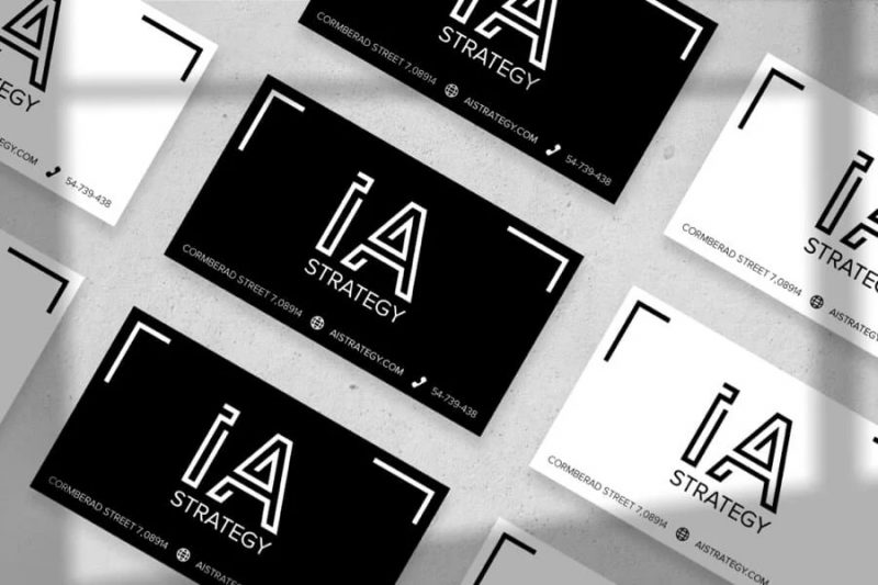
You can choose a character as the main focus in your logo. Logos like KFC, Wendy’s, and Starbucks all have people in their designs. Some characters are more stylized like the bird in the Twitter logo or the CBS eye.
The old PBS logo (from 1984-2019) is a great example of a black and white logo design with a character at the center of the logo. (Newer version changed to blue after 2019)
Ralph Lauren has another version with a similar style – the polo player on horseback. The design is both detailed and simple to help customers easily identify from a distance.
Negative space

Because you are designing your logo with only 2 colors (black and white), you should consider how you can make the most of your negative space . Most objects (text or symbols) are simply placed on the background, and negative space is the areas that surround them (like the white areas around the black Swoosh mark on Nike’s app).
However, you can use negative space to form another element of your design. One of the logos that makes great use of negative space is the American Network logo.
Negative spaces will be treated as 3rd colors if they are used correctly. Although the color is not black and white, the NBC logo (peacock) also shows the use of negative space with a simple center cut that perfectly shapes the body and head of the bird.
The Pittsburgh Zoo & PPG Aquarium is an outstanding example of using negative space in a black and white logo. The clear silhouettes of gorillas and lions that make up the contours of a tree give this design a unique look.
Texture
In black and white logos, you can also use lines, dots, and other character forms to create the illusion of color. The older version of the Burberry logo is a great example of the use of textures in logo design.
You can use textures to accent and distinguish shapes in your black and white logo. This will help you create a design that not only looks “complicated” but also has a proper layout with eye movement directions to draw attention to the design and clarify intent.

Brands that use famous black and white logos
Here are some famous brands that have great black and white logo designs.
Uber
There was a lot of talk when Uber decided to switch from a black and white “u” to a “u” with a different design. However, they felt the original logo was too ordinary and did not fit the essence of the brand.
Then, in 2018, Uber announced their decision to just use the word “Uber” in white on a black background for their Uber Move app logo.

Miu Miu
Miu Miu’s logo looks almost like the motifs you might see on painted walls in a European city. The broken “m” and “u” make it look like stencils, the words designed with a certain curvature suggesting ingenuity and solidity.
This Italian haute couture brand is a subsidiary of Prada. It was founded in 1993 and currently has its headquarters in Paris, France. Similar brands like Louis Vuitton and Valentino also have B&W logos designed in a similar style.
Mont-Blanc
The block letters combined with a star in the top right corner make up the emblem of Mont Blanc. Not only is the font split into two stacked words, but the star is also used to represent Europe’s highest snowy peak – Mont Blanc.
Although the logo has a modern look, this star symbol has been around since 1913 after the company was founded in 1906.
The Guild of Food Writers
The simple and striking ink nib creates the logo for the Food Writers Association. Using negative space, the center of the pen’s nib outlines a standing spoon on a black background.
This logo represents a group of people from the UK, more than 550 food writers as broadcasters, journalists and columnists.

Vans
Vans is a famous skate brand. This company was founded in 1966 by two Van Doren brothers. Its current logo is almost identical to the original created by the founder’s son.
While the original Vans was uneven because it was hand-drawn, the typeface in today’s logos has been designed to be clearer. Throughout the logo changes, they have kept the unique V-shaped design like its first version.

For you
If you’re ready to create a logo for your business, get to it now! Our logo design service is available for you to experiment with any image, layout and color ideas in your logo.
It’s time to create the perfect logo to represent your brand!

If you are looking for a reputable and experienced unit to be able to design a professional and impressive logo and brand identity system , then please contact us immediately by phone. 0988 622 991, or leave your information and requirements, Malu Design ‘s consulting department will contact you right away to answer all your questions!
————————
Malu Design – Branding Identity Agency
Hotline: 0988 622 991

