The goal of a logo is to represent the brand and help the viewer distinguish it from other brands. When someone looks at the logo, they will be able to determine two things: what the brand offers and whether or not to trust the brand. Logo design principles will help customers easily identify the brand and create more trust in that brand.
1. Simple

Wise choices in typography, color options and graphics are crucial for this step. Is your logo made up of some overlapping shades, images, fonts? Pick just a few elements that work best for your design, a great logo doesn’t get bogged down by too many elements. And don’t forget the whitespace! Simplicity requires excellent use of space.
2. Unique
Your logo needs to be distinctive enough to attract attention and memorable enough to stay in people’s minds.
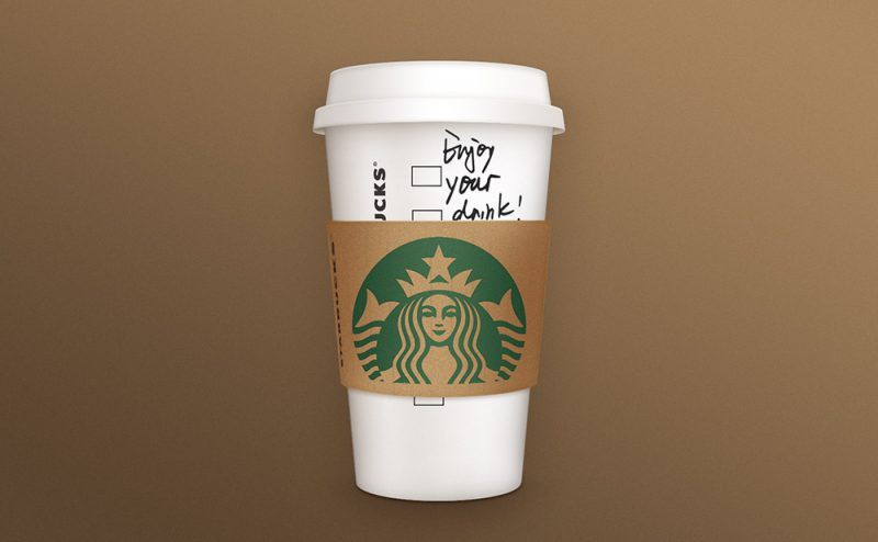
Think of all the unforgettable logos stored in your memory: Starbucks, Apple,… Their logos stand out from the crowd by being different, unique and memorable. Your logo should capture the first look that people will remember and then demonstrate trust and credibility upon repeated interactions.
3. Versatility
Logo is one of the important symbols of the brand. It will appear in all your products, store signs, advertisements, etc. So your logo needs to be flexible and adaptable wherever you go. Think of all the places you’ll want to use your logo and make sure it’s easily identifiable when placed in a variety of places.
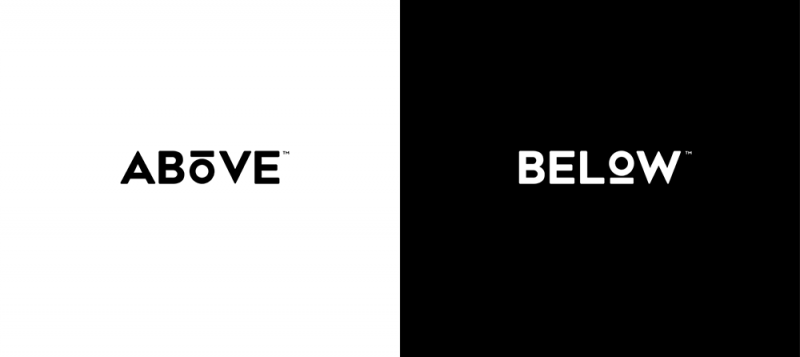
The rule of thumb is that your logo can work with any color or background as well. That means it needs to look good in black and white with no effects.
4. Scalability
Similarly, your logo should be able to adapt to any size. It may appear on a giant billboard or in a small brochure. We should know that the logo needs to be scalable to represent the brand anywhere.
A logo needs to have a nice look and be recognizable at any size whether it’s printed on a small business card or on a large poster. If you add too much detail in the logo, it will make it more difficult to downsize.
To achieve scalability in your logo, the designer will create your logo in vector format. Vector files are created with resizing in mind, so your logo looks sharp when placed on large places.
5. Balance & rate
People recognize balanced design as the most beautiful. A well-balanced design will strike a balance between the different elements that make up your logo.
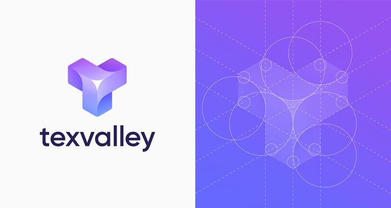
Ratio refers to the weight of each element that makes up your logo. Symmetrical logos are balanced through equally weighted elements lined up on either side of a central line. On the other hand, asymmetrical logos can also be balanced, using opposite weights to create an uneven, yet balanced composition.
6. Use color carefully
Use these vivid colors always attract attention. Striking colors will connect emotionally with the viewer. However you should research the color before deciding. Color has an effect on human emotions. Know what emotion you want to convey to your audience. From there choose the right color for your logo.

Logo firefox
Remember, no matter how brilliant your logo is, it must be clearly visible in black and white. Many t-shirts and some banners will only come in these two colors. Wouldn’t you squander an opportunity to promote your brand just because the logo doesn’t look good in black and white? A good logo design should be able to display well on both black and white backgrounds without losing details. Keep this detail in mind and check when you design the logo.

