Popular logos do not come naturally. While it is true, it is still possible to create a logo with striking colors and eye-catching typography . But without the originality and credibility of the brand, the logo will lose most of its meaning.
The combination of execution, core values with the new product/service itself creates a memorable and iconic logo.
If handled correctly, logos can set trends and even become part of popular culture.
Even if you are just learning about logos. Or simply curious about the process of designing a logo. Continue reading Malu’s article below to get inspiration from the following 18 famous logos!
Apple:
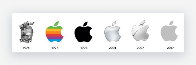
Referring to legendary logos, it is impossible not to mention Apple. The apple logo is considered one of the most recognizable and trustworthy logos of all time. This logo was first designed by Rob Janoff in 1977. This is a revised version of the old version in 1976. (The old logo was Isaac Newton sitting under an apple tree)
In the first edition, the apple was the color of the rainbow bands. It wasn’t until the iMac was first released in 1998 that the logo changed to monochrome gray as it is today. This change brings more elegance and modernity than before.
Janoff explained, the apple is missing to distinguish it from the cherry, especially when the logo is formatted at a small size. Because, size is an extremely important factor to consider when designing a logo.
Nike:
No matter what nationality you are, whatever language you speak, perhaps the Nike logo is still on the list of things that cannot be confused. This is known as one of the most famous logos in the world. Surprisingly, the person behind this legend – Carolyn Davidson, who was a student at the time, received only $35 for her design.
Nike logo in Abstract style , with the shape of a stylized check mark. The logo stands for speed and movement – all about Nike. Carolyn explains: the logo represents the wings of the goddess of victory – NIKKE that the brand was inspired by.
Nike’s logo is not “a step into the clouds”. It is the result of years of persistent branding and innovation.
FedEx:

You may not know, there is a hidden image in the FedEx logo. But once you realize it, it’s hard for anyone to forget it. The negative space encapsulated between the letters “E” and “x” forms an arrow. This is a typical example of an Emblem Logo . The success of this logo comes from its simplicity, simplicity and effectiveness.
Created by Lindon Leader, this logo has won countless awards. It was even included in the list of 20 designs that helped shape the modern world. The FedEx logo is a testament to how effective the use of negative space can be in communicating messages.
Other famous logos that use similar techniques include NBC, Bronx Zoo or The Academy of Motion Picture Arts and Sciences.
Twitter:
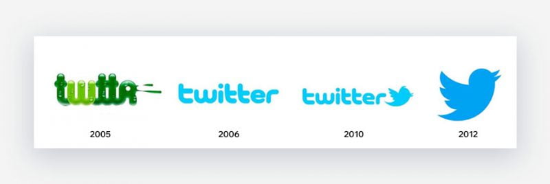
Twitter’s logo is probably one of the best. Before taking the form of the small bird it is today, it also went through a few changes. When it was released in 2006, the Twitter logo was in the form of a wordmark with a green tone . Quite a surprise, isn’t it? But what’s more surprising is that the iconic “Larry the Bird” is named after the basketball player who played for Boston Celtic.
The improved version used to date was designed by Douglas Bowman in 2012. No longer using the old name, the logo is known as “Twitter Bird” and helps to perfectly express the Brand Voice and brand message . .
Shell:
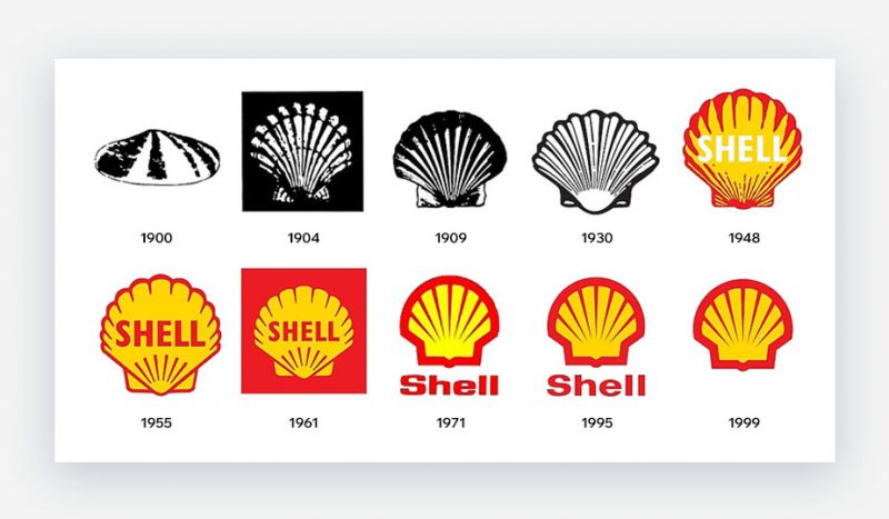
One of the best examples of symmetrical logos. This seashell-shaped Brand Mark is the “heart” of the brand identity system. In the words of Shell itself, the logo is “the embodiment of what we stand for, and how we have evolved over time”.
This classic clamshell has also undergone a few modifications but still shows Brand Value and consistently uses the familiar red and yellow colors. As one of the strongest multinational oil and gas corporations in the world, Shell’s logo plays a big part in the success of the business.
Supreme:
Supreme’s bold Futura font logo was once a hot topic due to a controversy over plagiarism of the work of artist Barbara Kruger. Especially since Kruger’s product is rooted in anti-capitalism. Ironically, it turned out to be a street-culture phenomenon for Supreme.
Supreme has successfully expanded the streetwear market and cooperated with many famous brands such as Nike or LV. This is an example of how a logo can influence both a culture and our buying decisions.
Mastercard:

This is a logo with relatively few changes and minimalism. It is this consistency and visualization that makes for an iconic logo.
Through the edits, the color of the logo is always kept the same as red and orange. This design makes connecting with both businesses and consumers extremely effective. Because the symbol Mastercard has chosen implies that the payment can be done both offline and online.
Tesla:

Some argue that Tesla’s logo looks like many other things. But according to “father” Elon Musk: “The letter T is the intersection of the electric motor. Like the X in SpaceX is rocket orbit.”
What makes the Tesla brand color attractive is the combination of lead gray and deep red. This color scheme has created a very glossy feel for the design. As what Tesla stands for – luxury and innovation. This futuristic logo successfully conveys the hidden meanings behind the brand.
Airbnb:

Airbnb’s logo not only successfully represents Brand Identity , but also Brand Values. Airbnb wanted to create a recognizable logo in any language or location.
What makes it unique is that it matters to users as much as to the brand itself. Because the hosts of course want to take advantage of the prestige and pride of Airbnb to attract customers.
Airbnb’s logo is classified as minimalism . In fact, behind this compactness are 4 hidden symbols: a human figure, a heart, a location pin and the letter “A”.
Chanel:

Like the style of French fashion houses, the Chanel logo is timeless and outstandingly elegant. The Chanel logo has never been modified. Viewers often interpret this logo as the two letters “C” in Coco Chanel’s name interlocked.
Similar to Coco’s designs, this monochrome logo represents “luxury without effort”. The classy black and white logo comes in two forms, black text on a white background or reversed white text on a black background. Regardless of the version used, it is always in vogue.
Starbucks:
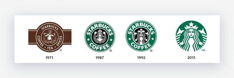
It’s as if we were inhaling the scent of coffee or hearing the barista mispronounce the customer’s name as soon as we saw the Starbucks logo.
True to its creative branding ambitions, Starbucks has changed the way we drink coffee a lot. Although the original logo has undergone a few changes, the basic idea remains the same. The iconic symbol of a two-tailed mermaid, also known as the Siren in Greek mythology, has become an icon.
Perhaps it is thanks to the friendly blue color, combined with the asymmetrical mermaid face that helps Starbucks own one of the most famous logos in the world. The latest version no longer has wordmark around the border but simpler. There is only the Siren icon in the center.
Pringles:
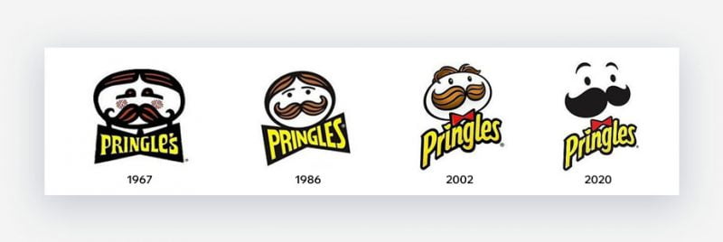
“Mr Pringles” is the perfect mascot logo for the brand, designed in 1967. The character’s facial expressions and hairstyle have been modified a few times. However, only the beard remains original.
In 2020, Pringles is no exception to the stream of streamlining, like Uber and Netflix. The minimal version of Mr. Pringles has lost all of his hair, but has more eyebrows and a smoother outline of the bow.
Unfortunately, this version is not supported. Customers want the brand to return to the original logo. Some minor hassles aside, there’s nothing wrong with improving the logo. Even this is an activity that is recommended to be done every 5 years.
CNN:

CNN or Cable News Network came into operation in 1980. Its logo has been completely unchanged since its inception. This is a deliberate act, to show consistency and sustainability in their news.
Built by Anthony Guy Bost. CNN’s lettermark logo is strong and unmistakable. It is simple, timeless and will continue to represent the prestige of the global news community.
Adidas:
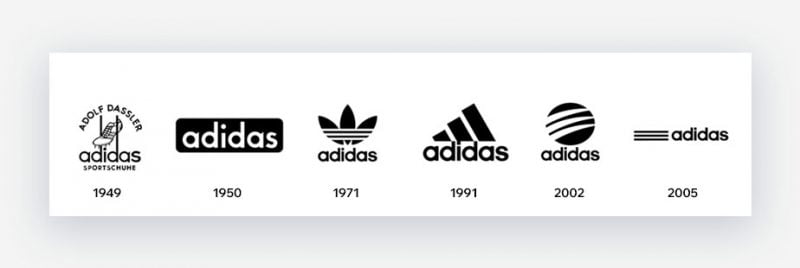
When you see the 3-Stripes logo, it’s hard not to think of Adidas. Originally named “Dassler Shoes”, this global sports brand has a complicated history and is closely linked to its rival – Puma. In fact, the two brands were founded by two brothers, Adolf Dassler and Rudolph Dassler.
Adidas started with the line of sneakers and put the 3-Stripes logo on all of its products. It was not until 1971 that the three-leaf clover was introduced for the first time. There are also two other versions: “mountain range” and circle.
Although modified, the 3 stripes that make up the Adidas brand are always cherished. Adidas has an excellent Brand Identity as well as loyalty from customers around the world.
Xbox 360:

As branding becomes easier through digital platforms, the idea of 3D logos also emerges. The 3D logo is eye-catching and has become an effective tool for many businesses. A good example must be mentioned Xbox 360.
In 2001, the “X” in the logo was transformed into a three-dimensional form with a gradient green tone. In 2005, the wordmark logo was reduced to a sans-serif font.
However, in 2019, the design was once again improved. Today, the Xbox appears only in black – a complete departure from the familiar green color for many years. The current logo is said to be more luxurious and fresh.
Hilton Hotel:
When it comes to the Service – Hotel – Restaurant industry, a recognizable logo plays a crucial role in Branding and Marketing strategies.
Exhausted travelers want to find something that makes them feel refreshed and safe. As one of the largest hotel chains in the world, Hilton is the preferred choice of a large number of travelers and business travelers.
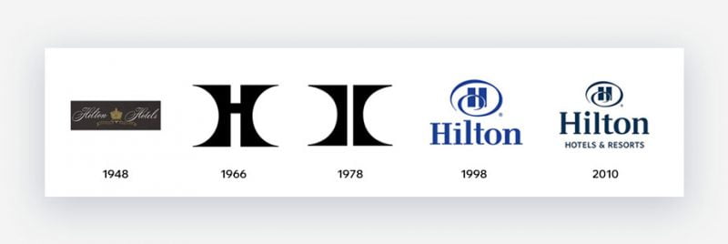
Hilton’s Emblem logo as we see it today has gone through a few changes since 1948. The first version was very different from the present, featuring a golden color combined with wavy typography.
The current version still includes the letter “H” but feels more modern and sophisticated. One of the factors that make a logo successful is probably color. Blue evokes peace and reliability.
In 2010, Hilton slightly changed the boldness of the logo, to better suit the contemporary style.
extra crown

Many people will know this brand by the name Corona Beer. This is a light Mexican beer, famous for its youthful, carefree “Life’s a Beach” spirit. In addition, Corona also owns some of the most famous logos in the world.
The design uses a contrasting blue and yellow color scheme. Followed by thin lines, with a typical Gothic font .
The crown symbol above the logo is related to the brand name. “Corona” in Spanish means “crown”.
Virgin:

When you see the Virgin logo, what do you think of? Perhaps Virgin Airlines with its striking red and white planes? Or Virgin Radio? Or Virgin Hotel? Maybe, we will think of Virgin Records – the record label of this extremely powerful multi-industry group.
Products as being used with all of the company’s sub-brands, each designed specifically for Virgin Records. Therefore, the logo has a rather “hippy” impression, reminiscent of that period. Roger Dean is the creator of this logo template.
The logo as we see it today has a deep red color. Followed by the letter “V” in handwritten pseudo-font. Although it has gone through some transformations, the logo remains true to the spirit and speaks the “language” of the brand.
Conclude:
Above is the interesting information that Malu has compiled. Hope this article has helped you have a clearer view of how to create iconic logos.
If you are still having trouble with the logo design process, contact the professional team at Malu for assistance!

