Are you bored with classic fall color palettes like yellow oranges and earthy tones? So try with new tones, Neon looks especially modern when combined with autumn shades.
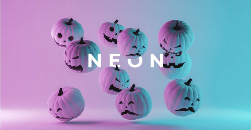 Why neon tones work so well with seasonal colors collect? Autumn’s colors are rich and cozy, while neon is vibrant and clear. Consider extroverted neon as a counterpoint to the introverted atmosphere of autumn. It helps create contrast and gives your design accent.
Here are the suggested color palettes:
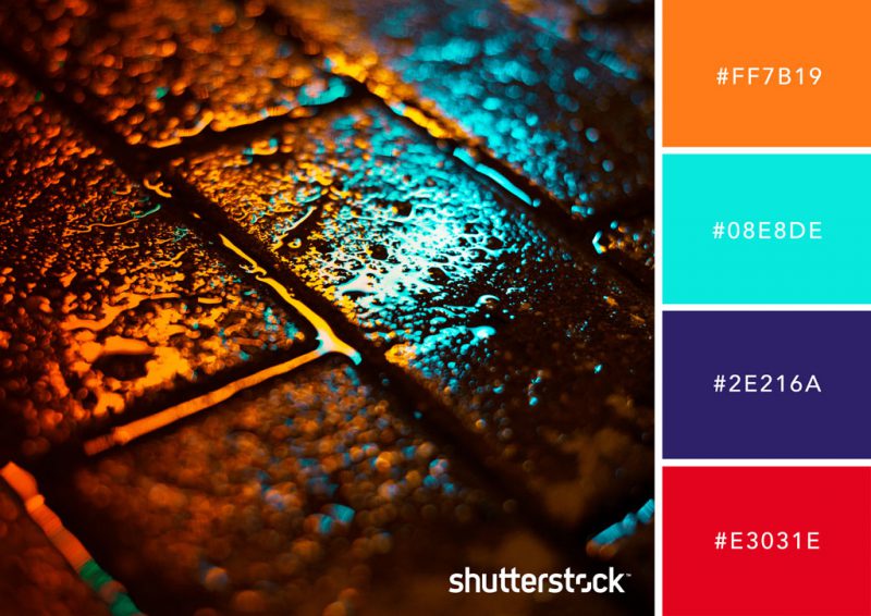
1. Autumn in the park
Here neon cyan, dark blue, orange and cherry red combine to evoke the feeling of a glorious autumn day in the park. This palette offers a fresh take on complementary tones of blue and red.
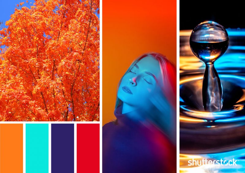
While pure cyan is a particularly bright neon tone, here it is tempered by richer hues, resulting in a complex, modern palette.
2. Dusky Neons
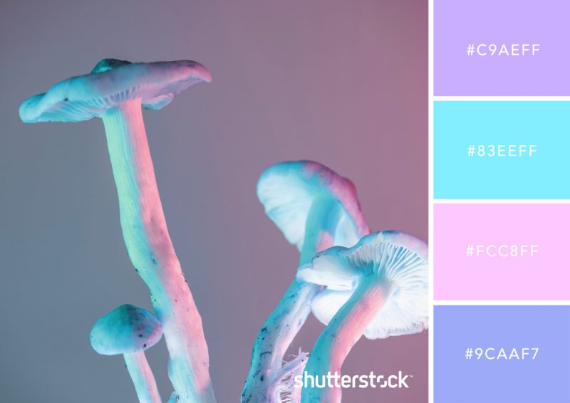
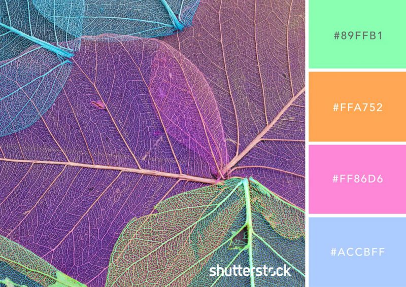
At this time of year, the air is wetter and fresher, giving the landscape an ethereal feel. This soothing palette is inspired by misty mornings that change the light, giving everything a pink and purple glow.
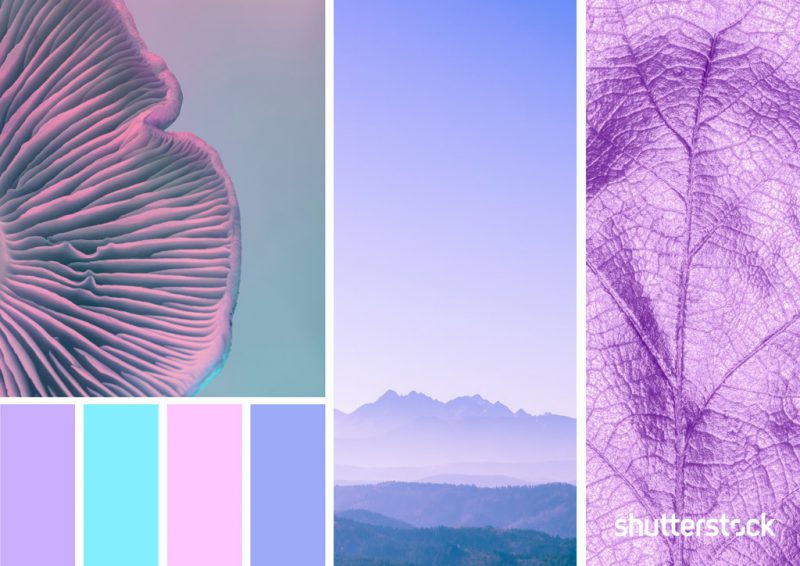
Neon turquoise and lavender pair with neon pastel pink and cornflower blue for an otherworldly color palette.
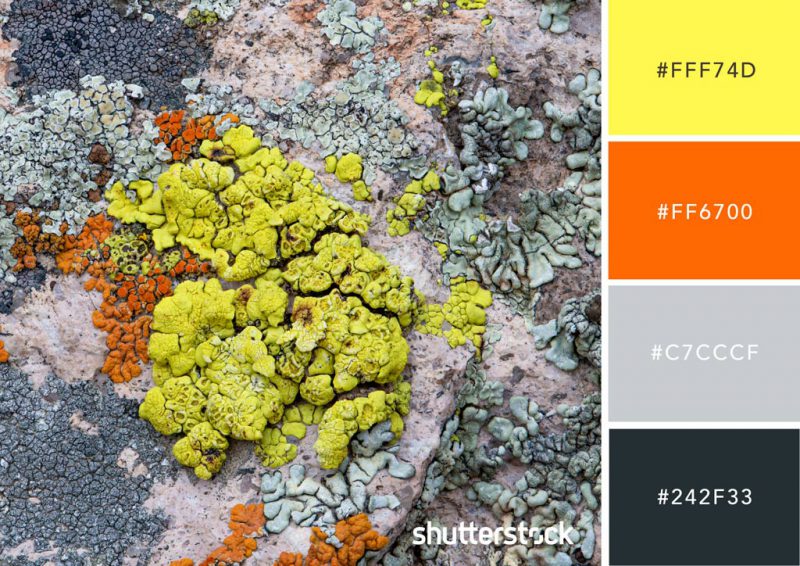
3. Lichens and concrete
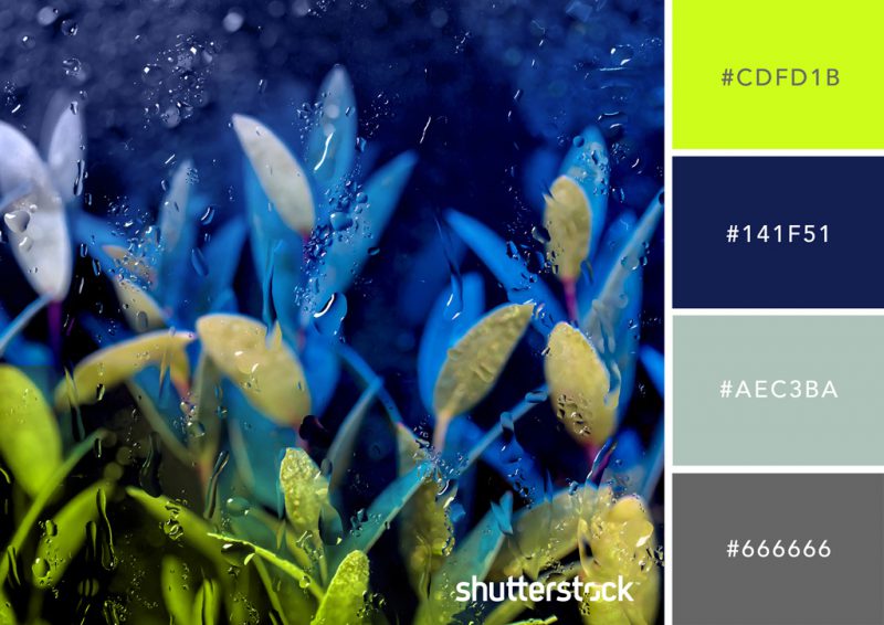
This modern neon color scheme, inspired by rain-soaked streets and the unexpected vibrant hues of forest lichens, is the perfect way to incorporate fall orange into a trendy color scheme. more direction.
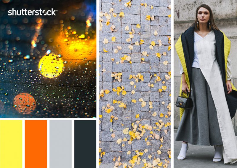
This would be the perfect palette to use for seasonal projects that require a different approach or a modern edge.
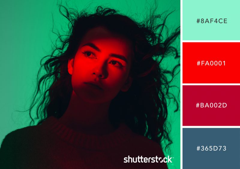
4. Berry and Mint
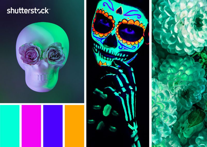
Neon mint green might not be immediately reminiscent of fall, but when paired with berry tones, it’s very seasonally appropriate.
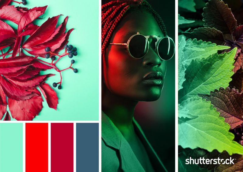
This scheme feels both fresh and mature at the same time, with petrol blue giving the palette a sophisticated, oceanic element.
5. The color of the deep forest
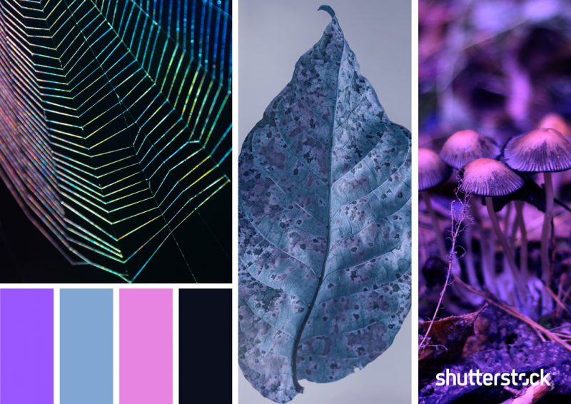
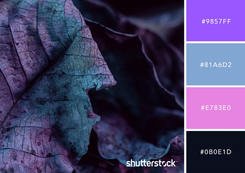
Combine neon purple and neon pink with blues and jet blacks to create an atmospheric palette that celebrates the beauty of doom. A great color palette for the ghostly atmosphere of the Halloween season.
6. Neon Aurora
The northern lights (the aurora borealis) are visible between fall and spring, meaning that if you’re lucky enough to look up a dark night in the northern hemisphere from late August, you could catch a glimpse of the scene. this season.
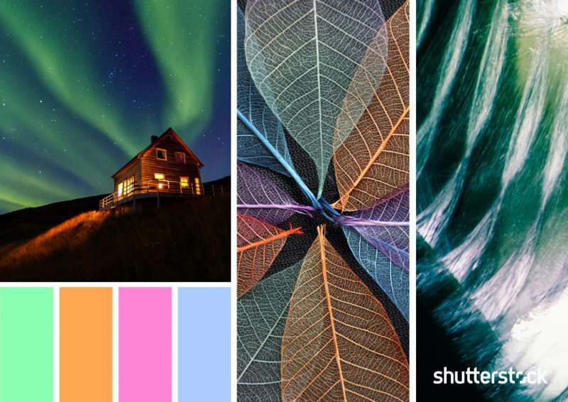
This palette is inspired by the neon pastel colors visible in nature’s biggest light show, creating a matching mix and matchWith both fall and Halloween themed designs.
7. Halloween
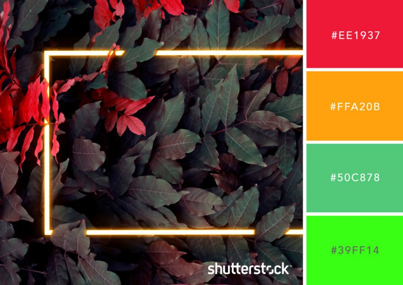
This palette incorporates more typical fall colors like orange, rusty red, and green.
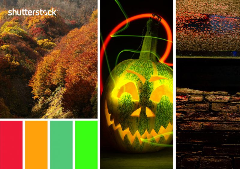
The changing colors of forest foliage combine with green Ghostbuster for a palette that summarizes the natural spectacle and spooky celebrations of autumn.
8. Full Moon
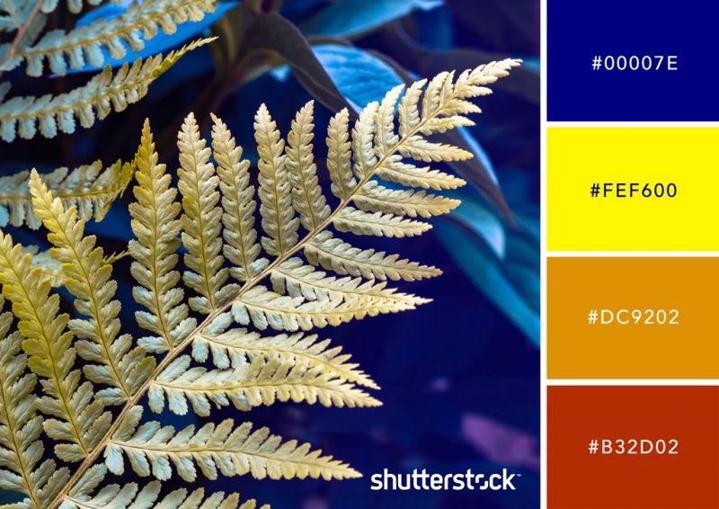
A playful contrast, this palette combines neon Crayola yellow and rich pure blue with the more conventional fall tones of caramel and russet. This palette balances dynamic and cozy colors to create a palette that is both fresh and seasonally comfortable.
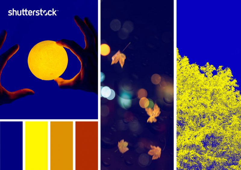
Use this high-contrast color palette for branding and logo designs coming in the fall months.
9. Festival Día de los Muertos
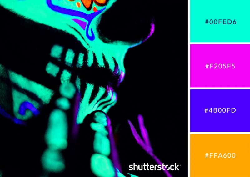
This palette evokes the festive atmosphere of Día de los Muertos, a Mexican holiday that takes place on November 1. Characterized by participants dressed in incredible costumes and makeup, the celebration includes the Families gather to pray for their deceased loved ones.
The holiday is not considered a sad affair, but rather a vibrant event involving parades and celebrations.

This neon palette combines some of the iconic and festive colors of the holiday, with marigold yellow and purple being commonly used in this day’s decor.
10. Acid Gray
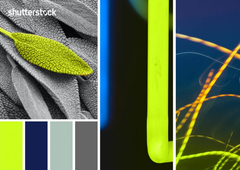
If you’re creating seasonal content for a corporate business and don’t want to use the usual browns and oranges, this scheme feels fresh.

