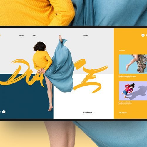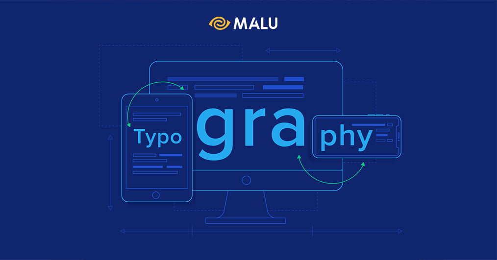
Typography is 50% of graphic design, just imagine: what if a magazine, a brand identity, a label, a traditional publication information and many more non-display-a-character-at-all?
What is Typography?
We start again with the age-old question: What is typography?
From the Greek, “typography” is compounded by τύπος – typos meaning “form” and γράφειν – graphein meaning “writing”. To put it simply, Typography is the art and technique of arranging type. It’s like you’re playing: put the letters together in a way that is as legible as possible, carries as much of the message as possible, and is as relevant as possible… Typography is the process of creating a “graphic image” visually through the representation of alphabetical text, i.e., linguistic and readable images, giving designers a variety of ways to present a product’s message to consumers.
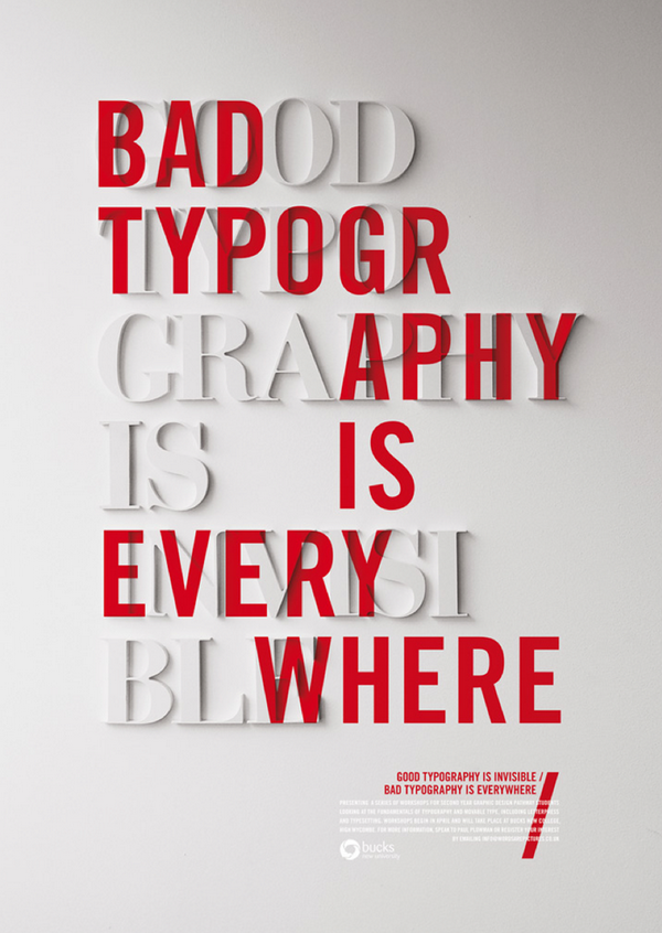
Depending on the purpose, Typography is used for readability optimization – Text typography or for display – Display typography. The effectiveness of the design makes a big difference to how the message is read and perceived through that design. And of course, the Typography effect is achieved mainly due to the factors of font combination, size, spacing and color…
History of Typography
Design history and artistic styles give Typography a variety of typefaces and fonts. There are thousands of different typefaces and fonts available to designers today, everything from screen display to printed text. There are all kinds of digital formats, sizes and printing technologies ready to be used… However, what matters is where the font you are using comes from and what personality it has.
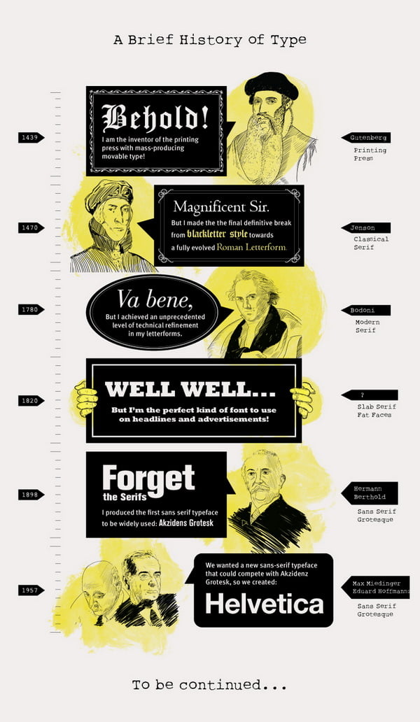
A Brief History of Type – Arthur W. Presser
Text Typography và Display Typography
Text typography is usually multi-letter text. This is also the traditional style and the source of typographic problems, the text is composed to create an easy to read, coherent whole…
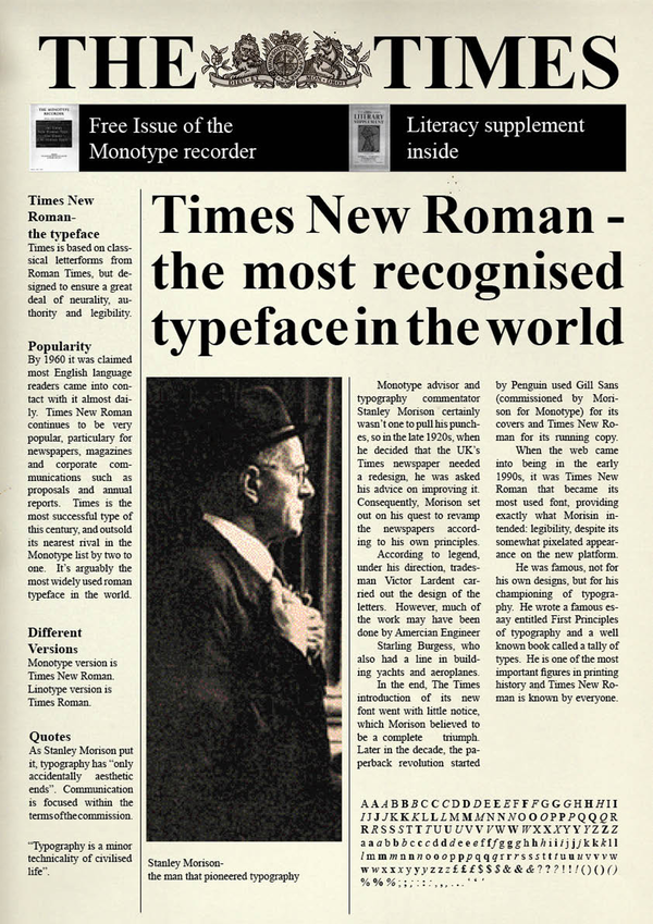
Times New Roman is a popular typeface that optimizes reading
State documents or contemporary books mostly use serif (Times New Roman) typeface. For more specialized requirements, newspaper and magazine pages that don’t have a lot of text space also use serif typefaces that provide maximum reading speed and efficient use of page space. Sans-serif typefaces are often used for intros or short articles. One of the current trends is to combine a sans-serif style for large headlines and a serif typeface for high readability efficiency.
Display Typography has more potential for exploiting graphic design, where there is less concern about readability and more concern about using text as a tool to convey a message or art. Display Typography is combined with negative space ( negative space ), other graphic elements and illustrations… creating the reciprocal relationship between words and images. Therefore, Display Typography requires more than the principles of graphic processing, size and color … to achieve emotional effectiveness when conveying the rhythm and story that Typography wants to be told.
Display Typography includes: book cover design, logo and brand printing, packaging and labelling, graffiti, poster design and large-scale information such as signs, billboards, media products marketing….Typography Kinetic (moving text) is used in television and cartoons, vending machine screens, computer monitors….
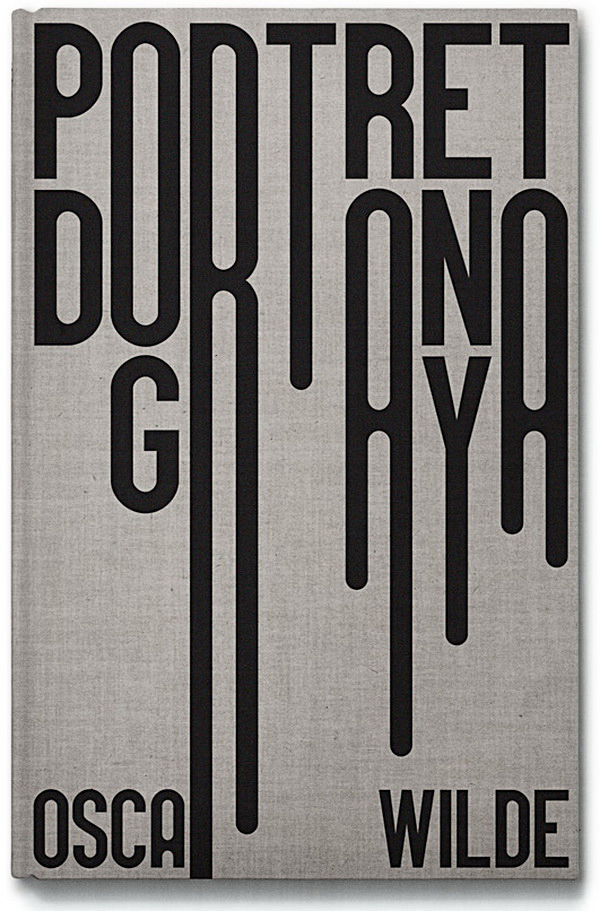
Book cover design is a form of Display Typography

Printing logo and brand
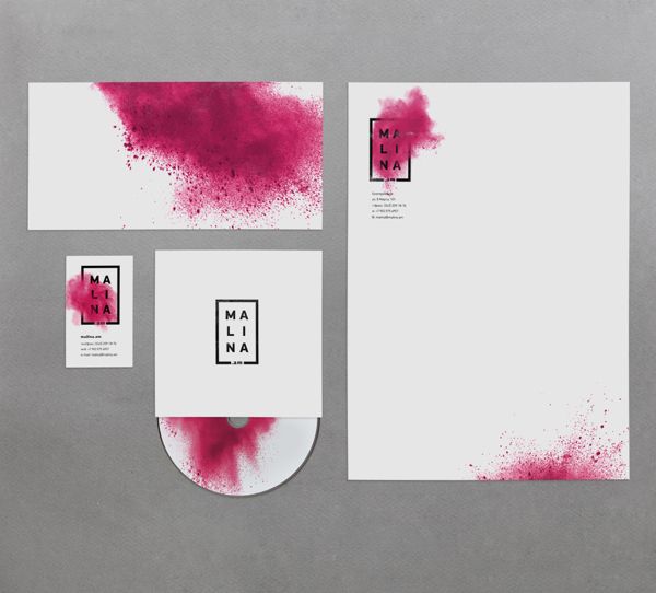
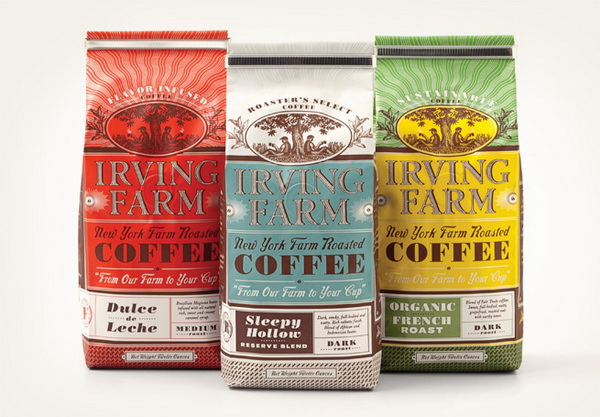
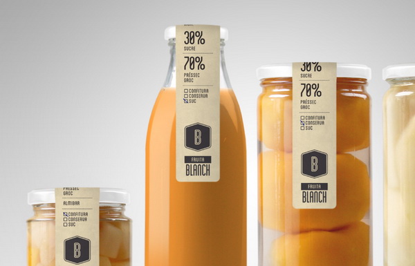
Packaging and labeling
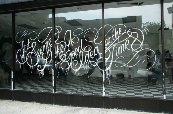
Graffiti
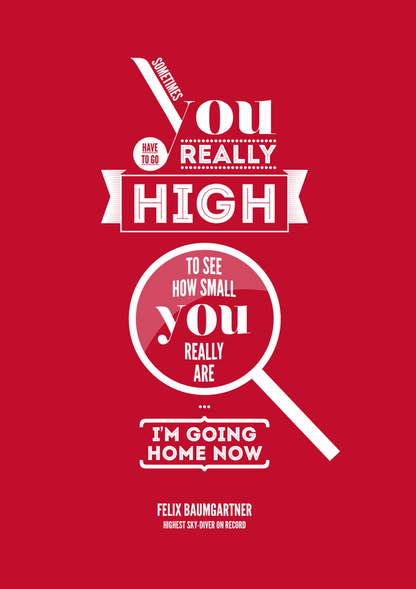
Posters and Advertisements

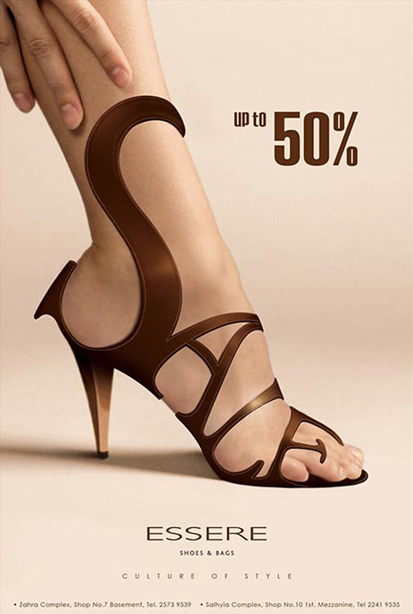
A sale campaign with impressive Typography design
Concepts commonly found in Typography
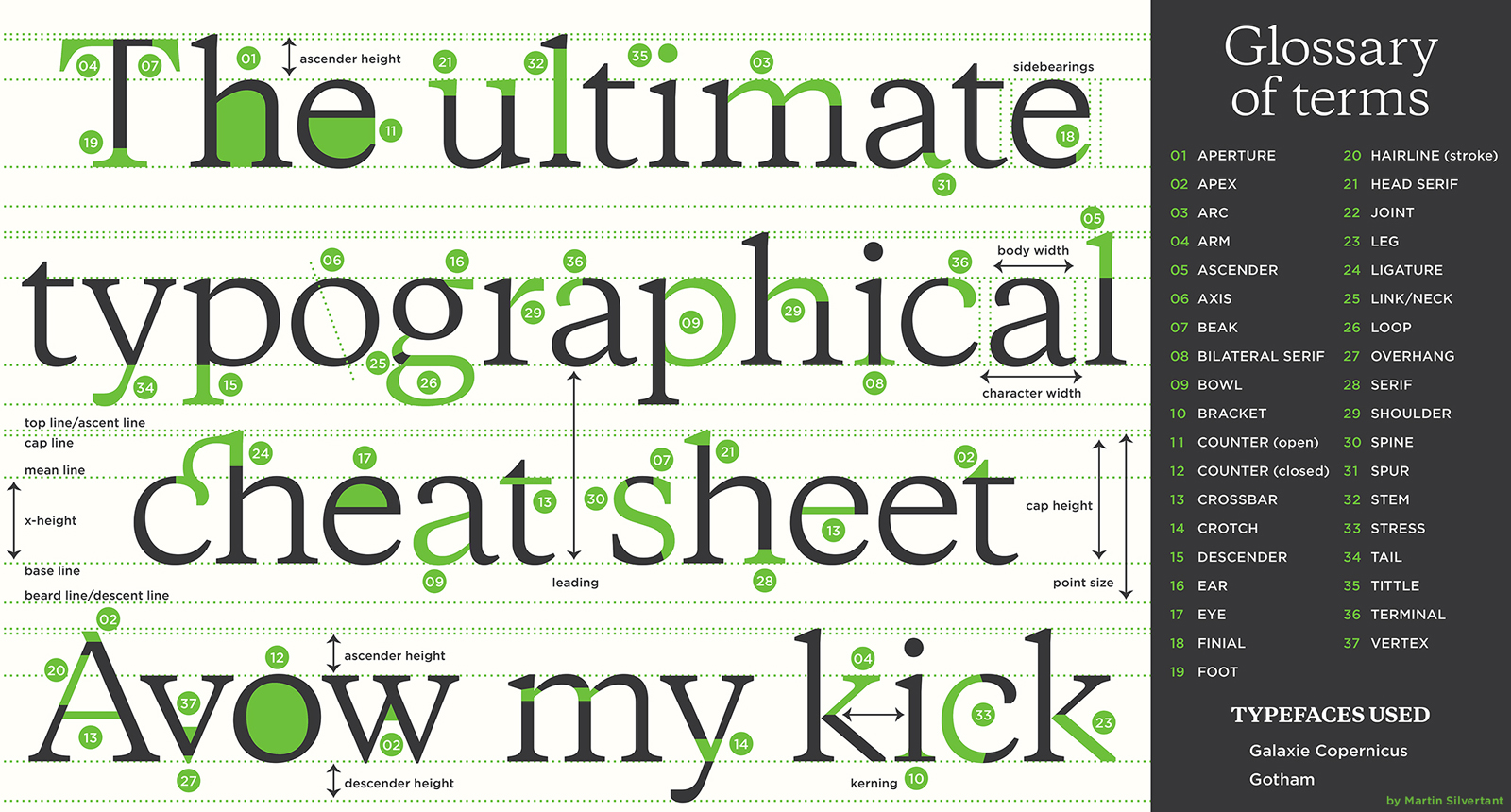
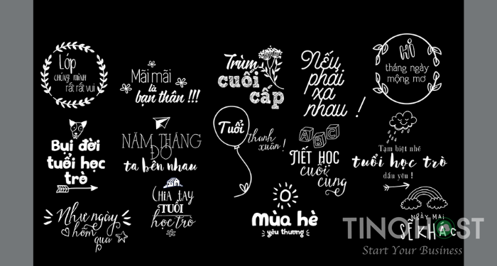
Bored with Typography, that is, you have touched everything to the letter: What is a font? What is Typyface? What is Serif? The structure of the letters… You are even interested in the hand-written typefaces (Hand-Writing) which is a prominent design trend. It is difficult to translate and translate all those definitions into Vietnamese, so let’s take the most specific illustration of the structure of words and concepts – Anatomy of Typography – to make it easier for you to visualize. More about them (click for full-size image):
Requirements for Typography Designers
Typography design is likened to an art in this day and age. Because to get a really professional typography requires a lot of elements from the designer.
Aesthetic thinking
It is not by chance that design is classified as an art form. Because this subject requires a lot of aesthetic thinking. You need to have the eyes of an artist to see the correlation between beautiful and ugly, far and near, big and small, etc. Above all, to solidify individual things into a harmonious, perfect whole.
Creative and sophisticated
Currently, there are many people involved in this field. Your job is to always innovate, be creative, avoid folding frames and old rules. Only then, can you really bring products that attract viewers. But remember to design skillfully and subtly integrate.
Be patient and serious
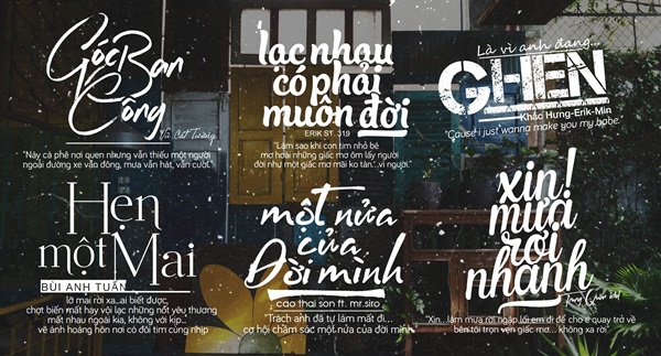
For design professions, art like creative typography, perseverance and seriousness is indispensable. Being rejected, or being conceptualized by design is inevitable in the design industry. Therefore, you should get used to this. And be really patient with each letter designed with absolute seriousness.
Invest and focus
Typographic design is one thing, good design is another. And this distinction requires an investment of your time and energy. You are only really satisfied with the product when you have fully focused on the work. All the effort and effort you put in will get a well-deserved result.
Requirements for a good typography
Agree art is frameless and constantly creative. However, there are implicit rules such as unwritten rules you need to keep in mind in the design, if you do not want your product to become stupid and unprofessional.
Lines
The line in typography design is extremely diverse and unique. There are many different varieties of sugar for you to choose from depending on your personal preferences and intended use. Mainly for the beginnings (ascenders), the endings (descenders), the uppercase letters (capital letters), the lowercase letters (lowercase).
Leadings (line spacing)
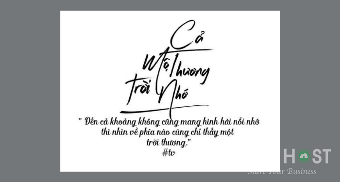
This is an important factor for you to have a desired typography. You need to harmonize the spacing between the lines to have an eye-catching composition. Remember not to be too close or too close to the car to make the viewer feel uncomfortable.
Tracking (letter spacing)
Also known as letter-spacing, letter spacing also plays a very important role in presenting beautiful typography. You should also pay attention to the density of spacing between letters. Avoiding too thick will confuse the reader as well as avoid leaving the space too wide to cause an empty and uncomfortable feeling when looking at it.
Kerning (letter spacing)
If your content has a lot of text, make sure the typography has enough space but not too much space. You should pay attention to every small detail because it is these seemingly innocuous factors that contribute to the perfect overall.
Hierarchy (hierarchy)
This will help the viewer to be able to see the endpoints of a typography, avoiding visual disturbances. At the same time, the effect of hierarchy also helps you emphasize the importance of the message you want to send. Therefore, as a typography designer, you need to be careful with this element.
Alignment (comparing lines of text)
Comparing lines is also one of the layout elements to help make typography vivid and consistent with design desires and purposes. Avoid the cumbersome or careless in arranging the lines of text properly if you do not want your work to lose points in the eyes of the viewer.
A few little tricks that can help you upgrade your typography
After mastering the requirements of a work, you can apply the following few tips to design yourself impressive and unique typography.
- Content hierarchy in order of importance
- Choose a font that suits your style and purpose
- Arrange the layout properly
- Constantly learning and improving
- Join groups and communities to share and exchange
Above is preliminary knowledge for those who are passionate about this art of typography. Hopefully, through the article, you will feel more loved and improve your design ability.
Frequently asked questions
Are typeface and font the same thing?
Typeface and font are actually two completely different concepts.
Typeface is a system of typefaces, where each typeface is a typeface. For example Time New Roman is a typeface.
Font is a set of formatting tweaks of typeface such as type, bold, italic, size, etc. Time New Roman size 11 and Time New Roman 12 are two different fonts.
What are the main groups of Typeface?
There are many typefaces, but there are four main types of typeface: Serif, Sans-Serif, Monoface, and Display.
What is the difference between Sans-Serif and Serif typefaces?
Serif means serif typefaces, i.e. with extra stroke at the beginning or end of the letter. And Sans-Serif is the opposite, meaning the typeface has no feet.
Which typeface is suitable for designing posters, book covers, etc.?
Of the four main types of typeface, display is the most suitable type to design “facades”. Display is also understood as display, so the character of this typeface includes outstanding elements such as: black letter (high contrast), script (copy of elegant calligraphy style), handwriting (handwritten copy, casual closer).

