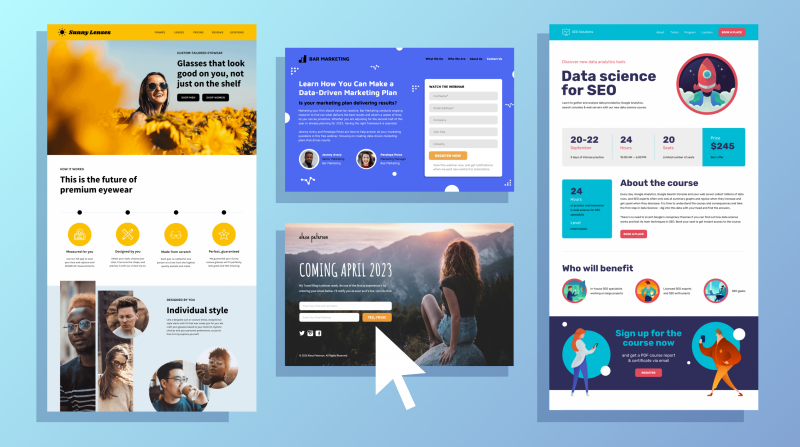
Landing page (also known as landing page) is one of the most important elements in any marketing campaign. Businesses that push the number of landing pages from 10 to 15 can see up to 55% more leads for the entire month.
However, optimizing the conversion rate on the landing page is also one of the hardest jobs for marketing managers. On average, the conversion rate from simple site visitors to business customers is only somewhere between 1 – 3%.
How does this number surpass your business expectations? The answer will lie in the tips that Malu would like to share with you in the next part of the article.
1. Understand campaign goals
Do you think you have the goal of your marketing campaign in the palm of your hand? You may be wrong, because the lack of focus on a specific goal is one of the most common problems businesses face when it comes to conversion rates.
As a result, many businesses become confused when landing page conversion rates are lower than expected.
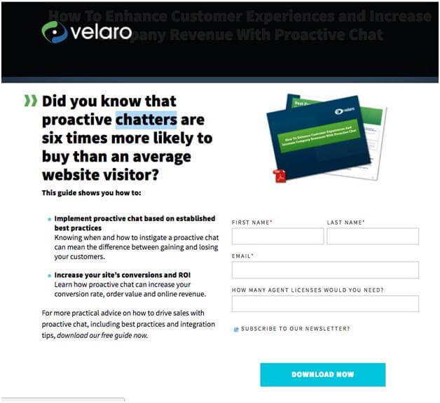
Therefore, the solution for you is: Only focus on a single goal when implementing a landing page. Do you want customers to buy? That should be the ultimate goal when you’re building a landing page.
Other issues such as: Collecting potential customer information, providing useful documents for guests, etc. should be used for other landing pages.
The landing page of the Velaro Live Chat platform could be your best example. The sole purpose of this landing page is simply: Encourage visitors to download the software and generate new leads for your business.
2. Write short and concise headlines
In fact, each landing page only has a few seconds to capture the reader’s attention.
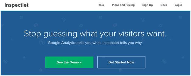
Obviously, a landing page title that stands out, is uncluttered, and straight to the point will instantly get readers interested and spend more time getting to know you.
3. Build persuasive content
No one will care about your landing page if the content in it makes them skeptical and feel unconvincing.
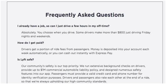
Therefore, preparing content to answer all the questions that users may ask is a necessity to make your business’ landing page more credible.
Placing an FAQ section (frequently asked questions) in the landing page is a smart choice to solve this problem.
4. Use the right image
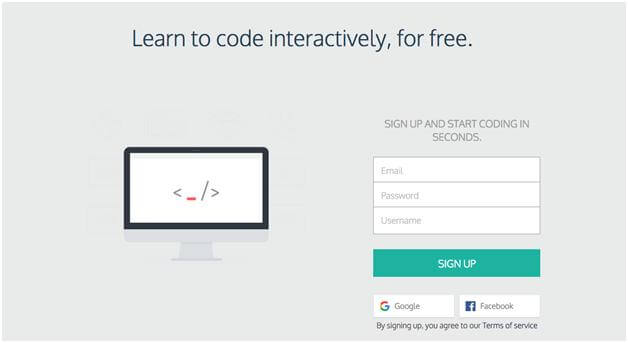
The content is important, but the image plays a decisive role to turn the reader’s thoughts into real actions. You need to make sure: The illustrations in the landing page must have a certain correlation with the content you want to convey in it.
Take a look at the example below from Codecademy. It’s simple, intuitive, and incredibly striking.
5. Leverage the CTA button for a call to action
CTA (Call to Action) is arguably the most important element in a landing page. Obviously, it’s just a button click, but it decides: whether the user wants to take any action after reading the content on the landing page or not.
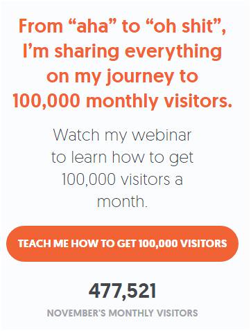
Here are a few tips if you want to optimize the effectiveness of a button click on your landing page:
Color: Make sure the button’s color contrasts with the landing page background color. Usually, green, navy and orange are the right colors to choose for buttons.
Size: Make sure the size of the button is not too small or too large for the content inside the landing page. To know what size is right, only direct testing will help you find the best answer.
Message: The message in the button must show a certain urgency, be concise, concise and easy to understand. For example, “Buy Now” or “See Great Deals” is more effective than a “Click Here” CTA.
> What are CTAs? 8 Types of CTA on Websites
6. Emphasize the benefits that users can get
Let customers know the benefits they can get when using your product/service, more specifically: The benefits they can only get when using your company’s product which cannot be found anywhere else.
One example you might have noticed is the Uber landing page.
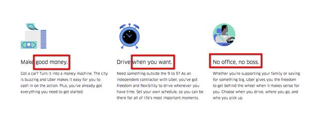
You are a driver but you think you are restricted by the rigid rules of taxi businesses? Your income is low because you have to discount too much money for the business owner? Or are you worried that your work will have to stick to the boring 4 walls of the office? Then you have to choose to work at Uber, where all your dreams will come true!
7. Pay attention to page load time
One important thing: You must control the loading time of the landing page or you do not want to let impatient customers go elsewhere.
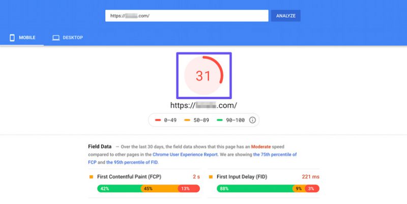
To minimize page load time, you can refer to the Google PageSpeed Insights tool developed and operated by Google itself. In particular, the tips from PageSpeed also help your website improve its ranking in the search list of Google Search.
8. Interested in the form to fill out information
If you want to collect data related to your leads, a fill-in form is just what you need. However, you also need to keep a few things in mind to maximize the effectiveness of placing form templates on landing pages:
For customers who are consumers and households, collecting their email addresses is enough, should not exploit more information.
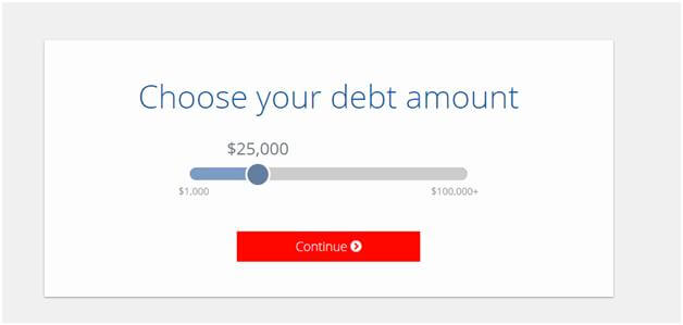
You should use a multi-page fill-in form, instead of cramming all the information into one question page. This can give customers a certain trust, from there, they will provide you with exactly the necessary information.
Note the placement of the form on the landing page. This can affect the likelihood that customers will be willing to take the time to answer the questions you want.
Bills.com, a financial management system, has a smart way to collect information from its customers. Bills uses a multi-page form sheet to slowly gain the trust of the form-fillers, thereby collecting exactly the data they need.
9. Use A/B testing
Using tests is a must to attest to the effectiveness of your business’ digital marketing strategy. A/B testing is the simplest and most effective test for you to determine the right landing page version for your business.
> What is A/B Testing? A Complete Guide to A/B Testing
However, it is important that you choose the right tool to perform A/B testing. In addition, the choice of variables to test is equally important to determine the version that can drive conversion rate. Some tools you can refer to to perform A/B tests can be: Google Optimize, CrazyEggs, Optimizely, …
Optimizing landing pages is not a simple task. Honestly, there’s no one-size-fits-all formula. But with the 9 steps that Malu introduced above, the conversion rate on your business’ landing page will be significantly improved.
If you have been successful in increasing the conversion rate on your landing page, do not hesitate to send Malu your share in the comments section below. Thank you for following the article!


