First World Cup held in the Middle East
World Cup – the biggest football festival on the planet, held every 4 years is always the focus of all attention. In addition to being a place for players to show off spectacular shots, the World Cup is also a playground for designers with unique artworks representing each World Cup. Let’s analyze the unique features of the World Cup 2022 Qatar brand identity with Malu Design!
First Middle East World Cup as Ambassador for the Future
The year 2022 is already history. This is the first time a World Cup has been hosted by an Arab country. This means more than just a new address for the most beloved sports league in the world. Football brings hope, positive change, inclusivity and more everywhere. It changes everything forward. Connecting cultures, ways of life and beliefs, overcoming all kinds of misconceptions. Just a ball, but with unparalleled transformative power.
Qatar welcomes the world and the world gets to meet one of its most ancient cultures. Crafts old and new, smells, tastes, experiences, landscapes – all these are opportunities for dialogue and discovery. Also representing 21 other Arab countries, Qatar is proud to be the host of this global sporting and cultural celebration.
The world amazes with a unique culture and the magic of football
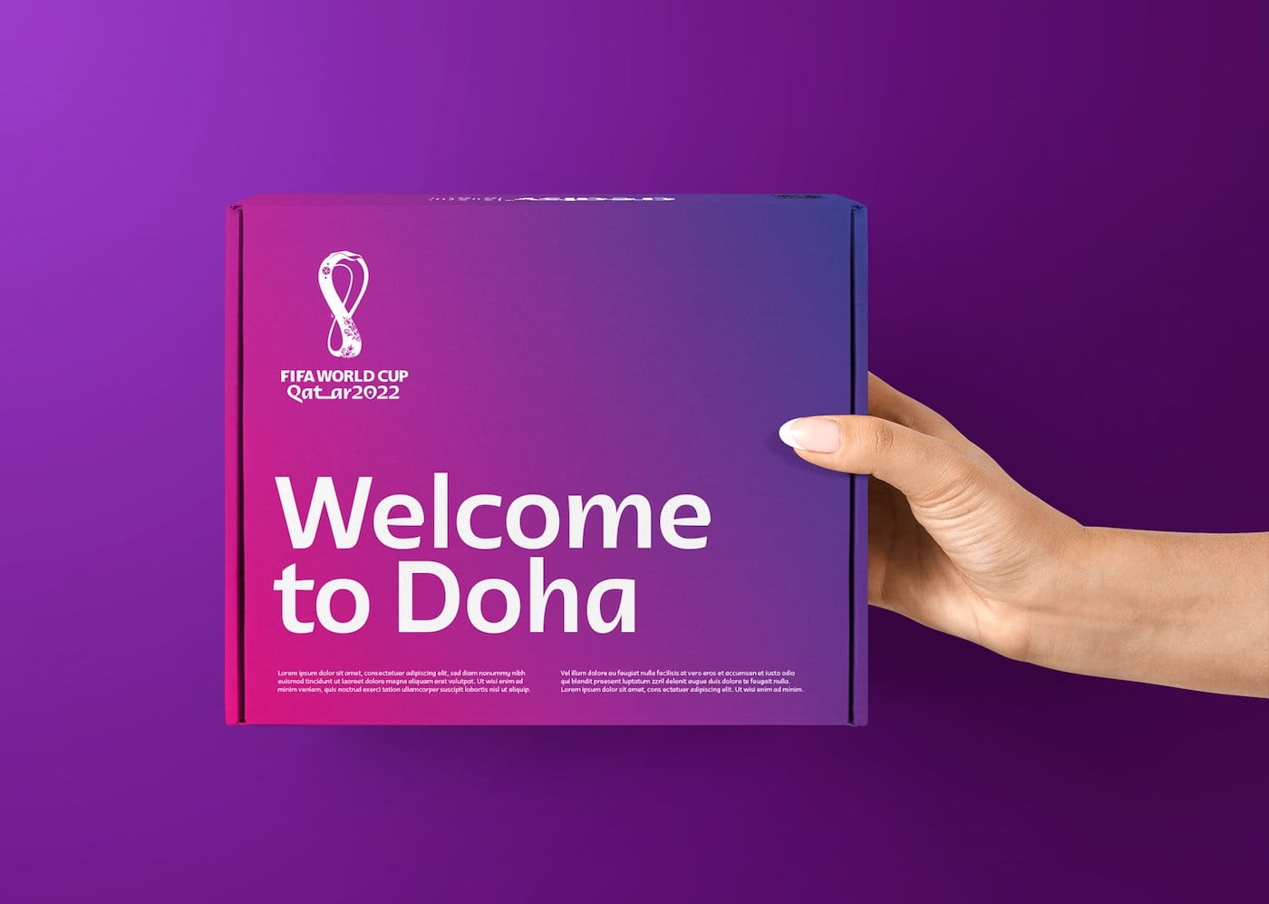
Developed in close collaboration with FIFA and the Local Organizing Committee in Qatar (Supreme Commission on Distribution and Legacy), the FIFA World Cup Qatar 2022™ branding celebrates the welcoming culture and how it will shape the FIFA World Cup™ experience.
Unlock Brands implemented the project for nearly 3 years. Brand strategy, Arabic lessons, 3D design, 2D design, motion design, workshop on Arabic and Latin typography, music and sound design, field trip, Islamic art Teachers, interviews, funny pictures at Souq Waqif. They have to learn and do everything.
PROJECT INCLUDES ONE ITEM
- — Market and consumer analysis
- — Strategic recommendations
- — Corporate identity
- — Brand design
- — Brand content
- — Sports events Branding
- – Branding
- — Brand communication
- — Digital experiences
- – Web design
- — Digital Media
- — Integrated project
- – Advertisement
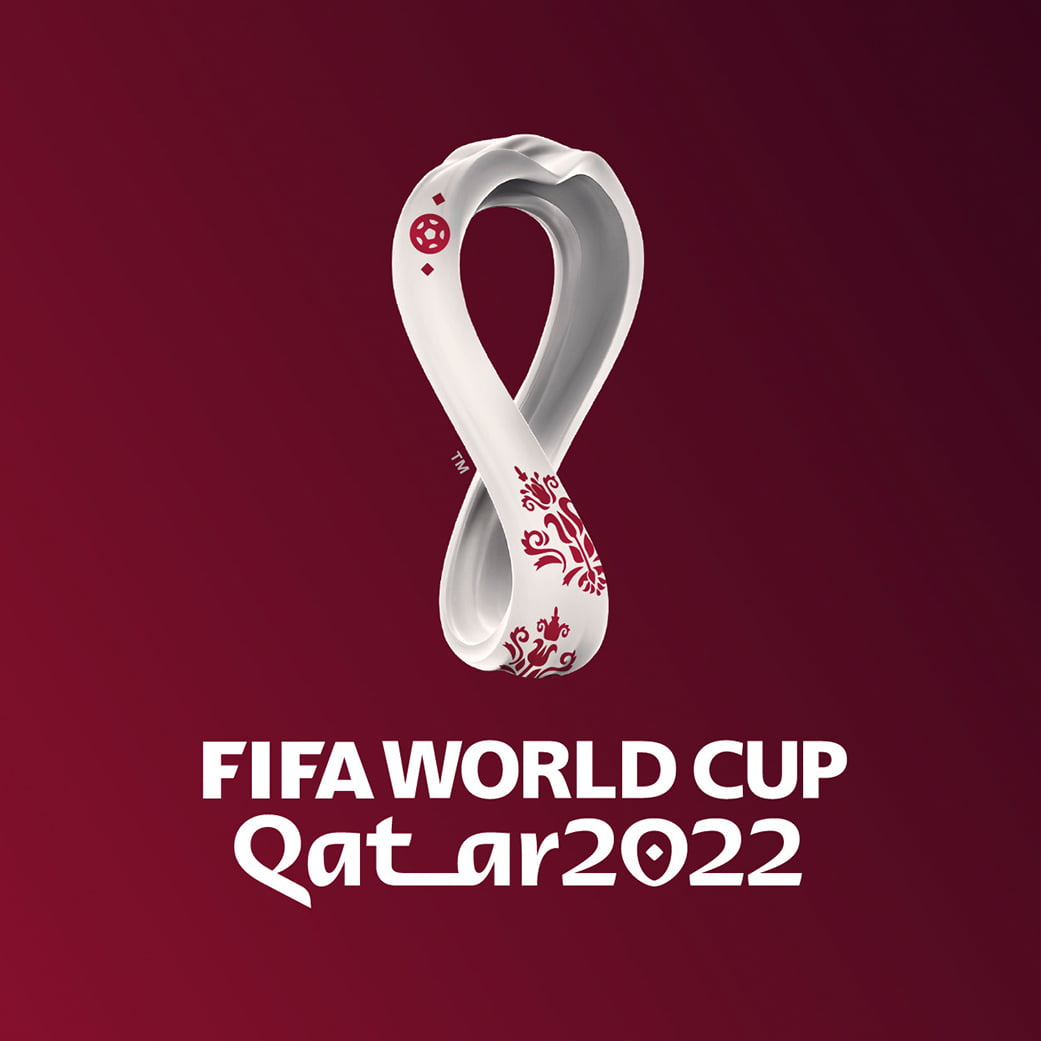
INNOVATIVE EMBLEM
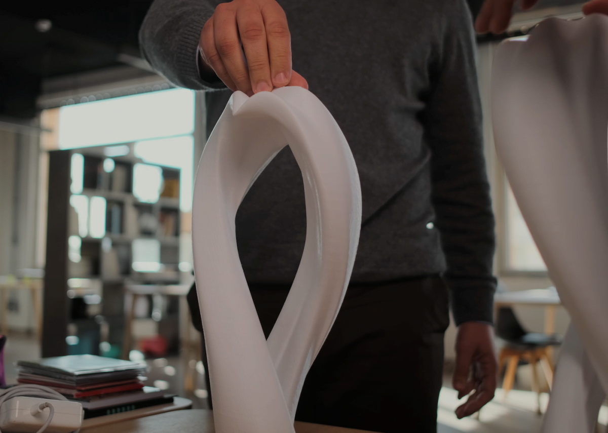
An icon developed to become a real object
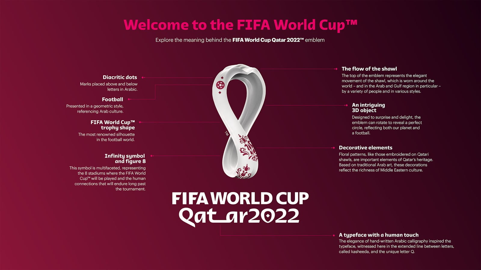
The first full 3D icon of the FIFA World Cup. An endless loop of culture and football, inspired by Arab clothing, the undulating desert dunes and the shape of the Official Cup.
As it rotates, one can see a perfect circle, reminiscent of both the shape of the ball and the planetary scale of its impact.
It also reflects the number (8) of the stadium that will welcome the world in 2022 and the infinity symbol, based on human connections, that will endure long after the event.
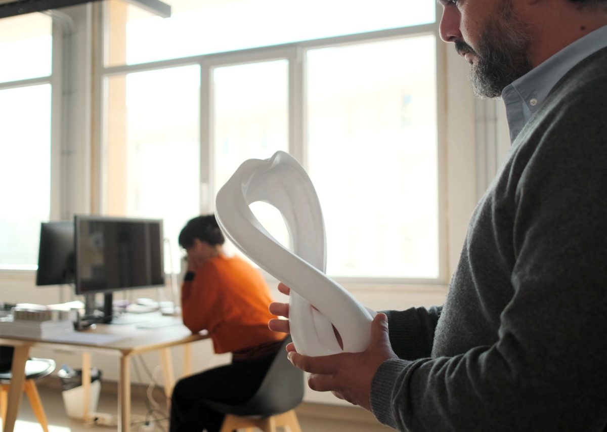
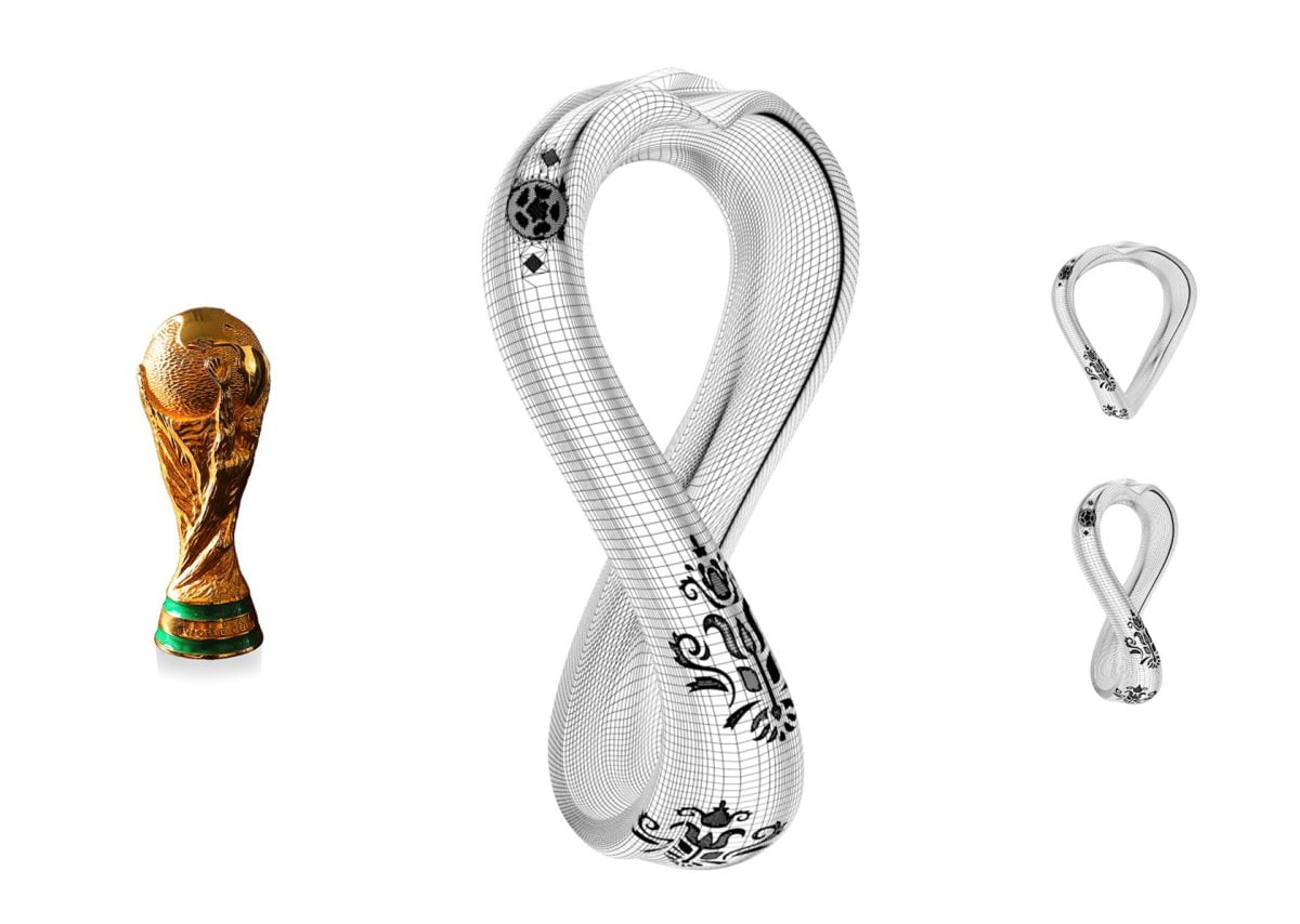
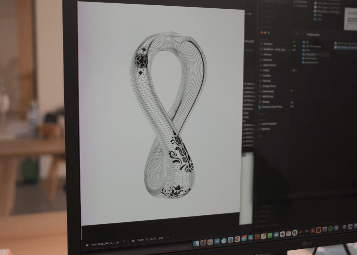
From ancient engineering to a dynamic visual universe
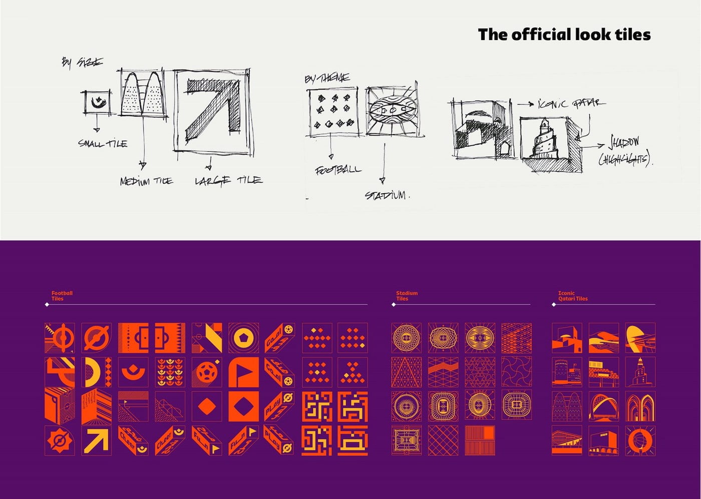
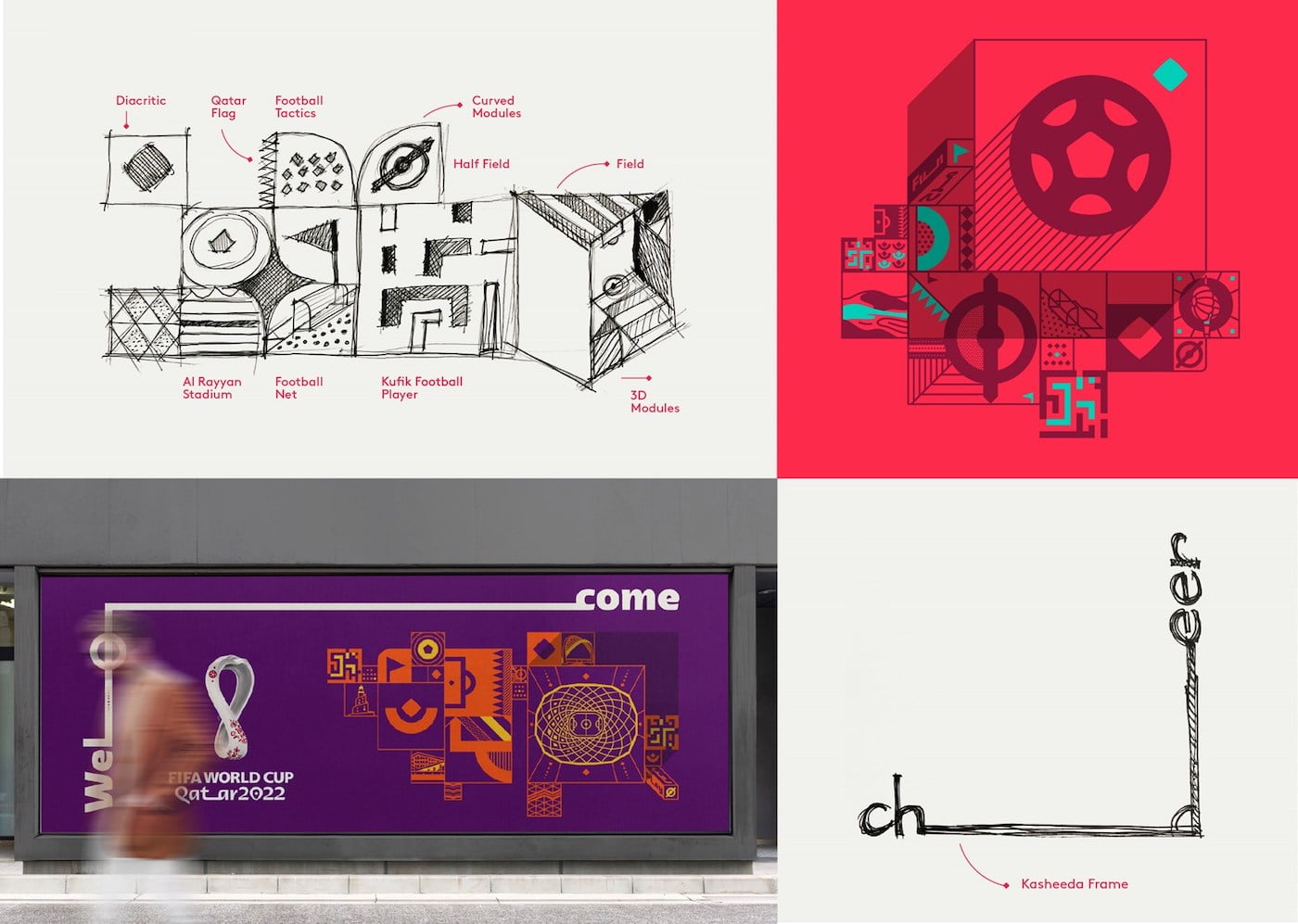
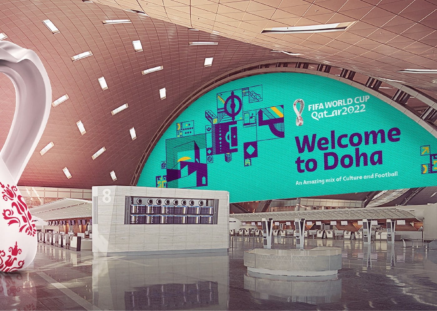
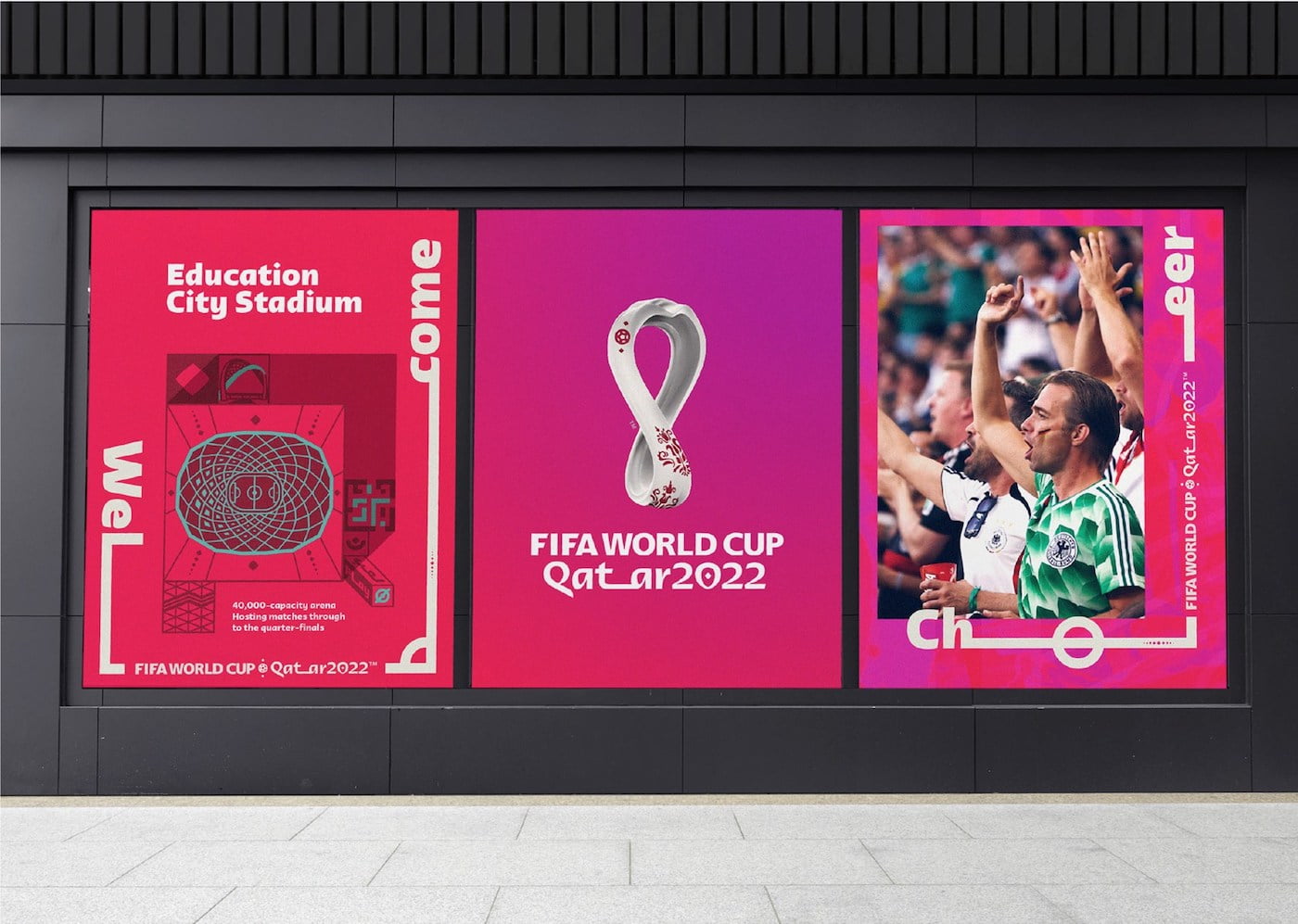
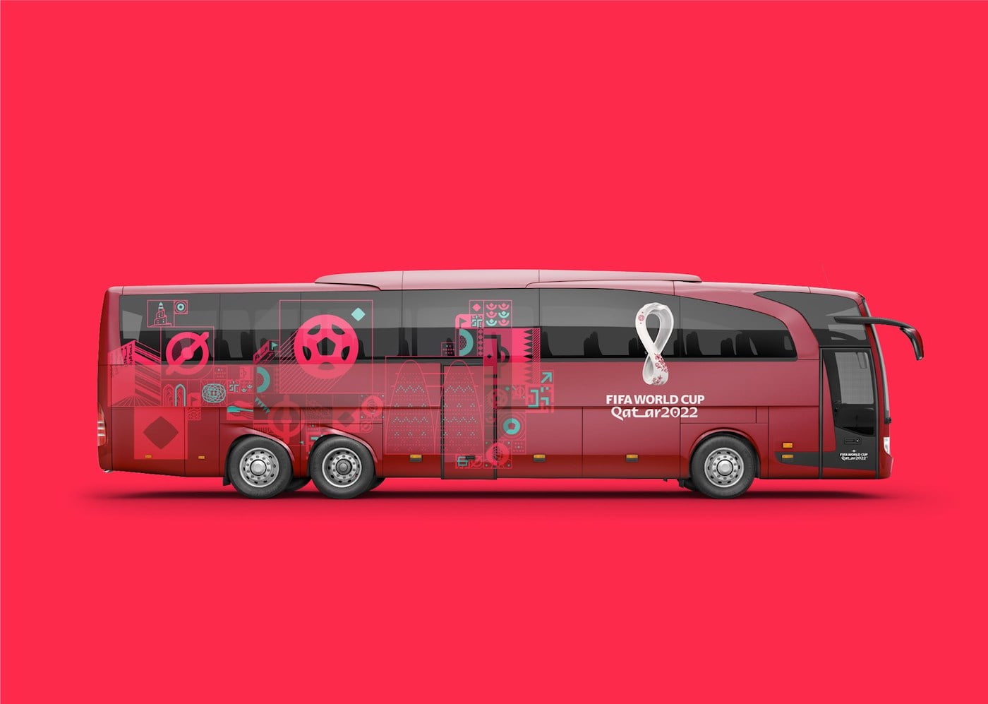
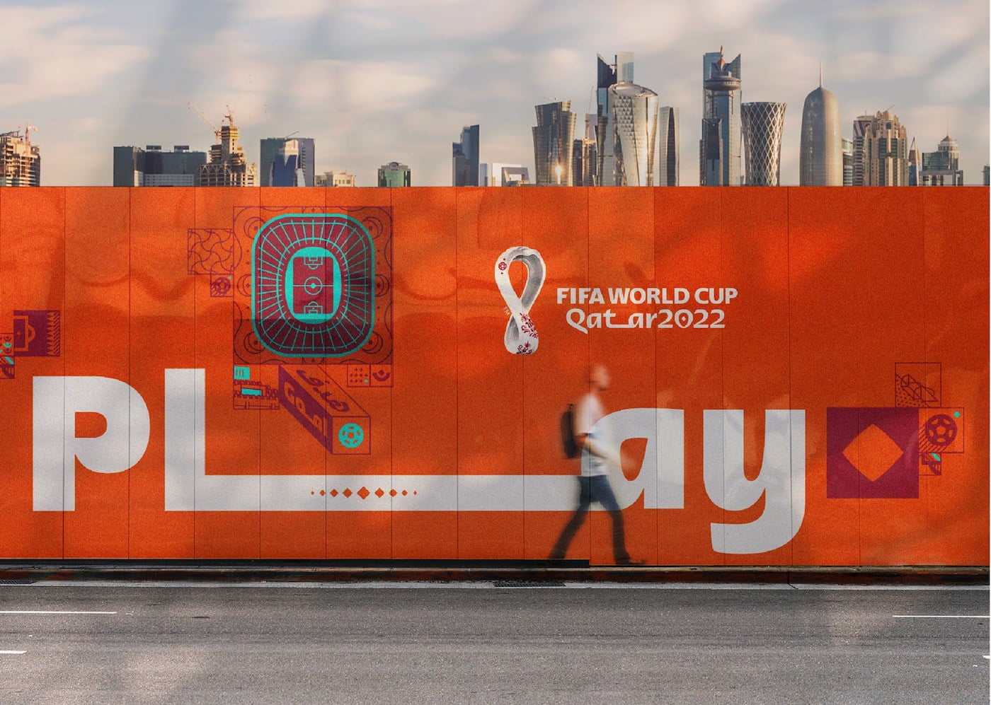
The graphic universe for the FIFA World Cup Qatar 2022™ brand is a unique system. Inspired by the ancient Arabic technique that produced the famous geometric bricks, this graphic universe presents a lot of engaging content, incorporating football, Qatari landmarks, and elements. culture.
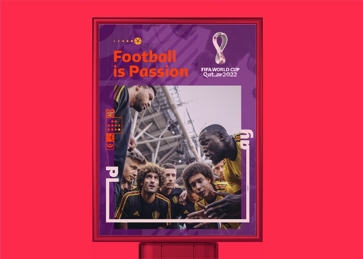
In a simple, square-based grid, these different elements can be arranged into a multitude of layouts, interacting with text and images.
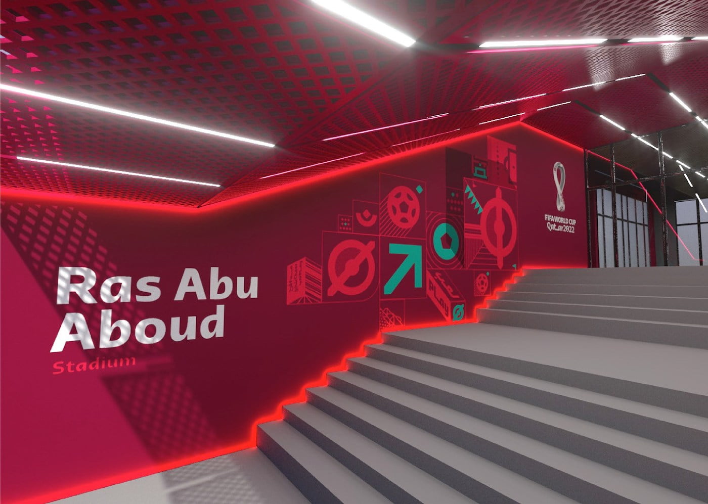
An extended group of hieroglyphs was also developed to support more functional communication needs, such as Signage and Pathfinder.
Emblem animation
Animation of the official logo depicting the desert dunes and the fabric texture of the Shawl, a head scarf used throughout the Middle East and Asia, alluding to the tournament’s single day, from November to December.
The circular motion of the icon emphasizes its unique 3D properties. The “Kasheeda” stretch is the ultimate highlight as it unfolds the ultimate visual identity for the world’s most anticipated single sporting event.
TYPOGRAPHY
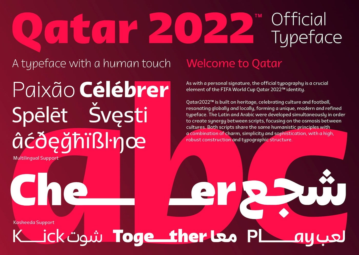
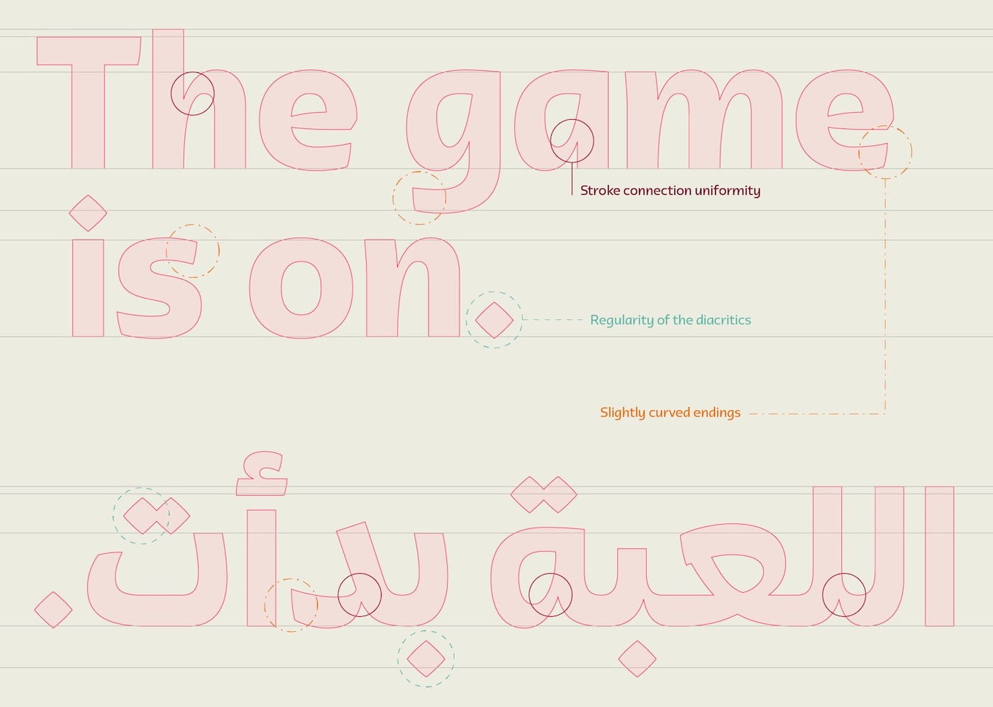
Arabic and Latin, same design
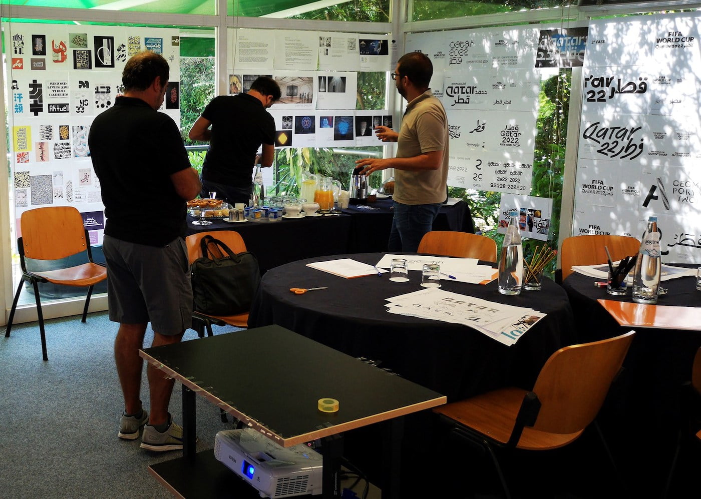
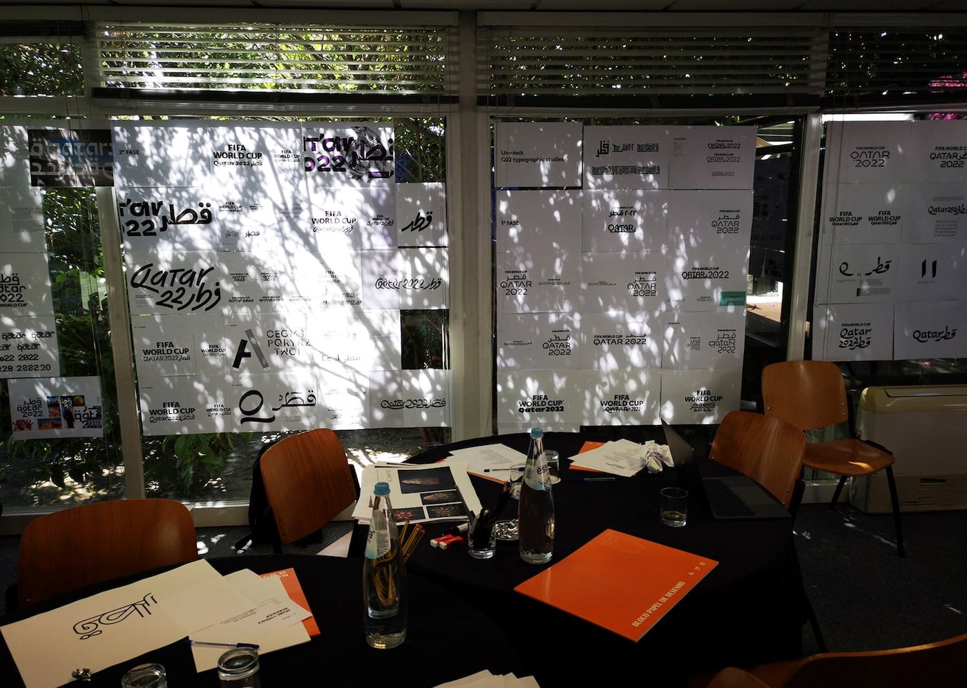
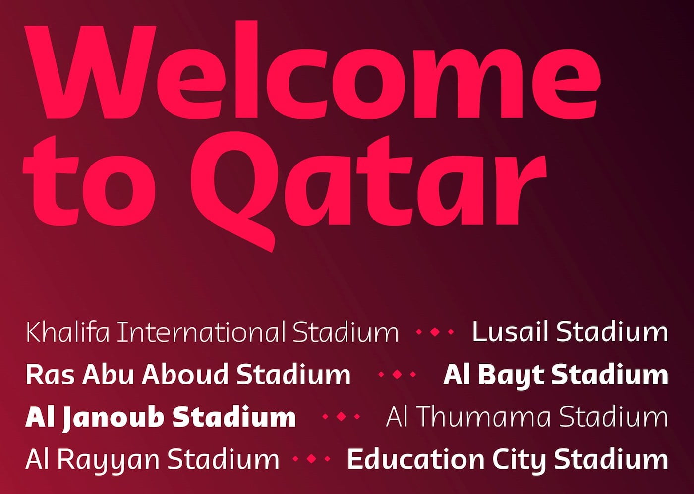
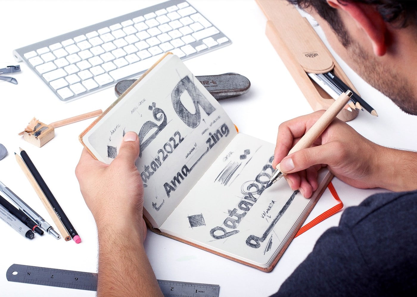
A comprehensive workshop took place to kick off this fundamental project, as it will be key to defining the brand identity and its heritage. Hundreds of exercises and several rounds of tweaking were needed to create Qatar2022™, the Official Typeface for the Qatar 2022™ FIFA World Cup.
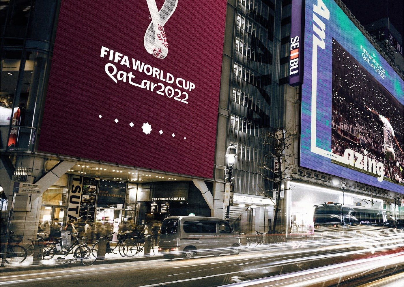
Typographers Dino Santos, Rui Abreu and Hussein Alazaat played an essential role throughout this phase of the project. Arabic calligraphy exudes a flow and personality of its own, with the Kasheeda element – a linear extension of specific Arabic letters – establishing itself as a prominent brand identity element.
The Latin and Arabic versions were developed simultaneously to create synergy between the scripts.
The result is a new, modern, regionally inspired font that blends tradition with modernity.
