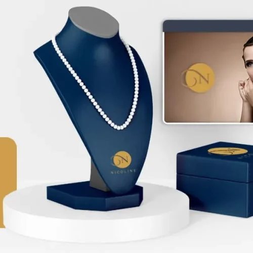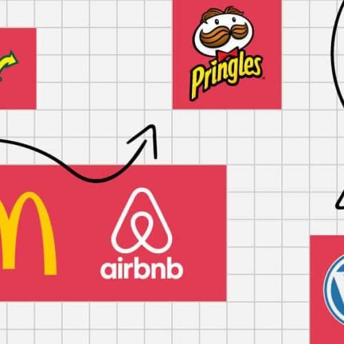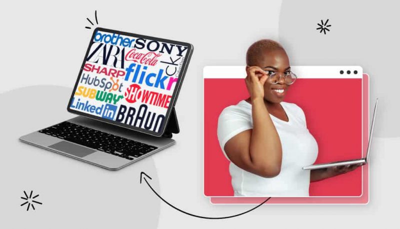
The Wordmark logo is an enduring symbol for any business in any field. Whether it’s technology, fashion, real estate, food and beverage or another industry group that can’t even be named.
Mục lục bài viết
ToggleWhat is the Wordmark logo?
Also known as “Logotypes”, this is a type of logo designed entirely from letters and includes only the brand name. No images, no icons, wordmark is sometimes reduced to only 1 to 3 characters.
However, simple does not mean boring. On the contrary, this type of logo also helps to improve brand recognition. In fact, many big brands in the world are using wordmark logos, such as: Google, Coca-Cola, FedEx, … The wordmark logo stands out thanks to its simplicity and easy identification on all platforms, every platform. size.
When to use Logo Wordmark?
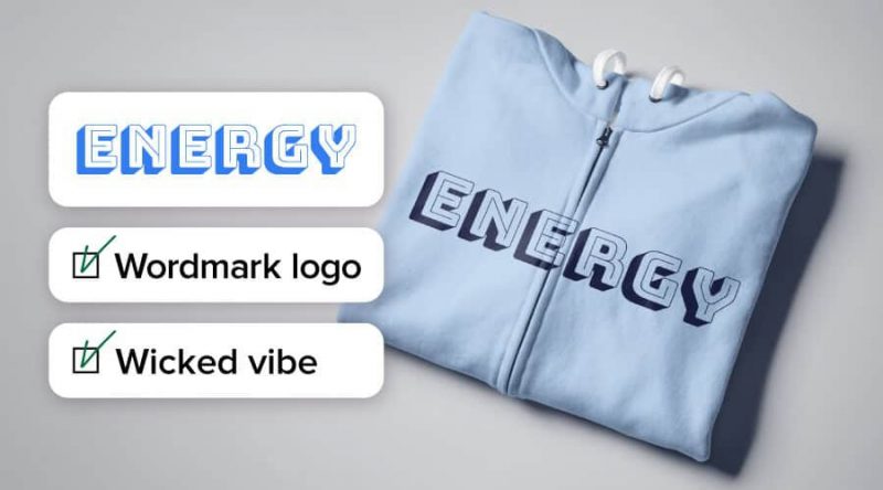
Because it does not include any images or symbols, many people think that this is a faded, unattractive logo type. Of course that is a misconception. First of all, let’s take a look at some cases where wordmark logos are recommended for brands:
Enterprises at the beginning:
When just entering the market, a direct logo like wordmark is not a bad idea. Wordmark logo helps brands build initial identity from fonts, logo colors, etc. When the business position improves, the logo can completely be shortened to monogram logo with the same logo . colors and typefaces.
Short business name :
Ideally, the brand name should consist of only one phrase. If the wordmark is too long, the logo will be confused and difficult to apply on small-sized publications.
Distinctive business name:
Logos emphasize the uniqueness of the brand, but without supporting images, communication messages can be less effective. However, a unique name will make the brand stand out from the competition. Therefore, the wordmark logo is still the optimal choice.
Ready to test many colors:
While typography is key with wordmark logos, color shouldn’t be overlooked. A patch of color can be the difference between an easy-to-forget word mark and one that people remember. Consider using a classic typeface with a color change or using a contrasting color scheme to emphasize your business name.
Wordmark logo design tips
As mentioned, simple does not mean boring, if designed properly. Here are a few tips for you when starting to design a wordmark logo:
The most important factor: Typeface
The selected typeface will be the key to best express the personality of the logo. Instead of creating a logo with messy meanings that cannot be conveyed to the public. People have strong connections with typeface and often seek empathy through the character, design, and style of a given object. Therefore, fonts with their own personalities play a huge role in shaping how the public perceives the brand.
Before going into choosing the right typeface for your business, there are a few terms you need to pay attention to:
Weight: the thickness or thinness of the characters in the typeface, can also be bold, italic, lowercase, …
Casing: characters in lowercase or uppercase, or just capitalize the first letter, …
A wordmark consisting of all capital letters with high thickness will create a sense of seriousness and rigidity. Another logo with thin lettering is more attractive and easy to read. Think carefully about the message the brand wants to convey to the public to choose the most suitable typeface.
In addition, there are 4 main font types commonly used in logo design: serif, sans serif, slab serif and script.
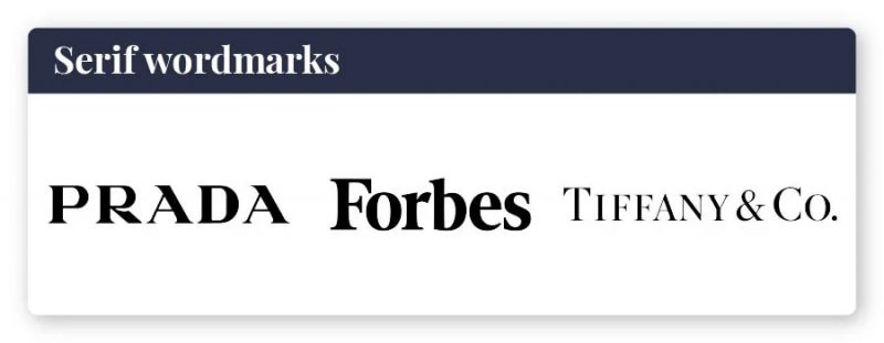
For example, serif fonts in wordmark have brands like Prada, Forbes.
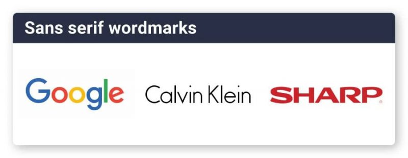
Sans serif appears in more modern brands like Google, Calvin Klein.
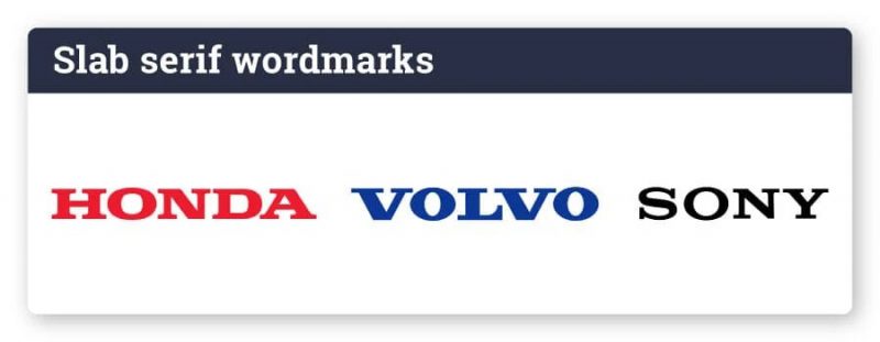
Slab serif includes Honda, Volvo – often used by brands that want to show bravery, strength and confidence.
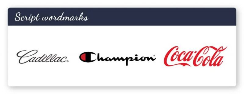
Script fonts bring sophistication and high personal impression, like the logo of Cadillac, Coca-Cola.
Remember, before designing your own logo, it is also important to learn and analyze how competitors are doing.
Notice the Kerning and Tracking of the characters:
Kerning and Tracking are two design terms that refer to spacing in a font, but each concept has its own differences.
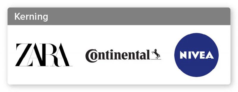
Kerning : spacing between characters, independent letters. The higher the kerning, the further apart the letters stand and vice versa. Adjusting the kerning helps the logo to keep its proportions and make it more eye-catching for the viewer.
Like Zara’s logo, the letters almost overlap and the Nivea logo is more discrete. Both designs are intentionally kerning adjusted, creating balance with the original font.
Tracking : also affects the spirit of the design relatively. Look at the stretch of text in the Avon logo, which is different from the Brother logo – the letters are next to each other. Avon feels like a pioneer and Brother is reliable and safe.
When designing, kerning and tracking need to be guaranteed to be as eye-catching as possible.
Font size is important:
Design has its own information hierarchy in which large objects often attract more attention. When designing wordmark logos, an interesting variation lies in customizing the size of some characters to be larger/smaller than others. This technique can be applied to a single letter, as in a Braun or the Beatles logo.
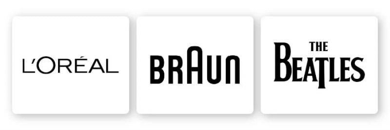
Get creative with the font size to highlight the aspect of your logo that you want the public to notice the most.
Create your own signature for characters:
A good typeface is not only about the typeface but more than that. Although adding markup details to a logo is not always easy to apply in practice, there are some situations that still make the wordmark stand out.
Like the Vans logo, the V-head extends across the entire face of the lettering to create a sense of movement, moving forward – perfect for the skate brand. Or the Hubspot logo, which even integrates an image between the letters. The image of branches extending from the letter “O” symbolizes the multi-platform marketing channel that Hubspot provides, thereby helping businesses develop more in all aspects.

Use color wisely:
Color is just as important as font in creating an impressive wordmark.
Humans associate colors with emotions both on purpose and unconsciously. Therefore, when choosing a color scheme for your logo, think about the message you want to convey and which colors will best convey that message.
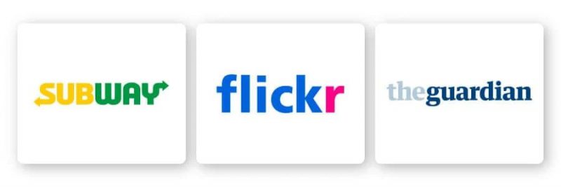
Also, notice that each of the above example logos can only have a maximum of 2 colors. Because simply, the fewer colors selected, the easier it is to control them. Subway and Flickr both divide the logo into 2 separate color parts. Meanwhile, The Guardian chooses the same color tone but creates a contrast with lightness.
Finally, make sure the color scheme you choose is helping to accentuate the font. For example, if the typeface is already fun and dynamic enough, the colors can be subdued and vice versa.
Don’t forget to combine cubes:
Last but not least, consider incorporating shapes into your logo to add personality to your brand. Shape can help an important aspect of a brand stand out. Like the way the oval surrounds the word “Sho” in “Showtime” or the Z in “LaZboy”.
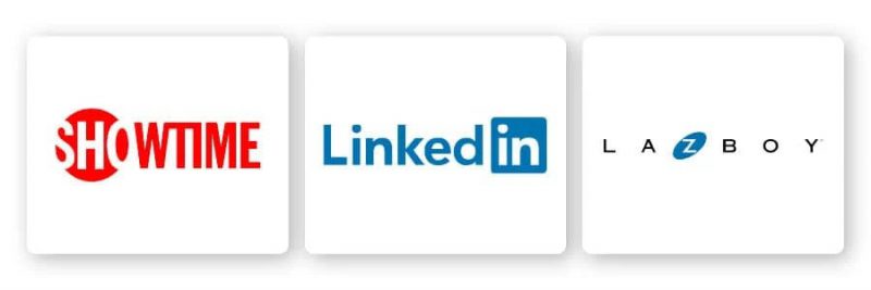
Squares and rectangles add boldness yet balance to the logo. Circles and ovals symbolize stability and unity, while triangles have more meanings, depending on the context.
Simply using straight or horizontal lines is also a way to express strength and growth. Vary different shapes and consider what might be ways to help reinforce the brand message . As long as you don’t complicate and mess up the design.
Message for you:
Wordmark is a rather monotonous logo form compared to other genres. But that doesn’t mean they’re underrated. Wordmark focuses on detail and precision, so it has the power to create a design that is versatile and individual.
Not sure how to design a workmark logo? Try Malu Design logo design

If you are looking for a reputable and experienced unit to be able to design a professional and impressive logo and brand identity system , then please contact us immediately by phone. 0988 622 991, or leave your information and requirements, Malu Design ‘s consulting department will contact you right away to answer all your questions!
————————
Malu Design – Branding Identity Agency
Hotline: 0988 622 991

