Certainly, the path for amateurs to reach the “superior” in the field of web design is full of challenges and thorns. Therefore, we would like to present to you a handbook of 10 tips to be able to design an ideal website interface (including do’s and don’ts when starting to design). To be able to “hegem” in the field of website design, you need to know the 10 requirements below.
>>> The secret to designing a beautiful, professional and attractive Website ; App design – software interface design ; Use the 60-30-10 rule of color in UI design
1. Clean up the clutter on the website interface
First, you need to know the mistake any designer can make, which is design clutter. Before embarking on design, designers always prepare a list of things they need. And of course, they want to put everything they feel is necessary on the homepage.
Essentially, with each element you push to the homepage, it distracts from the rest. If you push too many unnecessary elements, users will have a hard time finding what they need, in general, reducing their surfing experience.
On the contrary, if all the elements you push are necessary and well organized, the elements will complement each other, increasing the surfing experience, prolonging the visit time and reducing the bounce rate. user.

“A lot of space in the Website means neatness. This is especially important and necessary to design a neat, tidy and minimalist Website” – Slaviana
Look at how Slaviana – a professional designer – designs her Web site. On it there are only elements such as: navigation bar, logo , tagline, CTA button and a few elements to respect the function and image of the product. There are other elements, of course, but it is organized and neatly arranged so that the homepage is never too “cluttered”.
For an effective Web design, you need to lead the client in a specific and clear sequence. There are many ways to direct users along the “path” you have outlined, but the number one priority is always: highlight the most important elements and remove the unnecessary elements.
Should:
1. Remove unimportant elements: Immediately remove those elements that do not improve the user experience, or push it to another page, but absolutely do not let the Web’s homepage become cluttered and cluttered. .
2. Limit pull-out menus: With cursor-style menus and options appearing, they can reduce clutter to your Web site. But too much is not good either. If possible, only 7 indexes should be used at most.
Should not:
1. Use sidebars: New visitors definitely won’t click on sidebars. Not to mention if they don’t fit the screen, you have to remove the selections in the navigation bar. This is not good at all.
2. Use slides: Using slides to switch between images (as well as movement in images) will distract users. Better yet, you should just use still images for all situations. Users will pay attention to the content, and more importantly, not be distracted by unnecessary elements.
2. Leave plenty of room for design
Do you need to fill every gap on your website with cumbersome, entangled, unnecessary information? Or you just leave those gaps, isn’t everything more open and “breathable”.
Negative space (or “white space”) is a term for textures, or images that have the effect of not attracting the attention of the reader. Usually, white space often contains no information, or images such as the sky without clouds, the wall without texture. It sounds monotonous, but if they are used purposefully, these spaces serve to direct attention and complement the “central character”, improving the reading experience and making the image more appealing. should be more “comfortable”.
“My motto when designing is: Simplicity is the best. It directs the reader’s attention right to the things that matter most. And, simplicity is always very seductive.” – Hitron
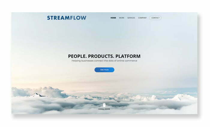
The image above is a prime example of the aforementioned design motto. In the design for Streamflow that only includes taglines, the CTA buttons are the focus, not because they are flashy or embellished with striking details, but because of the “space” that surrounds them. Detailed information is pushed down to the sections below to help customers have a more specific view of the business and their development vision. Simple but extremely beautiful, that is the effect that space brings to the interface design of the website.
Should:
1. Surrounding the most important elements are “white spaces”: Customers’ attention will focus on these elements.
2. Avoid using unnecessary graphics: Unnecessary textures like typography, or complementary colors only distract the viewer’s attention.
Should not:
1. Emphasize the wrong element: Use “space” to emphasize the right element. For example, if your goal is to direct the user to the purchase page, don’t use “whitespace” to emphasize your logo, or other irrelevant information.
2. Use too much background detail: As mentioned above, “blank” should really just be a literal space. If your background has too many details, it will “rob” the viewer’s attention from the most important details.
3. Direct the user’s attention according to the visual layout system
“Visual hierarchy” is a term for visual layout systems, which are hierarchical based on importance from high to low. For example: The most important information, attracting the viewer’s attention should be enlarged, bolded and placed at the top of the Web page, information such as business address should be minimized and placed at the bottom of the page. Web. This is the order in which designers need to arrange to direct users’ priorities when accessing a Website.
But designing a website interface is not simply about adding elements to a Web page, it is also about how you add elements. Add a CTA button, that’s not enough. It’s a designer’s job to get customers to notice that button and click it. Elements such as size, color, placement, and “space” can all increase or decrease a customer’s time spent on the Web.

Shearline is a prime example, on the home page of the business prioritizes three elements: the title, the image of the product, and the CTA button. The rest of the elements, like the navigation bar, the logo, and the explanatory subtitle line, are placed behind. This can be considered the “Visual Hierarchy” that every designer needs to follow, to direct the user’s attention to the most important factors.
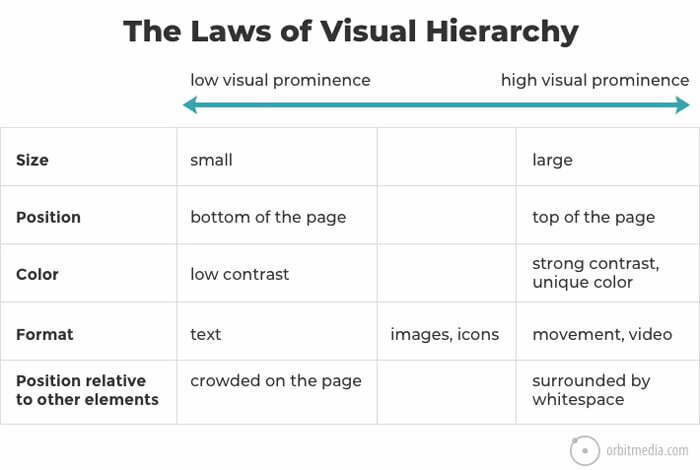
Orbit Media Studio’s breakdown above shows how you can draw users’ attention to the elements that matter most.
Should:
1. Design that highlights the most important details: Most users don’t have time to read every word on a web page. You need to prioritize the most important factors. From there, design them to attract the most attention from customers.
2. Use Multiple Alternatives: Since the “Visual Hierarchy” you build for a Web site can be very complex (because of the many elements that need to be arranged when designing), you need to do lots of trial and error. . You can use many different methods (like A/B testing and plug-ins; or create different versions) and choose the one that works best for you.
Should not:
1. Using “equal” elements: The system needs to be arranged in order of top and bottom, according to the level of importance. The arrangement of elements in the same direction will prevent the viewer from paying attention to the most important elements (because users will not read all the information on the web, they will only pay attention to the elements that are important to them). most attractive).
2. Beyond the framework: Do not design details that are too large, have too many color contrasts. Use factors that stimulate the reader when absolutely necessary, “within the allowable framework”.
4. Choose the right colors for the interface with the right strategy
Now that you have a better view of the arrangement and organization of the elements in the interface design of the Website, we now go into more detail on each element. Let’s start with color, a powerful tool for any designer.
Each color gives a different feeling to the reader. If you want to convey the enthusiasm and energy from your own brand, you should use red for the website interface, instead of using the background blue. In addition to considering color choices, you need to master how colors blend together, and how they blend with surrounding textures, to highlight the most important element in the overall page. Web.
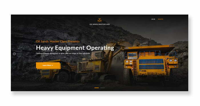
“To properly use colors in Web design, you need to understand the composition of a color, and how they combine and combine with each other. Harmony and balance are the keys to success” – Desinly
Like how Desinly used orange for her Web design in the example above. First, orange is a smart choice, because it has a connection with the specialized industrial equipment that the Oil Sands Masterclass company is selling. But more importantly, they match the black and orange background of the Web page (and make it stand out, too).
Desinly also uses a consistent color scheme for the keywords and buttons of the website, making it fit and match the background frame.
Should:
1. Set “priority order” between colors: Each color is selected for the elements, sorted in order of priority, from the primary element, the secondary element, and less important elements (like background)
2. Color consistency: Once you have chosen an appropriate color scheme for your design, use them consistently, from the most important elements to the background.
Should not:
1. Choose the colors you feel like for the design: Clearly color plays an important role in the marketing strategy. Use it as a way to convey the message your business wants to deliver, not because you feel it’s beautiful. Take this opportunity to promote your brand.
2. Choose colors that do not harmonize: It is not enough to choose each single color, you need to consider the harmony between them. Purple and red may work well to convey your business message, but they look pathetic and ugly when combined.
5.Don’t take the wallpaper lightly
If you intend to use a photo for the background of a Web page, be careful in arranging and using them. A beautiful, meaningful photo will convey the quintessence and beauty of the business on your behalf. A bad photo can “pull” you into the abyss.
“Photos always show the connection between the brand and the message it wants to convey. The image it creates can create contrast, draw attention, or direct the user to the next section of the Web” – JPSDesign
Of course, using photos in Web design requires you to comply with the general requirements of photography. An artistic photo displayed in the exhibitions will certainly make a strong impression on visitors. But the theme and style of the photo must match the message you want to convey through the Website.
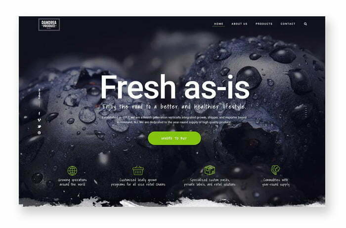
Take a look at the JPSDesign blueprint above. The blueberry picture above looks delicious, but more importantly, it’s a great fit for a catering business Web site.
Should:
1. Use “real people”: Many businesses when using photos for the background often use actors or photo models. The advice here is that you should use photos of employees, or customers of the business. That helps your photo really connect with the viewer.
2. Choose the photo with the atmosphere that best fits the message you want to convey: If your business wants to convey a cheerful, upbeat atmosphere, just push a photo where everyone is smiling, is enough.
Should not:
1. Use “fake” photos: Obviously, you can go to Google and choose a photo that you feel conveys the atmosphere and message of the business. But what if the customer learns that the beautiful photo is just a Google product that anyone can use? Remember the important thing you need to keep in mind here is the bond between your business and your customers, don’t lose it!
2. Use low resolution photos: This is the digital era where photos can reach resolutions up to 4K. Blurry, jagged photos will give customers a bad impression of you, thinking that your brand is old, outdated and less successful. You can completely use modern image compression tools to reduce the resolution, both suitable for the design and solve the problem of increasing page load speed, optimizing for SEO.
6. Take care of typography to elevate your brand
In addition to the power of the pen you convey through the slogan , you can completely elevate your brand by using the right typography.
If the content of the Web is considered the beauty of a girl’s soul, typography is the charm of her appearance, Typography is not only the individual fonts, it is also the size, color, degree italic, bold, and spacing between characters. All of the above will contribute a lot to the customer’s experience with your Web site.
“Typography is seduction from appearance. But just like a pretty girl, if you use fonts that are too confusing, they can make it difficult for the reader to focus on the content and business message you want to convey. Combining the beauty of typography with minimalism is the key to success. – Studio Ubique
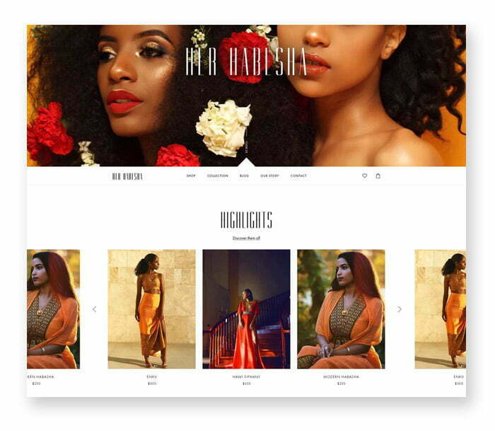
Like color and photography, typography comes in many different schools and styles, so choose the style that best suits your brand. Adding a bit of sophistication to Her Habesha’s design, designer Studio Ubique has raised the brand to a new level, more luxurious, more aristocratic. But notice the sans serif fonts Studio Ubique uses for the subtitles, that’s the balance.
>>> Refer to the right color for the brand
Should:
1. Use digital “friendly” fonts: Among the dozens of options, use fonts that are user-friendly for digital platforms. Because our customers will use the aforementioned platforms and devices to access.
2. Learn the schools of typography: Learn them to grasp their uses and how to use them properly.
Should not:
1. Overuse of flashy fonts: A prominent, attention-grabbing font is very effective for an individual headline. But if you overdo them, you can distract your viewers and lose focus.
2. Use 1 font for all: Obviously, using 2-3 different fonts will help your Web site become diverse, less boring, and even more balanced. For titles, subtitles, and body text, you should use 3 different fonts and be consistent with them when designing.
7. Navigate users logically
Finally, we come to the feature section: what businesses can bring to customers. We start with the navigation bar – the backbone of any Website.
Each designer may use a different approach to the design post. A good designer will build the navigation bar so that it can provide the best user experience. The more convenient for customers, the better for the Website.
But this is not an easy job. It starts with the organization and arrangement of the entire Website: like what will the homepage have, how to navigate to the subpages, what should or should not be on the menu bar? Each question is solved, the interface of your Website design is improved.
Therefore, your goal when designing the navigation bar is to make the customer experience the website of your business in the most convenient way.
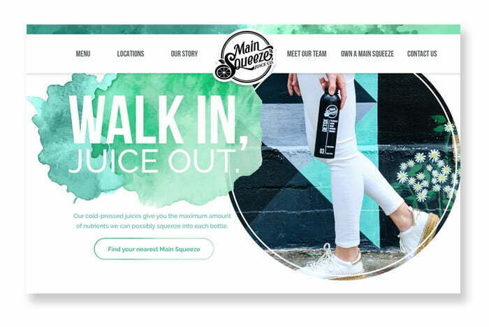
Should:
1. Find a balance between navigation options: You obviously want to give users the most options in the navigation bar, but you also don’t want to confuse them with dozens of other customizations. together. “Balance” them by grouping them into different groups, but remember that they must be grouped to bring the most convenience to the user.
2. Create a navigation bar based on users’ Web surfing habits: When buying shoes, they will certainly look for them in the “Clothing” section, some people will find them in the “Accessories” section. Obviously, different customers will have different search behavior. You can pre-test with a few users before releasing the final design.
Should not:
1. Experiment with an unusual interface : While trial and error (by testing a “weird” Web interface) can help you edit and bring many interesting new ideas, it may not be suitable for you. suitable for building navigation bars on the Web. You need a simple interface, helping users to easily perform operations when surfing the Web: the navigation bar at the top, the logo pointing to the home page, the search button with the icon of a circular mirror, …
8. Optimized for Website interface design on mobile
Many designers think that Web design is a concept for desktop platforms. But reality shows, today most people tend to surf the Web on mobile platforms. That’s why you should consider the compatibility of your designs across different mobile environments. This is not only related to having a lot of mobile customers to access your website, but also related to SEO Marketing on Google (which directly affects search rankings on Google).
“Mobile responsiveness” is a term used to refer to the compatibility of your Website on mobile platforms. If your website does not work well on mobile, it will bring a bad experience for users. In addition to coming with smaller screens, the mobile environment also includes many requirements for developers, including “swiping” while surfing the Web.
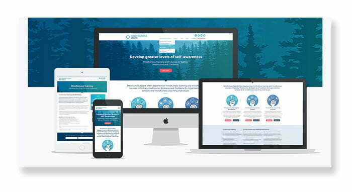
“Today, designers need to pay more attention to the compatibility of designs on mobile platforms. More people access the Web on mobile compared to using their desktop screens. Therefore, a design that cares about compatibility with the mobile environment is an effective design. Focusing on minimalism, neatness, and eliminating redundant details will help users focus more on the content” – Ink’d
Maybe the mobile version should be your number one priority from the start. But that doesn’t mean you neglect the desktop version. Your website needs to be perfect on any platform. Take a look at the example above by designer Ink’d – it’s absolutely perfect, whether on a large or small screen.
Should:
1. Design for mobile first: When you design for mobile, you know what elements are important in your design (because of screen size limitations). This makes it easier for you to design, like adding additional elements to the desktop environment, instead of having a headache thinking about which elements to leave out in case you design the desktop version first (and try to limit it). forced myself to remove in the mobile version).
2. Mobile device selection based on user behavior: The “mobile” platform here includes a variety of mobile platforms ranging from Apple’s iOS operating system to Apple’s iOS operating system. Google’s Android. Even though all mobile devices use the Android operating system, each mobile screen has a different display of content. You need to understand customer behavior, to identify mobile devices you need to prioritize for design.
Should not:
1. Using the Web as “m.dot” : Websites on mobile phones that have an “m.” in the domain name is the beginning of Web design on mobile platforms (before designers really cared about mobile users soon surpassing desktop users). Therefore, websites with the form “m.” often load slower than usual, and there is not much benefit in improving SEO marketing performance . The right choice here is to design a Website that is compatible with all platforms, instead of separate designs for each different type of platform.
9. Make the text inside easy to read
Web interface design that puts too much emphasis on the visual aspect can affect its “readability” for the viewer. If you choose a beautiful font that no one can read, you are greatly reducing the accessibility of your Web site to customers.
An easy-to-read Web page here consists of the following three elements:
1. Good content: The text content you show in the design must convey the message the business wants to send to the reader, in the most attractive and attractive way.
2. Satisfying aesthetics: The text must be aesthetic, both attractive to the viewer, and have plenty of space and good spacing between characters. Help readers not be “flooded” with information when reading them.
3. Easy to see: Both the font and the font size must support the reader’s reading of the information, the text must not be blurred, or jagged (affecting the ability to receive information).
While legibility is largely related to typography, you also need to consider other factors such as paragraph layout, and the combination of lettering and other design elements (visually). .
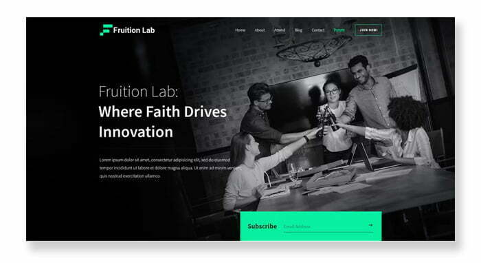
Having a beautiful web design will mean nothing if no one can read the content you want to convey. Designers akorn.creative know this philosophy by heart. Take a look at the design above by akorn.creative as he uses a contrasting font color to the background, making them easier to read for the viewer.
Should:
1. Pay attention to the combination of colors: Recognize the interaction between the text color and the background color of the design. You should pay attention to the visibility of the text to the human eye, especially for people with vision problems. The advice here is to use a contrasting color between elements (like text with a background color). Or if you find it difficult to choose colors, use the familiar black-and-white tone.
2. Test on different readers: What readability you think is fine for one person may be difficult for another. You should test with many different objects to get the best results.
Should not:
1. Use hand fonts, or colorful fonts for body text: These fonts are more suitable for titles or headers. When displayed with body text, it is difficult to read them in small, line-to-line terms. You should use simple fonts for body text.
2. Avoid using “wall” of text: A long piece of text, as much as a “statue” is something that should be avoided when designing Web. With a paragraph with long content, you should divide them into small paragraphs, or remove redundant details.
>>> How to choose the perfect font for Website
10. Convey the right message you want to send to the reader
Obviously, website design is not only about technical aspects, it is also how you communicate and convey your message to your readers. Convey exactly what you want to convey to the customer, that is what completes your Web design.
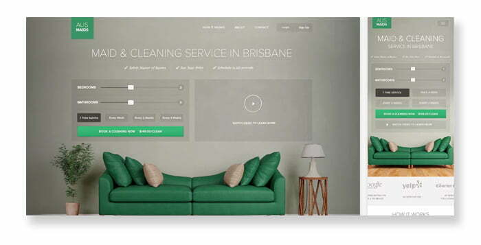
In the Web design above, the akdcreative designer knew that the client wanted to set the room number and cleaning frequency right on the homepage, so he placed this feature on the homepage of the AUSMAIDS Website. An idea that is both smart and understands the needs of customers, helping to enhance their Web surfing experience.
Should:
1. Plan before you design: Write down what you want on paper before you go directly to the design. This not only helps you remember the message you want to convey, but also gives you a foundation when designing based on the above message.
2. Think outside the box: Think outside the box of a designer. Because website design is not only creating a beautiful picture, it also contains the message you want to send to customers.
Should not:
1. Communicate the message in a general or vague way: You need to convey the message in a specific way, as specific as possible. Ambiguity can lead to mystery, but this isn’t an art gallery where people have to rack their brains to figure out what you want to say.
These are just the very basic concepts of website design. Hidden behind are many concepts and principles related to color scheme, typography, elements and compatibility of the Website on the mobile environment. Knowledge is the ocean, an invaluable treasure, learn more about Web design, one day you will become a “hegemonic” in this field. Hope you find it useful after reading these 10 tips to be able to design an ideal UI/UX standard website interface.


