If you think designing a logo is an easy task, you’re probably not a designer. Even for “pro” people, designing a logo is always an arduous process. It goes from research, expertise to implementation with a lot of weight and measure.
Just a few small mistakes can ruin the process and the final product. Therefore, predicting problems that may arise in the logo design process will help a lot.
Below, Malu has listed 10 common mistakes in logo design that designers should not miss:
There is no clear procedure:

The brainstorming process can generate 30, even 300 ideas. However, without specific guidelines, it is nearly impossible to refine which ideas work. As a result, we fall into a vicious cycle and lose time.
To save everyone’s time and effort, make the process clear from the start.
Confused terms:

The design process cannot go smoothly if no one understands who is saying what. Therefore, make sure that the terms are explained and understood correctly. Logo is so familiar, but the definitions that develop from it: Logomark, Wordmark or Combination mark are not well understood by everyone.
Logomark: An image that represents the brand (for example, Nike’s swoosh or Apple’s apple)
Wordmark: Logo includes the brand name but is more stylishly designed (eg Coca Cola or Gucci)
Combination mark: A combination of both elements (eg Puma)
Not researched enough:

Logo design is a core communication process between a brand and its customers. How can a brand story be conveyed with just one image? The deeper you study, the easier this task becomes.
New designers “wet feet” into the profession, or impatient brands often jump right into the brainstorming stage and ignore knowledge. In most cases this will result in ineffective logos.
So when is it equipped with enough knowledge? Try building a Brand Audit survey to evaluate brand goals and vision as well as communication activities. When there is enough data like that, the creative brief will be much more organized and effective.
Color the logo first:

A good logo should be good even if they stand alone – that is, without color. While color is an extremely important factor, coloring the logo in the first place will sometimes hinder the process of evaluating product quality.
Designers should design logos with 2 basic colors, black and white first. This makes it easier to filter and shorten options. Once you’ve settled on the last option, refer to the following on how to choose the right color for your brand.
Use the same Typography for Wordmark and other branded assets:

With wordmark, you will want to go for a simple and clean typography. Still, they can’t be as sketchy as Arial size 12. Why is that? Wordmark needs to have a certain uniqueness and distinction. Because it embodies the brand image. Of course, using simple typefaces is not a bad thing, but they need a little more personalization.
>>> Refer to more articles: Types of Popular Fonts and Usage
Using images that are too common:

It sounds obvious, but it still needs to be repeated. There’s nothing more dull in design than the use of all-too-common images. For example, a handshake represents community spirit. Or electric bulbs represent ideas. The problem in logo design is that it has to carry the brand’s own imprint.
Inappropriate image use:

The most terrible things often come from the very small details. This is especially true in design. Shapes and white space ( negative space ) help reinforce the brand message. However, in many cases, they backfire. There have been many logo designs that have been decoded into offensive, inappropriate images due to shapes or negative space. Of course, it was misinterpreted from the original intent.
The solution is to always consult with others. Because designers themselves are often too immersed in the product and can hardly notice the mistakes.
Logo lacks applicability:
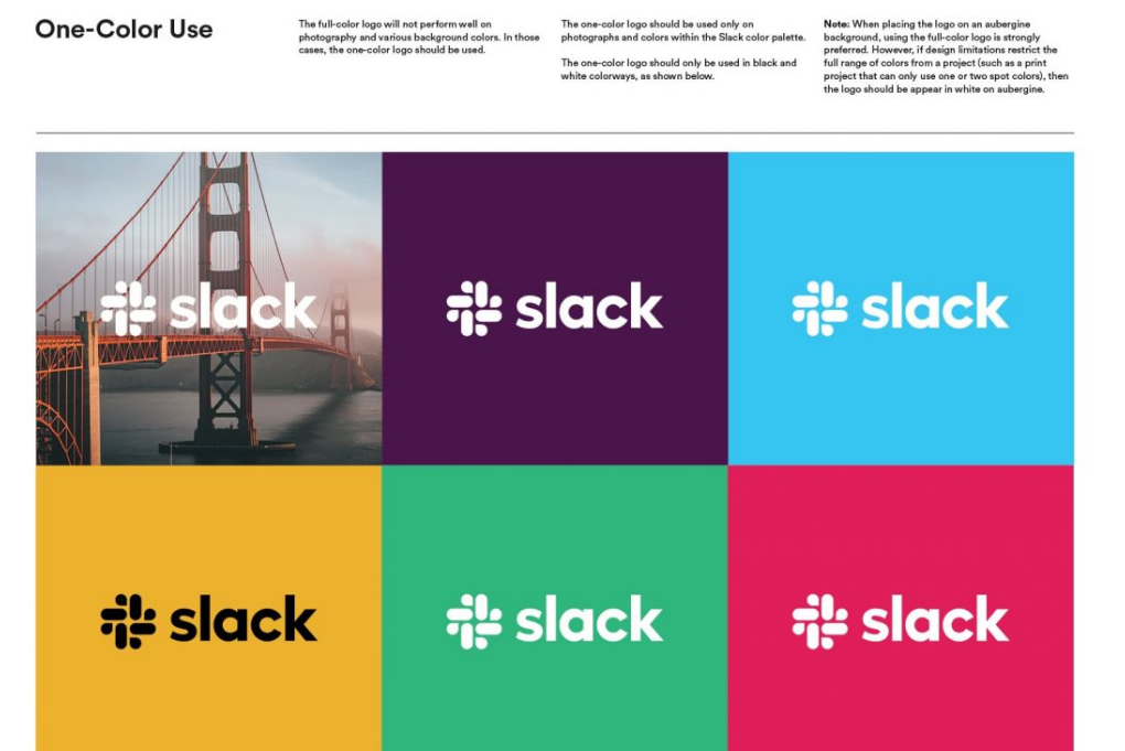
The logo will be used in many different forms. It needs to stand out in both print and online media, and in a variety of sizes. If the logo is too complex, when rendered to a smaller size, problems often occur. An effective logo is like a timeless mark – growing with the growth of the brand.
Failing because of following the crowd:
Everyone wants their logo to stand out and be different, however, it can be quite difficult not to get caught up in the trends and common standards of the industry. This has been further corroborated in recent years, as the industry has gradually become more homogeneous.
For example, designer James Edmonson from Oh No Type Comapny pointed out similarities in famous logos as follows:
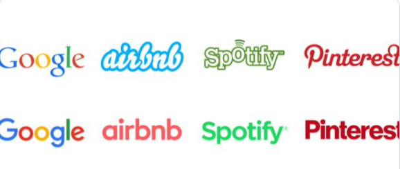
It’s not always good to follow the trend. Remember that the logo is trying to create communication with the customer. It’s important that you explain why certain elements can reinforce your brand’s goals.
Do not provide logo guidelines:
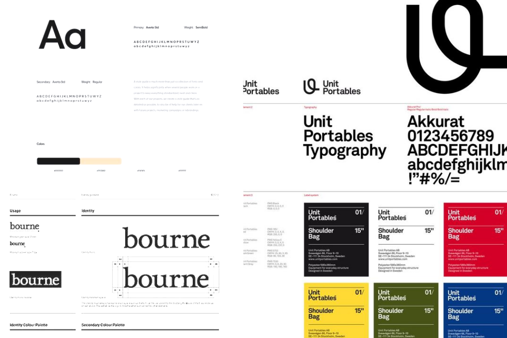
This is one of the most common mistakes beginners make. Don’t put all your efforts into designing a great logo and then ruin it by letting people use them indiscriminately, without specific standards or guidelines.
Please read the article about Brand Guidelines to understand better!
—————————————————————————————————————
Hopefully, with the above information, your logo design process will go smoothly and effectively. If you still find it difficult, contact people with long experience in the industry like Malu’s team!
If you are looking for a reputable and experienced unit to be able to design a professional and impressive logo and brand identity system , then please contact us immediately by phone. 0988 622 991, or leave your information and requirements, Malu Design ‘s consulting department will contact you right away to answer all your questions!
————————
Malu Design – Branding Identity Agency
Hotline: 0988 622 991


