If you are studying or doing work related to design or art, you must have heard of the concept of Flat Design. Flat Design is one of the favorite design styles. So what is Flat Design? Let’s find out through the article below.
What is Flat Design?
Flat Design is also known as flat design style . This means that this design style does not apply 3D effect elements, but only uses simple details, expressed on a flat surface as well as focusing on color combinations to create designed products. complete design.
In the field of graphic design , Flat Design is used to design websites, applications, … or in print graphic design. Since its inception, Flat Style has always been favored and is the choice that many designers love.

Currently, the design industry has grown more outstanding with many new design styles being born, but Flat Design is still one of the most popular design styles today, chosen and widely used.
Pros and cons of Flat Design style
Each design style has its own advantages and disadvantages. And flat design style is no exception. Let’s find out more details with Malu through the content below:
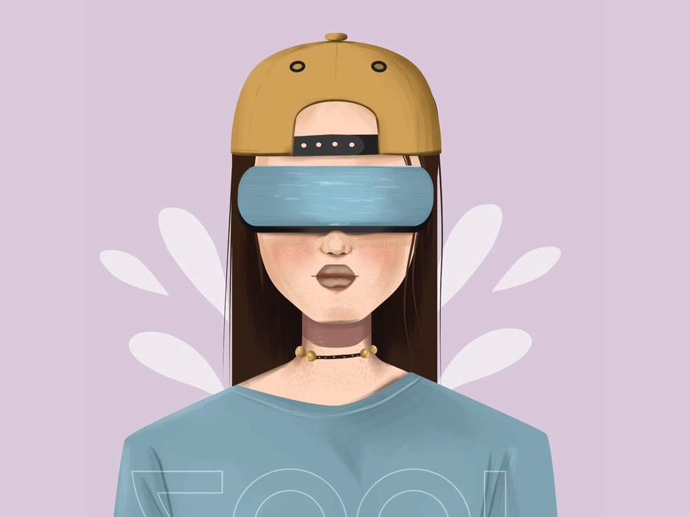
Advantage
This design style directs users to minimalism and convenience, so you won’t see complicated animations and details. More specifically, this style is increasingly being used because of the following outstanding advantages:
- The interface is “clean”, not too picky or confusing.
- Handy in any situation, on any device.
- Text is displayed prominently and easy to read, helping users to grasp the message conveyed in the most complete way.
- The limited structure allows the viewer to focus on the design.
- Can be applied in many different fields such as website design, app design, print graphic design, etc.
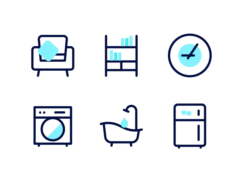
Weakness
Although there are many advantages, this design style still has certain disadvantages: Confusing for users because they do not know if it is a button or an object. Because every component object in this design style is pretty much the same and there is no 3D effect, shading is supported.
Since then, those who are not familiar with this design style may feel confused during the interaction.
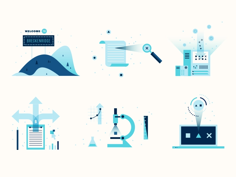
And to overcome this problem, designers have released versions like “Flat Design 2.0”, “Almost Flat” or “Semi Flat”. These versions allow designers to use effects such as shadows, fills, object layers, etc. to differentiate between objects and buttons.
It can be seen that, with its improvement, this design style is becoming more and more popular with users and is used more commonly.
5 most prominent features of Flat Design style
The outstanding advantages of this design style can be mentioned as:
- Minimalist design, no complicated effects used.
- Maximum utility in all situations.
- Use simple objects and images.
- Easy-to-read text style, suitable for everyone.
- Simple structure, limited to focus on design.
- Diverse colors in the design with different shades.
To better understand the advantages of this style, let’s find out in detail the above-mentioned outstanding advantages through the content below!
Don’t use effects
As mentioned at the beginning, Flat Design is flat design, so all the details of the design are on a single plane. Eye-catching 3D effects such as shadow, fill color, embossing, etc. will not appear in Flat Style designs .
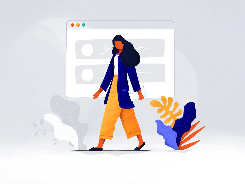
Although it does not use effects, Flat Design is still loved by many designers and gives viewers a unique feeling.
The reason UX/UI designers prefer to choose this style is because Flat Design focuses on taking advantage of the arrangement of details and components. Thereby making it easier for viewers to observe as well as better interact with the product.
Prioritize simple details in design
This is the next outstanding advantage of the flat design style. You will easily notice that Button and Icon are the two elements that appear a lot in the designs. Simple shapes such as vertical polygons and zebras are selected and bordered or rounded details are added to create accents, giving the image curvature, creating a smoother feel.

Focus on Typography
Besides simple details, fonts will have the effect of enhancing your design.
And Typography – The art of font, has a very important meaning in designs using flat design style (Flat design). In general, the fonts used are not too picky, but often have bold strokes. And the font used needs to match the design to express the message in the clearest way.
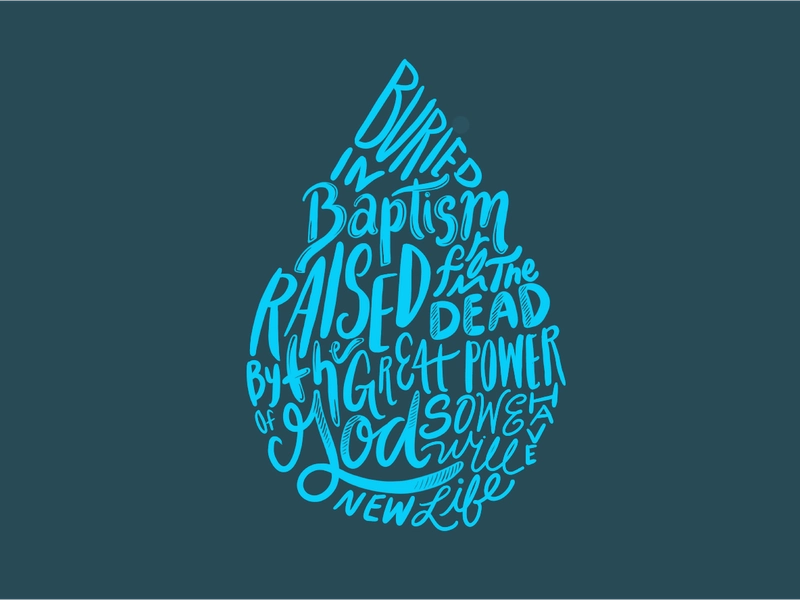
Designers often use sans serif fonts in their designs instead of other fonts. Thanks to that, you can easily read the information of each application without having to open the application – something that was not possible before when included in the UX/UI.
Focus on color
Besides the Typography part, color is also an important and decisive factor in Flat Design design. The comfort in the use of color allows you to be creative with the design product.
Specifically, you don’t need to limit colors to about 2 to 3 colors like with other design styles, you can use 6 to 8 different colors with different shades in your design to create vibrancy.
By freely using bright colors with flexibly changing hues, you can not only increase the attractiveness of your design products, but also hierarchical information and divide information-containing areas. believe it most clearly.
Fix the weakness of Skeuomorphic design
Skeuomorphic is a design style that emulates simulation with the highlight of trying to show the details as realistic as possible.
But if you apply this style in UX / UI, it will lead to a lot of inadequacies such as:
- Having to use too many effects makes it difficult for the user to follow the entire interface.
- Space is occupied by decorative details leading to more important information not having enough space to express.
- Designers do not fully promote their creativity in their designs, but must follow the framework to simulate the image as close to reality as possible.
- The use of many effects in Skeuomorphic design makes the device weak in hardware and consumes a lot of battery life when applied to UX/UI.
Therefore, the minimalism contained in the Flat Design design style helps designers to freely create and communicate ideas to viewers. In addition, the flat design style easily overcomes the weaknesses of the Skeuomorphic style that Malu just mentioned above.
The best experiences when using Flat Design
Some of the experiences below can help you further perfect your design products in a flat style.
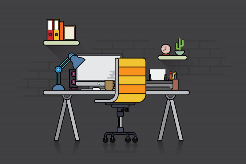
- Start expressing your ideas with sketches on paper. Then, observe, study, and change the details to see if you can come up with a unique idea. This is the step to help you choose the most suitable place to place the bold and light strokes.
- Analyze other works that also follow this design style from other designers to find yourself many new and unique ideas to help complete the product in progress. This is also a way to help you find more ideas for yourself in the future.
- Unleash your creativity by choosing an interesting aspect that you love and start exploring it from many angles. However, don’t forget the element of balance in the design.
- Observing the design from different perspectives, metaphors can be applied to the design to find the perfect fit for your product. And also a way to make the design more attractive and different.
- Although the flat design style allows you to freely use colors, be careful in the color selection process to highlight the theme of the design.
Some images in Flat Design style
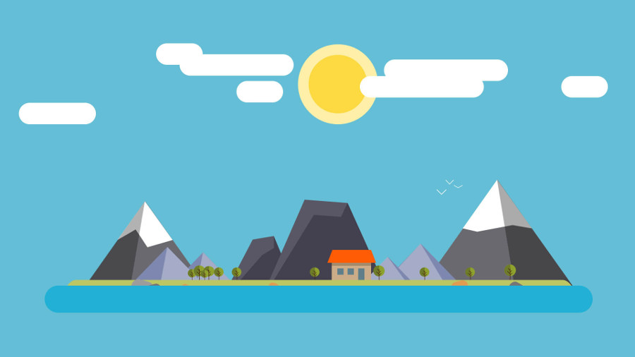
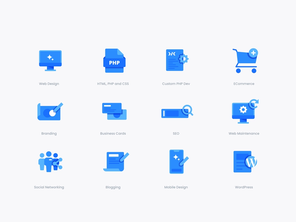
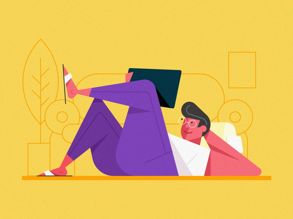
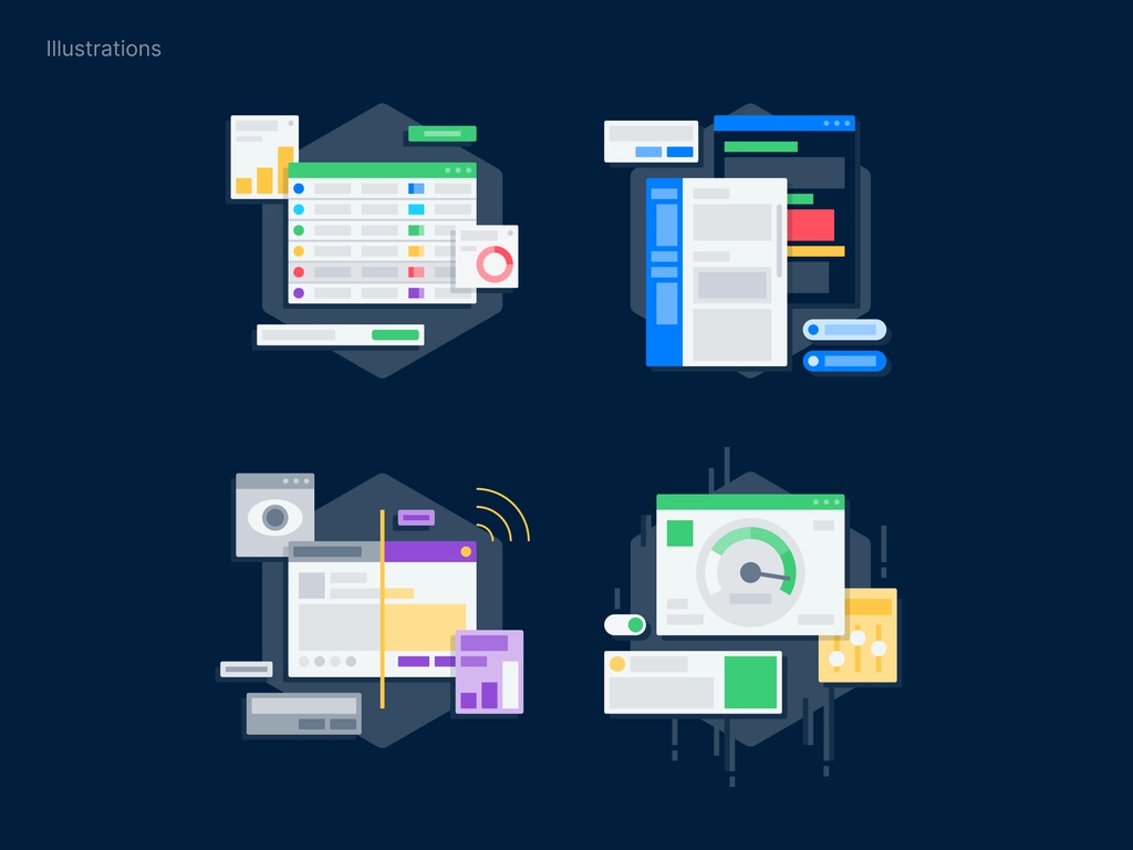
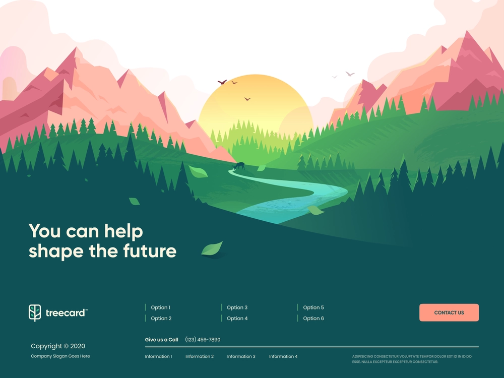
Here are some reference pictures that Malu has compiled and shared with you. For you to have a clearer picture of the design style. As well as refer to these ideas to be able to create your own Flat Design images.



Frequently asked questions about Flat Design
What does Flat Design in Graphic Design mean?
Flat Design is a minimalist design approach that uses simple design elements like flat icons and two-dimensional shapes. This approach is in contrast to the three-dimensional elements used by skeuomorphic designers
What is Flat Design used for?
Flat Design allows users to view and understand website content easily, regardless of whether they are using a desktop computer or a mobile device.
It replaces complex images with simplified icons and vectors. Flat icons and accompanying text make it easy for users to grasp any concept.
Why is Flat Design so popular?
There are many reasons that Flat Design when designing websites has taken the web world by storm. Easy user interface, bold colors, sharp images, simple navigation, distinctive fonts, easy to read text, all contribute to making Flat Design the best choice. for many designers and customers.
Epilogue
Above, Malu introduced you to the concept of Flat Design style . Besides, there is information related to outstanding features and experiences when using Flat Design style in their designs. Hope the above sharing will help you successfully apply in design.

