If you are learning the field of design, then perhaps Moodboard is a technique that is still quite strange. However, for designers, this technique is considered as a very effective solution when presenting their ideas. If you are wondering “ What is Moodboard and how to use them?”. Let’s find out in the article below.
What is Moodboard?
Imagine you are a designer who needs to present an idea to a client. The profession of drawing is the profession of marrying hundreds of families. You have to show your style and satisfy your customers. Sometimes balancing is hard and getting inspired is even harder. So how to find designer inspiration? – GOOD VIBES ONLY WITH MOODBOARD .
Image people will “play” with images. Professional designers will choose special forms of simulation such as wireframe or prototype, or simply moodboard. Moodboard is a board that summarizes all the images and references needed to inspire artists and designers to work.
To put it simply, a moodboard is a board to present the “mood” of a designer’s design. This can be a literal board, or a board on a computer, phone, whatever is convenient for the designer. On that board, they will present ideas in the form of images to serve the design process.
Why do designers need Moodboards?
Moodboard is like an outline that helps designers decipher requirements from clients. Thanks to that outline frame, they catch the inspiration, better visualize the ideas in their heads. At the same time, the “board” is also a useful tool to help them communicate ideas to guests. Specifically, many designers prefer to use moodboards because of the following great effects:
1. Save time and effort
The first and biggest advantage of moodboard is that it does not require much time to complete. It only takes a few hours, or less, for designers to create a visual guide to presenting ideas to clients. Moodboards for web design or branding are easily editable to save both time and effort.
2. Looking for inspiration
Designers can’t count on inspiration because they have work to do. However, things will be made more effective if creators are inspired. Moodboards are a great way to find ideas and spark excitement. Beautiful pictures and illustrations help us find the right mood and style. Also, if you can, try to create a moodboard out of materials through objects around you. This will have a big impact on your thinking!
3. Communicate effectively with customers
When a product is in the brainstorming stage, it is difficult for a designer and a client to understand each other during discussions. For example, slightly different styles can also cause controversy. Visual materials like Moodboard will be the bridge for customers to better understand what the designer wants to convey.
4. Easy to find design style
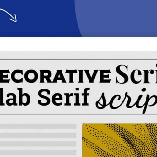
If a creative team has not received instructions from the client about the design style, that task falls on the shoulders of the designer. To come up with style ideas, we don’t need to build a detailed prototype. When experimenting, a moodboard with different textures, illustrations, fonts, and colors is faster and more convenient than spending time changing each prototype.
5. Communicate ideas clearly
Words may fail to form a picture in a client’s mind, but visual documentation is a useful guide, helping clients dig deeper into the details and understand exactly what your ideas are. That’s why Moodboard was born.
Ways to create moodboards
Free photo collage
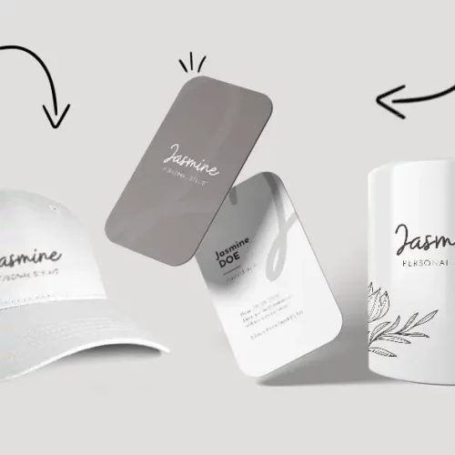
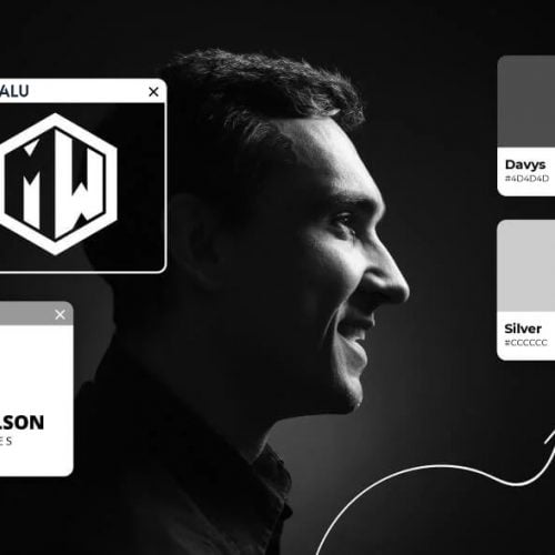
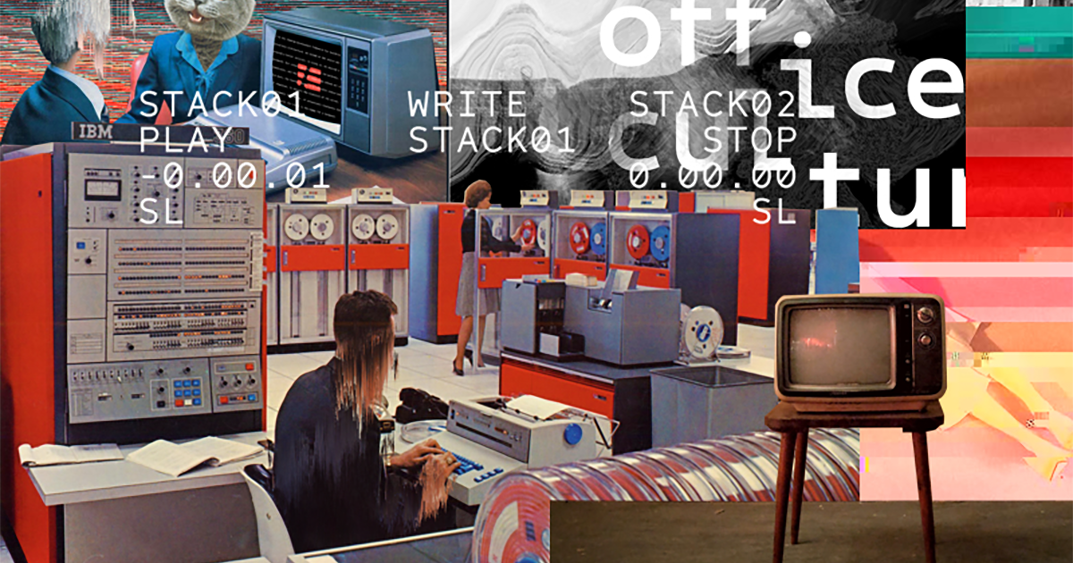
If you are a liberal, do not like stereotypes, the collage style will suit your moodboard very well. You can put together anything for your moodboard, any photo, illustration, font or color that interests you. Note: freely but pay attention to arrange them properly lest your moodboard will be confused.
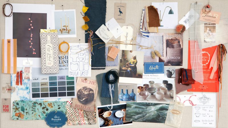
Check out the available collections
This is the way of quite a few designers who are new to moodboards. You can find resources like Behance and Dribbble, where designers can find inspiring concepts.
Use sample table
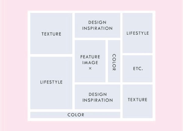
Like prototypes and wireframes, moodboards also come in a variety of sample boards. Usually the sample tables are quite simple. You can arrange the elements in a pre-arranged layout without spending too much time.
Choose physical or digital moodboard
One of the biggest choices to make when you start a mood board is whether you want it to be physical or digital.
Traditional physical moodboard.
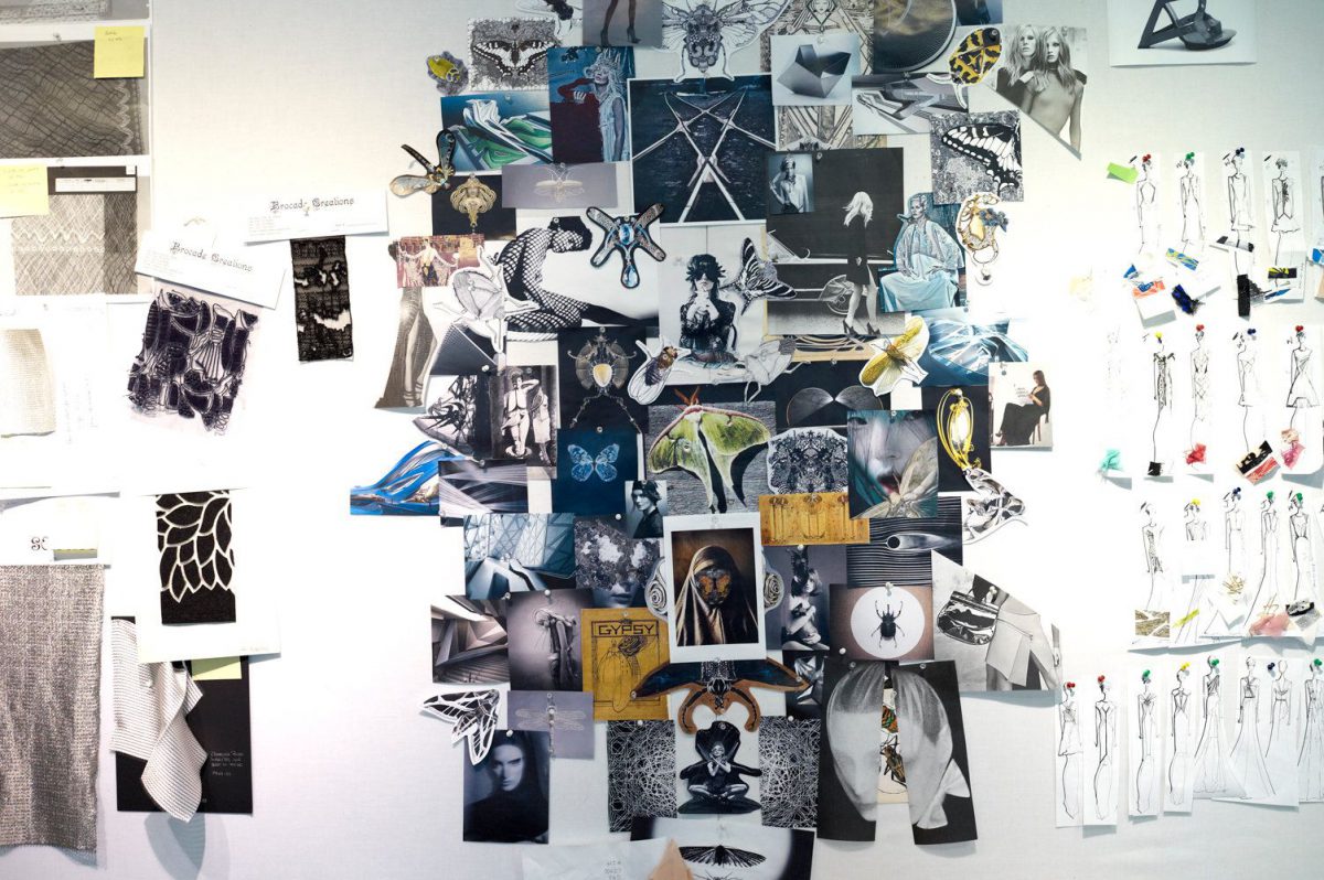
Usually, they are placed on a piece of foam board – a craft material used for purposes as widely as building dioramas and mounting photographs. Cut your images neatly and stick them to the board with spray glue for best results. You can stack images on top of each other so that they completely cover the table; If you prefer a cleaner grid layout with space between items, consider painting the board in a color that matches your chosen color scheme. Alternatively, a cork board with pins can be a stylized way to show off your inspiration.
Digital mood boards are a modern solution.
They allow you to easily combine images you’ve seen on the internet or objects you’ve photographed digitally. Several online platforms give you a way to combine these images together. Some popular ones are:
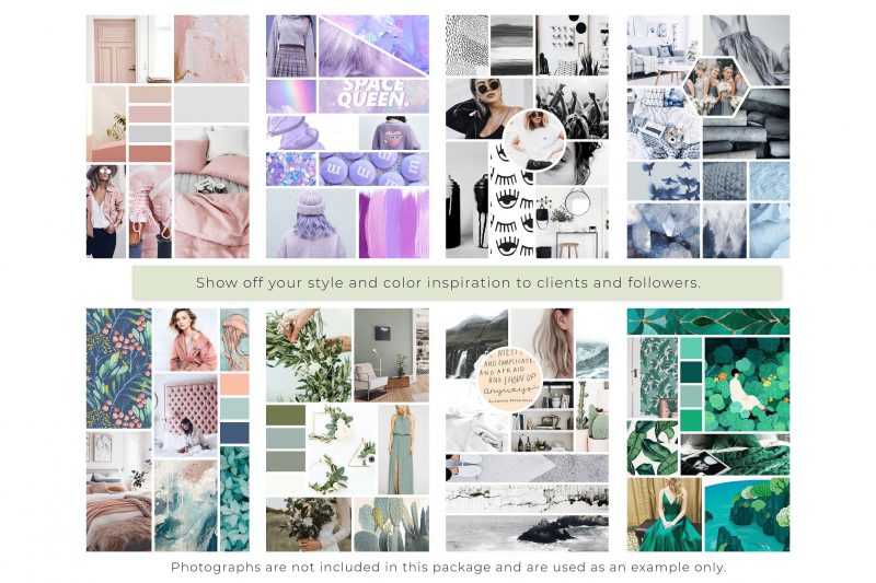
This social media platform allows you to easily group images together into themed “boards”. It’s especially good for discovering new images, so you’ll want to use it for at least the research phase. Another advantage is that many people are already familiar with the platform, so you can easily collaborate with others.
Canva
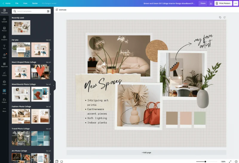
Canva offers online graphic design tools that provide a free alternative to expensive industrial software. Its mood board builder has an easy to use drag and drop interface and several template options. The clean layout makes it a professional choice for presenting your work to others.
Milanote
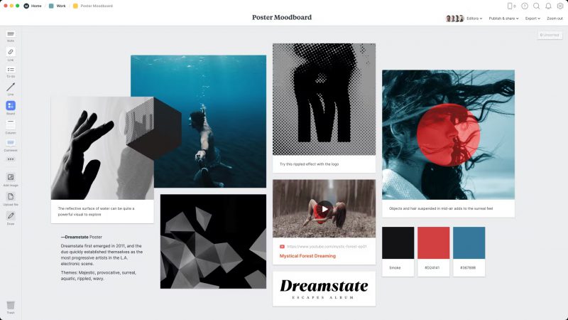
Here’s another good browser-based app. It packs some handy extras, like the ability to add videos and gifs, font files, and text notes to explain your thoughts.
Epilogue
Moodboard is one of the indispensable tools of a designer in the working process. Hopefully the above article will give you a more general overview of Moodboard.

