
Visual brand identity not only plays a supporting role but also helps to elevate the brand. From product packaging to images posted on social networks, using a strong brand identity will represent the brand visually, directly conveying the brand’s characteristics and identity to the user. experience.
Conversely, a weak identity can lower the customer’s brand experience. Many people think that just having a beautiful logo, adding a color palette and typography is more than enough for an excellent brand identity. However, if there is no connection and consistency in the identity, you are just telling a story without beginning or end; and it will be difficult for your brand story to connect with your target audience.
Fortunately, there are still many brands in the world that are on the right track.
Humans are intuitive creatures – we base our judgments on what we see. If dogs use their keen sense of smell, or dolphins perceive their surroundings with sound waves, then we humans interact with the world by what our eyes “see”. On the other hand, people have always been fascinated with looking at beauty, from the time Leonardo da Vinci painted Renaissance paintings, until now, Tiktok videos.
The more time we spend online, the easier it is to enjoy, create, and share visual content these days.
With so much visual content on the internet, every brand needs to build an outstanding and durable Visual Identity.
As Paul Rand, the famous graphic designer and art director, once said: “Design is the silent ambassador of the brand.” Every detail, from how you create your logo to how you choose your color palette, are visual elements that need to be carefully considered.
In this article, let’s explore what Visual Identity is, why your brand needs it, and how to build Visual Identity to grow with your brand.
What is visual identity?
Visual identity is a collection of visual elements used to represent and differentiate a brand. In other words, visual identity is all the visible, tangible details that customers can distinguish your brand from other companies.
When all these details are designed with a consistent aesthetic, they build brand recognition.
Visual Identity is based on Brand Identity (brand identity) and the skeleton is Brand Guidelines (brand standards). Visual identity represents the core values and brand promise with visible elements.
Elements that make up an effective visual identity
- Relevance: Are the tangible elements of your visual identity relevant to your target audience? Is your design evoking the right emotions? Make sure each brand-related image is relevant to a specific audience, purpose, or situation.
- Differentiation: A strong visual identity will help the brand to differentiate and stand out from the competition, while also capturing a strong place in the minds of customers. Ask questions like these: Is my visual identity recognizable? Will customers remember my visual identity?
- Simplicity: Effective design needs to be easy to see and understand. For the convenience of both the design team and the client – remember that the simpler, the clearer.
- Timeless: Being flexible and trendy is not enough, visual identity also needs to be highly applicable and suitable for all situations. All trends are only temporary, let’s build a visual identity with a sustainable, timeless orientation if you don’t want it to be “out of fashion” one day.
- Highly applicable: Can your visual identity be used in all media? Remember that the details of the visual identity should be designed to suit many purposes – from displaying on digital screens, printing to interior space design .
The difference between Brand Identity (brand identity) and Visual Identity
Imagine your brand is a living organism. Brand and visual identity combine to create a healthy body; in which brand identity focuses more on “content”, such as mission, voice or brand personality. In contrast, visual identity represents the “appearance”, such as logos, brand colors and typography.
All of the above factors combine to create a complete and unique identity. Visual identity and brand identity work together for the common purpose of shaping the brand.
Elements that create a strong visual identity
Logo
In short, a logo is the most direct and easiest way to identify a brand. Combining many elements such as colors, shapes, characters, and sometimes even taglines, the overall logo will represent the brand and evoke positive emotions for people looking at it. Whatever type of logo you use, it needs to convey the brand identity.
For example, a wordmark logo containing a business name will be extremely suitable for brands that want to make their name stand out. However, if your brand name is too long, consider using a lettermark or monogram logo . Whatever logo style you choose, remember that visual identity requires a lockup logo – the logotype combo, icon, tagline is in place and can be customized for each design purpose.
Brand color
Brand colors are so important that they shape the visual identity at every customer touchpoint. The color palette you choose can have a powerful impact on your customers’ attitudes and feelings towards your brand. Therefore, learn more about color psychology and color meanings – they will greatly help with creativity and branding.
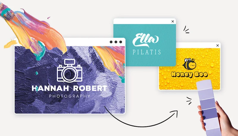
Choose colors that are brand-appropriate and highly functional, as they will be used for a variety of design purposes. For example, there is always a slight difference between colors displayed on the web, on social media posts, or in print.
Typography
In fact, there is no universal formula to find the perfect typography for every brand. Robert Bringhurst, poet, photographer and author of The Elements of Typographic Style once said, “Typography is the art of making words visible.” To choose the right typography, evaluate its ability to convey the message. Typography – which includes everything from typeface to kerning size (space between characters) – is extremely important in evoking the emotions of customers and creating brand recognition.
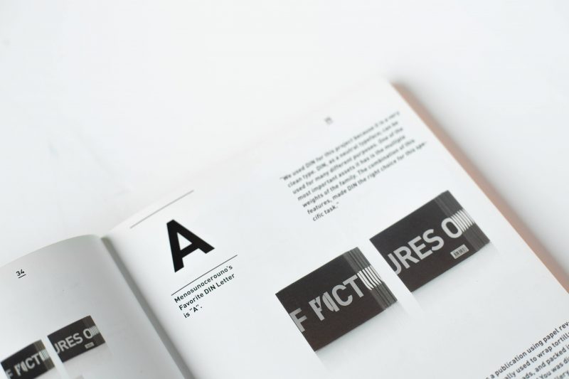
Professional typography usually has the following properties:
- Easy to read
- flexible
- Multi-use
- Convey
Image
There is a saying, “a picture speaks louder than a thousand words”: images and videos will make the brand story appear in front of customers.
When choosing images for your website or social media posts, pay attention to their style, layout, and theme, and make sure the content is visually cohesive. This is the key to creating a uniform, consistent brand image.

Here are some essential parts of a brand image:
- Team portraits
- Pictures of life
- Product photos/videos
- Photos for social media posts
Graphics, illustrations and icons
All of the above are extensions of the brand identity. Whether it is lines, shapes or symbols – they all have their own function. For example, icons and buttons on a website can greatly affect the user experience.

All in all, no matter how you use and combine graphic design and illustration, these details contribute to your overall visual identity.
Why do brands need a visual identity?
Visual identity greatly affects the way customers perceive the brand. Here are the reasons why brands need visual identity:
Make differences
Unique and impressive visual identity will make a clear difference between one brand and another in the minds of customers.
Boxed Water is an example. Although operating in an industry that causes a large amount of plastic waste, Boxed Water aims to reduce plastic and aluminum waste in production, and offer effective alternatives. It is clear that the product of this brand is very different from the competitors, and their visual identity also makes that difference more obvious and conspicuous. Boxed Water’s products are not only beautiful, but also represent the ideals and core values of the brand.
Make a connection
A brand that creates attraction will connect with customers. Visual identity helps express the brand and give customers a personalized experience. For example, a logo can be thought of as the face of a brand. The more specific and concise the “face” is, the more empathy and attachment it will create with customers.
Consistency
For branding, consistency is important, especially with visual identity. A uniform and unified visual identity will improve the customer experience, thereby building customer loyalty. The more recognizable a brand is, the more it attracts customers and is trusted by customers.
Moreover, a strong visual identity that gives customers a familiar feeling will be very helpful for the long-term development of the brand. Even if the visual identity changes over time, keep the most familiar details to avoid customers … not recognizing you! The most obvious example is Tropicana and the story of the failure to change the packaging design – buyers do not realize the product they are still using, because of the familiar signs of the brand and the core elements on it. The old packaging is gone.
Build long-term trust
Simply put, customers are loyal to brands that they feel familiar and reputable. According to some surveys, 84% of consumers tend to trust brands with clear and distinctive visual identities. The more customers feel that your product or service is familiar and easy to remember, the more they will trust.
How to build an impressive visual identity
- Leverage brand identity
- Learn about customers
- Define brand meaning
- Efficient design
- Keep Consistency
01. Leverage brand identity
A complete and effective brand identity will clearly express the meaning, core values and goals of the business. Let’s build a visual identity based on that foundation.
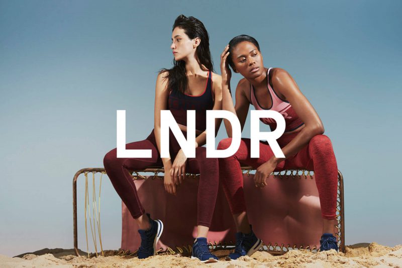
Take, for example, sportswear brand LNDR, founded for “the lifestyle we want to live, the clothes we want to wear, and the people we want to be around.” The brand’s products are designed with a focus on practicality and sustainability. This is evident in the visual identity of LNDR, with its neutral color palette and minimalist design style – “less but better”.
02. Learn about customers
Imagine, you were invited to a party and now you need to find the right outfit to wear. First, consider where the party will be held? Who will attend? Is it a barbecue or a formal dinner party? Only by understanding the situation and the requirements of the party can you choose the appropriate outfit.
The same goes for building visual identity. Only when you understand your target market well can you choose an effective visual language that is relevant to your audience.
Businesses can easily learn the wants and needs of customers by developing customer portraits. Target customer portraits provide valuable insights about buyers such as: age, gender, income, education level, motivation and beliefs, etc. These information will be a guide to help you speak. the right way with the right people – choose the right visual identity for the right audience.
03. Defining the meaning of the brand (brand purpose)
Understanding your brand’s core values and meanings will help you stay on track.
Take for example Real – an online therapy mental health platform. The brand’s mission is not only to “normalize” but also to promote the care of mental and psychological problems.
The brand’s visual elements, from the blue color palette – creating a sense of calm, reducing stress – to the hand-drawn decorative motifs, are all geared towards the mission of making it accessible to young people. with counseling and psychotherapy.
04. Effective Design
Understanding the differences between each media will help you optimize your visual identity with more effective designs. It is absolutely necessary to build and take advantage of a detailed and clear Brand style guidelines.
Every designer will be used to using different tools, but every member of the design team must understand the core of visual identity and know how to present those details with any tool. From changing logo resolution and size to adjusting color offsets for digital display and print – your designer should be adept at these things.
05. Keep Consistency
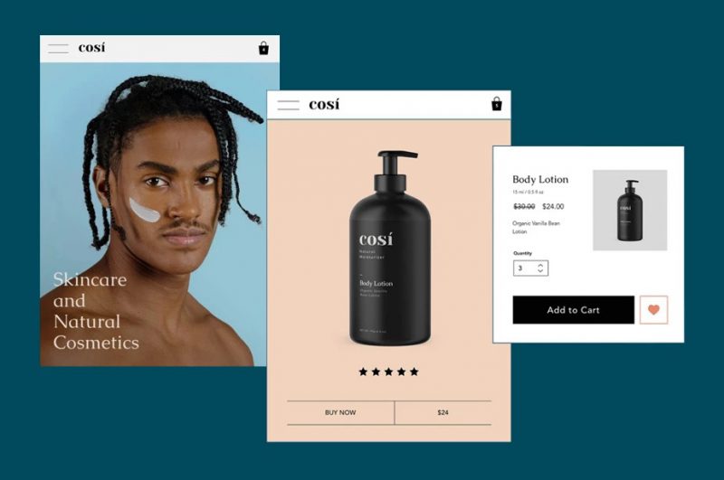
Keeping the visual identity consistent and synchronous brings two great benefits. First, as mentioned, visual consistency will help guide the branding process.
Secondly, a consistent visual identity will quickly create the feeling that this is a professional and reputable brand for customers, partners and competitors. However, it is important to understand that being consistent does not mean being rigid and conservative: brands can, and should, change and reinvent themselves when there is enough momentum to grow. Consistency is merely a solid foundation on which a brand can move forward.
Typical visual identity
Magic spoon
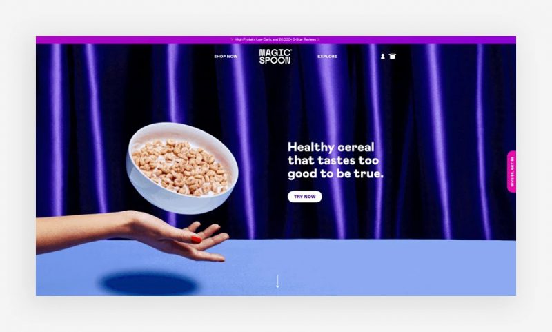
The brand identity of Magic Spoon has been built very well since its launch, when evoking customers’ nostalgic feelings about childhood cereal. Founders Greg Sewitz and Gabi Lewis explain that “We tested the product for a year, inspired by the taste and nostalgia of the cereal you used to eat as a child, but also very suitable with a modern taste.” This snack is both nutritious (suitable for keto dieters), and has “modernized” childhood taste. Similarly, Magic spoon’s visual identity reflects that image with bright, youthful colors with some retro touches. From logo design, mascot to each Instagram post, they all carry a specific message and aim to ultimately tell the brand story – with joy and positivity.
Hims
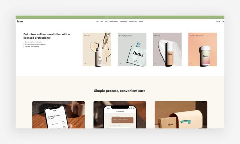
Launched in 2017, Hims is a pioneer in the field of men’s body care – contributing to changing the health, hair and skin care habits of modern men. Secret illnesses, hard-to-talk problems that men are often embarrassed to talk about can all be solved with Hims’ convenient telemedicine and consultation service.
Minimalist yet elegant, Hims’ design style is bright and friendly. They use serif fonts, muted color palettes, and smart, clean packaging designs. The goal is for customers to not feel burdened or embarrassed even while using the drug; It’s just like using a health-promoting product. The image of the brand is therefore very general, modern and expresses the characteristics of positive masculinity.
Notably, this business also launched the Hers brand for the potential female market, after the initial success with Hims. Using a similar business model and aesthetic, the leadership team aimed to build and expand these two brands to even broader markets.
Blue Bottle Coffee
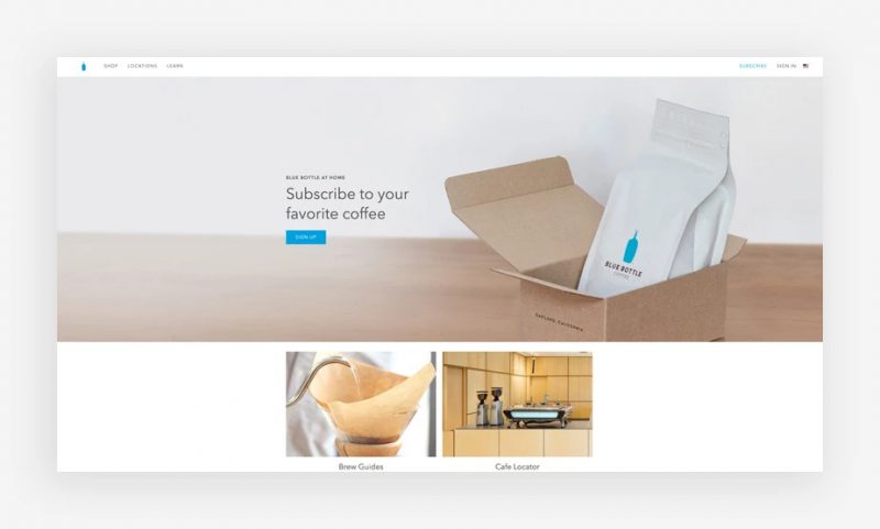
The California-based specialty coffee brand Blue Bottle Coffee impressed the market not only with its own brewing method, but also with its excellent branding campaign. For coffee lovers, besides the taste, the enjoyment experience is also very important. That experience includes scents, sounds, and many other visual elements.
Blue Bottle’s visual identity is so special that it’s unmistakable, with a very distinctive blue color. The Blue Bottle brand color stands out when accompanied by the brown color of mocha coffee and caramel cream color, making a strong impression on viewers from the first time they see it. According to Blue Bottle, the brand’s color palette also makes their coffee taste better: “Our store is designed to draw customers’ attention to what matters most: good coffee, daydreams, conversations between friends. To do that, the colors used in the store are also 3 main colors: Blue Bottle’s signature blue, fog gray and blonde wood.”
Every little detail in the visual identity is carefully considered, together they build the brand story, enhance the product, and create an emotional connection with the customer.


![[Social Branding] Branding on Facebook 7 xay dung thuong hieu tren facebook](https://maludesign.vn/wp-content/uploads/2021/03/xay-dung-thuong-hieu-tren-facebook-500x500.jpg)
