One of the main purposes of a logo is to share your business story.
The best way to do that is to use the oldest form of logos: Icons.
Icons have a long history; it is actually one of the earliest forms of trademark. It was used for everything from collecting taxes to marking the official titles of kings. Over the years, logos have remained proof that an organization can be trusted, respected, and authoritative.
What makes the iconic logo unique is that it’s not necessarily for the elite but still gives that high-class feel. And chances are, you’ve seen the symbols dozens of times (think Superman’s icon).
For your business, embodying your corporate mission also means going back to tradition. If that is the case, then choosing an iconic logo can be the most effective way. In an ever-evolving world, we still need to stay connected to traditional values.
What is the icon?
Before we delve deeper into this type of logo, it can be helpful to review the main logo categories: Wordmark, brandmark, monogram, combination, and symbol.
A logo combination combines both text and images. Similarly, emblem logos take the symbol and combine it with a frame or border. The images used are often symbolic and blend seamlessly with the text. Think of a badge, seal or emblem.
With brands with a long history, it’s not uncommon for a logo to convey a sense of prestige and power.
Who can use the iconic logo?
Businesses choose iconic logos to create a vintage vibe, while at the same time expressing prestige and popularity. This type of logo is a great choice for modern businesses that want to convey confidence, trustworthiness, heritage and tradition.
Take the Warner Brothers logo for example. Spanning almost 100 years, this major film conglomerate’s time-tested classic design features a shield with a ribbon on a blue background and bold yellow initials. The Warner Bros logo is instantly recognizable, prompting audiences to immediately respect the films the studio has produced.
Let’s take a look at some of the most prominent iconic icons in the world:
Sports team
When designed well, a sports team’s logo can rally a fan base and intimidate rival teams. These three do it well.
NFL
Iconic logos make your consumers feel like they are connected to a community of like-minded people. The logo for the NFL does this well. The iconic logo has essentially remained unchanged since the league was founded in the 1920s. The shield, capital letters and small oval ball, became the defining elements of what the logo became. the international symbol of the sport. The shield shape conveys the league’s commitment to excellence and glory, while the colors proudly represent the American identity.
Manchester United
Undoubtedly, their badges and emblems have played a big part in making Manchester United one of the biggest establishments in the history of sport. Although the logo has undergone many revisions over the years, it has remained essentially unchanged over the past 23 years. Other clubs have used simplified logos in modern times, but the United crest remains rooted in history and heritage.
Liverpool Football Club
It is fitting that the logo of Liverpool Football Club looks as fierce and regal as Manchester’s because the two clubs have a long-standing rivalry relationship. Red was deliberately chosen to represent power and danger. Their tagline “You’ll Never Walk Alone” has attracted the club’s close-knit community and loyal fan base.
University
Harvard

Nothing speaks to prestige like the latin motto on a logo. Veritas, Latin for “truth,” was adopted as Harvard’s motto in 1643 and is now engraved on its coat of arms.
Yale

The coat of arms of Yale University is the main emblem, which is dark blue, officially known as Yale Blue. Enclosed in the shield is an open book with Hebrew inscriptions while the Latin inscription Lux et Veritas surrounds the shield. These words translate as “light and truth”, guaranteeing academic integrity and respect.
Princeton

The historic Princeton logo features a shield in contrasting colors. Placing orange and black next to each other creates visual appeal while creating attention. The shield depicts an open Bible and a ribbon underneath bears the university’s motto, “under God’s power she flourishes”.
Manufacturers of cars and motorcycles
Harley Davidson
Although this world-renowned motorcycle maker has changed its logo design over time, the design has remained iconic throughout its century of existence.
Ferrari
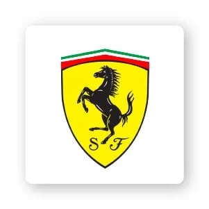
The icon’s yellow background represents the colors of the Italian city of Modena, Italy. The two letters accompanying the horse – S and F – stand for Scuderia Ferrari, the name of the racing brand. The stripes on the top of the logo are red, white and green representing the national colors of Italy.
Porsche
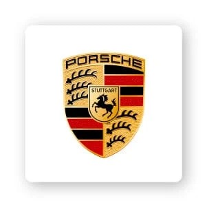
When the cars were manufactured in Stuttgart, Germany, the city’s coat of arms was chosen as the centerpiece of Porsche. The black horse and the black and red stripes both combine to symbolize power and status.
Restaurant
The Diner of Dallas
The logo of this beloved local restaurant practically gives off the all-American feel that diners have come to. The Diner of Dallas logo promises home-cooked meals, a sense of nostalgia and decades of experience to perfect their sweet apple pie.
Starbucks
Although the coffee group went through a rebrand in 2011, their iconic logo, which they have highlighted for decades, remains among the favorites of the majority.
Steak n Shake
Steak n Shake is an inspiring example of a small local restaurant that has turned into a huge international success story. When he first started, the founder had a dish that was completely unheard of, a steak sandwich, something that even his customers didn’t trust. He won the trust of customers in his product by grinding steaks into hamburgers openly at his restaurant. The company slogan “Famous for burgers” is featured in the logo, proving that a logo based on your own unique history is a good place to start.
Iconic logo design tips
It is not easy to create a powerful logo as imagined. Here are some design tips to keep in mind before you start designing.
Color : Stick with 2 colors (or 3, on top) and only aim for a “lighter” color if you are prepared to have one. Because the icons have a timeless feel, you’ll want a lasting color palette. Think white, gray, black, maroon, blue, etc. but remember to consider the meaning of the logo colors before you decide on the right color scheme.
Fonts: If you want a vintage feel, serifs are your go-to. However, if you want something that speaks to a more modern crowd, consider sans serif typefaces with thick thickness (as you see in the Starbucks logo). Try to choose a simple font so as not to overwhelm another busy design. And, make sure that the typeface you choose looks good regardless of size.
Icons: Remember, in an iconic logo, your icon is the symbol. However, you may want to consider taking it a step further by incorporating images or shapes in frames to say something about your brand. For example, the Harvard logo above incorporates pamphlets inside the shield to symbolize its academic achievements.
Remember, when designing a logo, you will want to use elements that support what it stands for – longevity, traditionalism, originality, permanence, etc.
Things to consider before creating an iconic logo
One barrier you might want to consider with the iconic logo is scalability.
A logo is a way of getting your business out into the world and giving your audience a positive, visual image to associate with your brand. As a result, you’ll want to put your logo everywhere for it to work, whether it’s in the corner of your website or printed on a cushion.
However, because the detailed design is often characteristic of an icon, the icon can become difficult to read when resized. And, while there are tools to help you with this problem – like Vector files for offline printing – preserving designs can be a challenge.
Think about your overall brand strategy and where you plan to present your logo. As a general rule, icons tend to look best on:
- Merchandise, such as clothing, coffee mugs (again, think Starbucks) or product packaging
- Advertising, especially billboards and signage
- The front of a building
- Desktop, whether on a website or a social media ad
For you
Like any logo you choose, it must tell the story of your brand.
Logos are a great way for a business to evoke a sense of heritage and nostalgia. Traditional shapes and symbols make these logos great for communicating personal values.
So when you’re ready to design your logo , first think about the basic story of your business and all the core values you want to convey in the design. This will help you infuse your designs with emotions and values that your audience will connect with.
If you’re not sure how to get started, try browsing through logo design inspiration websites to see how others have used the iconic logo to convey their brand message. Then see if you can use the logo to communicate your own brand values in a similar way.
Malu Design wishes you successful branding!
If you are looking for a reputable and experienced unit to be able to design a professional and impressive logo and brand identity system , then please contact us immediately by phone. 0988 622 991, or leave your information and requirements, Malu Design ‘s consulting department will contact you right away to answer all your questions!
————————
Malu Design – Branding Identity Agency
Hotline: 0988 622 991

