If your logo design doesn’t appeal to your target audience, you’ve got a big problem. Maybe it doesn’t capture their interest or worse – send a negative message that turns people away from your brand!
Remember when you fell in love with a certain brand’s logo at first sight. And as if by magic, you don’t hesitate to learn more about that brand!
It’s not magic, but in fact there are some pretty cool logo design tricks that you may not be aware of.
Something that touches the emotions and creates a sense of familiarity that gives you peace of mind. Design a logo with such appeal, all you need is a logo design that attracts your customers.
I’ll tell you how and the steps so you can do it right now. First, we’ll start with understanding what the target audience is.
What is the target audience?
The target audience is people who want or need your products/services and have used them. They are specific segments of society, defined by age, gender, location, education, occupation, income, family status and other social factors.
If now you are wondering how to define your target audience. That means you are one step closer to creating a logo design that attracts customers.
STEP #1 – DEFINITE TARGET AUDIENCE:
How to define target audience?
Let’s start with three tactics you can use right now to better define and understand your target audience.
- Customer analysis. If you have a familiar group of customers (if not, move on to step two), learn everything about them. A great way to get this information is to interact with them through social media and take surveys. It’s as simple as seeing their product reviews after every purchase.
- Competitor analysis. You can learn many things from your competitors, such as who they are selling to and what marketing channels they use to reach them. Go online and analyze their websites, see customer reviews about them, and find out how customers have been attracted to them. Or you just need to find the answer to the following 3 questions: How old are they? What do they look like? Where are they from.
- Use Google Analytics. If you already have a website, then Google Analytics will provide data about website visitors to you clearly. For example, the channels customers use to find you and what content captures their interest. Identifying their likes/dislikes will give you a demographic outline that you can research.
Once you’ve identified your target audience, you have to come up with a design strategy that appeals to their emotions.
STEP #2 – TARGET DESIGN USERS:
The importance of audience targeting through design

A lot of business owners adopt a one-size-fits-all approach when they design a logo. But it will also be a headache because if you just try to design according to the majority of the audience, your logo will not be able to target any individual.
The target audience is the one that influences your decisions when it comes to choosing the logo style, colors, fonts and shapes that you will use. However, the decision to buy is up to them , your sole goal is to create a logo design that attracts, connects viewers and turns them into an advantage in the market.
Once you know which design elements are right for your customers, you can use them to express your brand values and tap into their emotions.
Remember, a logo is the most powerful marketing tool, but only when it attracts your target audience.
Here’s how you make it happen.
STEP #3 – EVEN TARGET AUDIENCE:
How do you engage your target audience?
Do this by standing in the shoes of your own customer!
As you deepen your understanding of the customer’s pain points, you will truly empathize with them. When you understand them and what they think, they will feel your brand more trustworthy.
STEP #4 – CREATE CUSTOMER PHOTOGRAPHY:
How different target audiences impact logo design
Okay, you know your logo design has to resonate with your target audience, but let’s tackle the problem: what makes a logo so appealing?
Colors, fonts, shapes, and images are proven to suit every market because they send the right message to consumers. However, it is not the companies that determine these factors directly, but the customers who define them.
After all, brands incorporate elements that make a connection with their target audience, making the brand more memorable. The perfect comb is to sketch out your customer profile.
Create a customer profile:
Paint your customer by giving your ideal customer a personality by learning how they communicate, where they often appear, their weaknesses, and even their attitudes, styles, and preferences. , goals, challenges and behaviors.
Keep the customer persona different because by making them an individual, you get to know what interests them, how they feel, and what they think.
First, start by sitting down to answer a few questions about your customers using our template .
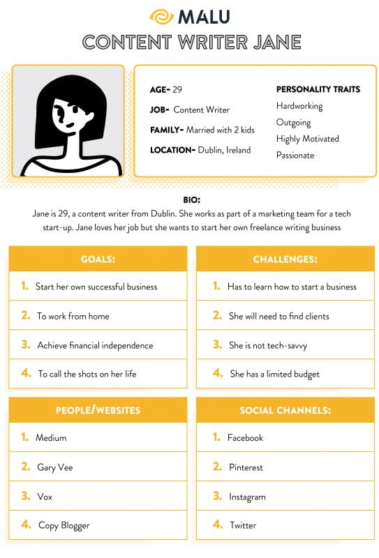
Four key logo design elements must connect with customers:
- Color. When choosing logo colors, consider the customer’s reaction to the tones, not your own feelings. The same is true when combining colors, because they also affect viewers’ perception of your brand. Color is proven to increase brand recognition by up to 80%, with 92% of consumers citing appearance as a convincing factor when choosing a brand. So research your target audience and use colors that match their gender, age, class, and tendencies.
- Font. It’s not what you say it’s how you design it! By choosing fonts that reflect your brand’s services, personality and values – you’ll attract the right audience. Make that happen by making sure your font captures the buyer’s eye.
- Symbols. The icons may be relatively small, but they convey a powerful message. The trick to creating a compelling logo is to keep it simple, minimal detail, use no more than two colors, and abbreviated brand names (like Facebook) that relate to your brand voice and market.
- Layout. Logo layouts can be formal, casual, or playful. If you do this wrong, the logo will send the wrong message and fail to connect with the customer. Make sure the icon represents what the customer is looking for.
To help you better understand how using colors, fonts, icons, and layout can benefit you, let’s take a look at some logo designs that use these elements.
STEP #5 – REFER THIS LOGO EXAMPLE TO FIND TARGET AUDIENCE:
1. Personal Trainer (PT)
Target audience – training women after giving birth:
This fitness logo uses contrasting fonts and colors to reinforce the message that mothers are strong, individual and beautiful, especially after giving birth. The font used for the word “strong” reflects their strength, while the signature font used for the word “mom” shows their feminism and motherly side. Pink tells us this training is for women, and black reinforces the message that you’re strong enough to do anything.
Target audience – fitness/fitness:
GymGuyz is a global home fitness service that prides itself on providing customized training programs to fit the individual needs of their clients. Their fonts reflect this personalized approach, the dynamics and strength of their brand, and what their customers can achieve. And the use of a single color – red in the two Gs – represents the transmission of energy and vitality.
2. Fashion brand
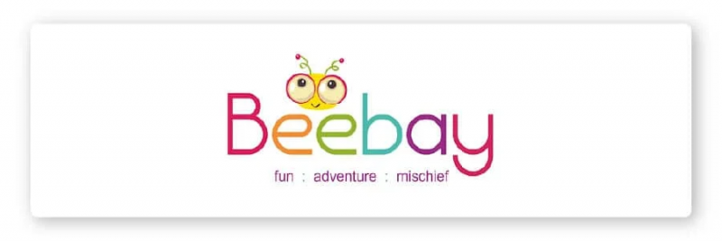
Target audience – children’s fashion:
Children often love bright colors and animation. E-commerce clothing brand Beebay (great pun) used every designer trick to appeal to their target customers.
Their brand message is “We provide comfortable, chic and vibrant clothing so your child can have fun with confidence.” Their choice of primary and secondary colors, along with their intro lines, confirmed exactly the message they wanted to highlight. The image of the bee represents hard work and efficiency, and sweet clothes like this will naturally be loved by children.
Target audience – senior:
The Chanel logo is one of the most recognizable fashion icons globally and it is widely considered a contributing factor to Chanel’s success.
How did they do this?
Classy, classic, minimalistic couture font, with the main color being black on white or white on black, along with the clear interlocking Coco Chanel logo, all expressing the level, prestige and wealth. That’s right, this brand’s logo is designed to attract the rich and famous.
Their slogans also hit the customers’ desire “Share the fantasy – It’s beautiful up here“ and “In order to be irreplaceable, one must be different.”
3. YouTube channel
Target audience – cooking enthusiasts:
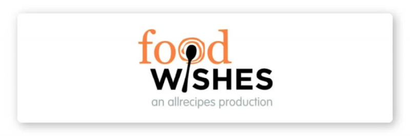
With 4 million YouTube subscribers, Food Wishes found the recipe for success! The YouTube logo is intended to capture the viewer’s attention and convey a vision of what viewers will discover when they click on the channel. That means it has to be catchy, iconic, and informative about the channel.
Food Wishes used a combined logo to achieve this purpose. Their name connects with their customers’ desire to create mouth-watering dishes, their tagline shows that this channel is for everyone. The clever design of a spoon sketched into the letter I touching the letter O conveys the message clearly.

Target audience – gamers:
The video game industry tends to use bright, primary colors in logos. They also use mainly letters to grab the viewer’s attention and keep them hooked. Most gamers like Ali-A (17.5 MILLION SUBSCRIBERS) are also using the same approach.
February 2020 – Ali-A changes its logo with its message of loyalty, wisdom, confidence and stability) to mark Ali-A’s authority in the market. The logo covered in silver resembles the sunroof of a spaceship with his head emerging from the inside, signifying a brand new approach to his followers.
Steps before you start designing a logo
We’ve covered a lot, let’s review the steps below:
- Define your target audience: As the saying goes, “If you’re marketing to everyone, you’re not marketing to anyone.” Keeping in mind the audience you want to target will help you rebrand to meet their needs.
- Build a customer persona: This step is a useful tool in the branding process. You always want customers to subscribe to your email list and stay loyal to your company.
- Check out the competition and learn from the big brands: Research who’s in the same industry as you, what they’ve been doing well, where they’ve failed and what they’re doing to earn their customers’ trust .
- Leverage symbolism in design: Never underestimate the power of symbolism in conveying the essence of your brand at a glance.
- Keep it simple, unique and memorable: Simple logos often have unique value, it makes viewers unable to take their eyes off and remember it for a long time.
For you
With thousands of new businesses popping up every day, you need to have an edge that will help you stay competitive with them. And now you will have one!
You already know how to make your logo design appealing to your target audience. By giving them peace of mind and confidence to learn more about you. Let’s change them from viewers to long-term users.
Remember, if you target and engage your customers, your logo can be something they remember for life!

