Your logo is an essential part of your business, and you want to make sure it’s done well – down to the last detail, including colors.
Choosing a color for your logo is a big decision! Your logo colors have the power to communicate what your business stands for, make a lasting impression on your target audience, and help you stand out from the competition.
This post will help you decide if green is right for your brand, both in terms of your message and the industry you’re in. I’ll cover everything from the psychology of green and how to use it with other design elements, to the different industries where green is best suited and whether it’s a color. suitable for your business or not.
The Meaning Behind the Green Logo
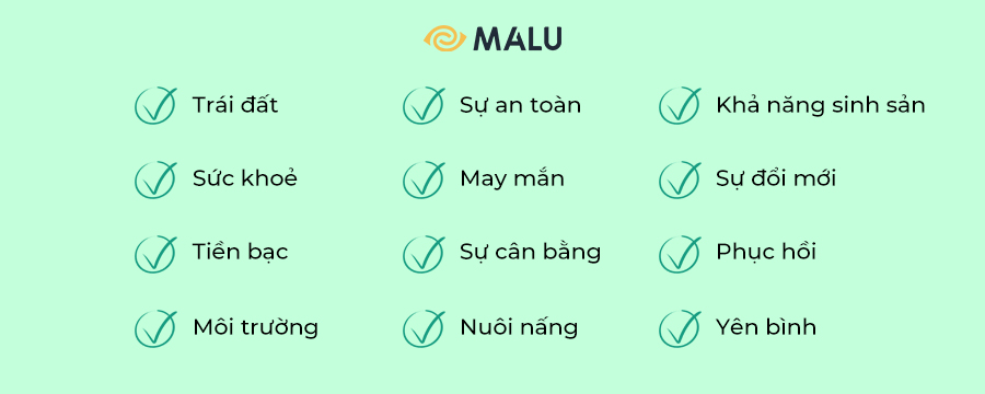
Each color has a significant effect on our behavior, mood, and even physiological responses. That being said, color associations rely heavily on culture, personal experience, and upbringing — the meaning of color is not a box of crayons that fits.
If you are looking for a symbol that represents safety, luck, balance, nature, balance, money and success, then green is the color for you.
WhatsApp, the mobile messaging app, promises simple and secure messaging and calling. To convey those attributes to their audience, WhatsApp deliberately chose green, a color commonly used in the digital world.
Grab, the transportation app, is another company that uses the attributes of green to send safety messages to their audience.
Or look at Subway’s logo. The green logo is used to reflect fresh vegetables, encouraging audiences to view the fast food chain as a place to enjoy healthy, natural meals.
How to combine green with other logo design elements
When it comes to green logos, there are some design elements that mix well and those that don’t.
font
Choosing the right typeface in your logo can strengthen your overall brand. The font you use in combination with the color green can be the key to effective brand recognition.
There are 5 main font families , each with their own characteristics:
Serif – Great choice for brands that want to be seen as trustworthy, long-standing and trustworthy. For example, Whole Foods fonts have rounded edges to evoke things made from the earth or by hand.
Sans serif – Modern, easy to read, and simple, sans-serif is a popular choice among tech companies and startups like Hulu.
Slab serif – Slab serif font bold and dramatic are often used by technology and automotive companies.
Script – Great for businesses that want to show off luxury and add a personal touch, such as photographers, coaches or any home brand.
Decorative – Big, fun and entertaining, these fonts are versatile enough to allow companies to decide which emotions to focus on.
Of course, these are just general rules, but by no means are they fixed. Feel free to experiment with different font combinations .
Shapes and symbols
Different logo shapes can help create a clearer psychological and emotional connection between your brand and the consumer. It’s important to understand what each shape says about your brand and how you can effectively incorporate them into your design.
The circular logos combined with green are designed to be welcoming, symbolizing stability and balance (think Starbucks, Spotify, and Fiverr).
Abstract shapes also work well with green in logo designs (think Starbucks logo). Unlike other shapes, abstract logos combine recognizable shapes to form a logo with layers of meaning.
For example, Evernote, a note-taking app, uses an abstract logo design that combines the depiction of an elephant. But there’s a clever subtext: The corners of the elephant’s ears are folded, the same way people often fold the corners of a page to record points they’ve read. The use of a blue elephant as the main image recalls the brand’s identity as an app that provides alertness, balance, and creativity.
In logo design, a symbol is one that conveys instantly recognizable values and ideas. Many brands choose to use animal logos because images of animals can reinforce their values and characteristics in the eyes of the audience, such as John Deere’s dancing deer.
The deer logo and green color together communicate the company’s drive for progress and prosperity, and its mission to build agricultural machinery that helps us take care of the earth.
Is the green logo for you?
As I mentioned before, color is subjective and there is no right or wrong way to use green in a logo.
With that said, you should use green if it aligns with one of your brand messages/values. Or, you can use green to set yourself apart from your competitors’ logos.
If your brand is in one of these industries, here are a few ideas on how to use green:
Green logos for tech brands
Technology has had a permanent place in our lives, and many of us have spent hundreds of dollars on everything from software to video games. If you work in the tech world, consider using a green icon to give your target audience peace of mind when using your product or service.
Green logo for environmental brand
Green is the color of life. It is associated with nature and the earth, so it makes perfect sense for an environmental brand to choose a green logo.
If you look at the many eco-friendly products on store shelves, you’ll see that almost all of them use green in their logos or packaging.
Green logo for food brand
As a food brand, one of the best ways to tell customers that your food is healthy, fresh and nutritious is to use a green logo.
Take Pawcuterie Box , client of Malu Design as an example of a business that has done just that. The goal behind @pawcuteriebox is to encourage pet owners to treat their furry friend in a fun and healthy way. By using green in their logo, customers will automatically understand that this is the brand that offers the “greenest” pet treats.
Green logos for cleaning brands
Green is often used by cleaning brands because it is associated with health and safety. From Scotch-Brite and Swiffer to Seventh Generation, many cleaning brands use green to signal to customers that their products are healthy and safe to use.
Green logos for health and wellness brands
We automatically associate green with nature, which is why many health and wellness brands incorporate green in their logo designs.
The owners behind Kief and Coffee face a problem many of us have: Their love for coffee has been marred by the caffeine-induced jitters. So they decided to create a CBD latte to solve the problem. Talk about eating your cake (well, coffee) and eating it too!
They knew they wanted a fun logo with the signature green frog. To create the perfect logo, @kiefandcoffee turned to Malu Design to create an interesting design that fits their brand perfectly.
Green logos for financial brands
Because green is often associated with money, prosperity and security, many financial companies have taken advantage of that in their logos. Some of the most famous brands in the financial sector use the green logo, such as Fidelity, TD Bank, and NerdWallet.
It’s important to note that there are no matching colors in the box. See what competitors in your industry are doing and whether green is too commonly used. If it’s overdone, you can think about using an alternate color to stand out. But if it’s not used enough, ask yourself if the psychology of the color is right for your brand before choosing it.
Match color matching green
Green can be quite versatile depending on the color you combine it with. Let’s see some examples of green logo combinations:
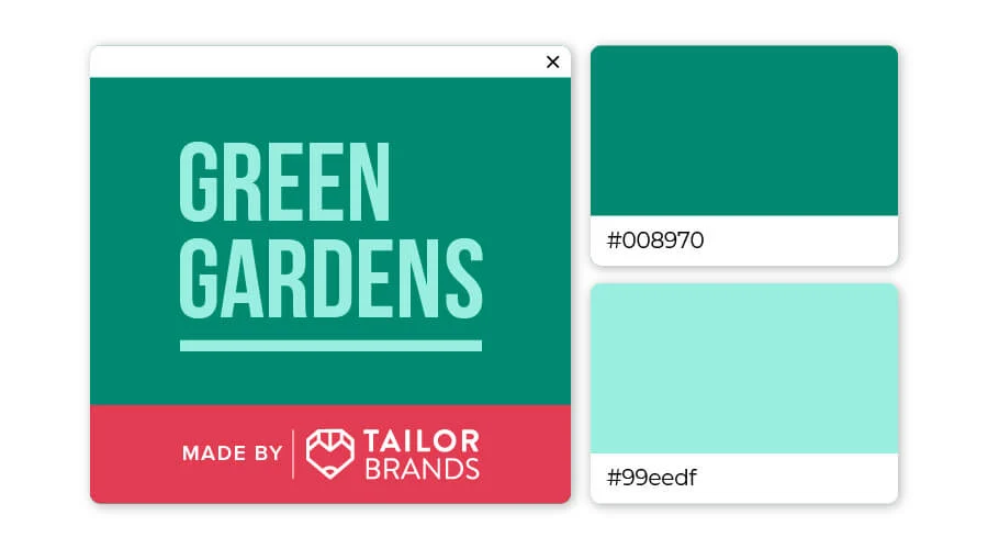
Deep forest green is a common color in the natural world that speaks of renewal, renewal and rebirth. Associated with clarity of mind and creativity, turquoise is a color that encourages contemplation and openness. This color combination will bring a sense of renewal and clarity to your brand.
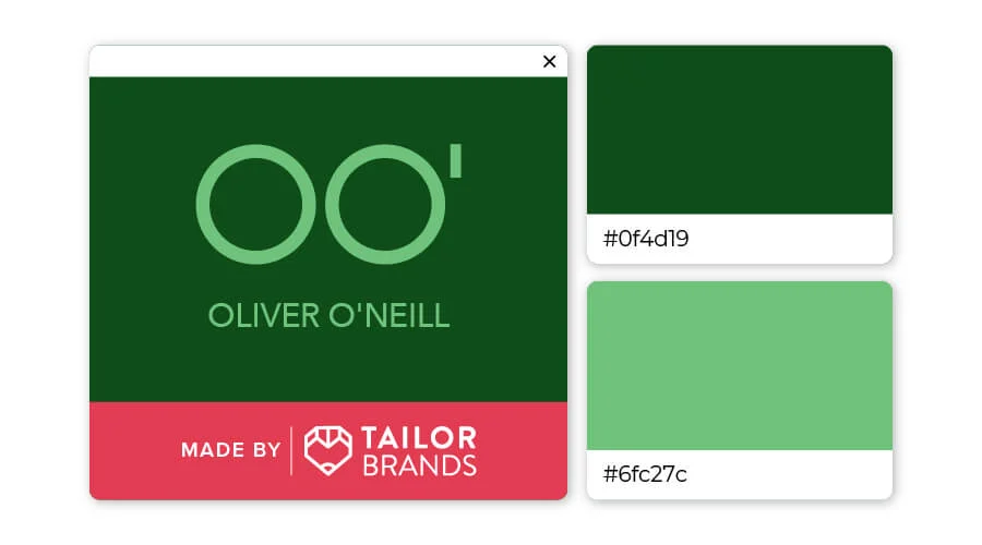
Just by the name, you also know that the green color of the forest is reminiscent of nature. This versatile color is associated with growth and is combined with the lighter green of the sponge helping to keep it cool and fresh. The contrast of colors makes a logo stand out, attracting viewers’ eyes.
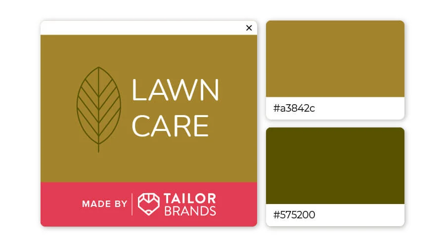
Earthy brown and green tones always go well together. Here, the fawn almost naturally harmonizes with the deep olive green. Together, the color combination tells customers this brand promises balance, healing and peace.
Let’s go through a series of famous green logos to find out what it means.
21 Famous Green Logos
1. Starbucks
The Starbucks logo has gone through many changes throughout the years, and the latest version has been redesigned to fit today’s trend – simplicity.
The Nordic-inspired mermaid has been simplified, and green is used to represent the freshness you can expect from every Starbucks coffee.
2. Shopify
For decades, green has been used to represent money and shopping.
By pressing an S on a green shopping bag, Shopify’s logo instantly tells you they’re always in the store (pun intended). To make their company more memorable, they added the brand name to their logo in black text.
3. Spotify
Using a light green color makes Spotify’s logo stand out and more eye-catching than other apps. It’s even more prominent on devices with “dark mode,” which helps users focus better and improves visibility for anyone with poor eyesight or sensitivity to glare.
The sound waves in the logo show that Spotify is an easy-to-use music application on most devices (laptop, mobile…)

4. Sprite
Sprite’s vibrant green logo is full of energy and the white font contrasts with the green background to create a refreshing design. Unlike newer companies, Sprite has been around for decades, which has allowed them to refine their logo and simplify it without losing its brand appeal.
5. Holiday Inn
Holiday Inn has been around for over 60 years. Using green for a hotel chain is a great way to show a relaxing nature in a room, as green is a peaceful color.
6. Lacoste
Lacoste Blue Crocodile was created in 1927 by artist Robert George. It was inspired by Rene Lacoste’s nickname ‘crocodile’ for his endurance on the tennis court.
7. Fiverr
Fiverr’s simple logo uses the ChunkFive serif font and is all lowercase. If you look closely, the letter “F” and the letter “I” are connected. (We still don’t know why, but there are many theories surrounding this.)
The solid green circle with white text is simple but effective in attracting attention.
8. Heineken
Incorporating contrasting colors is a great solution to make a logo pop off the screen or a label.
To help Heineken bottles and cans stand out from the rest, they opted for a red and green color combination.
9. Jaguar Land Rover
Land Rover vehicles are famous for their ability to cross the runway, run on jungle and desert terrain.
By using green in their logo, Jaguar Land Rover has made it clear that their products are primarily intended for use in the wild.
10. BP
As one of the world’s largest energy companies, BP uses the color light green to demonstrate its commitment to the use and renewable of “green” energy.
Their current logo has cleverly combined yellow, white and green to represent both the sunflower and the sun.
11. Tropicana
The use of a green serif font with a leaf above the I in Tropicana has helped the brand show that their drinks are natural, delicious and healthy.
12. Subway
Subway’s logo is both famous and memorable! Subway prides itself on being quick and healthy, so they use orange (energy) and green (healthy) to convey this message to customers.
13. Grab
The Grab app gives users the freedom to hire taxis, cars and even bicycles to help them get where they want to go. The parallel lines of the logo represent the endless ‘road’ and the green color represents savings when using their services.
14. Animal Planet
As you know, green has always been a color favored by eco-friendly companies. It’s also used by businesses revolving around agriculture and nature, so it’s a great choice for Animal Planet, a TV show devoted to wildlife and pets.
15. WhatsApp
Green usually symbolizes safety and freshness. WhatsApp is a free messaging app and they pride themselves on encrypting and securing all user communications!
The use of green allows them to showcase their free and secure service.
16. Hulu
The Hulu logo has gone through a number of changes over the years, but unlike other companies that always tweak the layout or fonts, Hulu just changes the color of their logo.
They switched from a green gradient to using a light green-turquoise color.
17. Whole Food Markets
Dedicated to providing food that will help you eat well, Whole Foods Market has chosen a green circle with white text to represent their commitment to natural foods. Green is the right choice if you are looking to promote a brand that is healthy and safe for users’ health.
18. Green Lantern
Green Lanterns are fictional superheroes who derive their powers from a giant green magic lantern. However, the green color in the logo is also not randomly chosen, it is used to symbolize strength and will.
19. Evernote
Evernote is a great app that you can use to store your notes and work.
Elephant – the symbol of an animal known for its impressive ability to remember information. Green is used to emphasize confidence and help the logo stand out.
20. TechCrunch
TechCrunch is a fast-access technology news website. They wanted to highlight their commitment to providing accurate information and their logo is simply designed with blocks inspired by the pixels you can find on a computer screen.
21. John Deere
The John Deere logo combines yellow with green to create a light and inspiring logo. The combination of yellow and green also helps them promote their brand in a stronger way and attract more customers.
For you
Using green can help you build trust with your customers, show your perspective on environmental issues, and highlight how you’re helping people thrive.
We hope you were inspired by this green logo collection and are ready to create your own perfect logo.
If you are looking for a reputable and experienced unit to be able to design a professional and impressive logo and brand identity system , then please contact us immediately by phone. 0988 622 991, or leave your information and requirements, Malu Design ‘s consulting department will contact you right away to answer all your questions!
————————
Malu Design – Branding Identity Agency
Hotline: 0988 622 991

