Have you ever looked at the thumbnail of a movie trailer and instantly knew what genre it was even though you hadn’t seen it yet?
That’s the power of good design. We all have a series of subconscious associations with different fonts, colors and shapes that give us information about our environment in a snap – that’s why creating Making a good logo is so important.
And guess? Color meaning plays a huge role in whether your audience understands what your business logo is all about! In this post, I’ll focus specifically on brown – what it means, how it’s used in design, and whether it’s the right choice for you.
Let’s find out together!
The Meaning Behind the Brown Logo
Color has a significant effect on our behavior, mood, and even psychophysiological responses. That being said, color associations rely heavily on culture, personal experience, and upbringing — the meaning of color is not a box of crayons that fits.
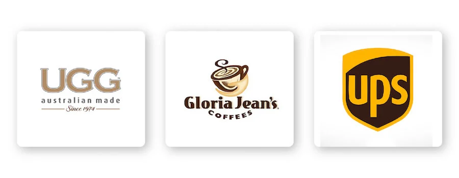
If you want your logo to represent attributes like trustworthiness, confidence, friendship, accessibility, etc., then brown is the color for you. For example, consider how both UGG Australia and Gloria Jean’s Coffees offer high-quality products while exuding a rustic, grounded vibe.

Brown can also convey a sense of security, making it the perfect color for a UPS logo. The brown logo has become a globally recognized symbol of reliability and security.
As you can see, there are different ways you can use brown to send a specific message to your audience.
How to combine brown with other logo design elements
When it comes to brown logos, there are some design elements that combine well and those that don’t.
font
Choosing the right typeface for your logo can strengthen your overall brand. Review the 5 main font families to determine which one best suits your brand.
Serif – Great choice for brands that want to be seen as trustworthy, long-standing and trustworthy. Both The Coffee Bean and Tea Leaf and M&M logos are great examples of combining serif fonts with brown. Brown evokes friendliness and accessibility, making traditional fonts look appealing and memorable.
Sans-serif – Binh Casual, legible and modern, sans-serif is a popular choice among startups, tech businesses, and restaurants. Brands that want to appear approachable will benefit from pairing sans-serif fonts with brown.
Slab serif – Slab serif font bold and dramatic are often used by technology and automotive companies. Mostly, slab serifs are fun and entertaining, and can really make an impact when used with brown.
Script – Great for businesses that want to show off luxury and add a personal touch, such as photographers, coaches or any home brand. Although it’s not very common to use a script font with brown color, it will be a great combination if you want to show warmth and friendliness.
Decorative – This is a loud, fun and entertaining font! These fonts are flexible enough to allow companies to decide which emotions to focus on.
Of course, these are just general rules, but by no means are they fixed. Feel free to experiment with different font combinations .
Shapes and symbols
In your logo design, different shapes can help create an emotional and psychological connection between your brand and the consumer. It’s important to understand what each shape says about your brand and how you can effectively incorporate them into your design.
Squares and rectangles are strong shapes that represent positive ideas and emotions, such as reliability, stability, and a sense of order. When combined with brown, squares and rectangles provide a bold yet balanced logo design. If you look at the Nespresso logo, you’ll notice how the logo is framed in a brown square, letting shoppers know they can expect quality and reliability.
In logo design, a symbol is one that conveys instantly recognizable values and ideas. To take your logo a step further, try incorporating negative space into your design. If you look closely at the Cotton Incorporated logo, the two “ts” are separated by white space to create a flower shape.
Is the brown logo right for you?
As I mentioned before, color is subjective and there is no right or wrong way to use brown in logos.
With that said, you should use brown if it fits with one of your brand messages/values. Or, you can use brown to set yourself apart from your competitors’ logos.
If your brand is in one of these industries, here are a few ideas on how to use brown:
Brown logos for environmental brands
Brown is associated with nature and the earth, so it makes perfect sense for an environmental brand to choose a brown logo. If you look at the many eco-friendly products on store shelves, you’ll see that many use brown in their logos or packaging.
Brown logo for coffee brand
Whether you own a small coffee shop or sell your own beans, you’ll want a strong espresso logo! Brown is the color of the earth associated with stability and certainty—just what people want from their cup of coffee. That’s why it’s become such a popular color for coffee brands (and no wonder it’s the color of coffee too). Just check out the Gloria Jean’s Coffees logo for inspiration!
Brown logos for chocolate brands
If you’ve ever walked down the candy aisle, you’ve probably noticed that many chocolate brands use brown as their logo color. Brown actually represents decadence and passion, making it a great color for chocolate brands like Hershey’s and M&M’s.
Brown logos for vintage brands
Vintage logo has fashion style, hipster style. Also known as vintage logos, vintage logos draw inspiration from a period of time and emulate that nostalgia through a specific design. Minimalist colors go well with classic brands, especially brown.
Brown logos for logistics brands
Logistics brands need to tell their customers that they are working fast, hard and friendly through their logo. If you take UPS as an example, you’ll find that they can express those core characteristics through their brown logo.
Brown logo for beer brand
Brown can connote feelings of comfort and contentment, the same feelings you feel when you open a cold beer. So when it comes to beer brands, you should go for classic beer colors like brown.
It’s important to note that there are no matching colors in the box. See what competitors in your industry are doing and whether brown is too commonly used. If it’s overdone, you can think about using an alternate color to stand out. But if it’s not used enough, ask yourself if the psychology of the color is right for your brand before choosing it.
Match the right color with brown
Brown can be quite versatile depending on the color you combine it with. Let’s see some examples of brown logo color combinations:
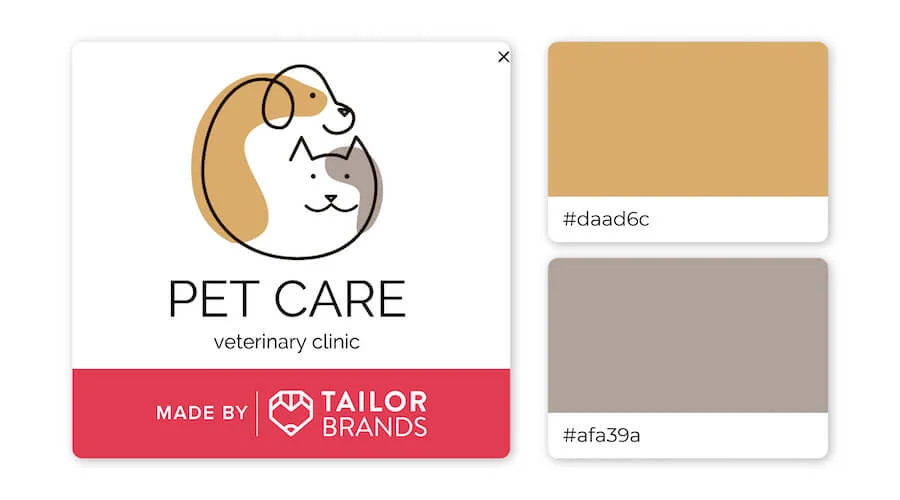
Brown is considered a warm color, while gray is cooler, which is why they go together so well! Browns and grays represent a warm welcome and are suitable for brands that want to convey a sense of calm and stability.
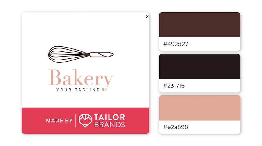
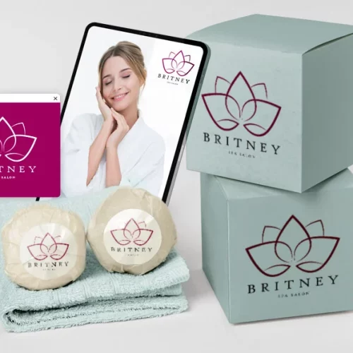
Combining blush with black and brown may seem odd, but this trio proves it’s a perfect combo! The color combination is distinct enough to make the logo stand out while still giving off a soft feel.
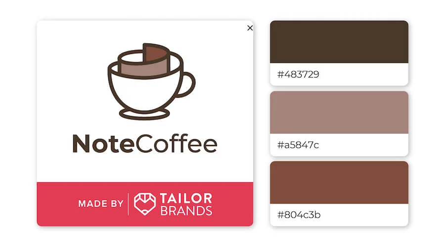
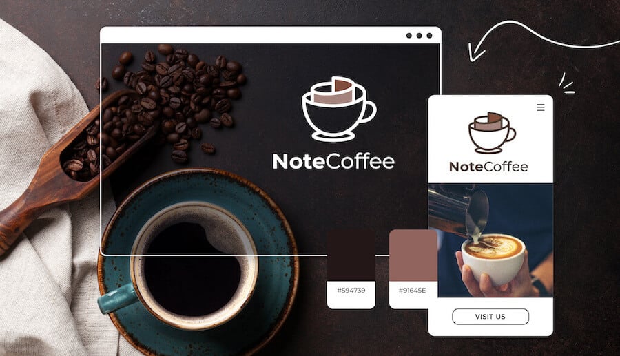
This design has a cozy, curled-up feel with a steaming cup of coffee. While these colors can be monotonous and boring, when combined, they create a warm, inviting feeling.
For you
We’ve seen that brown represents confidence, security, and friendship, but combining it with other design elements can create a unique and impressive logo.
If you are considering brown as the main color for your brand logo, contact us to design your logo!

If you are looking for a reputable and experienced unit to be able to design a professional and impressive logo and brand identity system , then please contact us immediately by phone. 0988 622 991, or leave your information and requirements, Malu Design ‘s consulting department will contact you right away to answer all your questions!
————————
Malu Design – Branding Identity Agency
Hotline: 0988 622 991

