The shape and meaning of your logo says a lot about your business. It can tell customers whether you are friendly or serious, scientific or artistic, free or strict.
Just like colors , logo shapes have their own meanings and this article will help you learn about them so that when you need a logo you will know exactly which shape will work for you.
Logo design is like any other type of design, everything has its own purpose.
Why Shapes are Important in Logo Design?
One of the basic principles in logo design, is that shapes can be used to change the perception of a brand by customers. The reason for this is that the human brain tends to associate shapes with distinct meanings . This is the operating mechanism for humans to learn and survive.
That’s why customers often remember brand logos with unique, simple designs that contain deep meanings.
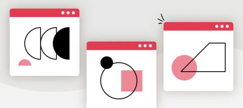
So in your logo design, different shapes can help create a clearer emotional and psychological connection between your brand and the consumer. It’s important to understand what each shape says about your brand and how you can effectively incorporate them into your design.
On that note, let’s find out what each key shape stands for, what the shape has to do with it, and which brands or industries would benefit most from using them!
Circle, Oval and Ellipse
Although they are not the most common shape, circles are symbols of stability and cooperation. The logo uses a circle designed to represent a welcoming, positive and focused message of unity. Notice how the Pfizer logo is reminiscent of a pill or pill – symbolizing wholeness and healing.
Circular logos can also be a sign of continuity and perseverance, as images are often associated with time, planets (or suns), etc.
The circle represents perfection, freedom.
Description Circle:
- Perfection
- Love
- Move
- the eternal
- Protection
- Intellectuality
- Feminine (anything that involves curves has femininity)
- Secret (keep inside the circle)
You’ll see circular logos in different industries, from car companies (Mercedes-Benz) to clothing brands (Target). Think about using circles in your design if your brand is focused on coherence or harmony, such as NGOs that want to unify their audience or brands that provide provide an all-in-one solution to a customer’s problem.
Square and Rectangle
A square, square and rectangular design offers a combination of boldness and balance.
Rectangles are often considered a sign of reliability and strength, as they are associated with objects such as houses, safes, and boxes, where things are kept safe. In addition, straight lines and angles convey a sense of order and professionalism, and they are great for imparting a sense of power and stability.
Thus, these shapes have formed their meanings in our minds. These four-sided shapes evoke the psyche:
- Trust
- Stable
- Uniformity
- Honest
- Equality
- Protect
Furthermore, right-angled figures (squares and rectangles) also show:
- Quiet
- Rationality
- Sobriety, politeness
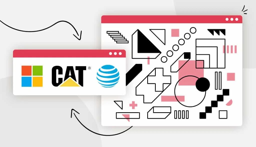
For example, companies like Microsoft and Dropbox use square logos to convey a sense of order and trust in their brand. Microsoft’s new square design is focused on promoting the company’s approach as a more dynamic and edgy design, while in the case of Dropbox it is used to convey a sense of Safe and reliable combined with a blue palette – a place where you can drop all your files and know they’ll be protected.
However, qualities are only manifested when they are in their basic form. Tilt it slightly and its stability is lost, but it has that unique, attention-grabbing ability .
Squares and rectangles are so common that their appearance is too ordinary, sometimes boring, lacking the ability to attract attention. A slight slant can get it attention, but will result in you losing the existing attributes of stability, order, and form.

Isosceles trapezoids and parallelograms have different meanings than squares and rectangles. Isosceles trapezoid (like the body of a pyramid) depicts better stability and growth . Parallelograms (rhombuses) represent speed (like the DHL logo).
So consider using squares or rectangles if your brand is related to finance, news, or dealing with sensitive information (like psychology or casework). Cleaning and organizing service brands will also work well with square/rectangular logos, as they will help you convey the sense of order you are promising to create to your clients.
Triangle
Like squares, triangles stand out thanks to a combination of straight lines and sharp angles. They also convey some of the same feelings and ideas.
The triangle represents a leader , energy and focus (because of the corners). The triangle represents action . It also describes the direction of that action (the side it points to).
Triangles are also known for:
- dynamics
- Power
- combative
- Work
- Orientation
- Stress
- Balance
- masculine
- Serenity
Note that the meanings of the triangle logos can vary significantly depending on how they are placed. An upward triangle, like the CAT and Qantas logos, symbolizes stability and momentum. On the other hand, triangles pointing downwards show more feminine features, while triangles placed to the side – like the YouTube logo – show movement and action.
Triangles describe different meanings when used in different forms . It shows stability and strength when placed in its base form. But when we tilt it at an angle, it shows instability and tension.

Interestingly, triangle logos are increasingly popular in two very different fields: Science and religion. Their association with power and masculinity makes them strong choices for these two fields, as well as industries such as law and male-oriented consumer demographics.
You might also consider using a triangle logo if you’re in the lingerie business, extreme sports, or if you want your brand to convey an atmosphere of mystery.
Horizontal line
Has anyone ever told you not to wear clothes with horizontal lines because they will make you look fat? Rub ! In logo design too, horizontal lines expand the view.
The horizontal lines again represent lying on the same plane, the same boat, showing calm and harmlessness. They represent:
- Calm
- Rest
- Girly
- Silence
Like a horizon or a vision of solid land, horizontal lines are a fundamental influence on a brand. For most people, these lines represent a sense of stability and calm, like the IBM logo with the dash.
Brands that want to draw their audience’s attention to their feminine side will often use horizontal lines as part of their designs, incorporating a softening effect on bold and angular signs.

See how the AT&T logo incorporates horizontal lines in a circle to further soften the look and make it look more peaceful? The overall image gives the feeling of a globe communicating interconnectedness.
Horizontal lines can also represent dynamism and movement. For example, delivery companies can add horizontal lines to their logos to convey a sense of movement and speed, just like DHL.
By using horizontal lines, companies can create a feeling of peace and tranquility, as well as an image of the community. So think about using horizontal lines if you’re in the shipping or delivery industry – or if you handle contact forms.
Straight line
Where horizontal lines tend to be associated with calm, serenity, and femininity, vertical lines represent strength, stability, and forward thinking.
Vertical lines are like obstacles blocking your way, showing dominance and boldness, orienting upward movement. Therefore, they represent:
- Courage
- Overwhelm
- masculine
- Boldness
- combative
- Evolution
The logo uses prominent vertical lines that are bold and present a sense of strength and durability, combined with a more “aggressive” approach. They are also a great way to present an image of efficiency and reliability, which is evident in the Adidas logo.
Vertical lines are also very versatile, as they can remind us of everything from the walls of a building to the edges of a rocket, and even form larger images when layered. reasonable.
Businesses that want to look creative and bold — like SoundCloud and Cisco — use straight lines as a way to frame their designs with elements of stability.
That’s why “disruptor” tech companies can really do well with vertical lines; they’ll show your audience that you’re not afraid to make bold and thoughtful choices. However, it’s important to be careful when using vertical lines, as too much can make the brand overbearing and overzealous.
Natural figure
Natural shapes are considered preference-based shapes. They are like geometric shapes but also more related to color psychology. Natural shapes are a combination of basic geometric shapes and so you can also get their meaning through the above geometric shapes to create a more unique logo icon .
However, natural shapes will describe some common characteristics such as:
- Attention
- They are considered more relevant to the niche (if the shape relates to the niche)
- Unique
Because they are often made for a specific brand, natural shapes are more flexible in what they convey and they can do this more directly than squares or circles. In many cases, these logos are intended to convey a sense of comfort and familiarity as well as a deeper knowledge of the company’s identity. For example, Puma, Dove, and Shell all use wordmark logos that directly represent their brand names.
Natural shapes can work well for brands whose names can be directly described by something in the real world – no matter what industry you are in – because it will help you create brand recognition over time.
However, since these logos are more specialized, it is important to consider exactly what you want them to say, to avoid creating a shape that loses some of its impact and ultimately harms the brand. your.
Abstract shapes
Abstract shapes are an interesting topic, mainly because they disobey the rules of “normal” shapes. Unlike the other symbols we’ve seen on this list, abstract logos actually combine “recognizable” shapes to form a symbol that has multiple layers of meaning – whether through the use of Symmetrical lines, geometric shapes or symbols are interpreted ambiguously.
In general, abstract logos are used to represent ideas or emotions rather than concrete items or products (although you can use abstract versions of a real-world object to create layered meaning in your design).
For example, the “comma” Nike logo inspires momentum and speed, while the Under Armor logo uses an inverted ‘U’ shape to convey a sense of power. While the Nike logo can also be thought of as a comma, it’s the abstract aspect that gives it that extra layer of meaning.
Because of their versatility and uniqueness, abstract logos are used in a number of different industries – from technology and finance to music, clothing and retail. These designs are meant to engage your audience and inspire them to feel like it takes too much effort to understand what you’re trying to say.
Before using abstract shapes in your logo design, make sure that the shapes are communicating the message you really want to convey and are not confused with conflicting or counterproductive meanings. your brand.
Curve
Curves are a great way to add a sense of movement and rhythm to a logo design, as we often associate them with undulating waves. In fact, brands like Vaio use curves to represent waves (in this case, analog waves).
Unlike horizontal or vertical lines, curves depict feelings of movement, happiness, and positive emotions. They are better suited to logos and brands that are less concerned with engaging the business world and more focused on building an emotional bond with their customers.
The curve is considered the shape of “happiness”. The curve represents:
- Creation
- Beat
- Generous, generous
- Bring lightness and joy to viewers
Any shape that touches the curve is generally considered feminine.
Two of the most famous logos in the world – Coca Cola and Disney – use curves to convey their playful brand personality, helping them connect with audiences on a personal level.
Finally, like we mentioned above, curves tend to be perceived as feminine – making them an ideal addition to logos geared towards a female demographic. Or, if your brand is in a family-friendly space like entertainment or food and drink, you would be a great fit for a curved logo – reflecting the feeling of happiness and fun with your design. .
Spiral
They may be an uncommon design element, but spirals provide a unique twist and can make a logo more interesting (look back at the Malu Design logo). Spirals are a useful visualization tool, as they can create a sense of hypnosis and calm.
In many cases, this shape is used to represent a flow — energy, time, love — as well as a slowly building strategy. For example, the Fetcom logo is almost like a spiral galaxy, giving the impression that everything is moving and connected.
Perhaps more importantly, spirals are a great strategy to showcase your business’ creativity, inclination to differentiate, and out-of-the-box thinking. So brands that want to communicate their growth and evolution can also use spirals to symbolize their ever-changing nature.
Healthcare brands, spas, healers, and interestingly tech companies can all benefit from a spiral logo design. Ubisoft’s logo uses a spiral to represent the world they’ve created in their game, while Somersby uses the concept of a “living tree” – a tree made up of flowing spirals that block how they compare to other cider companies.
In this way, you may also want to consider spirals if you are working in an industry or creative space.
Using shapes in logo design
Now that you understand what all the different shapes mean, it’s time to really use them effectively! What’s the best way for you to incorporate shapes into your logo? It all comes down to the logo shape mentality and the message you want to convey with your design.
How to apply logo shape psychology
Before starting to create a new logo, your first step should be to consider your brand’s values and the most relevant characteristics.
After you’ve written these down, it’s important to consider not only the shapes that best represent these properties, but also how shapes can be combined to create something. that’s more wonderful. While shapes can stand as the overall frame of a logo, you can also use them as part of a design, in a logo, or even incorporated in your font.
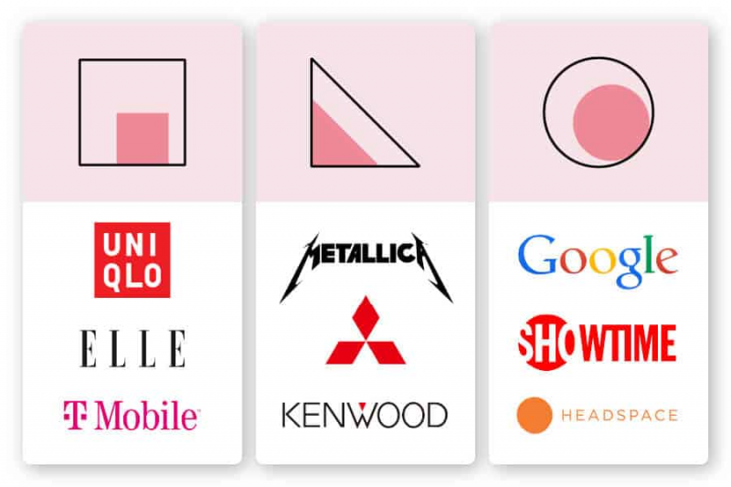
Circle : See how the Showtime logo draws attention to the first half of the design by placing a circle over the first half of the letter?
You can use circles to highlight a specific part of your design that you want to draw attention to. Alternatively, you can incorporate circular images in your typography, like Google does, if you want to create a healthy, interconnected feel in your design; or, treat a circle as your entire logo, like Headspace, to impart an overall sense of calm to your audience.
Rectangle : The most reliable shape, rectangles can be interspersed in your logo design just like T Mobile, to show credibility from start to finish. You can also mimic Uniqlo and frame your entire logo in a square, which shows your audience that they can expect quality from what you have to offer.
Triangles : Like we mentioned above, triangles convey different things depending on the direction they are facing. Consider using a triangle as the accent for one of the letters in your logo, like Kenwood. Or, you can also use triangle-inspired lettering like Metallica does in their logo, to give your designs an edgy look without having to commit to the complete design.
Remember, most of all, you want your logo to convey a specific message and that the different shapes can connect together harmoniously.
For you
The best logos are timeless designs. Combining all aspects of a good logo—colors, fonts, and shapes—can create a final design that conveys your brand personality and values, while leaving a remarkable impression. for anyone to see it.
Choosing the right shape to form your logo design is an important step in the creative process, as it lays the foundation for your brand message. Determine how these shapes will fit into your logo and will ultimately help your brand maximize your logo’s potential impact!


