Believe it or not, the balance of your logo design says a lot about your company.
It elicits feedback from potential customers, letting them know who you are and what you do. The right design layout, combined with the right colors and styles, can make a strong impression on your audience.
There are many design styles and formats that can be used to create a visual representation of a brand in the form of a logo. Choosing the right type of logo will depend on a number of different factors based on your brand, industry, and audience characteristics.
Symmetrical logos can give balance and a professional look to a business logo. Find out if a symmetrical logo is right for your brand with Malu Design.
Mục lục bài viết
ToggleWhat is a Symmetrical Logo?
Symmetry means mirroring or mirroring one half of the design with the other half. This means that both sides are the same. When it comes to logo design, symmetry can include the entire design or part of it.
We often feel extremely comfortable when looking at a symmetrical design. Some experts believe that the brain is attracted to symmetrical order and repetition, and this is especially true in design.
A symmetrical design could be the right logo for your company if you want to portray a trustworthy brand. There are many different types of symmetrical logos and many famous brands have used them successfully.
Types of Symmetrical Logos
If you are considering a symmetrical logo design, there are different ways to learn it. Here are four types of symmetrical logos and some of the most popular brands with logos that fall under that design category.
1. Reflective Symmetrical Logo
If a logo can be split in half and both halves are the same, then the logo is reflective. If you fold a reflective design vertically, it will be a mirror image. These are usually some of the simplest logo designs, but they can have a huge impact.
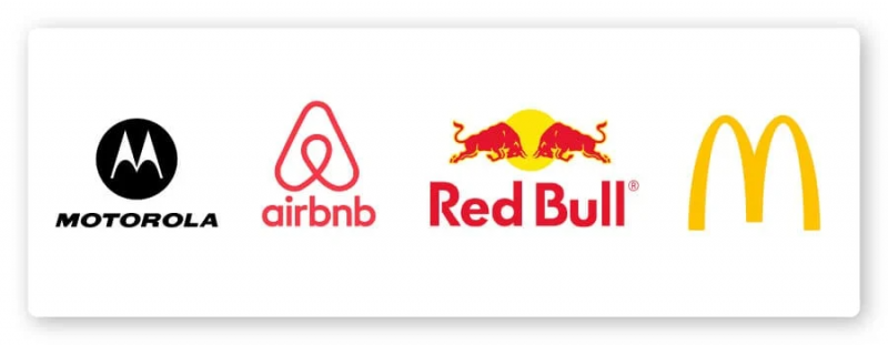
McDonalds: The famous golden domes of this fast food joint are evenly matched and stand out as a monogram representing the “m” in McDonald’s.
Motorola: Another monogram logo of the letter ‘m’, Motorola’s Symmetrical Letter shows mirror-image mountaintop-like arches enclosed in a circle.
Airbnb: The design is a combination of four icons: A location icon, an upside-down heart, and a person reaching out.
Redbull: Two bulls fighting in front of the sunset is how the logo of this energy drink shows the strength and power of the brand.
2. Rotating Symmetrical Logo
If you rotate the logo, it will still be the same in each rotation. Think of a hexagon or a starfish – no matter which way you rotate it, it will always be the same.
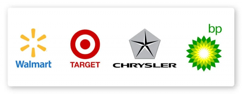
Walmart : The six spokes of the Walmart spark are all equally spaced and identical, creating the rotational symmetry of the mark.
Target : The red-eyed target’s symbol literally represents the name of the favorite retail store. A simple circle that sits sideways within an outer ring, creating the same symbol no matter how you rotate it.
BP : The flower symbolizes nature and energy for the gas company. Despite having plenty of white, yellow, light green and green spots, the image is perfectly symmetrical at all angles.
Chrysler : The Chrysler star in the pentagonal shield doesn’t have complete rotational symmetry like the other examples, but it still counts. Symmetry is not exact at every point of the rotation, but many points of symmetry exist in this logo.
3. Translational symmetry logo
Translational symmetry is not an exact reflection that can be divided like the first two examples, but it does provide an iterative design element. Translational symmetry is when a design element in a logo is moved to another area without changing its symmetry.
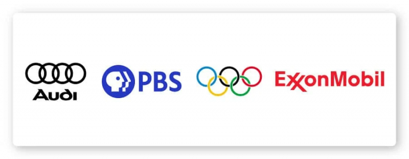
Audi : The car brand’s silver rings are the same four repeating shapes that make up its interlocking chain logo.
PBS : The Public Broadcasting Station logo features three repeating profile shapes housed in a circular logo. Simple and recognizable design with a clear message of programming consistency for a wide range of audiences.
Exxon Mobile : The natural gas company uses a repeating ‘x’ for an eye-catching example of a translationally symmetrical logo.
Olympics: The five repeating Olympic rings represent the five major regions of the world participating in the events when the Olympic logo was designed in 1913.
4. Logo is symmetrical in the direction of reflection
This is the least common type of logo symmetry because it is a bit more complicated. Glide reflection symmetry means taking half of the image and flipping it to create reverse symmetry on the opposite side and moving it forward so those reflections don’t align.
For example, if you turn one of the bulls upside down in the Red Bull symbol and hang below the horizontal line the other bull is standing on, you will have a glide reflex instead of a mirror reflex.
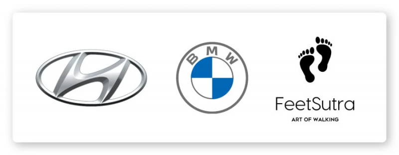
Shoes : One of the best examples of glide reflection symmetry is in the footprint. Each footprint is reflected and moved forward, creating an inverted symmetry pattern.
BMW : While the shape of the BMW logo is rotationally symmetrical, the colors are flipped. This makes the BMW logo a glide reflection symmetry where the blue color is at the top in one half of the logo and at the bottom in the other half.
Hyundai : The italic ‘h’ in the oval for the Hyundai logo is at an angle, making it an inverted mirror image if you split the logo vertically or horizontally. In this example, forward motions are interconnected creating a fluid shape.
Benefits of Symmetrical Logo Design

Many people are naturally attracted to symmetrical design because it gives a sense of balance. A symmetrical logo can provide a number of visual benefits:
Balance
Balance does not mean stagnation. Reflective symmetry will have solid balance, while rotational symmetry or sliding reflection symmetry simulates the appearance of fluid motion in your design.
Aesthetically beautiful
The visually balanced design is also highly aesthetic. They are meant for our mind, so we find them beautiful and attractive. Use symmetry to draw attention to your design by making it easy for your audience to connect with your design.
Reliable
Symmetrical design makes sense for the mind on a subconscious level. This allows it to sound like a sensible design choice, making your company look grounded.
The balance of symmetrical design creates a feeling of comfort and peace, which naturally establishes a basic form of trust. Because the symmetrical design seems reliable, it is used a lot by brands in the engineering, commercial and automotive industries.
Predictable
Symmetrical designs (especially reflective and translational symmetry) provide a predictable design pattern. Matching faces or repeating symmetrical design patterns allow the brain to relax.
The stability
The above benefits of a symmetrical design ultimately provide a sense of stability. When your brand exhibits stability, people are more willing to follow those feelings of trust and believe that the brand will thrive in the future. People want to follow an engaged and constant brand. You can increase sales with the right design by encouraging trust in your brand.
Does the Symmetrical Logo hurt my brand?
Features related to symmetry may not be suitable for all brands. While a symmetrical logo design is a great choice for some, its style may not be suitable for others. To understand if it’s right for you, define your brand ethos before determining which approach will work best.
If your company is edgy or skewed, symmetry can clash with your brand as it creates a sense of credibility and stability. Asymmetrical design may better serve brands that want to emulate an unpredictable approach.
It’s also important to keep your design in mind when designing with your target audience. Not all audiences are involved with symmetrical design. While younger audiences tend to prefer simpler designs for simple appeal, older generations prefer a more traditional approach. Nature-loving audiences find symmetry often feel manufactured, so brands in nature-based industries may also want to opt for something asymmetrical.
For you
If you are trying to create the right logo design for your brand, Malu Design can help you. Once you’ve taken the time to understand your brand’s needs, aesthetic, and audience, you’ll be able to begin the design process.
This is the perfect way to test out symmetrical designs to see which works for your brand. You can include company details, color scheme, font options, images, etc. to create logo options for your brand.
If you are looking for a reputable and experienced unit to be able to design a professional and impressive logo and brand identity system , then please contact us immediately by phone. 0988 622 991, or leave your information and requirements, Malu Design ‘s consulting department will contact you right away to answer all your questions!
————————
Malu Design – Branding Identity Agency
Hotline: 0988 622 991

