Mục lục bài viết
ToggleWhat is color?
Color is a part of our lives and for a designer color is very important. A beautiful product is the perfect combination of composition and color. Therefore, the right color will make the design vivid, eye-catching and it directly affects the viewers’ feelings.
Color has been around for a long time, but there is still no universal definition for color. And perhaps humans are one of the luckiest creatures to be able to perceive colors. Normally, the human eye perceives an infinite number of colors, and those colors are always changing based on the relationship between light and viewing angle.
In design, color creates attraction, psychology and style. People can use the art of color mixing to express their ideas without needing words or sentences.
Color, in addition to its beauty, also has a hidden depth, it is that miracle that moves people’s hearts. Of course, colors are not always beautiful, colors are not always harmonious. Therefore, the art of color mixing will compensate for those shortcomings.
Color has always had an impact on our lives. Color has its own language that we must perceive for ourselves. Color has the power to shake our souls.
Color properties
What is the real color? As abstract as it sounds, the closest definition is that color is defined by the different ways our eyes perceive light when it hits an object. With that said, each color is defined by three main properties that make up the vast variety of that color effect.

-
- Hue – Tone: The term Hue is often mistaken to mean Color. We need to understand that “Color in general” includes sub-terms such as Hue, Tint and Tone. Hue is the attribute that helps us answer the question “What color is that?”. Basically Hue is a combination of 12 different colors on the color wheel.
- Intensity – Intensity: It reflects the saturation of the color. This parameter helps to determine whether the color is vivid or pale.
- Value – Value: The third attribute that forms the tints and shades of each color. It refers to the lightness or darkness of that color. You create tints by adding white to the base color, and you create shades when you add black.
Color has four more properties related to its hue, intensity, and value. The color principle teaches us that because color is a segment of a particular color family on the wheel, it is also the purest state of color. From there, by varying the intensity and value, you can create tones, tints, and shades.
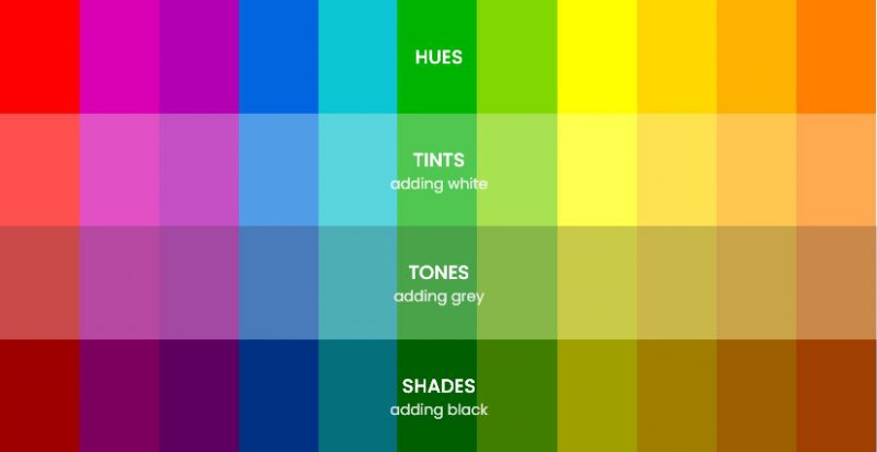
- Tints: Usually created by blending Hue with white
- Shades: Usually created by blending Hue with black
- Tones: Tone formation is a bit more subtle, because it requires a combination of both black and white, this is also why Tone looks more natural than Shade and Tint.
Color wheel
If you have any lessons related to painting, you must see the circle consisting of different colors. It is called the color wheel which helps to understand how different colors are related to each other and how they can be combined. The color wheel is usually constructed of primary, secondary, and tertiary colors. It is the three pigments that cannot be formed by any combination of other colors.
According to color theory, a harmonious color combination uses two colors that are opposite each other on the color wheel, any 3 equivalent colors running around the palette forming a triangle, or any 4 colors of the same shape. form a rectangle (in which the two pairs of colors will be opposite each other). This harmonious combination is called a color scheme – sometimes the term “color harmony” is also used.
On the color wheel, there is still another separation that you need to recognize in order to better understand color schemes: those are warm colors and cool colors. Each of these types has its own purpose to stimulate the emotions of the viewer. Warm colors represent energy and joy (ideal for conveying personal messages) while cool colors evoke calm and peacefulness (ideal for utensils or materials). in the office).
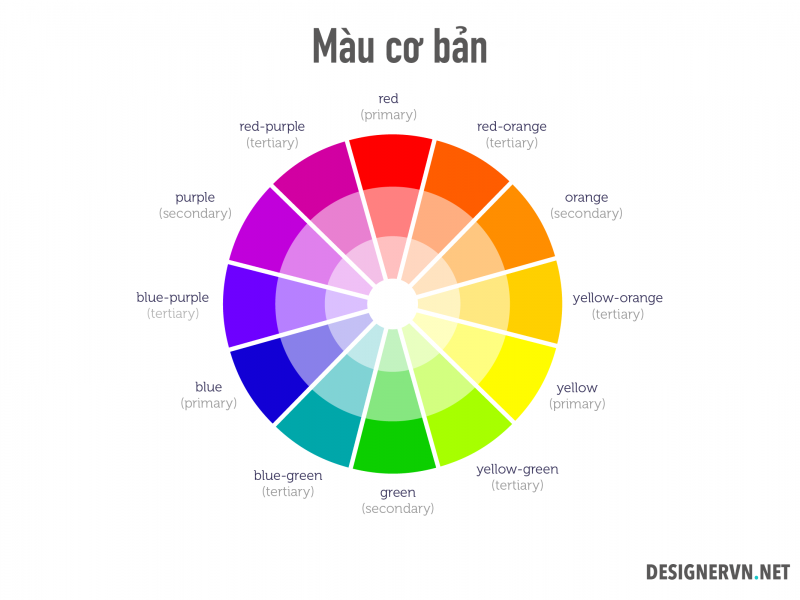
The color circle was created in 1666 by Isaac Newton in a schematic way and since then it has undergone many transformations but remains the primary tool for color mixing. The main idea is that the color wheel should be created that way so the colors will be appropriately mixed.
The basic color circle has 12 arcs evenly divided in the shape of a fan on the area of the circle, each arc has 8 color levels that gradually go into the center of the circle from dark to light. 12 arcs x 8 levels will create 106 primary colors and are numbered from 1 to 106 which is also the symbol when we choose a color.
Types of colors in the color principle
When it comes to color basics, it all starts with a color wheel that shows the relationships between all sorts of colors.
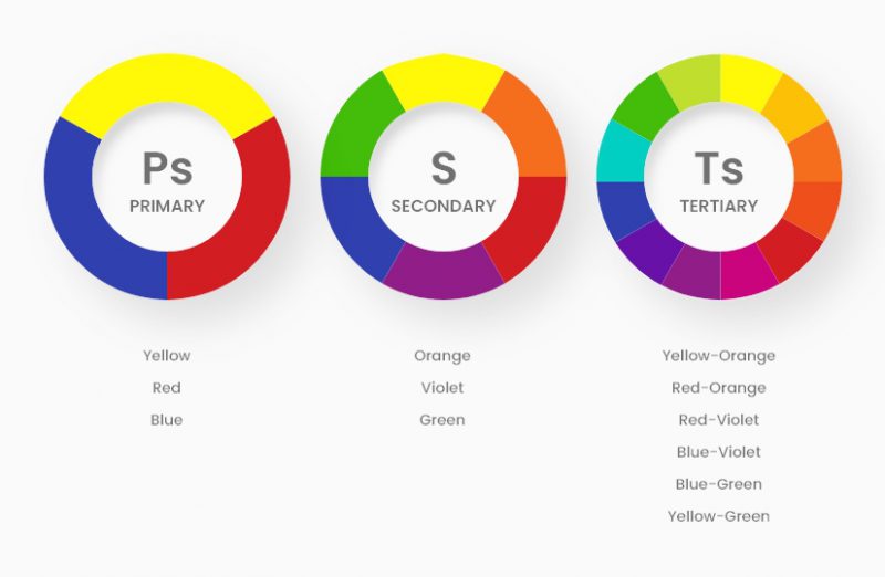
- Primary colors (Ps): Red, yellow and blue.
In traditional color theory (used in paints and pigments), primary colors are 3 color pigments that cannot be mixed or formed by any combination of other colors. Remember that all other colors are derived from these 3 primary colors. - Secondary colors (S): Green, orange and purple.
These are colors formed by mixing primary colors. - Tertiary colors (Ts) : Yellow-orange, red-orange, red-violet, blue-violet, green and yellow-green.
These are colors formed by mixing a primary color and a secondary color. That’s why color is a two-word name, such as blue-green, red-violet, and yellow-orange.
Color temperature
In the color principle, color also has a temperature. It is a characteristic that refers to the relative coolness or warmth of each color. When you divide the color wheel into two halves, cool colors start with purple and end with yellow-green, while warm colors start with yellow and end with purple-red.
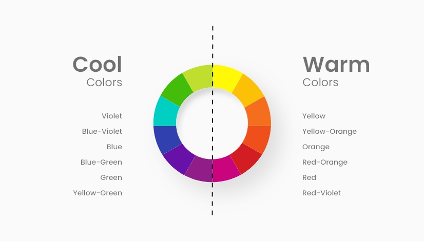
- Cool colors:
Blue and any color that includes blue is the predominant component. The closer the color is to blue on the color wheel (the more blue there is), the cooler the color. - Warm colors:
Yellow and any color that includes yellow as the main ingredient. The closer the color is to yellow on the color wheel (the more yellow there is), the warmer the color.
Neutral color
In addition, there are also colors that have difficulty finding the original color. They are called neutral, because they are hardly warm or cool. In fact, neutrals, especially black and white, are really capable of creating great designs on their own without using vibrant colors.

Types of color combinations in the color principle
When it comes to combining colors using the color wheel, there are five ways to combine. The truth is, you can create as many harmonious schemes and color schemes as you can imagine, but the results will always fall into one of those categories. So let’s see how they work.
Monochrome (MONOCHROMATIC)
The simplest formula is to use a solid color because only 1 color (1 hue) needs to be used. To create a monochromatic dithering, select a point on the color wheel and then change the saturation and value to create variations.
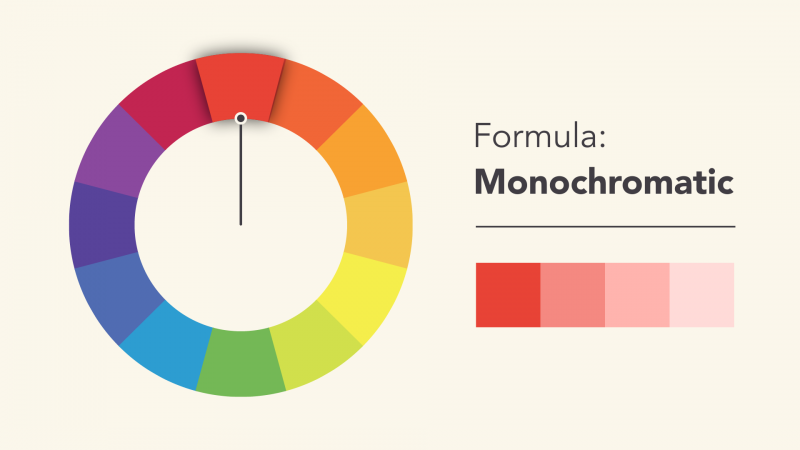
The best thing about using this method is that it ensures color harmony. The colors match each other perfectly because they come from the same source.

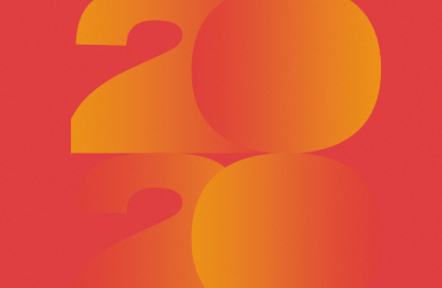
In the first example, we have a monochromatic color scheme with two different tones of blue that looks rich and varied, due to the different shades and shades created by the gradient. Same with the second example, also using gradients to enrich the orange tones.
ANALOGOUS (ANALOGOUS)
Analogous color matching is to use colors that are next to each other on the color wheel, like red and orange; blue and green.
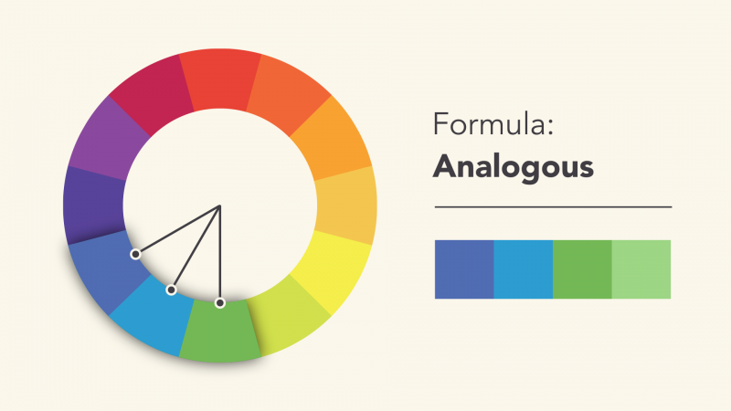
Don’t be afraid to use the palette and create your own unique set of colors. Recipes are just a starting point to guide and inspire you.
COMPLEMENTARY (COMPLEMENTARY)
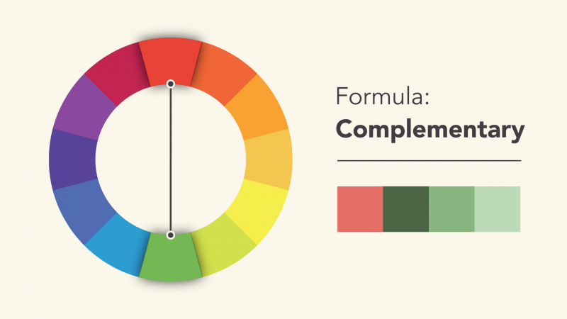
Complementary colors are colors that are opposite each other on the color wheel, for example blue and orange, or magenta and green.
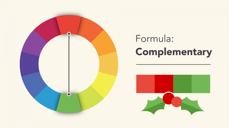
To avoid contrasting color combinations that look too monotonous, add some variation by using darker, lighter tones or low saturation.
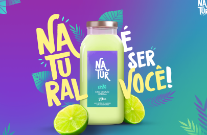
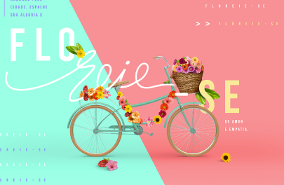
In the first example, the main complementary colors are purple and yellow. We also see a lovely addition of blue-green and lime, however, none of those greens complement the purple or yellow. In the second, pastel blue-green and red-orange shades create complementary combinations. There is also a third accent color which is yellow, but similar to the first example, it is not a complementary color to any of the two dominant colors.
SPLIT-COMPLEMENTARY (SPLIT-COMPLEMENTARY)
Isosceles triangle color matching is to use 2 colors next to a contrasting color.
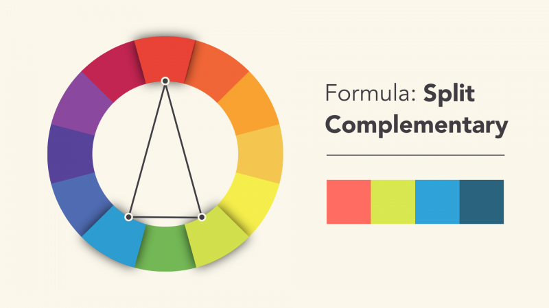
This type of combination creates the same effect as contrast, but there are more colors to use (and potentially more interesting results).
TRIADIC (TRIADIC)
Triad combinations use three evenly spaced colors, forming an equilateral triangle on the color wheel.
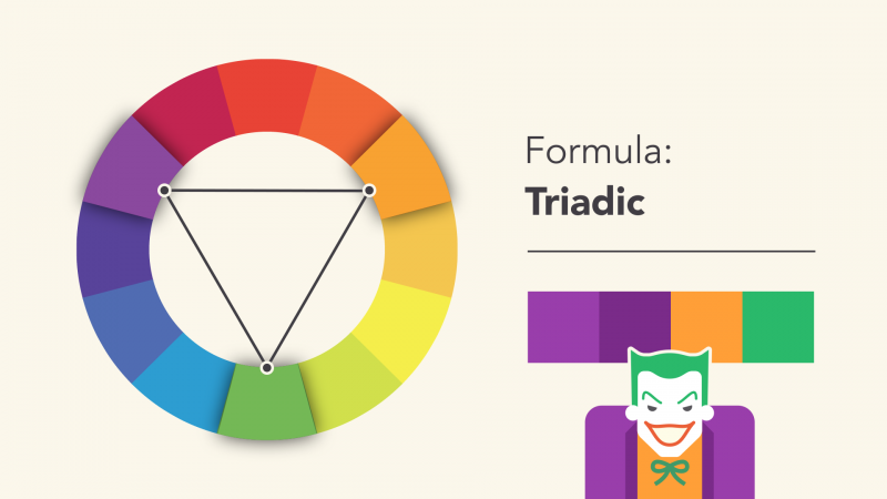
This type of combination is often quite dazzling – especially when using 3 primary or secondary colors. Therefore, you should be careful when applying them in your work.
RIGHT (TETRADIC)
This combination forms a rectangle on the color wheel, using not 1 but 2 pairs of contrasting colors. This formula works best when you choose 1 dominant color while the other colors play a supporting role.
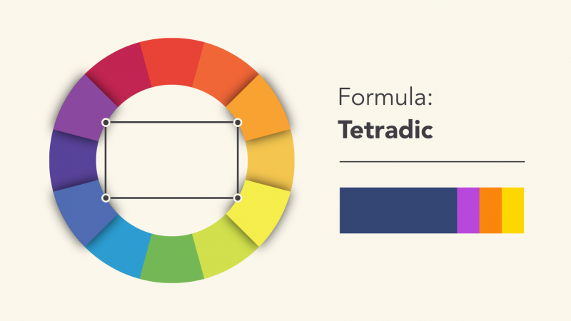
Individual Color Combinations:
What colors go well together?
This is often subjective because every color pair can be matched to the correct tones, tints or shades. However, there are some classic combinations that you will find in many designs from fashion, to interior design, to graphics and web design. So let’s take a look at some of those pairs.
>>> See more 42 design inspiration logo color scheme ideas
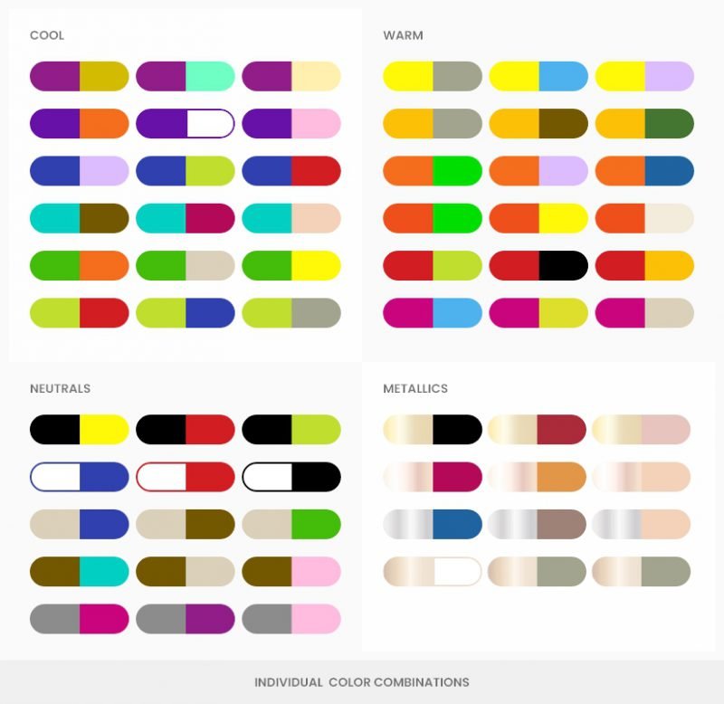
Neutral
- Black:
Since it is a universal color, it looks great with any other color. It pairs especially well with orange, green, white, red and yellow. - White:
Another universal color that pairs perfectly with blue, red and black. - Beige:
Blue, brown, green and red. - Brown: Bright cyan, cream, pink and beige.
- Gray:
Fuchsia, purple, pink and blue.
Metal
- Gold:
Black, burgundy, pink and army green. - Rose gold:
Purple red, flamingo and peach. - Silver: Blue
, brown and antique gold. - Bronze:
White, neutral green and navy blue.
Cool colors
- Violet:
Golden brown, light yellow and mint. - Blue-Violet:
Orange, pink, yellow and white. - Blue:
Lilac, cyan, yellow-green, brown, and gray. - Blue-Green:
Brown, orange, pink, cherry red and beige. - Green:
Orange, yellow, brown and creamy white. - Yellow-Green:
Cherry red, blue and gray.
Warm colors:
- Yellow:
Gray, blue, lilac and black. - Yellow-Orange:
Gray, brown and olive. - Orange:
Cyan, blue, and lilac. - Red-orange:
Cyan, mint and creamy white. - Red:
Yellow, green, blue and black. - Red-Purple:
Grey, lime, mint, blue, gray and beige.
You may also be interested in learning more about the color of the year 2020: Classic Blue.
Gradient Color:
Expansion in color
For a while, gradients were pushed aside in graphic and web design in favor of flat styles, but as of 2018 they’re back again. The trend is constantly evolving as designers are constantly mastering their skills to create beautiful color transitions and use them better than the overwhelming gradient designs of the 90s.
So what is gradient? In short, these are color transitions that blend from one color to another and are not limited to just two colors. There is no rule for the type of colors you mix, as you can create transitions between similar colors or completely contrasting colors. In the image below, there are ten different examples of gradients. Some include transitions between two warm colors, others between cool tones, while in other cases they are mixed.
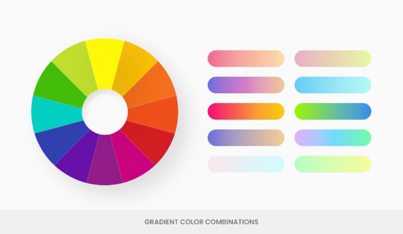
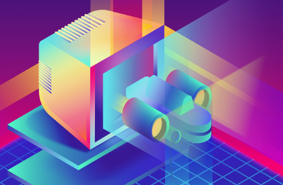
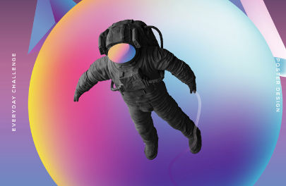
The color-theoretic color matching methods are the same for gradients as they are for flat design. However, what gradients do better than flat is that they create more depth and create texture. Gradient color combinations are rich and attention-grabbing and since their return in 2018, they feel more vibrant, bright and modern.
Color combinations in psychology : How colors affect mood and emotions
Color matching is not just about aesthetics, optimize and make your designs beautiful and eye-catching. Therefore, the color principle may not be enough for modern design. Half the job of creating a color palette is strategically choosing specific colors that will successfully convey your message and influence your audience to give you the response you desire.
Color evokes the emotion and atmosphere of a design. On the other hand, the psychology and meaning behind each tone of a color vary in different cultures, cases and combinations.
We are often told that warm colors are inherently positive while cold colors bring negative feelings. This is somewhat true, but it is not a rule. For example, red is a warm color but in most of its tones, especially with higher intensity and purity, evoke feelings of anger or danger. Yellow, the primary warm color, can evoke anxiety and a sense of urgency. So experiment with colors and see how each can affect the behavior of your target audience.
Cool palette
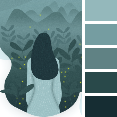
These are color schemes that include shades of cool colors like blues, greens, and purples and are often mixed with neutrals for better contrast. In general, cool colors have a calming and relaxing effect. However, depending on the specific tones, a cold palette can convey sadness and depression. Such lonely shows often include grays and unsaturated blues and grays. With greater intensity, similar colors can induce more positive feelings and convey health, beauty, reliability, and even freshness.
Let’s take a look at some visual examples of the versatile nature of the cold palette.
Sad and melancholy
Calm and relax
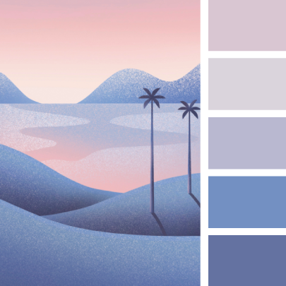
Refreshing and uplifting
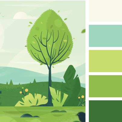
Peace and serenity
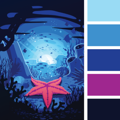
Cold
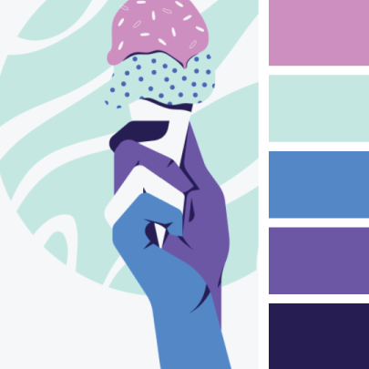
Loyalty and reliability
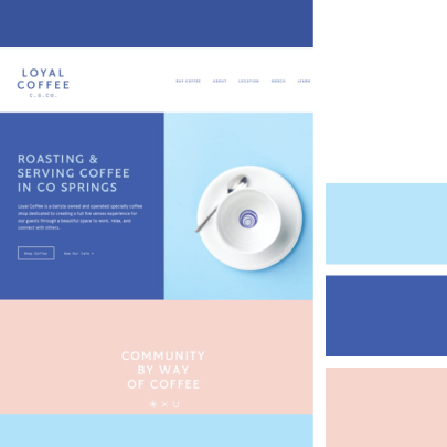
Fun
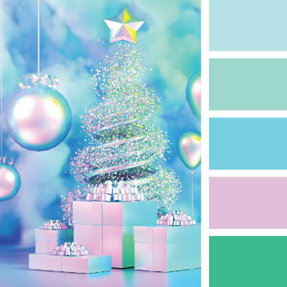
Cozy and fun
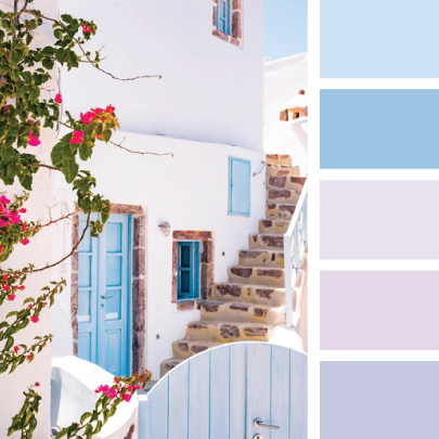
Warm palette
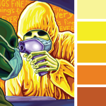
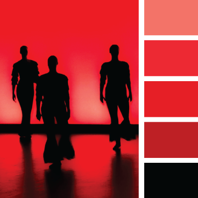
Like cool colors, warm colors are also a double-edged sword. On the one hand, they convey optimism, happiness, energy, enthusiasm, and passion. On the other hand, they can also convey anxiety, urgency, danger, and indignation. Red and yellow stimulate quick reactions and increase heart rate, as well as cravings. So let’s see what different uses they have in color schemes and what moods they evoke.
Energy
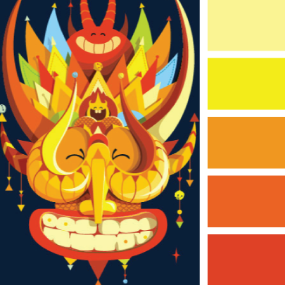
Happy
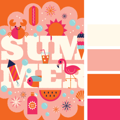
Romantic and sexy
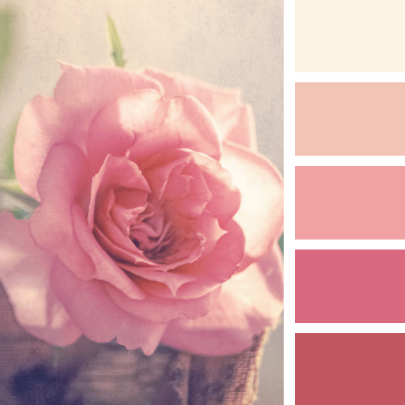
Warm
![Color principles - All the basic knowledge that beginners need to know 34 [IMG]](https://i.graphicmama.com/blog/wp-content/uploads/2020/11/18133638/warm-color-palettes-example-warmth.png)
Love and cherish
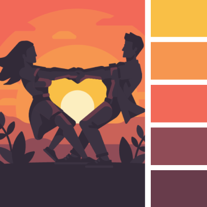
Passion
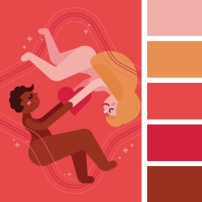
Worry
Confused and scared
Color in marketing – business
>> Read more
What Is Marketing? The Important Role Of Marketing In Business
How does color affect user behavior?
While people often react in a certain way to individual colors, it is important to note that the effect of each color depends on many factors: combination, context, experience , personal preferences, age, gender and cultural differences. Additional research is always essential when you are choosing your colors for a specific target audience.
Warm colors:
- Yellow: Bright and strong, attention-grabbing, warm and vibrant color. At the same time, it is hard to read and overwhelming to our eyes and can also create feelings of frustration and anxiety. It is common in sales and marketing.
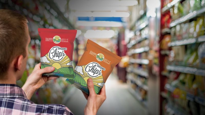
- Orange: Very attractive and popular for CTA buttons (call-to-action buttons), logos and accent colors due to its ability to attract attention. It is rarely used for external accents, as it is a very energetic color that gives a feeling of excitement and enthusiasm. Too many oranges can upset your guests.
- Red: Often used for sales, a strong color causes a faster reaction. Red raises blood pressure and is also great to use for engagement and socializing. Therefore, if it is used heavily, it can have a negative impact on your audience and turn your visitors away.
- Pink: The most feminine and romantic color, ideal for children’s toys, nurseries, women’s health products. Compared to the base color red, the longer you are exposed to pink, the calmer you become.
- Purple: Royal color, associated with wealth, sensuality and wisdom. This is why it is heavily used with luxury items, as well as high-end beauty products. Due to its dramatic nature, it also gives off romantic and mysterious vibes.
Cool and neutral colors:
- Green: The color is easy on the eyes and relaxing. It is closely associated with nature, biological products, luck, health and wealth. On the other hand, green is also a color of envy or malice, so the right tone and shade of this color is extremely important.
- Blue:
According to a worldwide survey, blue is the most popular and loved color not only among men but also among women. It is used heavily in communications, banking, and insurance because it evokes feelings of security, loyalty, honesty, power, and trustworthiness. Depending on the shade, blue can also evoke sadness and loneliness. - Black:
Elegant and sophisticated color often used in high-end brands. It is associated with class and power, and is often used in communication. - White:
A universal high-contrast color that adds space and conveys purity, cleanliness, freshness and simplicity but can also create a sense of sterility and coldness. It is widely used in healthcare and technology industries. - Gray:
Subtle color for delicate people who don’t like to stand out. Due to its simplicity, it is used to calm visitors and make them feel at ease. It is also a popular color in the tech industry.
Moods and emotions through color palettes
Those are the main effects of the purest state of color, according to color theory. When we consider all the factors and decide on the feeling and emotion we want to convey, this effect is highly dependent on the brightness, tone, shades of the shades and the temperature of their colors. . Is your orange too energetic? You can reduce the intensity and add more white to create a pastel color. Do you have too much blue in your design and feel a little sad? Mix with a warm tune to cheer it up.
- Soft colors : These are usually lighter shades of blue and green. The most soothing color schemes are pastel palettes. Think light blue, mint, lilac, pastel pink, pale yellow, especially when paired with neutrals like beige, white and light gray.
- Energy Colors : The most vibrant shades of colors like magenta, neon green, magenta, cyan, magenta, vibrant blue. Those are colors that are stimulating and invigorating but can also be irritating and exhausting.
- Cheerful Colors : These are warm pinks, oranges, and reds. They can be pastel, candy colors, as well as vibrant and attractive. It’s important that these colors are intense, meaning you can experiment with different values, but avoid adding gray.
- Sad colors: Gray, unsaturated and dark tones of cold colors. When colors lack vibrancy and warmth, they can feel empty, lonely and sad.
20 interesting facts about color
Color has always had an impact on our lives. Color has its own language that we must perceive for ourselves. Color has the power to shake our souls.
1. The most popular color in the world is…
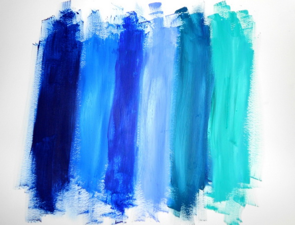
Blue! Global market researchers conducted a survey and came to the conclusion that: 40% of the world’s population likes blue, followed by purple with 14%. 3rd and 4th place belongs to red and green, respectively. White, orange and yellow are the least preferred colors.
2. Red is the first color children recognize

A recent study has shown that as early as 2 weeks of age, babies can already recognize the color red. The reason may be because red is the color with the longest wavelength, so the nerves in the baby’s eyes can process and receive it easily.
3. Women and men see the world differently
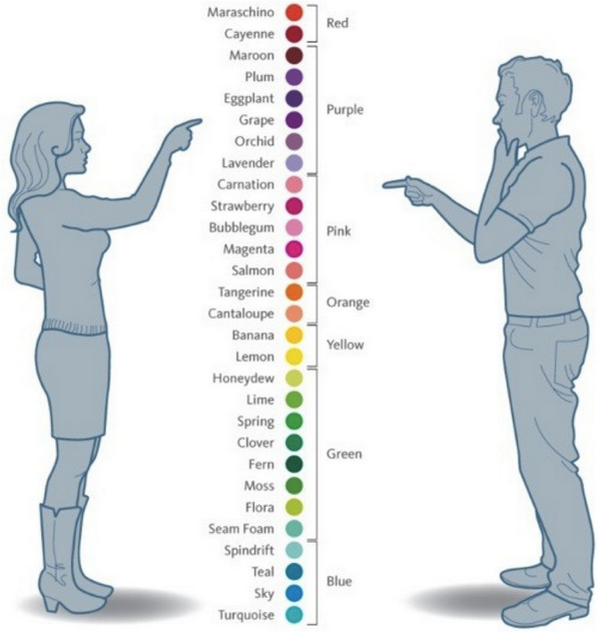
Women can distinguish between crimson, burgundy, and red-orange, while for men it’s all red. Research by Arizona State University in Tempe has shown that genetics or specifically the difference in the number of X chromosomes in males and females is responsible for this difference. In addition, women perceive color changes at close range more subtly, while men are more sensitive to the movement of the world.
4. Want to control anger? Let’s use pink

Pink is a soothing and bright color that helps calm anger and anxiety. That’s why prisons and mental health organizations are painted pink to curb the uncontrolled behavior of inmates and patients.
5. Traffic accidents can be limited by…white
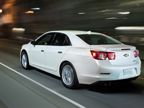
White is the color of the safest cars! According to scientific research, this is the most noticeable color in all conditions except when it’s snowing. However, lemon yellow is the most popular color on the road. While not the most popular choice, white is the most practical choice. Silver is hard to spot in heavy rain and fog and this makes it the second safest color.
6. Red and yellow will make you hungry
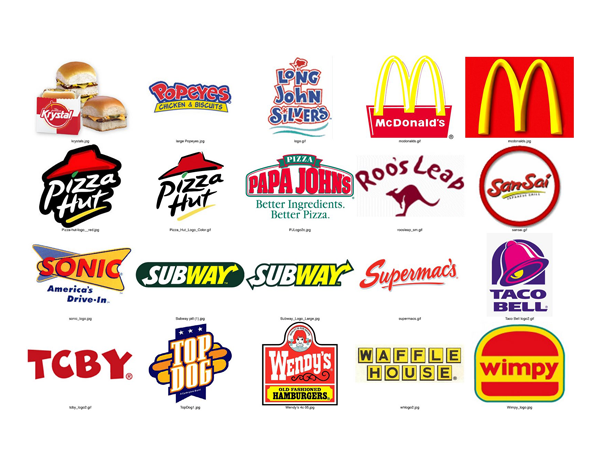
So it’s not surprising why many big fast food brands like McDonald’s, KFC, Burger King and many others choose this as the main color. Studies have shown that red and yellow are the most stimulating colors. So if you’re on a diet, don’t paint your kitchen red and yellow. It will make you feel guilty for not resisting temptation. On the other hand, blue is the color that causes the least appetite.
7. Colorphobia

Chromophobia (or Chromatophobia) is known as a persistent and irrational fear of colors. In severe cases, it can interfere with daily activities and cause people to limit themselves. People with this condition often associate a traumatic past with a certain color.
8. Color affects perception of distance
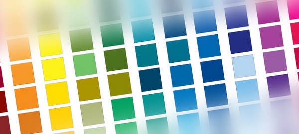
We perceive that warm colors are closer to us while cool colors are further away, similarly, light colors will appear closer than dark colors.
9. What happens when the hen looks at the red light?
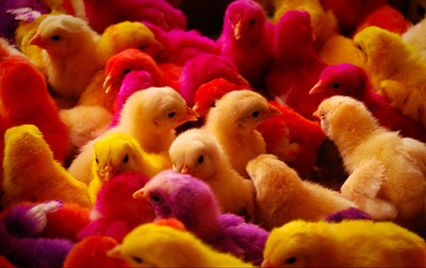
Red light reassures hens. It helps them calm down, sleep better and avoid fighting and pecking each other.
10. Color also affects taste

Recent studies have shown that color also affects our taste buds. For example, no cup can make chocolate taste better than an orange or cream cup.
11. Is orange called orange because it looks like an orange or is orange called orange because it’s orange?
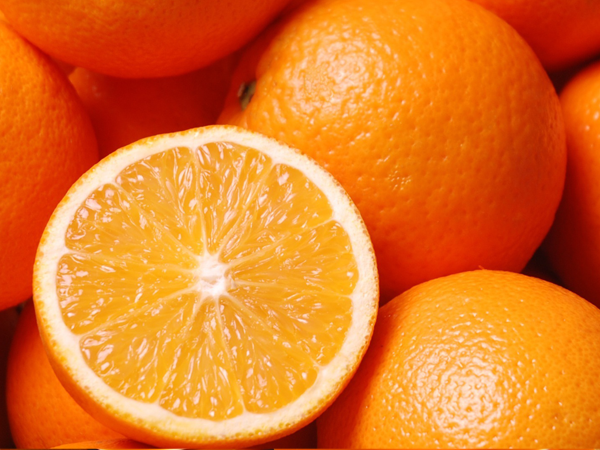
A centuries-old mystery like whether the chicken came first or the egg came first. However, recent studies have shown that the word “orange” appeared in English around the 13th century to refer to a type of fruit. The orange color was originally called Geoluhread which means yellow-red. In addition, many people have recognized that not a single word in the English language rhymes with the word “orange”.
12. Red can affect your test performance

It is theorized that the color red has a negative effect on exam results because it is associated with failure and avoidance.
13. Mosquitoes like the color blue

Leave dark shirts at home when planning a picnic, unless you want to be a mosquito party. Studies have shown that mosquitoes are attracted to dark colors, especially blue. Therefore, choose light-colored long-sleeve shirts.
14. Eigengrau?

When you suddenly turn off the lights in your room, just before darkness covers all, you will see a dark gray color known as eigengrau. According to Wikipedia, it’s a term used to refer to the dark gray scene many people have seen in low light.
15. Blood Mars

In Roman legends, Mars was the god of war, so they associated its color with blood. However, science has noted that Mars has a reddish brown or rust color because they are covered with iron oxide, the element that gives the color of blood and rust.
16. Gaur hating red is completely fictional
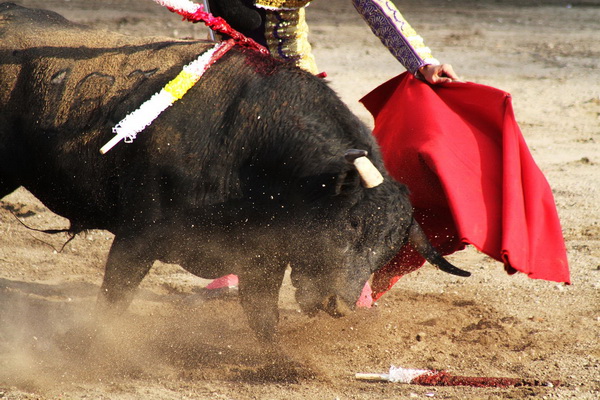
The fact that bulls hate red is purely fictional. What drives a bull crazy is not the color of the mutela, but its movement. In fact, cows have no concept of color. Any object, regardless of their color, is a target for the bulls.
17. Yellow makes you dizzy
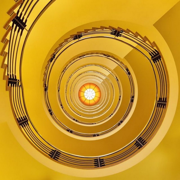
Yellow can make you nauseous, so all planes avoid using this color. Also because of the overstimulation of the eyes, bright yellow becomes the most unpleasant color.
18. Black and white are easily forgotten
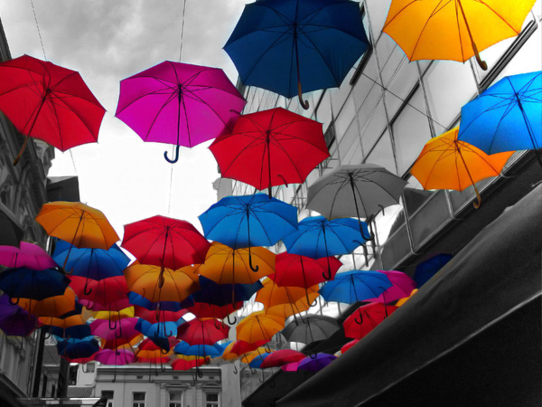
If it takes a lot of effort to recall a scene from a black-and-white movie or something written down on black and white paper, it’s probably the colors (or more precisely, the lack of them). . Scientists have shown that compared to a black and white image, it is easier for us to recall the color version of the image. They think it’s because color has a stronger effect on the senses, making it easier to remember.
19. Is black a color? That depends
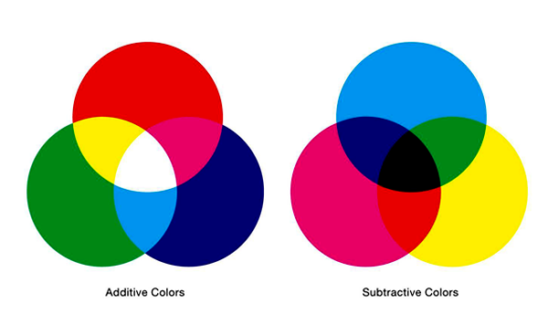
The question for this answer depends on your point of view, based on two color theories. The first is the theory of auxiliary pigments that help us perceive colors under light. In this case, without light there is no color. We can assume that black is the inability to see all colors in the absence of light. No light means no color…therefore no black.
On the other hand, we also have theories of color as what we perceive as pigments or substances such as paints. In this case, black is again a color. If not, how do you name the black in your crayons or paints? Chemists will confirm that coal, iron metal, and other black chemicals are the source of the black paints. So black is a color when you refer to color pigments and colorants.
20. Actually color doesn’t exist. It’s only in your brain
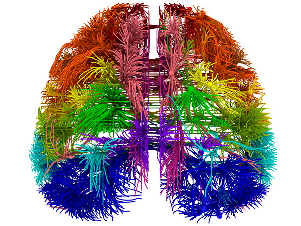
Exactly! Theoretically, color is just the result of the brain trying to decode visual cues coming in from the outside.
Summary
Color is an important aspect of your brand identity . After choosing the type of logo you want to use, you should take a moment to consider what each color will say about your company.
Think about the emotions you’re trying to elicit and how you want consumers to respond to your brand. By choosing the right color combination, you can help your brand leave a lasting impact that helps shape a stronger connection with consumers. Hopefully after this article you have gained new knowledge about color, Malu Design wishes you success!

