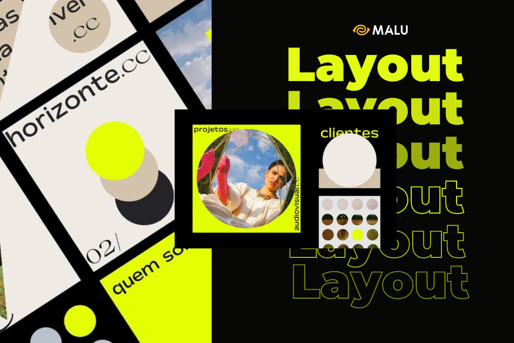
Layout is a very familiar term for graphic designers. However, for those of you who are just starting to learn about this field, you must still feel confused in the working process. In this article, Malu Design will help you better understand Layout and the importance of this element in graphic design.
What is Layout Design?
Layout design (or Layout design) is the process of arranging graphic elements and typefaces for a publication. The purpose of this process is to grab the viewer’s attention. It also helps the publication to convey a certain message. Layout design is important with any publication that needs to convey a message through images. For example, magazines, website interfaces or general advertising publications.
More specifically, Layout includes the actions you use to design the presentation of your publication. You need to pay attention to align both the content and the image, the details so that it is most reasonable and beautiful. How much margin is reasonable, how much space is needed for this publication, what is the right spacing between cells, etc. all the answers will help you perfect your design with Layout spectacular.
The importance of layout in design
Layout is like a solid foundation to build a house – a beautiful design. Therefore, surely the layout system will play an important and decisive role in graphic design, thanks to the layout, viewers can understand the content of the message you want to convey through the design. More specifically, the importance of Layout is shown through the following 3 contents:
1. Enhance aesthetic value
The layout system will help each part to be present in your design in a neater and more beautiful way. This is like when you decide to redecorate your room, if everything is neatly arranged and has a main – secondary and depth layout, it will attract viewers and be much more aesthetically pleasing. compared to a room that is not invested in pages only but simply has furniture. Moreover, with new layout templates, you can easily create a highlight in the eyes of the viewer so that they will be impressed with your product for a long time and many more times.
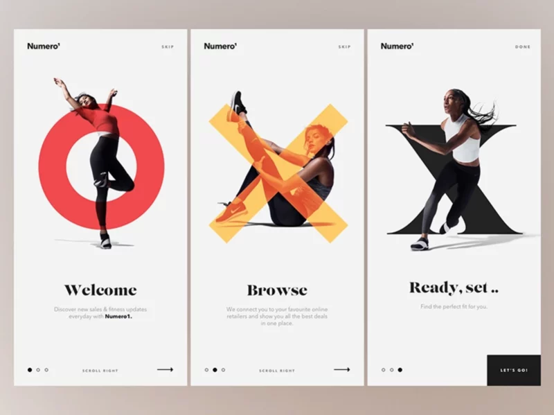
2. Link components in design
With publications with a reasonable layout, a clear layout will help viewers grasp the comprehensive content of the entire product. By doing so, the reader can find the important point of interest in the page and from there they get the information they need to be guided from that point.
3. Increase the ability to attract readers
With the creativity and design thinking of the designers, the layout has a beautiful layout, the content is presented reasonably will attract viewers more effectively. Linked displays make them easy to understand and attract more people to see your design.
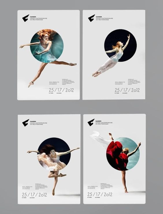
This can be understood simply as when you design a website for your business, the friendly and clear layout will make customers attracted and inspired to see more of the products or content you present. Therefore, the designer is the one who knows best the principles to apply to the layout design so as to emphasize the connection of the entire publication.
5 elements in layout design:
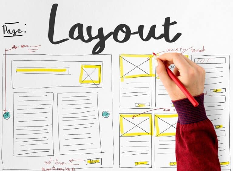
Text: The text sections in the layout include the main header, subheader, header, footer, and body paragraphs. For websites, text also includes command bars and menus. Each typography stylewill bring different feelings. Consideration offontalso contributes to increased communication efficiency.
Images : Including photos and illustrations, infographics, … Large images often attract the viewer’s eyes more.
Contour: Refers to how far any two points are connected. Whether it is a straight, diagonal or oblique line, it also has the effect of directing the viewer’s eye to a certain part of the design. Lines also serve as a boundary between different parts of a publication.
Cubic: Basically, a cube is a 2-dimensional space surrounded with contours. Circles, squares, triangles or any other shape can serve as visual part of the composition.
White Space (Negative Space): The space between objects is just as important as the visual elements. If used properly, white space can attract attention and highlight a design.
>>> See more articles : 20 design principles in the Graphic Design industry
Common rules in layout design
1. Rule of thirds
Similar to photography, the rule of thirds is also one of the important layout systems that help you have a great composition in your design. This rule is considered a basic standard to help your product achieve the highest efficiency and impress customers.

Creating this layout is extremely simple. You just need to divide your design into 3 columns and 3 rows. At the intersections of these rows and columns, you should place the main subjects as well as other supporting elements. If you are having trouble creating balance in your design layout. The Rule of 1 of 3 is sure to become a great friend.
2. Odd number rule
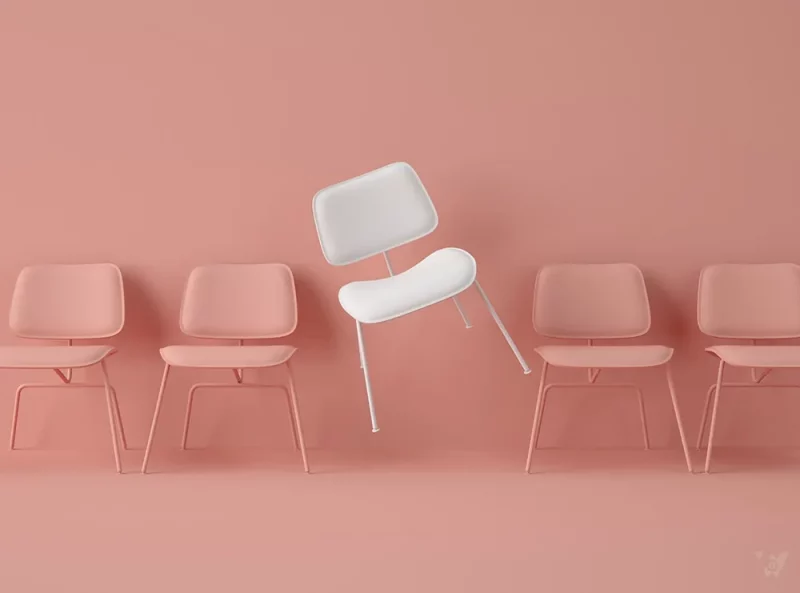
Designers have found that a layout system with odd-numbered elements (about 3 objects) is often highly effective. The 2 outer objects create balance for the central focus point, creating simplicity and naturalness for the design. This is also the basic content of the odd number rule. This rule is used quite a lot in logo design.
3. The Rule of Balance
Everything in this world becomes more perfect when there is balance. So is the design. Designers always have to change different elements in their products towards harmony and balance in their work. Lack of balance in layout arrangement, lack of white space between details… will make a design extremely “painful” and create a bad impression for customers.
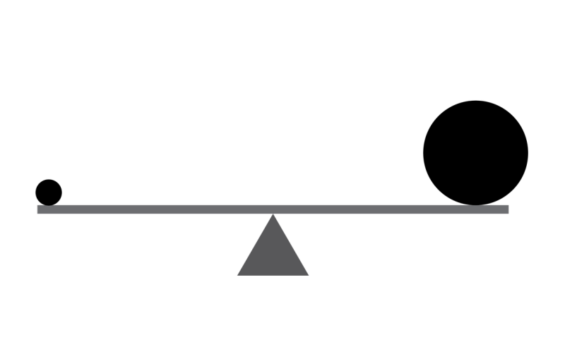
In addition, in design, white space is also an extremely important factor. White space will give other details space to “breathe”, and create the necessary balance for your design.
4. Rule of emphasis

Besides the gaps mentioned above, the average viewer’s eye also needs something prominent to focus on, or else they’ll just glimpse your design and walk away.
To convey the message to the audience that what is the main point, the main object that they need to focus on, you need to use this layout system with secondary and balanced elements. Before embarking on the design, clearly define the focus point in the design, and guide the viewer’s eyes based on the structure of the layout system!
5. The Grid System
“Grid systems are an important part of graphic design. It speeds up the design process by helping designers determine where to place what type of content.” The simple reason that designers love to use this layout system is because Grid makes design products look cleaner, more efficient and more applicable.
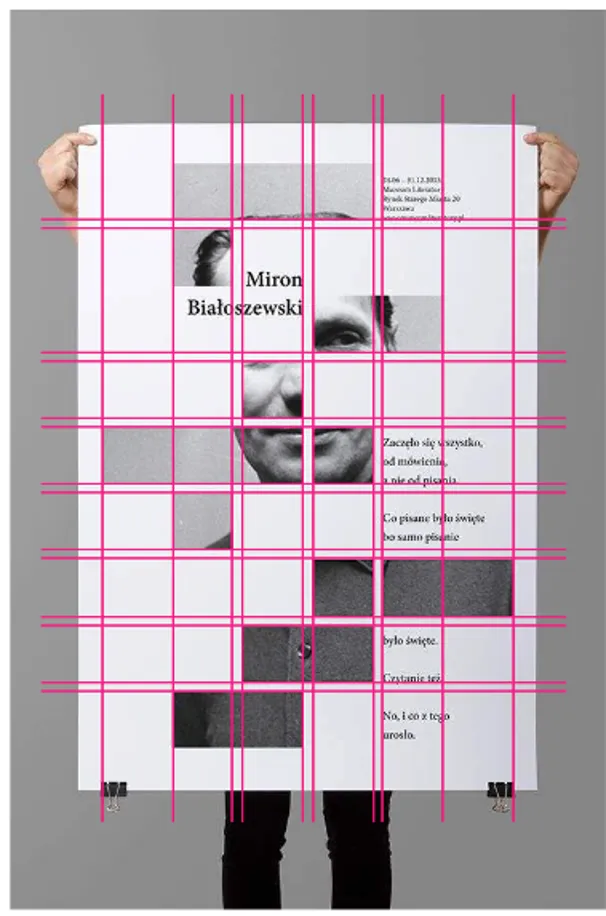
Grid systems bring many advantages not only to the design product, but also to the process of creating that design. For example, when you want to design many general posters of an event, stick to your grid system to arrange the elements of date, time, images, colors, … from which you can create out consistency in its posters. What’s more, they save a lot of time to edit later.
> See more What is a Grid? How to use grid system in graphic design
7 tips for creative layout design
1. Build a mood board
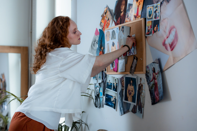
Try making a compilation of design inspirations for your product. Keywords like “page layout”, “color scheme”, “typography”, … will give a lot of references. Moodboard is also a guide to remind designers of the style they are trying to build for the design.
2. Associate design with content

Think about the content as well as the audience the design is targeting. For example, if you design a magazine, you should read the content carefully to choose the most suitable concept. Or when building a landing page for a brand, you need to consider the brand identity to create the right style.
3. Refer to the template
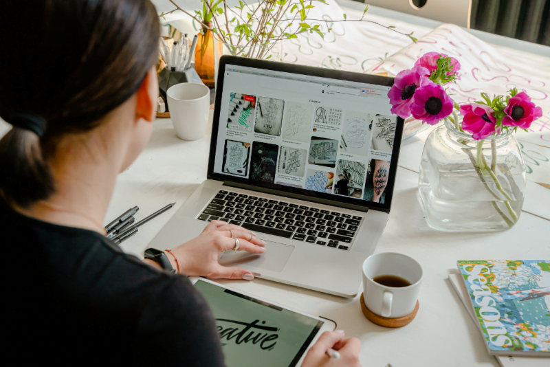
If you’re building layouts for your website, it’s not a bad idea to refer to available online templates. This is a way to learn more about balance and vibrancy for composition.
4. Create Intuitive Contrast
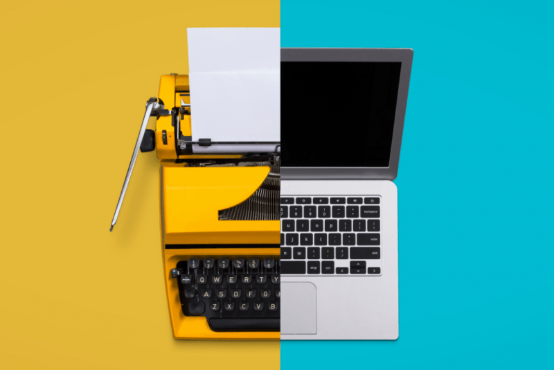
Look for solutions to create visual contrasts that instantly catch the eye of the design.
5. Variations with typography
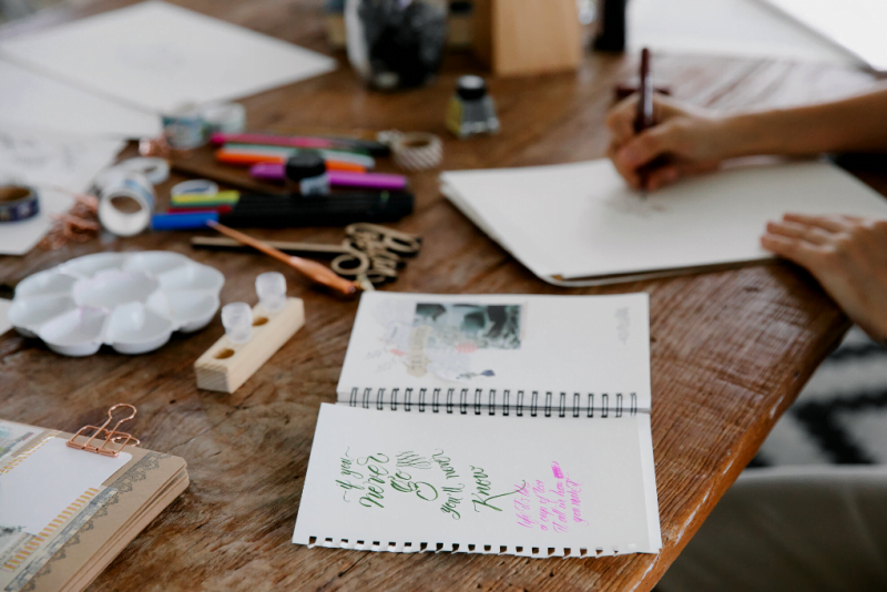
Choosing typography is one of the most important tasks to properly represent your brand identity. Mixing fonts in the same family can bring consistency and coherence to a design.
6. Take advantage of negative space
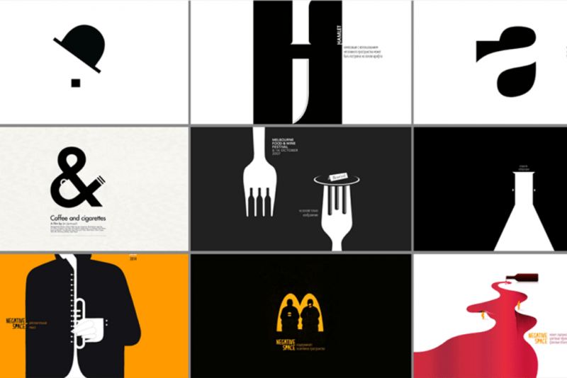
Using negative space purposefully helps create a better visual effect than a thick and messy composition. When mockup on the product, if the design is too messy, change the light to a more minimalist and neater direction.
7. Test the rules

The design process is different for each designer. The general rules are for reference only. Feel free to experiment a lot to create the most original and unique product.
>>> See more articles Rules of layout in design
Conclude
The information about the layout above hopefully has partly helped you have the most general picture of this extremely important task in the design. Follow Malu’s blog to update more useful knowledge!

![What is Infographic? How to design beautiful and attractive Infographic [Template] 5 infographic la gi](https://maludesign.vn/wp-content/uploads/2022/12/infographic-la-gi-500x500.webp)
