In the current digital age, Flyers are hired by many agencies and brands to design because they are the most popular approach to marketing. Let’s refer to the article below to understand useful information about Flyer and the design section as well as the most attractive Flyer design tips.
What is Flyer?
Flyer
Flyers are product flyers with different sizes and designed on both sides. It can be said that Flyer has become too familiar to everyone. We can easily see Flyer leaflets at schools, offices, restaurants, etc. They reach customers by distributing or giving gifts in crowded places or public places. Thanks to this form of promotion, the company’s product advertising messages reached the public easily and on a large scale.
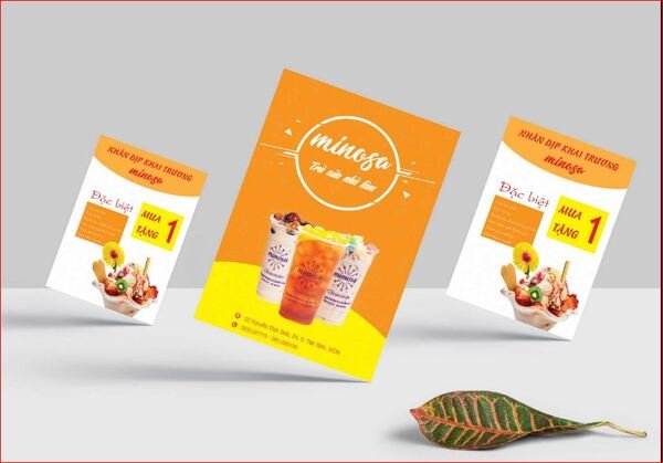
Flyer is now used by many companies because it both meets the needs of saving costs and achieving quick results.
Flyer Design
Flyer design needs to pay attention to clearly show information about the content so that it can easily attract viewers.
- Show fully and clearly information about activities, time or place of organization, etc.
- Arrange the layout scientifically, clearly, in the order of priority of the information so that the viewers easily remember the necessary content.
- The colors in the Flyer design also need to be chosen in accordance with the brand image, do not abuse flashy colors to attract viewers, but use the colors subtly and skillfully.
- Balance the layout so that the Flyer does not have too much space.
Beautiful and impressive Flyer mockups
-
Flyer design for business
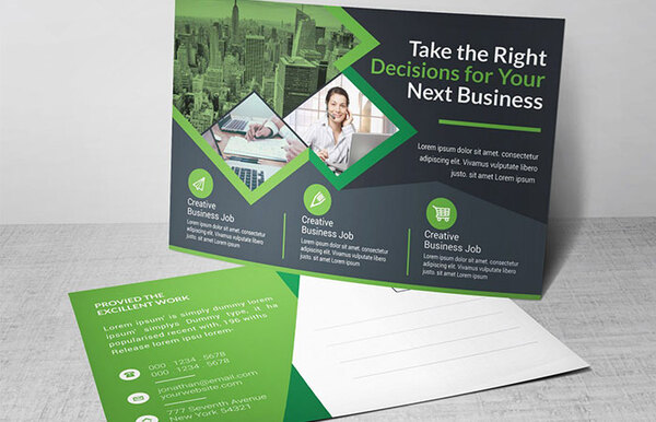
For Flyer design for business, it should be noted that important information is arranged in card form so that customers can quickly read and cover the services/products that the business is providing.
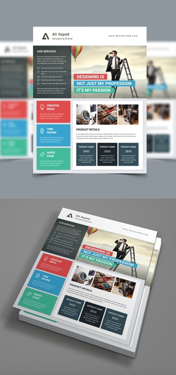
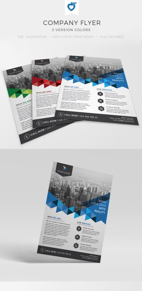
2. Flyer design for the company
With corporate designs, introduce to customers through Flyer presented simply but easily attracted by layout and color. Customers are not only impressed by the services/products the business provides, but are also attracted by the impressive FLyer design they are holding in their hands.
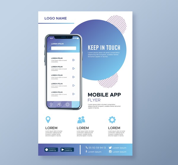
3. Design Flyer to advertise mobile apps
The FLyer ad template below can be used for not only mobile ads but also for other web or digital companies. Featuring bold colors and direct cues, you can easily impress potential customers with a small flyer template.
4. Flyer design with product and price data sheet
The Flyer design includes product data sheets and price lists that will help your customers easily focus and find the information they need. This Flyer template is also useful in business meetings when the necessary data is presented in a simple, easy to understand manner.

Flyer design purpose
As mentioned above, Flyer is a marketing publication, so they will contribute greatly to the development of business activities. With a beautiful and impressive Flyer design, attracting customers also becomes easier. Most customers only spend 5 seconds or even less to scroll through your Flyer so it is extremely important to present and design the Flyer as impressively as possible.
3 tips for Flyer to attract and highlight
Flyer is a tool to communicate information directly to customers, so designing Flyer becomes more important than ever. They need to be designed to stand out and even stand out as possible to attract more and longer customers. No one wants to read a flyer with faded colors, messy layouts, and cumbersome content. So when you start designing the Flyer, note the 3 tips below to make things easier.

Create a highlight
To create an attractive highlight for your Flyer , pay attention to the combination of the factors below.
-
Color
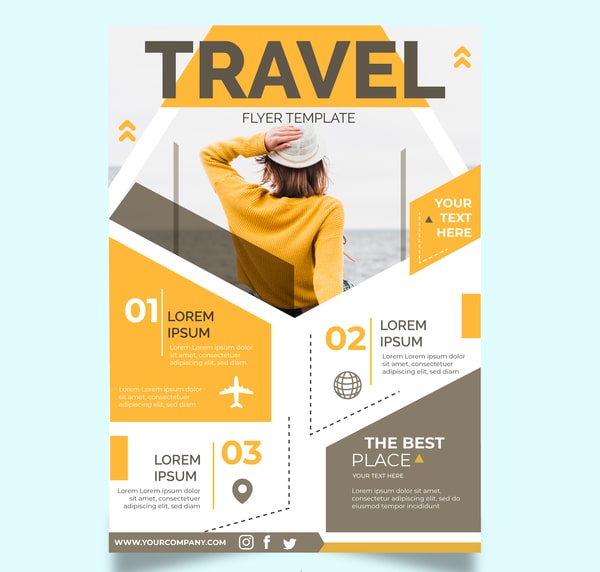
The advice when choosing colors for Flyer design is to choose colors that stand out but still make sure to match the nature of the product/service. However, you also need to consider the color to match the printing quality that the company uses so that the Flyer after printing will have the desired color.
- Achromatic: pure colors, including colors such as black, gray and white.
- Additive: color emission, using different light sources and same surface dimension.
- Subtractive: subtractive color, produced by white light source, specimen and receiver.
- Cool Color: usually violet, blue, green.
- Warm Color: warm color; eg yellow, red, orange.
- Neutral Color: neutral colors such as gray, brown, beige.
2. Fonts
Flyer is a form of conveying information in words, because the font chosen is also very important and determines whether your Flyer has a highlight or not. Just like colors, each font carries a different emotion and meaning. According to statistics, fonts like Serif, Sans-serif, Scrift or Decorative are most often used.
3. Beautifully illustrated Flyer templates
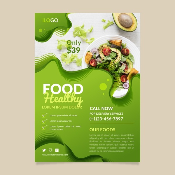
Each Flyer has an important main content to convey, and just fonts or colors are not enough, illustrations also play a very important role. If the illustration you use describes almost the entire main content, then one thing is for sure, your Flyer can already attract and help the reader grasp the most important part.
- Flyer Template
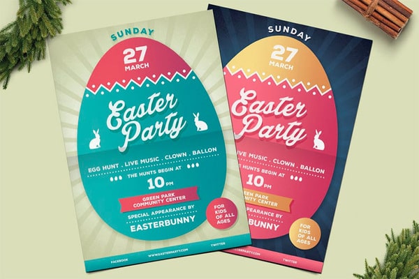
Flyer Templates are pre-designed layout templates, all you need to do is put information or objects in and edit to get the complete version. With such templates, users can save design time as well as get more ideas to make other publications.
- Flyer Template Free
You can use the available Templates to design Flyer more easily and quickly. Some websites you can refer to to choose or get Flyer design ideas like https://www.freepik.com/ , https://www.pinterest.com/ , https://www.canva. com/vi_vn/ … These templates are completely free and diverse, rich, suitable for many different design themes you can use. Based on these templates, you will save design time as well as get more ideas about layout and fonts to make your publication more impressive.
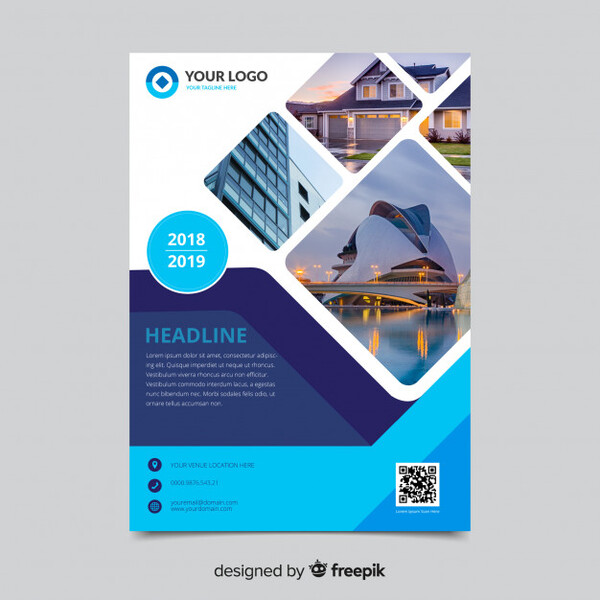
Efficient and accurate Flyer printing
The printing process is the last important step to being able to own a complete Flyer publication. So how to make the last step as smooth and perfect as possible, let’s take a look at the following 2 notes:
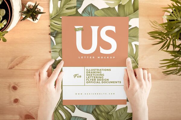
-
Color
When designing Offline publications, you need to set the color system in Photoshop to CMYK – a color system dedicated to printing. Please note this point so that the color quality after printing displays the best and sharpest.
2. Save file
For saved files, there will be 2 main types: JPG and PNG. JPG is the preferred file for designs that use captured images or many details; If you want to save the image in a small size, the JPG format is more suitable. The preferred PNG type for designs with lots of gradients, lines, blocks, and text; suitable even for images with transparent backgrounds such as logos, icons and web images
Thus, the above article of the Malu team has compiled the necessary information about the Flyer and the tips to design the most attractive Flyer. Hope readers can take note of the important content to apply for effective design in your business.

