Overall, logo design trends are not easy to predict. The classic designs that once “lost points” are now back as a hit. Trends have both sequentially replaced each other and re-emerged in new faces.
Half way through 2022 has passed. Today, Malu will summarize 11 emerging logo design trends , as well as analyze each type from the most general perspective. Thereby, each business can draw lessons from experience to apply the right logo style for themselves.
Gradient:
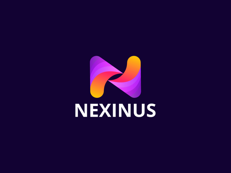
In fact, the gradient trend has been maintained for several years and will not recede anytime soon. Especially in today’s digital era. Designs from website backgrounds to logos (of course) can apply gradients well.
Gradient is the effect created when colors gradually fade into each other. Gradient goes from both monochromatic to polychromatic. No matter which gradient method is used, coherence and fluidity are at the core of a good product.
Adding gradients to the logo design gives depth to the publication. Especially with flat designs. (Which is also a trend in 2022).
The key to a good logo is that they are aesthetically pleasing in any size, look or feel. Therefore, gradients are sometimes a bit “difficult”. If you decide to adopt this style, try to best harmonize the elements.
For example, apply a gradient color to only a small part of the overall design. Or consider using gradient icons with minimal, neat shapes.
>>> Read more Gradient Logo Design – Impressive, professional and different!
Logo 3D
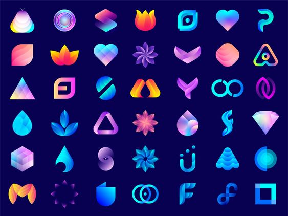
We all know that the nostalgic Y2K trend is taking its toll. Along with that is the rise of 3D logos. 3D logo used to be “resounding for a while” around the early 2000s. 3-D design at that time was like a step into the modern technology era. However, 3D lost ground when flat design took the throne.
3D returns in 2022 with fresh new looks. The use of chamfered edges, subtle blurs, reflections, and gradients helps the logo convey certain meanings. In addition, the 3D design is also eye-catching because it draws the viewer into a multi-dimensional world.
Similar to gradients, consider using only 3D as part of your design. Or combine 3D with minimal motifs .
Animation:
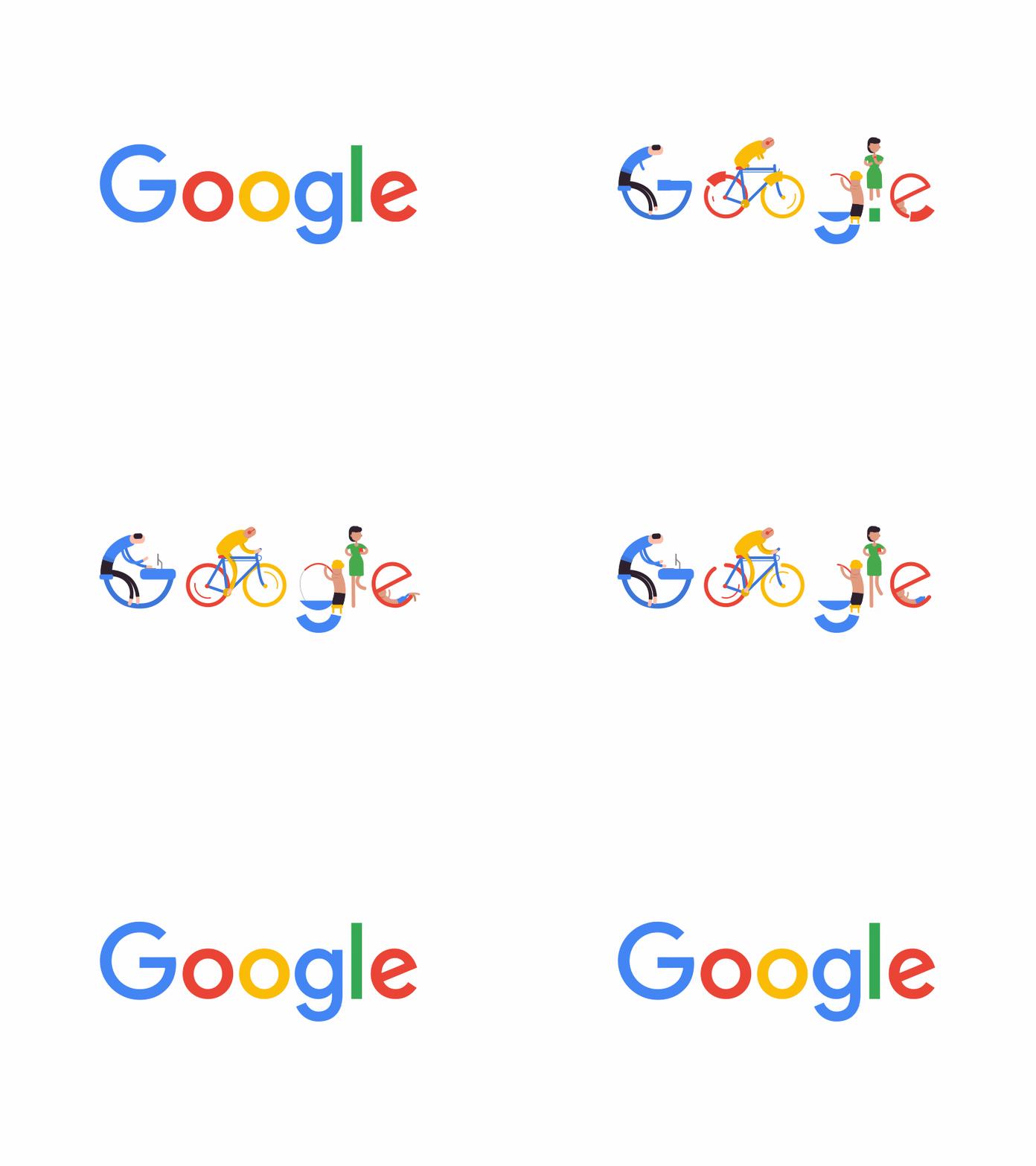
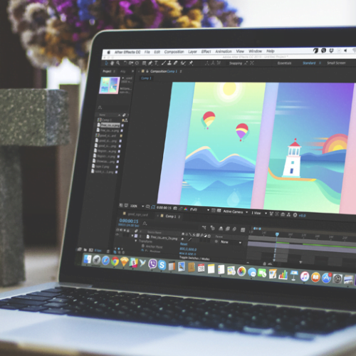
It can be said that businesses large and small are racing to follow the animation trend to create a more vivid version of their logo. Why is animation so favored? Animation is an effective storytelling tool for businesses. It creates an opportunity for static designs to become more unique. In addition, animation also makes the original, the mark that each brand needs to be different from the competition.
>> Read more:
Logo Motion (animation) Trends of Brands of Times, Personality
What is Brand Story? Steps to Telling a Compelling Brand Story
Of course. Not every field or profession is suitable for this style. Depending on the needs of the brand, the application of the 3D element will vary. For example, if most of a business’s promotion is online, a 3D logo pop up will better represent the Brand Personality . Conversely, if businesses focus on Branding on printed products, 3D textures can be distracting.
Nostalgic feeling:
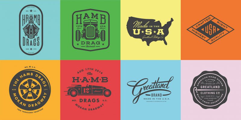
From fashion to web design, the retro wave seems to be dominating modern styles. Nostalgia comes from the neon background colors of the 80s. Or the Grunge motifs – a legacy of the 90s.
The outstanding thing that Generation Z has shown is the personal imprint that makes things that seem outdated come back to life. That is, bringing nostalgia into the logo design is more effective when it is consistent with the brand message .
Altering modern and traditional elements in a logo is also a good way to harmonize the publication. Consider using a classic serif font with a trendy Avant-Garde logo .
>>> Read more Vintage Logo: Why “Old School” is “New Cool”
Monochrome (Monochrome) range
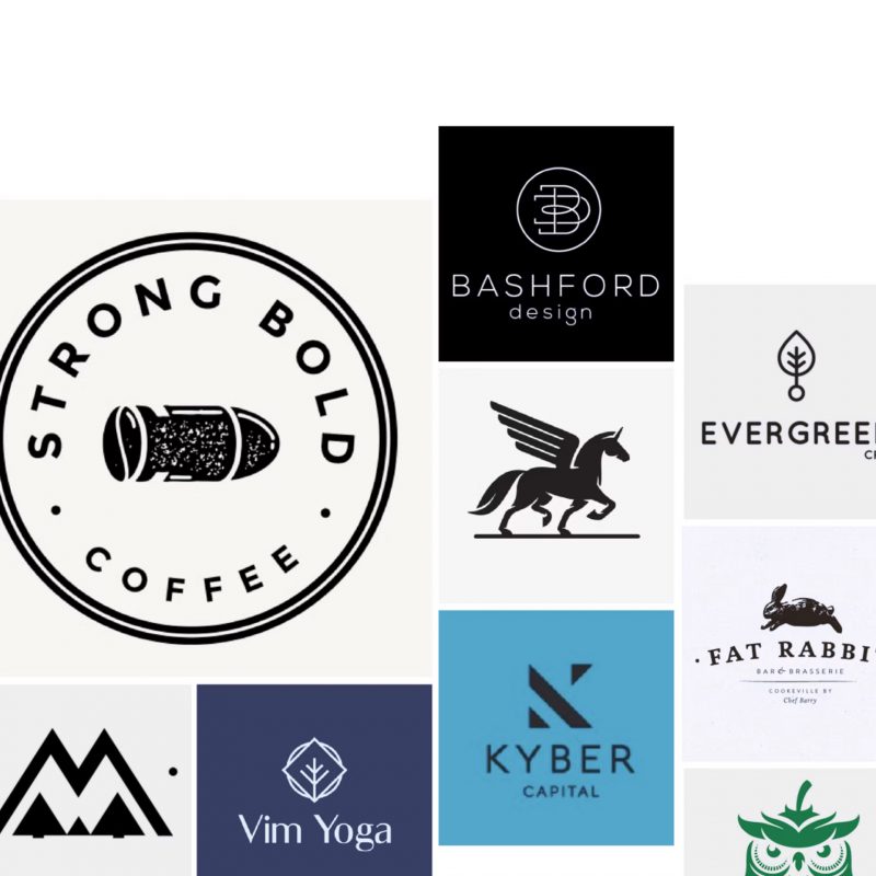
Monochromatic colors are always “expensive” in both designer outfits and popular streetwear. Simplicity, versatility is what monochrome color brings. Because of that, monochrome is expected to still dominate the logo design trend in 2022.
As the name suggests, monochromatic means using only one color. It sounds boring and monotonous, but the truth is the opposite. By combining the weight and light adjustment of a certain color, the design will become much more depth.
The color of the logo is very important. Monochrome logos have a “weight” of their own that few logos can express. Color trends for 2022 will be bright, warm tones and a rustic feel. However, it is not always good to follow the trend. No matter what color scheme is chosen, it is important that it enhances the personality and Brand Identity of the brand.
>>> Read more Logo monogram (Monogram) Optimizing brand message
Hand drawn details:
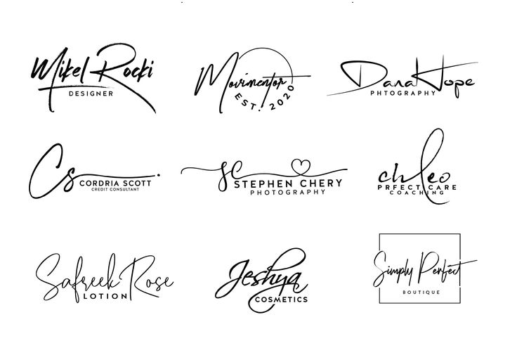
Like a signature, a hand-drawn logo is a 1-0-2 thing. It is fertile ground for creativity and freedom. At the same time, it helps to most accurately express the personality of the brand. Hand-drawn elements leave a personal impression and make it easier for viewers to empathize.
In 2022, the beauty that comes from imperfection is exalted. Because of that, hand-painted patterns are more and more popular. On the one hand, hand-drawing feels rustic, true, and pure. On the other hand, its sophistication helps to elevate the logo unexpectedly.
Hand-drawn hand-drawn, freehand shapes can be used in any type of logo . The main limit is the sky. In 2022, how will brands race to sublimate creativity? It’s worth looking forward to.
>>> Read more Hand-drawn logo Pure design style
Using multiple layers:

Layering is a visual technique that adds thickness and depth to a design. Obviously, the layer will help the main part of the logo “float” – literally and figuratively.
In 2022, the layer should accentuate the logo instead of making it look cluttered. It makes no sense to throw all the elements together without calculating the specific intent.
Layers provide flexibility in combining shapes and elements in the design. Want to use layers effectively, or consider how each element will be when standing alone, or when forming a block.
Main Typography:
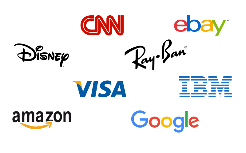
Typography will always be trendy. In 2022, a series of typography trends emerge. From high-contrast serif fonts to casual script fonts. They appear in every branding publication and of course, logos.
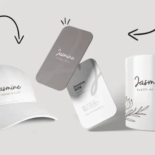
Letterform or Wordmark logo designed entirely from typography is a smart choice for any field. Typography will help tell the brand story. Therefore, consider carefully to choose a font that is not only representative but also evolves with the brand over time.
>>> Read more Logo Wordmark (Logo Letter) Unique mark for the brand
Each part of the Visual Brand Identity needs to have the same identity and speak the same message. Sometimes, a simple text logo can make the process easier.
Classic White – Black:
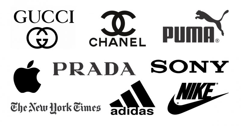
This minimalism that many people consider to be monotonous, do not rush to ignore it. The power of a black and white logo cannot be underestimated. Simply because “classic” means never out of date.
Negative space is a special technique when designing black and white logos. It helps create contrast. Or visualize metaphorical messages that are difficult to interpret. Emphasis with lines and dots also contributes to building attractive visual “illusions”.
Simplicity is king, when handled with intention. Black and white logos are among the logos that need the most consideration and absolute precision. Since no other colors are used, the logo itself must be extremely suggestive. Taking advantage of spacing and typography can be the key to better conveying your message.
>>> Read more Why You Should Try Black And White Logo Design
Conclude
I hope this article has brought you a lot of useful information. Don’t forget to follow Malu’s blog to update more interesting knowledge!

