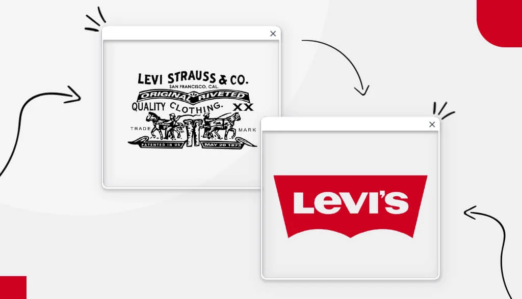
When people think of denim jeans, they automatically associate them with Levi’s and vice versa. Levi’s has dominated the denim market since what felt like forever, and their iconic logo is recognized around the world – with its 2 horses, red card, bat wing logo and Arcuate Design stitching.
But the Levi’s logo wasn’t always the same logo we know and love today. In fact, Levi’s logo has undergone 8 redesigns over the years!
Read on to discover the full history of the Levi’s logo.
Mục lục bài viết
ToggleA Brief History of Levi’s
Denim pants have been used as business wear for years, but since when have they become a staple in American fashion dictionaries?
It all started in 1853 when Levi Strauss, a Bavarian merchant, moved to San Francisco to start a dry goods wholesale business in his brother’s West Coast branch. As the business grew, Strauss established himself as a respected businessman. One of his clients was a tailor named Jacob Davis.
A woman asked Jacob to make a pair of pants that her husband could wear and not tear. Jacob came up with the idea of placing metal studs in stress points, such as pocket corners. These rivet pants were a success, and Jacob asked Levi Strauss to jointly patent the product. They received the patent on May 20, 1873 and just like that, jeans were born.
Levi’s logo development process
The Levi’s logo has undergone eight redesigns in nearly 150 years. Some updates are minimal, while others take a bold approach. Let’s take a closer look at Levi’s logo journey.
1892 to 1925
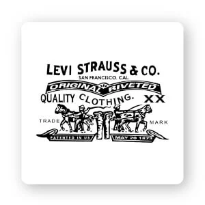
Before Levi’s was called Levi’s, it was called the 2 Horse Brand. (In fact, Levi’s was not the official name of the company until 1928.) Patents by Levi Strauss & Co. expired in 1890, so they needed a way to build a reputation that their jeans were good quality, sturdy, and reliable. More importantly, they need to make it known to consumers in a quick and understandable way.
They landed on a logo of 2 horses pulling in opposite directions on the same pair of jeans trying to rip them in half.
Images are meant to serve 2 purposes. First, it showcased the quality and durability of their jeans and became a recognizable brand element. Second, many consumers do not speak English as their first language and not everyone in the West is literate.
Strauss & Co. know they need a memorable image so a consumer can walk into a store and ask for a pair of pony pants, and they’ll get a pair of Levi’s jeans.
1925-1929
You will notice that this new logo has almost nothing in common with the previous logo except for the name. This logo is a stripped-down, minimal design that might be the bottom line. Levi jeans were in high demand in the 1920s, so the two-horse image was no longer necessary.
They got rid of the monochromatic color scheme and used a light brown background that makes the magenta pop. The redesign removed everything but the Levi Strauss name, removing the “& Co.” Even the typography has been changed, selecting text is like a bubble with rounded edges and almost no kerning (space between letters).
1929-1943
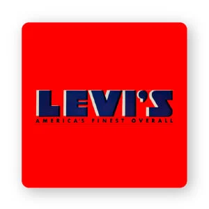
By the 1930s, despite their popularity, jeans were limited to the working class (cowboys, woodworkers, and railroad workers) of the West. Levi’s jeans were first introduced during the boyish ranch craze of the 1930s when Easter vacationers brought home Levi’s pants. World War II also promoted blue jeans, which were considered essentials and sold only to people working in the defense sector.
This logo redesign is historic in that the brand ditched Strauss and started using the company’s initials. When competitors started copying Levi’s jeans and their iconic Arcuate stitch, the brand decided to sew a small red stitch (legally known as the Tab Device) into it. back pocket seam to distinguish them from fakes.
This may have inspired the new logo redesign palette. The almost black navy blue text and the bright red background attract attention. Block text conveys a fixed structure that ignites confidence and strength–a redesign that’s just right for the times!
1943-1949
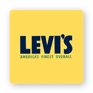
In this logo redesign, Levi’s still uses a bold, confident typeface, but this time with an all-caps sans-serif font. There’s also more kerning – giving the logo more space and a relaxed, comfortable feel. Interestingly, the company changed the red color to yellow and green, emphasizing the feeling of comfort. The only thing they kept was the tagline “America’s Best Overall.”
1949-1954
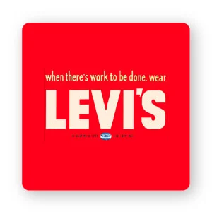
In 1949, after World War II, Levi’s redesigned their logo again. This time, they brought back the red color scheme and kept the uppercase sans-serif font.
If you look closely, the only thing that changes in the font is the apostrophe; it has a geometric shape in contrast to the soft, circular shape used before. You may also notice that the ‘S’ is less fluid in this design. Additionally, the company changed their tagline from “America’s Best Overall” to “When there’s something to do, wear Levi’s.”
1954-1969
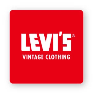
From the 1950s on, Levi’s jeans became popular among subcultures, including rockers, hippies, and fat people. That could have been a potential reason this font worked at the time. The letters are sharpened and smoothed; the red and white color scheme is even brighter.
The brand once again adopts a new tagline: “Classic clothing”, written in a simple uppercase sans-serif font.
1969-2003
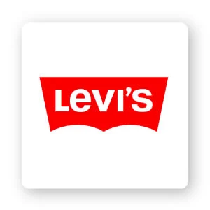
Around 1967, Levi’s renewed its image. Renowned brand designer Walter Landor (best known for Coca-Cola’s screenplay) worked on the redesign of Levi’s. The batwing shape of this logo reflects the Arcuate stitching on the back pocket of the jeans.
In 1971, Walter Landor & Associates suggested that the brand change the all-caps logo with a lowercase ‘E’. Refreshed images create a youthful, timeless feel.
2003 – Present
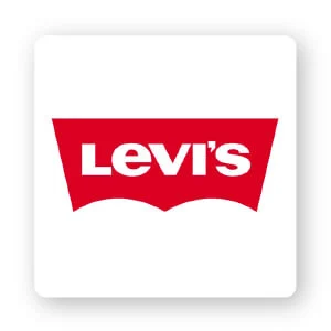
For about 34 years, the Levi’s logo remained unchanged, until 2003 when it underwent minor changes. They decided to choose a dark red background and reduce the height of the text. All the identifying features of the brand’s long history remain.
Epilogue
What’s remarkable about Levi’s logo is their ability to capture their long history and modern style. The iconic brand is about 169 years old; it has thrived as a company thanks to their constant innovation and high quality products, and the red and white batwing logo has become a symbol of strength, durability and timelessness.
What is the lesson learned for you? Levi’s logo is unique, clear, unassuming and remarkable, and it works because it’s legible, versatile, memorable, and timeless. So when you are thinking of creating your own logo, try to instill those qualities into your own design!


![[Case Study] Mixue: From a small house selling “Bing chilling” to a chain of 22,000 stores worldwide 7 Mixue 0926](https://maludesign.vn/wp-content/uploads/2023/04/Mixue-0926-500x500.webp)
