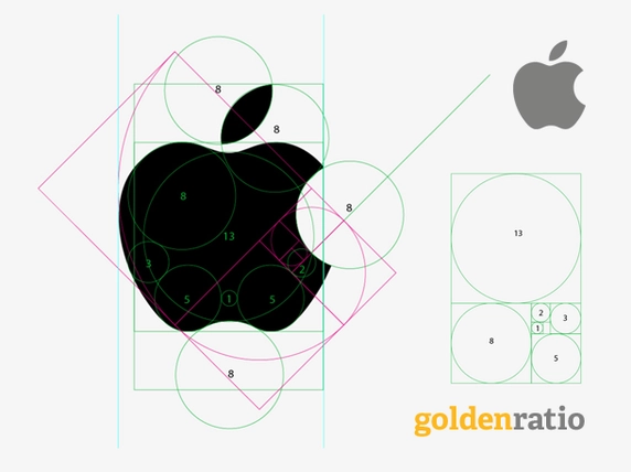
Perhaps many people are no stranger to posters explaining the admirable golden ratio in Apple’s logo as below:
Over the years, many people have always believed that the Apple logo is definitely a prime example of the golden ratio. However, the actual golden ratio does not exist on this famous symbol. The article below will better explain to you why all the “golden ratio” here is just an elaborate trick.
>> View more posts:
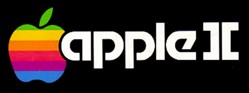
The current image of the perfect defective apple is actually not the first version designed by designer Rob Janoff for Apple. In a previous interview, he revealed that although it is still an apple prototype, its shape has been designed by the design company Landor & Associates changed more or less. Specifically, they lightened the color and adjusted its shape to make it more symmetrical.
When designing it, Janoff turned out to be hand-drawn, so the early 1980s version looked rather distorted like this:
Yes, the original logo Apple used certainly cannot be called a symmetry or a “mathematical masterpiece” at all. Then Apple hired design firm Landor & Associates to “orthopedic” it quite a lot. Although not much is known about the design process of this company, but we all know that after being revised, the missing apple image in the Macintosh catalog looks quite close to the current Apple logo.
This version is really proportionate, the lines are no longer hand drawn but are positioned with simple but consistent curves.
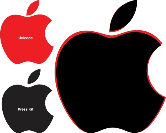
But is it following the golden ratio? Every computer Apple sells contains a vector version of the logo in Unicode character. Some logo templates are also included in the press release kit that can be displayed on retina screens as well. Try dissecting these logos provided by Apple itself.
The first thing that can be clearly seen is that the Unicode character image and the image in the press brand identity are not designed to the same geometric scale.
Put the 2 pictures together, we can clearly see the difference
This shows that the geometric parameters on this logo are not immutable and also shows that the rumored magic about the Apple logo turns out not to actually exist.
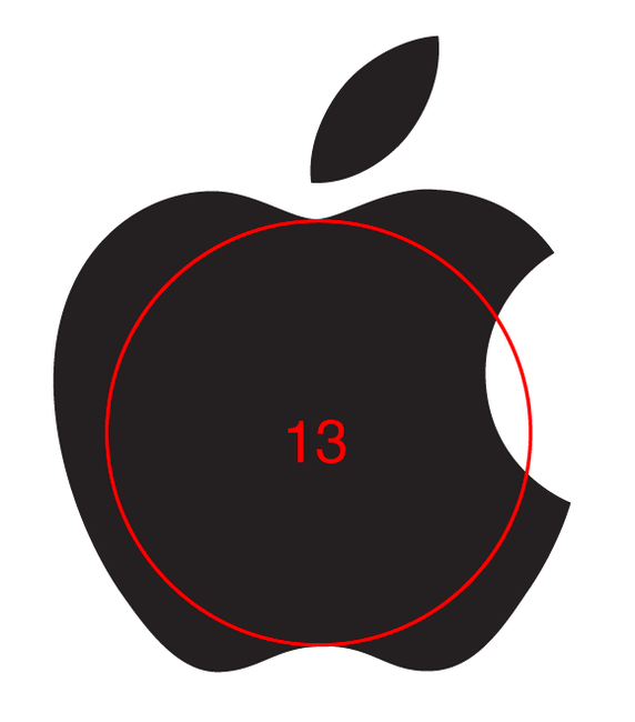
Let’s ignore it for the time being and dissect a recent version. The first element that catches our eye is the circle marked 13 in the center of the logo. It is not difficult to draw a circle running from the top concave to the lower concave of an apple with a temporary diameter of 13.
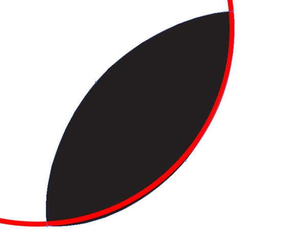
The next step is to match the circles to other curves on the logo to see if the geometric relationship between them matches the graph above. It turns out that many of the curves on the Apple logo are not arcs (arcs belonging to a certain circle). For example, compare two curves on a leaf, you will see that they intersect but are not symmetrical like the “golden ratio” graph plotted.
Wet the two curves together and we see another difference
The two curves that make up the leaf are actually completely different curves. Unfortunately, the same goes for many other curves in the logo. If these curves are not arcs, even using circles to create this logo is difficult, let alone assessing the correlation between them.
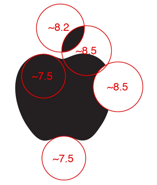
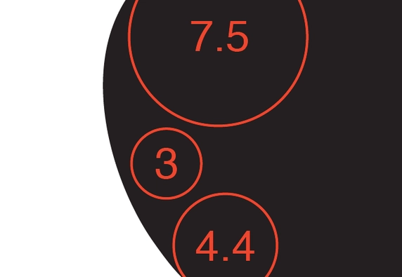
Continuing with the numbered circles 8: Suppose we ignore the fact that they are not arcs and align a few circles until it is compatible with the logo (with some tolerances) as shown below. The results still show that their diameters are not equal.
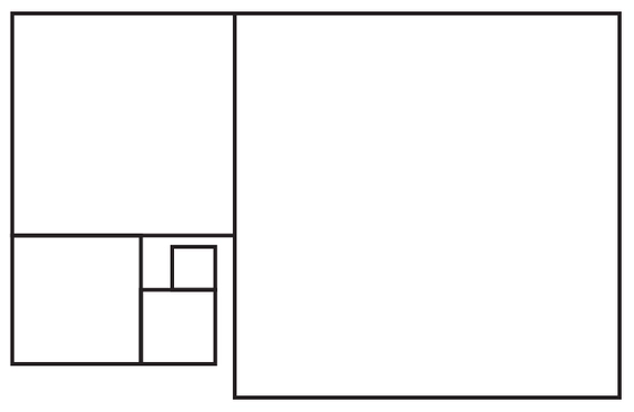
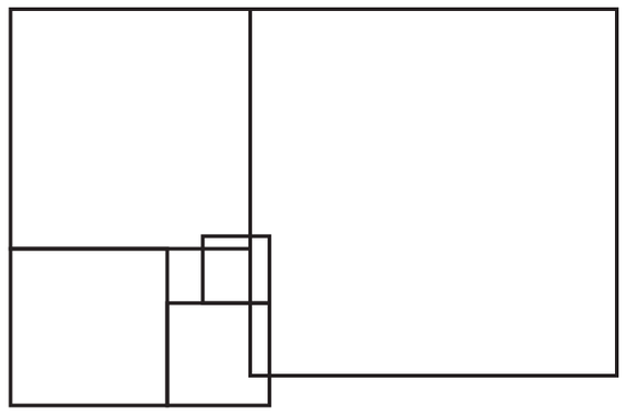
The difference between 7.5 and 8.5 is like a “golden ratio” where the value is not 1.618 as usual, but 1.53 or 1.73. For ease of visualization, here is an actual image of a 1.73 “golden ratio” rectangle:
Or 1.53:
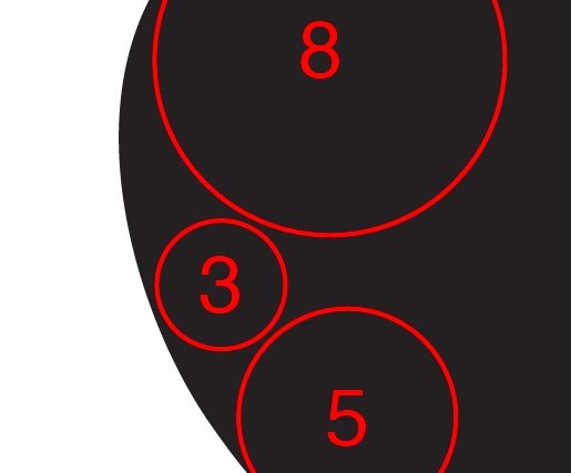
But let’s forget about this for a while and continue with the diameter 5 circle that the original graph plotted. Did you notice that the corner of 8th and 5th street meets 3rd street very suspiciously?
Try starting from circle number 5…
Turns out it’s 4.4 just…
If so, when inserted into the logo it will look like this, really the circles are too small to touch each other:
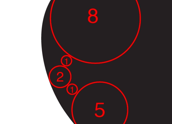
At this point, everything is probably over: The ratio of the diameters of the curved rings in this logo design (3:4,4:7,5) is actually quite meaningless, not as uniform as the rumored graph has shown. state.
What if trying to eat sticky rice round their diameter? We will be like below:
Still not much better, right?
Last attempt, like this?
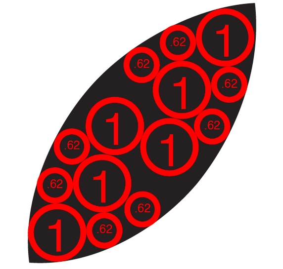
In this case, the “gold” standard has been lowered too low, because any area can be filled by circles of decreasing diameter that touch each other, for example right with the leaf on the logo:
Thus, ignoring the fact that this logo can hardly be designed based on circles, the fact that the circles are made with the wrong diameter will still not match the graph above or even any shape will have the same shape. can be filled with contact circles of different diameters, what are we left with? Is the unit “1” in the title graph a consistent basis? Does the golden ratio exist on the Apple logo? Perhaps you already have your own answer.
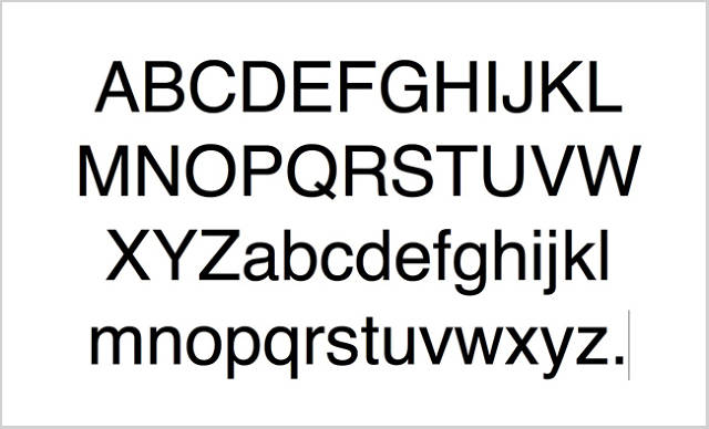
To better understand the inevitable deviation of our eyes when observing things, take a look at the Helvetica font that many designers love below:
Font Helvetica always gives the impression that the strokes are quite uniform
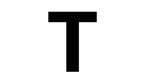
Then observe the uppercase T in this font:
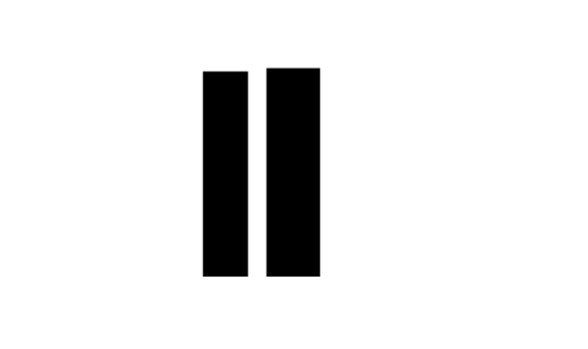
At first glance you may think that the horizontal stroke and the stroke in the letter T have the same width. However, when placed side by side, their actual widths “shown as is”:
The difference is quite large, but it is difficult for the human eye to notice when they are arranged in different directions. In fact, if these two strokes were the same width, the image of a T up would be very odd. This is what they call “accuracy that can tear art”. In design, we can only say: If it looks right, let it be. Likewise, the Apple logo draws people in because it feels confusingly accurate when it’s not.






![[UX Case study] The story of building Airbnb's design language 44 10airbnb 1600x1000 1](https://maludesign.vn/wp-content/uploads/2022/11/10airbnb-1600x1000-1-500x500.jpg)