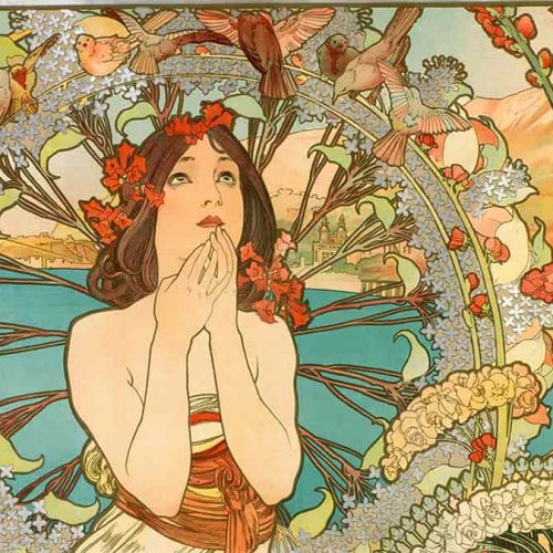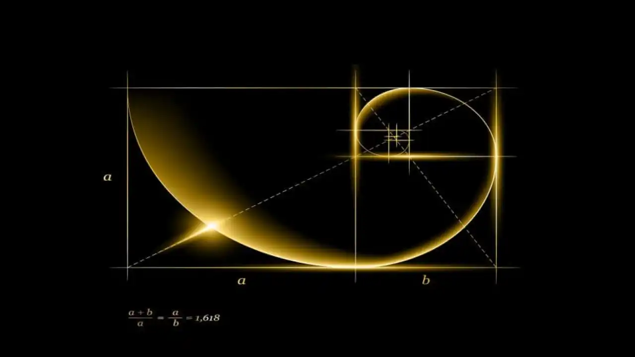
Have you ever wondered: What makes the Egyptian Pyramids or the legendary Mona Liza painting of Leonardo da Vinci so attractive to viewers? That wonderful mystery lies in the concept of the Golden Ratio .
So what is the golden ratio – the golden ratio?
It can be said: The golden ratio is simply a mathematical ratio, which can be encountered in nature, in famous paintings, and of course, in design as well. Roughly speaking, the golden ratio is the standard ratio between design elements, carefully measured, so that they can fit the eyes of those who enjoy the most creative works. .
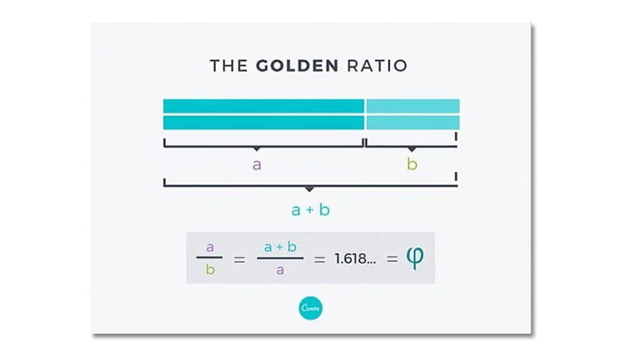
People often use the symbol phi (φ) in the Greek alphabet to convention for the golden ratio. An example of the golden ratio is as follows: A straight line is divided into 2 parts: The longer one is called a, the shorter one is called b. The golden ratio here is equal to: The sum of two lines (a) and (b), divided by sugar (a), is exactly equal to the ratio of sugar (a) divided by the ratio of sugar (b). If that ratio equals 1.618 then bingo, you already have the standard golden ratio.
The following figure will give you a more detailed look at the golden ratio.
But don’t let a few math problems confuse you. In design, the golden ratio here is simply the expression of aesthetic harmony for creative products. The beauty of these works is hidden in the balance of the elements in the work.
It is because of the hidden beauty that the golden ratio is also considered by designers as an X-factor – a mysterious miracle that attracts all eyes.
This carefully calculated balance seems to have been discovered by us humans a long time ago: from the majestic Egyptian Pyramids, to the Parthenon in Athens; from the famous Adam statue that made Michelangelo’s name, to the mysterious smile of the Mona Lisa, or the logos of the two giants Pepsi and Twitter. One thing that few of us find out: A face with harmonious beauty has the ratio between the elements that follow the golden ratio.
If you’re curious to find out what they look like, find out in the photo below!
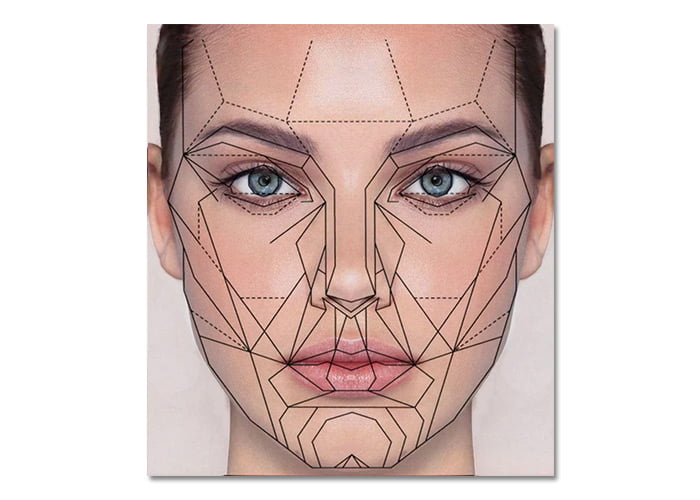
In fact, our brain seems to be very comfortable with images designed according to the golden ratio. They have an invisible charm, even when we don’t even know they really exist. In short, the golden ratio has a very important meaning in design, it can be considered as a hidden magic that any designer needs to take advantage of when designing.
The advantage of the golden ratio can also be applied in the design of cubes. You can completely design a rectangle, where their length divided by width is exactly 1.618 : 1.
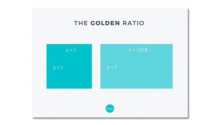
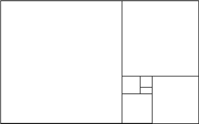
Now with the two shapes at the bottom, divide the area of the second shape by the area of the first. You will be surprised, because the ratio of these two areas is equal to the golden ratio 1.618 : 1
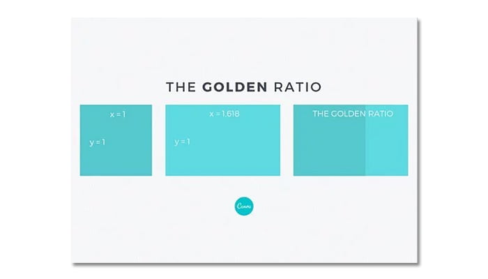
If you continue to apply that formula in creating other smaller rectangles, you get the result as shown below.
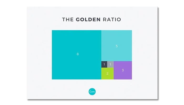
Next, you draw a curve connecting the two diagonal vertices of each rectangle (as shown below). Congratulations, you have created a Golden Spiral, also known as the Fibonacci Sequence. The Fibonacci sequence in algebra is a sequence of numbers where the next number is exactly the sum of the two preceding numbers. (Here we have: 0, 1, 1, 2, 3, 5, 8, 13, …)
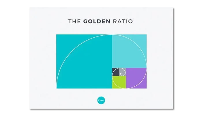
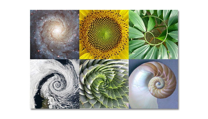
You can absolutely find the silhouette of this standard spiral in the natural world, in the pistil, in the shell of a snail, even in natural disasters (cyclones in storms). Simply, because mother nature always creates the most perfect creation.
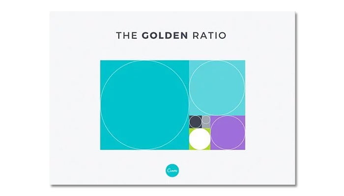
Now, for each rectangle, you draw a circle inscribed inside. You will see that the ratio of the circles to each other all adhere to the ratio 1: 1.618, strangely balanced.
Is the above enough to make you excited? And that’s not all, because the following section will guide you in detail on how to apply the golden ratio in your creative products. How do you weave this mysterious element into your own design? The following tips are things that every designer needs to know.
1. Layout – Select product size according to the golden ratio
Are you considering how to apply the golden ratio to your layout , design, right from the first steps? It’s simple, you just need to apply the golden ratio when aligning the dimensions to the design product.
For example, with a length of 960 px, the width of the design should reach 594 px (that’s 960 divided by 1.618).

Now, you take two different photos (with the frame divided in a ratio of 1: 1.618), and voila, you have created yourself a beautiful work, with balance and harmony between the two frames. seem to share little in common with each other.

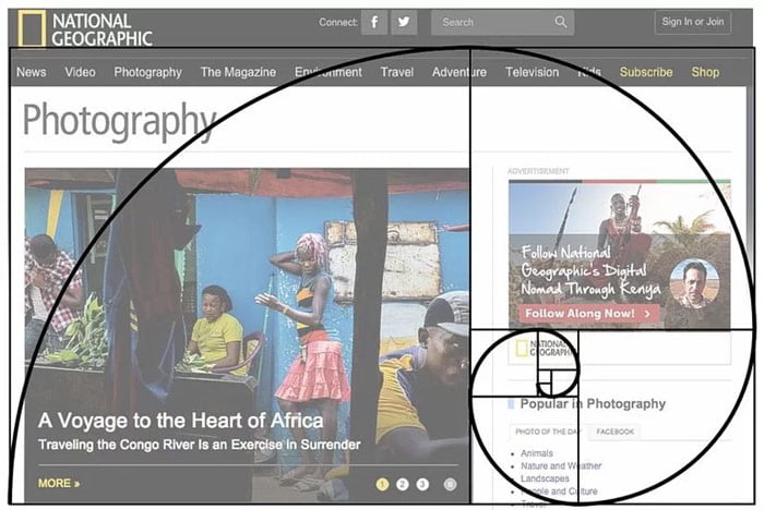
This type of two-frame layout is very suitable for Web design. You can often see this type of design. National Geographic regularly uses this design style to create a website that is neat, easy to read and has a well-organized layout. It gives readers a sense of orderliness, balance and order in the Website.
2. Spacing – Spacing between elements in the design
Spacing plays an extremely important role in design. If you are not clever in using distance, they can completely destroy your creative work. Instead of wasting time aligning the distance between elements, why don’t you apply the golden ratio here. With the ratio guaranteed by the eye-catching scientific factor, your design will certainly make a big difference.
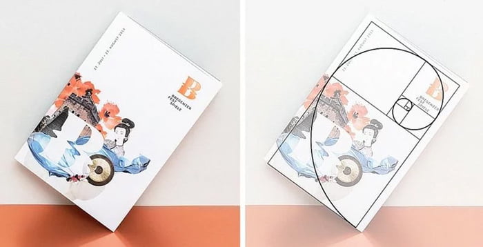
In the example below, design studio Moodley has created an identity for the Bregenzer Fesrspiele art festival (including logo, typo , billboard and some other promotional materials), using the golden ratio element as an element. Adjust the layout, spacing between elements in the design. This makes the product more neat and orderly in the eyes of the viewer.
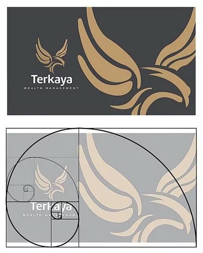
In another example, agency Lemon Graphic from Singapore created a beautiful piece of work for Terkaya Wealth Management. Below is a business card that strictly adheres to the golden ratio rule. You can see in 3 elements: The large eagle, the small image, and the logo are all aligned and spaced according to the golden spiral.
3. Content – Set content layout according to the golden ratio
The golden ratio is also used in the design and layout of content in the design. You may not know it, but our eyes tend to focus on the center of the spiral, where the most specific, detailed points are shown. Therefore, you should design the content layout of the design so that it faces the center of the spiral.
Take a look at the National Geographic example, and you will see an interesting point: The famous golden rectangle logo of this geographical organization is located in the center of the golden spiral. Is it interesting? This could be a trick, a hidden attraction from this organization when wanting readers to engrave their logo in their memory. But we can’t deny that: The golden ratio is powerful in design!
Designer Tim Roussilhe’s website may seem to contain a lot of content, but it is organized very neatly and effectively, thanks to the golden ratio. As you can see, the text of the Website interface design is concentrated mainly on the left corner of the Website, where the center of the golden spiral is.
Our eyes usually pay attention to the phrase My Name is Tim, but the golden ratio makes us instantly read detailed information about Tim, the Web navigation bar and the logo. That’s all Tim needs his clients to focus on.

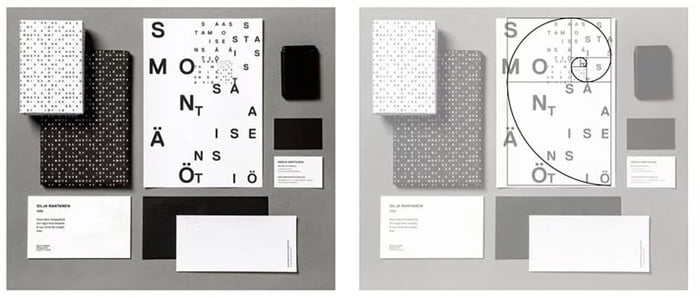
In a very interesting design, the alphabetic characters in the word Saastamoisen säätiö look like they are arranged in a chaotic fashion, where they are. But when you look closer, you’ll see that they are organized according to the golden ratio. Therefore, we find them very random, but still pleasing to the eye and enjoyable.
Design studio Helms takes advantage of the golden ratio in the brand design of Fullstream Brewery. In many details and elements, Helms has cleverly arranged them in a “legendary” spiral, helping the human eye to look towards the “main character” (a middle-aged man with a very beautiful beard). ” in the design, to the postmark symbol in the stamp, and much more.
Since then, Helms has achieved its purpose through design: Telling a hidden story behind the Fullstream wine brand.

4. The golden ratio in photography
Composition in photography is an extremely important factor. It helps you both convey the exact message behind the artwork you want to convey, and at the same time be eye-catching.
In photography, the golden ratio is used to divide the composition of an image into three different parts. You use lines/boundary lines to delineate them in the composition of the photo.
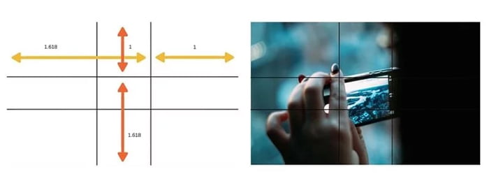
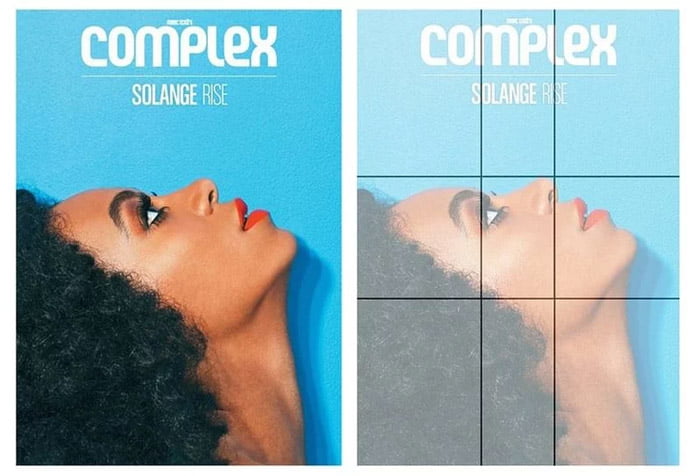
This rule is commonly known as the Rule of Thirds in photography, with a ratio of 1: 0.618 : 1. Specific stimulus parts, you can follow in the figure below. This rule helps the photographer to place the center of the image in this position (instead of the center as we usually imagine), helping to immediately attract all eyes from the viewer.
An example you can refer to is the cover design of Complex magazine. This magazine has cleverly divided the layout of the cover according to the rule of thirds. Accordingly, readers are immediately attracted to the beauty of the cover character – a famous singer.
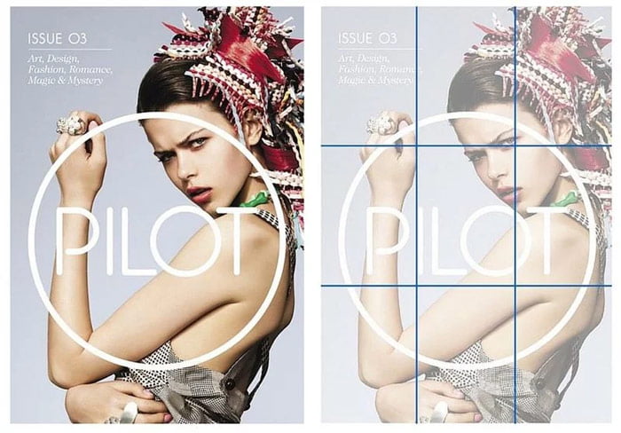
Designer Jason Mildren designed the following magazine cover for Pilot. If you’re observant, you’ll see that they strictly adhere to the rule of thirds – when every single point of the model’s star (her enchanting face) is in the very center of the dividing area. In addition, the center of all attention is also on the logo of Pilot magazine.
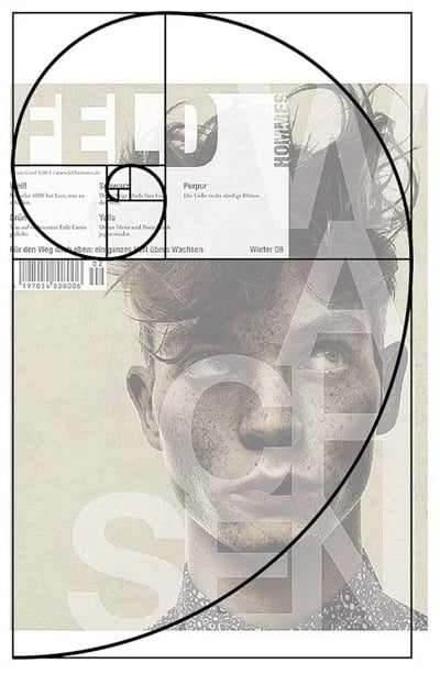
With the magazine cover below (Feld), thanks to the rule of thirds, the reader’s eyes will be directed to the face of the cover, and the hidden alphabetic characters visible above.

In addition, the cover of this magazine cleverly integrates the layout content according to the principle of the golden spiral.
5. Golden ratio in design
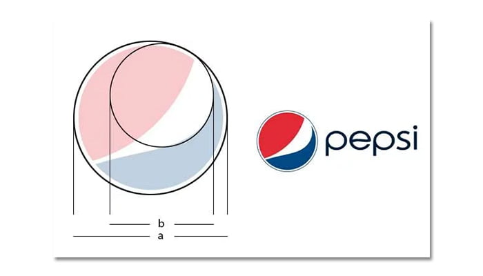
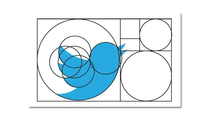
As we learned above, for each circle inscribed in a rectangle, they have a format ratio of 1: 1.618. We can completely use these circles in the design, and the most prominent is the Pepsi and Twitter logos.

With Pepsi, the integration of the circle (b) has created a soft curve for the Pepsi logo – which separates the two colors red and blue (with a white block in the middle).
With Twitter, the iconic bird is cleverly designed through the integration of golden circles. This creates harmony, balance in the design, and is eye-catching for the viewer.
According to György Dóczi, author of The Power of Limits: “The power of the golden ratio is the harmony and balance of separate, seemingly unrelated elements put together. into a unified whole. The elements shine on their own, but do not overshadow the whole.
5. The golden ratio in painting
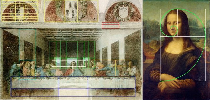
Leonardo da Vinci as well as many other artists used the golden ratio to create amazing work that has survived to this day.
5. Golden ratio in architecture
One of the 7 wonders of the world, the Taj Mahal is also a typical example of the application of the golden ratio in construction. When up to 67.45% are aligned to the golden ratio. The photo below is a “divine” angle that shows the perfect balance.

6. Golden ratio in industrial design
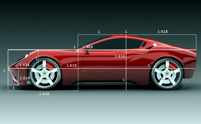
The golden ratio you can encounter in everyday life, from famous brand logos, to packaging products, household appliances, electronics from handmade ceramic vases to modern products like umbrellas. Bowl.
7. Interior design golden ratio application
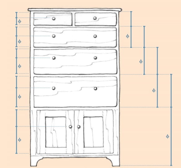
In interior design you can apply the golden ratio to get a harmonious balance, mainly focusing on the rectangle with the golden ratio. This ratio you can apply in the manufacture of furniture in the room, the arrangement of high and low ratio, short and long. Divide the decoration area, leave furniture in the room …
Epilogue
Because of the indisputable benefits of the golden ratio in design, make use of them, turning them into a mysterious element that highlights your artworks and creative publications. Hope the above sharing will help a lot in your design and creation process.


