Some logos seem simple at first, but a closer look reveals the ingenuity of the successor in using the space around the logo.
Of course, this is not always easy to see. But knowing how to skillfully use negative space in design helps create a more subtle and profound communication message.
In many cases, designers often ignore negative space and focus on the main objects of the logo – be it the central text or image. However, making good use of the space helps the design to connect with the public more effectively in every way.
There are a number of outstanding advantages when optimizing white space in logo design, including: Having more creative space to better convey brand identity . At the same time, build smart layouts that make the design both simple and effective. First, it is necessary to understand some basic elements of design.
What is Negative Space?
Negative space is the residual void that surrounds a complete object and serves to highlight the main object. In short, it’s the “unused” part of the image or design. However, negative space is rarely overlooked and, on the contrary, plays a crucial role in publication design.
In its purest role, negative space is essential when it comes to composition – the way objects are arranged in a design. If there are too many elements and not enough space, the design will become cluttered. On the contrary, if too much space appears, the design will be less attractive.
In addition, negative space is also favored when designing logos. By taking advantage of existing objects, combined with letters or logo marks, designers can freely create “optical illusions” or hidden meanings for their products.

Why use negative space in logo design?
Emphasize creativity:
Designs that use negative space are a harmonious combination of balance and creativity. When customers realize the meaning behind the logo, the effort is rewarded. An attractive design is the clearest proof of the creative and innovative capacity of a business.
Emphasis on leanness:
Instead of trying to cram a lot of elements into a logo, negative space brings out what’s available without overwhelming the design. Therefore, the design keeps the simplicity but no less unique.

Design to be memorable:
A logo with a clever design is always more memorable than a lackluster product. Knowing how to properly use negative space helps the logo become evocative and make customers think about the brand more.
Make a connection with your customers:
Creating “visual illusions” is one of the familiar techniques when using negative space. The messages or images hidden in the logo are a way to stimulate public curiosity and interaction with the brand.
Make your logo really stand out:
Most importantly, negative space makes the logo unique and goes beyond conventional logo design standards. The combination of creative elements and available resources helps the brand to stand out in a competitive market.
Negative space classification:
There are several different types of negative space. Each type has its own properties and uses. Choosing which type to use in logo design depends on the needs, as well as the logo style that the business likes.
Logo 2 meanings:



The logos above are the overall harmony between negative space and remaining space. By taking advantage of the negative space within the object itself, these logos create two different interpretations of the design. This is considered an example of the exemplary “visual illusion”.
In the logo of the Guild of Food Writers, negative space creates the shape of a fountain pen (representing “writer”) surrounding a spoon (representing “food”). There are also logo styles with a similar method used to introduce the business name along with the type of product/service they offer. For example, Snooty Peacock’s logo includes a peacock but is stylized as a woman’s face – since this is a jewelry brand. Or the Spartan Golf Club logo has the image of a man playing golf, but if you pay closer attention, you will see the Spartan logo embedded there.
Hidden images
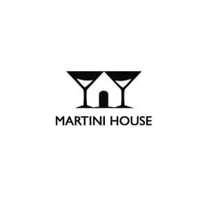
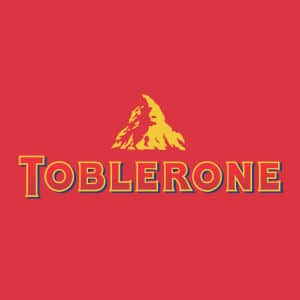

Some other logos take advantage of the negative space available in the design to build an implicit image/symbol that carries meaning and connects with the brand. For example, Toblerone company hides the bear image in the famous mountain logo to pay tribute to the Bern region – where the company’s headquarters is located. If you look in the middle of the image of 2 wine glasses in the Martini House logo, a house will appear. Or Yoga Australia has actually created a map of the continent of Australia through a woman’s yoga movement.
Typography

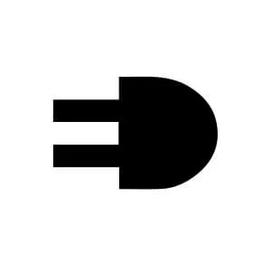

In many cases, warm space can also be used as a boundary between characters and letters. Mister Cooper Ice Cream Company has “hidden” the phrase “ice cream” in a typographic logo that mimics lips. Or the logo of ElettroDemstici changes with 2 letters “E” and “D”. Or Eaton highlights the letters “A” and “O” in brand names using a similar technique.
This is a good tactic when you want to focus on a certain character that represents the brand without necessarily making it the sole central focus of the logo.
The principle of closure


Negative space acts as a boundary between images, combined with previously used space to form a complete design. If you still don’t understand, take a look at some of the following examples: WWF logo – famous for its panda symbol. If you take a closer look, you’ll notice that you’ve filled in the white space in your design and decoded the image as a complete whole – the bear.
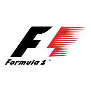
The same idea also applies in the F1 logo design. The number “1” is formed in the space between the letter “F” and a cube representing speed. Or the logo of the Pittsburgh Zoo has the ability to represent a complex old tree, and at the same time insert the image of two animals confronting each other.
Some examples of logos that use negative space
Here are some logos that cleverly optimize the space in the design. Let’s take a closer look!

Tips when designing a logo that uses negative space:
Learn to appreciate empty space:
When caught up in highlighting the main object, designers often forget that there is still negative space to be used. Taking this resource lightly means excluding an extremely important element of the design. Learning how to use negative space properly helps publications reduce the number of items but increase flexibility.
Remove objects – Add space:
In design, struggling to balance the spaces in a surface with a limited area is always a problem. After the first draft, maybe the design is missing too much negative space. But we don’t necessarily need to go back to sketching from the beginning, but should consider removing elements that are making the design cluttered.
Plan to use negative space as soon as possible:
Instead of struggling to find ways to add space to the design when “it’s all over” then, consider them from the start. At that time, we have the initiative as well as wise calculation for the design. Negative space needs to be tested over and over again to deliver the most effective publication.
Breakthrough thinking:
Using negative space in logo design promotes creativity, but sometimes it is also boring if old-fashioned thinking is applied. If you are cherishing a more unique, “weird” design, don’t be afraid to think boldly and boldly. It is only when we strive to build pure creativity that the brand stands out from the crowd.
Choose the right implementation:
Each logo has different requirements. Trying to apply 10 styles like 1 to every design does nothing but harm the brand itself. Instead, consider the type of negative space and appropriate implementation for each logo.
Message for you:
Using negative space is a pretty simple and fun strategy for creating a personal touch in logo design. Negative space can enhance and help express brand personality as well as bring value to potential customers. Focusing on developing this tactic early on helps the logo stand out more, stimulating public curiosity about the brand. Most importantly, the logo will be able to bounce back from an increasingly saturated market.
If you are looking for a reputable and experienced unit to be able to design a professional and impressive logo and brand identity system , then please contact us immediately by phone. 0988 622 991, or leave your information and requirements, Malu Design ‘s consulting department will contact you right away to answer all your questions!
————————
Malu Design – Branding Identity Agency
Hotline: 0988 622 991


