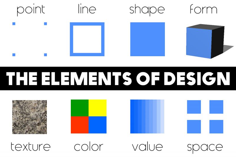
There are many elements that go into a design. Colors , shapes , typography , etc. all contribute significantly to the design success of the digital era. But as you dig deeper, you’ll find that there are a lot of things that affect the overall design. The elements that make up a design we have a collective term called Element.
Today we will learn what those Elements are.
What are the basic elements of design?
Design elements have an impact on how a work is perceived, performed and used and are present in the design regardless of skill, taste or style.
In his book, Art As Experience, American philosopher and psychologist John Dewey concluded that everything that artists and designers create has great significance to our everyday experiences. everybody. To break down the elements of design, we must follow his sound advice:
To understand aesthetics in its ultimate and approved forms, one must begin with it in its raw form; in events and scenes that eyes and ears.
John Dewey
American philosopher and psychologist
In other words: Start with the basics.
Form – Form:
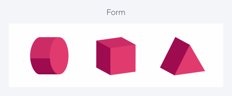
Forms usually have all 3 elements such as width, depth and height. Usually, forms have two types: Geometric form and Organic form. For those who do web design work, often they will immediately think of input elements in UI design when hearing the form.
Shape – Shape:
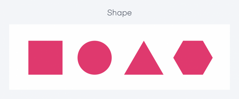
All objects are composed of shapes, and all design elements are shapes in some way. Shape is a two- or three-dimensional object that stands out from the space next to it because of a defined or implied boundary. Shapes are made up of lines and colored areas.
Some basic shapes that are used a lot in design are usually triangles, squares or circles, etc. You can use shapes in your design to convey meaning and organize information.
There are 3 basic types of shapes:
- Geometric shape: As the name implies, Geometric is geometry. From geometric blocks, from single-dimensional to multi-dimensional, from sharp, strong edges and corners.
- Organic shape: Using natural shapes, can also be similar but man-made shapes. Abstract shape: This is a type of shape that uses abstract shapes such as characters, logos or alphabets.
- Abstract shapes bring a sense of openness, an indescribable feeling. Really true to its name Abstract (meaning abstract).
Line – Road:
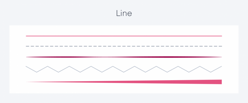
When using each line in your design, it can be used to separate, organize, emphasize or space the page. Alone or as part of another graphic element, lines can create patterns, set moods, provide visual texture, create motion, and define shape.
In drawing, a line is a pencil stroke, but in graphic design, it’s two points of connection.
- Lines can be long or short, straight or curved. The lines can be horizontal, vertical or diagonal.
- Lines can be a collection of many lines (lines) grouped together, a collection of many points next to each other.
- Lines can convey emotions and information very well.
In line design for organization, lines create direction, create movement, emphasize, lines convey meaning, and create texture.
Texture – Texture:
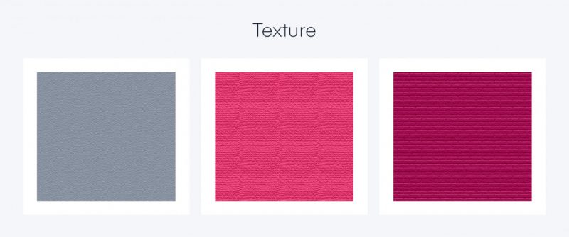
Texture is a concept that refers to properties that are related to the surface characteristics of an object and have the size, shape, density, arrangement and proportions of the basic components in the object. You will often encounter textures in nature. Texture is often seen a lot from reality such as on tree trunks, wood, metal, leather. Texture has 2 types including Tactile Texture and Visual Texture.
Tactile Texture: Tactile means touch. Tactile texture is the roughness (3D) of a surface that can be felt to the touch. This is a very important factor that gets more attention in 3D design than 2D. Real surface texture needs to be felt or seen by letting light shine on its surface.
Artists often take advantage of this to make the surface of their paintings look more alive. Layers of paint can be applied on top of each other to form rough peaks, a technique known as Impasto. There are many famous painters in the world with this technique, the most famous being Vincent Van Gogh. Visual Texture: Visual texture is the visible impression that texture gives the viewer, for example color, trend and density in an image. It is also an impression of the texture created by the artist by trying to reproduce the color and value of the real textures.
Visual texture properties will relate to the illusion of surface textures. No matter how rough the objects are, the surface of the image is very smooth. And this is the type of texture used mainly in 2D techniques.
Color – Color:
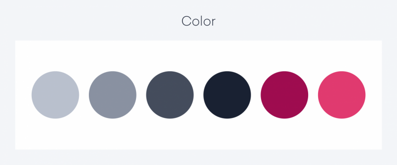
Color can help organize a design and give emphasis to specific areas or actions. Like other elements, it has a number of different properties: hue, saturation, and lightness. Designers can customize how colors are used to give different impressions of the design. A useful tool that can greatly help with color schemes that designers can apply is the Color Scheme Designer.
Space – Space:
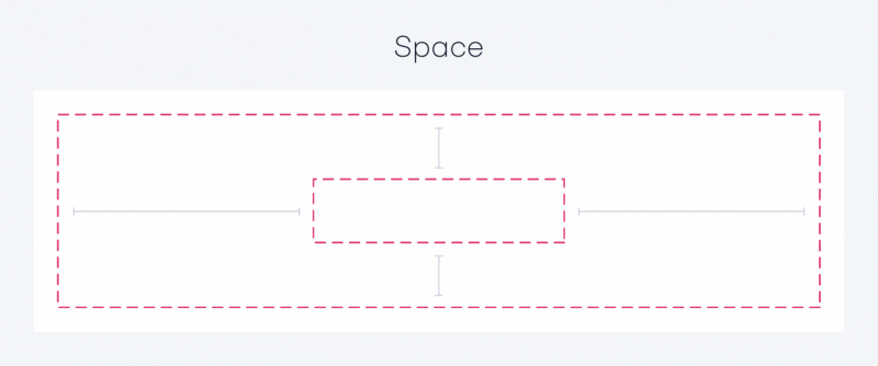
Space plays an important role in “giving oxygen” to the elements of your design. Negative space or white space is space that exists, usually behind and around an image or graphic object, in artwork or graphic design. This negative space keeps our design from looking cluttered or too confusing.
There are two main types of space, that is 2-dimensional space and 3-dimensional space. The space inside a shape is called positive space, and the space outside is called negative space. Usually, when it comes to space, a lot of people will refer to negative space .
Movement – Movement:
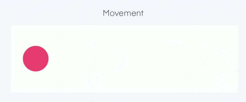
The seventh element suggested in the age of digital design is movement.
In classical or more static design methods, motion can be implied, but objects cannot move. Motion can be applied to lines, shapes, shapes and textures, and can even move objects in space. This is especially useful because it allows your forms or shapes to express personality or tell a story. An example in static media is animation where an artist has created the perception of motion with action lines or blurred areas. Motion can also be applied to physical experiences where users interact with their space.
Motion has become popular in apps and interfaces because it allows designers to create a timeline or sequence of events to mask transitions or loading screens. If the user taps a button, the button can animate on the canvas and the next page can slide into view. This allows designers to engage users through animation and/or provide them with feedback as they interact with a particular part of the interface.
Why you should understand the core design elements
A well-rounded designer has a solid basic understanding of what elements to use and when. It also gives you the ability to evaluate and deconstruct other designs; Looking at a design from its raw, basic elements can help you understand why a designer makes certain decisions in their work.

