Are you trying to find the perfect style for your logo to convey your brand message to your customers?
Well, we’ll tell you a little secret about what you’re looking for.
Not only is the color tone and typeface what makes your brand unique, but the shape of your logo plays an equally important role.
You shouldn’t choose the shape for your logo based on its aesthetic appeal (i.e. because it looks good). Instead, choose the connections it can make in our brains, which will help deliver your message to your target audience accurately.
You may find that compared to circles and squares, triangular logos are less commonly used—which is good news if you want your logo design to stand out from most of the competition. !
Mục lục bài viết
ToggleThe meaning behind the triangle logo
It’s no coincidence that big brands LOVE using triangles in their logos, as they combine all the benefits of both a circle and a square.
The symmetry of the triangle is easy to see, that’s because all 3 sides are the same size. It not only represents unity (like a circle) but also a building with a solid foundation (like a square).
Plus, the triangle in the design has great versatility. You can change the meaning of your logo just by changing the orientation of the triangle.
A triangle that exhibits amazing stability with an upward top (the Ancient Egyptian Pyramids have stood the test of time for thousands of years thanks to their triangular design). If you flip it upside down, you’ve created a PLAY button that, although less stable, represents movement — perfect if you want to give your logo a sense of urgency or signification. for action.
You can even replace them with letters of the alphabet, such as ‘A’ and ‘V.’. What a highly flexible form! So let’s take a look at 17 famous triangle logos and find out what makes them so appealing.
17 famous triangle logos
As you go through the examples below, pick out elements that you can use for your own logo. This is a diverse list, and we’ve picked logos from as many industries as possible so you can find inspiration when designing.
1. Google Drive
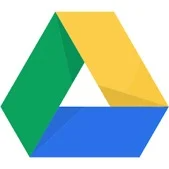
The Google Drive logo contains a lot of meaning in an icon, even though it looks quite simple.
Each side of the triangle is a different color and represents one of the Google Drive features: Blue (DOCS), green (SHEETS), and yellow (SLIDES).
By using a triangle instead of a circle, Google underscores the trio of services they’re offering, and shows how your data is protected inside a secure, self-contained structure.
2. Google Play

The Google Play logo has gone through many changes, but it has always retained its signature style with the triangle on the side, which represents the PLAY button commonly found on DVD and Netflix remotes.
Google has boosted its brand by adding in their corporate colors. Now, whenever we see icons or logos with similar colors, we subconsciously associate the Google logo.
3. ROW

FILA is an Italian clothing company founded in 1911. They initially produced clothing for the inhabitants of the Alps, then soon switched to distributing other types of clothing.
By turning the letter A into a triangle, they are able to represent the brand’s mountainous roots (durability and stability), as well as a softer expression of the brand thanks to its curved corners. .
Thanks to a stylized triangle shape, they succeeded in conveying their brand message to the customers.
4. HGTV
HGTV (Home and Garden TV) is famous for its home improvement and gardening content — not only on TV but also on their blog and YouTube.
By designing a triangle above the logo, they turned it into a home and created an instantly recognizable brand. Besides, blue is a warm, inviting color that showcases the smart and strong identity of the brand.
5. Airbnb

Airbnb’s logo is simple but extremely memorable and contains many messages for viewers.
The core message of the company is to create a sense of “belonging” to customers. As a tourist, you can feel at home no matter where you are.
When you flip the logo upside down, you’ll see it turn into a heart symbol representing love. In the center, there is a raised head and arm as if to greet people, showing their global reach similar to Google Maps.
And finally, the triangle also stands for the letter A – the first letter in Airbnb. By sticking a pure white logo on a red background, the symbol will be easier to see and remember thanks to its simplicity.
6. Guess
The Guess logo has an eye-catching design with red borders with a question mark in the middle, but this question mark ends with a triangle instead of a round dot. The inverted triangle looks similar to a warning sign, which goes well with Guess’s free-spirited brand aimed at younger audiences looking to express their lifestyle with their clothing.
7.reeboks

Reebok was previously only aimed at professional athletes, but in 2014 they redesigned their logo. Instead of harsh-looking contours, they switched to a segmented triangle with a softer feel.
The new logo shows how easily the brand is accessible to everyone, not just professional athletes. The triangle is a great shape to signify inclusiveness in all respects.
8. Metallica
Heavy metal music? The voice is difficult but melodious? That’s all you should know about Metallica. Although they are known for their rough image, there is always a softer side to some of their music.
This band’s logo is their name (a watermark), but the M and A have lines magnified by sharp serifs, creating a sense of power and action. When placed next to logos with regular typeface, it will stand out even more.
If your font is a watermark, change one of the letters to a triangle.
9. Toblerone
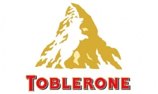
One of the most famous Swiss chocolate brands – Toblerone is not only famous for its chocolate but also famous for having a logo that holds great meaning.
The triangular mountain logo represents Switzerland’s most famous peak – the Matterhorn, and if you look closely, you can even see a cunningly hidden bear. The bear represents the coat of arms of the city where Toblerone appeared. Toblerone’s mountain logo certainly made a lot of visual impact on their customers.
10. Caterpillar Inc.
Caterpillar Inc. world famous for construction and mining machinery. With such a large and powerful engine, they were only suitable for designing a logo that embodies structural integrity, creating a sense of credibility with the wide triangle and keeping the company’s shortened name. – CAT.
The yellow color of the triangle is similar to the uniform color used on construction sites, the black font shows the viewer the strength and excellence of the brand.
11. Mitsubishi
Even if your brand name is not an English word, you can still express what it means with symbols. The Mitsubishi brand name is a combination of the words Mitsu (meaning three), and Hishi – a Japanese term used to describe the diamond shape.
Each diamond in the logo represents something associated with the brand: success, reliability, and integrity. And they all fit together to form the famous triangular logo that is recognizable anywhere.
12. Qantas
Qantas brilliantly recreated the feeling of joy and happiness when you board a flight and fly to a magical place, by depicting the shape of the plane’s tail with a simple triangle and a carrying kangaroo. brand symbolism.
The kangaroo looks sleek and is highlighted by the red background, which is also an eye-catching color combination.
13. Delta Air Lines, Inc.

Another well-known airline company – Delta has had more than 20 logo designs since 1928. But, one element of logo design that they almost always keep during logo changes is the triangle.
Their name also stands for the Greek letter Delta, represented by a triangle and the symbol Delta mimicking a jet plane taking off. Combining them with the striking red color gave Delta a powerful symbolism, demonstrating their authority, leadership, and credibility.
14. Adidas
Adidas’ iconic logo is no accident. The triangle with the inclined blocks looks like a mountain, representing the challenges that every athlete needs to overcome in order to pursue their goals.
High slopes also hint at speed and power, both traits consumers look for in sportswear. By keeping the entire palette white including the name, they can easily print the logo on the various types of clothing and sports equipment they distribute.
15. Kenwood

Kenwood’s name is a combination of two popular words: ‘Ken’ – commonly used as a boy’s name in Japan and the United States, ‘wood’ – denotes the durability and long life of its products. This sale (kitchen equipment).
The sans-serif font is simple, modern, beautiful and very legible even if they scaled down the logo and printed them on any product. The small triangle in the letter W helps customers clearly recognize the brand name.
Note that such a small icon can have a significant impact on your logo, so consider it carefully.
16. HSBC

HSBC’s logo uses not one, two but six triangles in its logo to form a unique, red hourglass symbol.
This is one of the most recognizable banking brands, this symbol has helped HSBC become more famous and recognized by customers.
Two of the triangles are created using negative space in the logo, which is a good design idea to help the audience pay more attention.
17. Alcatel
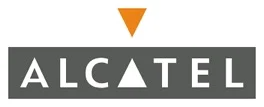
Another brand that substitutes a triangle for a letter in its name is Alcatel. Instead of both A’s, they just used a triangle to replace the middle letter and create symmetry.
Similar to Kenwood, the use of triangles helps them to create a unique logo with just a simple typeface, especially the sans-serif font that is currently trending in the field of logo design.
For you
As you have seen above, sometimes the small triangle has a significant impact on the value of a logo. Besides, smart use of negative space will also help you to allocate layout easily.
Are you inspired to create your own triangle logo now?
If you are looking for a reputable and experienced unit to be able to design a professional and impressive logo and brand identity system, then please contact us immediately by phone. 0988 622 991, or leave your information and requirements, Malu Design ‘s consulting department will contact you right away to answer all your questions!
————————
Malu Design – Branding Identity Agency
Hotline: 0988 622 991

