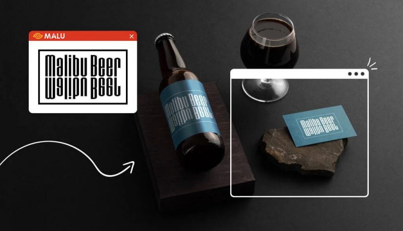
A good logo creates a connection between the target customer and the brand. The question here is: How to design such a logo? Although there are many types of logos in use, small businesses often overlook one type of logo: abstract logos .
Abstract logos are symbols or images that are relatively difficult to recognize. It is like a complex block representing the brand, designed according to certain concepts.
Abstract logos help transform many layers of meaning through images, making the brand memorable and easy to communicate with customers.
What is an abstract logo?
This is the type of image that stimulates reflection, association, and makes viewers feel a strong connection. This type of logo is a unique image designed to express something special about the brand.
What makes abstract logos attractive lies in their high flexibility. They range from symmetrical figures to line art. Therefore, you can freely choose a style that best suits your brand. The truth is that many of the logos we see every day are abstract logos.
Some tips when designing abstract logos
Choose the right icon :
A symbol can convey many ideas and emotions only through certain signs. Symbols are at the heart of logo design. It represents aspects of the brand: what products/services it offers, how the brand personality, what core values, etc.
Choose colors that reflect your brand message :
Many people don’t realize how beneficial an effective color palette can be in logo design. There is a whole psychological analysis system behind color that businesses should learn to build the right brand identity for themselves.
The colors used in the logo help customers have a clearer picture of the brand from a somewhat vague image. The right combination of colors gives depth to the design. In short, the issue of choosing colors should be prioritized when designing a logo.
Typographic choices that elevate icons:
The type of typeface chosen depends on the complexity or simplicity of the logo. In general, a perfect typeface will create balance for the design. A highly complex logo will suit a simple font and vice versa.
Experiment with different layouts:
Thinking about various logo variations according to a branding plan is a worthwhile investment. Maybe, abstract logos should only be applied on a small scale like a brand’s watermark, or a social media profile picture. As for the letterhead on the website, the logo can be transformed in a different way.
Types of abstract logos
Symmetrical abstract logo
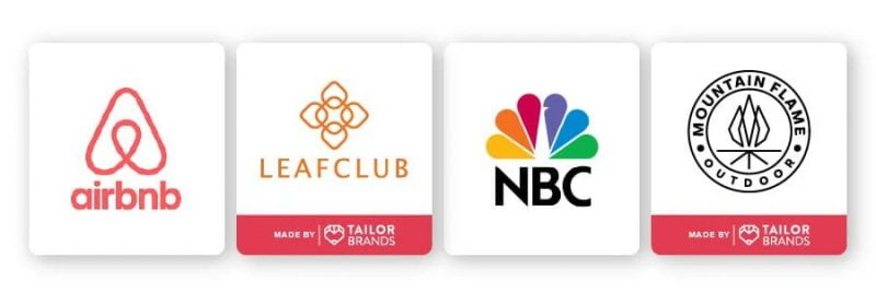
Symmetrical logos are a technique that mirrors the other half of the design to form two identical visual halves. While other types of abstract logos often try to stand out by going beyond standard design boundaries, symmetrical logos are more realistic and recognizable to the viewer.
Symmetrical abstract logo is very suitable for a fresh flower brand or health business. Leafclub is a good example of using a symmetrical logo to create an image of a flower. Mountain Flame is also a name that applies this style quite successfully. The brand’s logo reproduces the image of a flame with a dynamic style “branded” Mountain Flame.
However, symmetrical abstract logos are not necessarily encapsulated in the above business models. Big companies like Airbnb or NBC also use this type of logo. Airbnb has a very interesting logo design that includes 3 icons: an icon for the location, an upside down heart symbol and an image of a human hand reaching out.
And NBC’s logo is a combination of 6 peacock feathers – representing 6 areas: yellow for news, red for entertainment, blue for networking, orange for sports, green for you production and purple are information stations.
Abstract logo consists of cubes:
Geometry is often associated with Mathematics. But when placed within the framework of logo design, they create depth that only these minimalist shapes can.
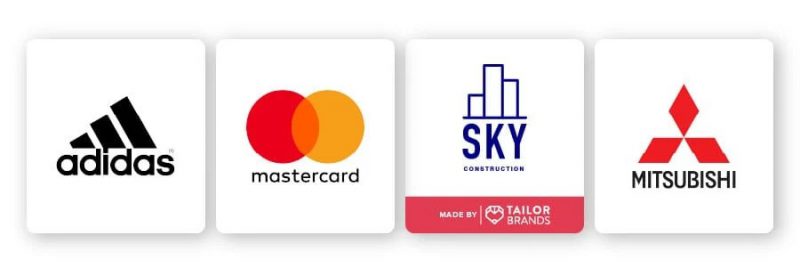
Geometry has the ability to capture and express emotions. As square symbolizes stability, order. Round shape creates a sense of security. Let’s take a look at the MasterCard logo, which is made up of 2 circles (the symbol for 2 coins). This logo makes potential customers feel more confident in the brand (and the circle is also easy to identify).
Other shapes like bold, straight lines convey a sense of durability and strength. This is also a good choice when you want to convey efficiency and credibility. The Adidas brand is a prime example that has been extremely successful with this approach.
The Mitsubishi logo is another pretty interesting example. The phrase “hishi” in Japanese means diamond-shaped. The founder of the company chose the 3-diamond symbol to design the logo, inspired by the qualities of the family as well as the first generation of employees of Mitsubishi.
Sometimes, shapes can be combined to form a complete image. Take Sky Construction as an example, by taking three simple rectangles, the brand has transformed them into the symbol of a skyscraper. Indeed, there is no limit to the use of shapes when designing logos.
Dynamic abstract logo
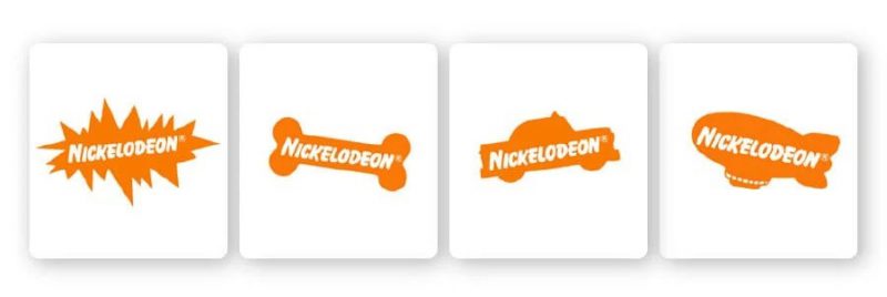
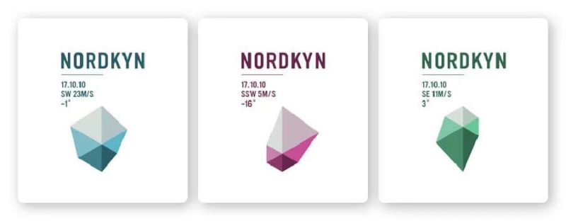
Dynamic logos are highly adaptable and can change depending on the context in which they appear. The dynamic logo still includes some abstract shapes and adds a little variation to use for different cases. Transformation includes: change color, change layout, change orientation of objects, …
Nickleodoen uses different icons for each part of its network but consistently the same orange color represents enthusiasm, energy and youthful font. Thereby expressing the vibrant personality of the brand and creating a more recognizable mark with customers.
Or with Nordkyn of Norway, customize the logo by geospatial. Based on live meteorological data, the logo changes according to the amount of wind and temperature in that area. Very impressive, isn’t it?
Abstract logos with hidden meanings:
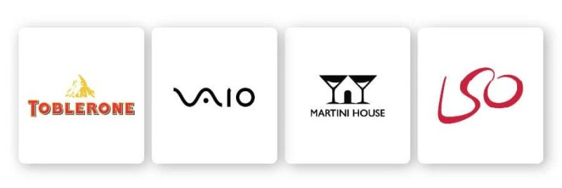
As mentioned, abstract logos suggest many different interpretations, so it often takes the viewer longer to understand the meaning behind them. From the use of negative space to the technique of shading to “trick” the eye, abstract logos are a complex, intelligent and stimulating whole for the viewer.
The London Symphony Orchestra logo is a prime example of an implicit abstract logo. The most noticeable thing when looking at the logo is the 3 letters LSO, 3 characters representing the name of the theater. But just looking more closely, we can recognize the image of the conductor conducting the orchestra.
Logo from line art:
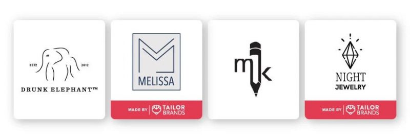
Those who claim that the essence comes from simplicity have their own arguments. As the name implies, line art consists of straight or curved lines drawn on an empty plane to depict 2 (sometimes 3) dimensional objects. Logos of this type are usually monochrome.
Line art is best applied in industries such as architecture, fashion, tattoo or skin care. Like the logo of Drunk Elephant – a brand aimed at Millennial and Gen Z audiences, consisting of only the simple shapes of an elephant, showing the not-so-sophisticated but very elegant style of this cosmetic company. Another example is the MK brand with its pencil logo. Or Night Jewelry’s logo is especially impressive when applying line art to describe a shining diamond.
Abstract logo illustration:
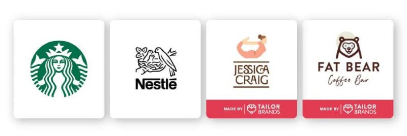
Not all abstract logos are… so abstract. With the illustrative type of logo, the images are still easily deciphered. Illustrated logos are used to represent objects in a fresh, creative light.
In the examples below, the images of a woman doing yoga, a mermaid, a bird’s nest or a bear are all illustrated quite clearly and easily. But if you pay close attention to the Starbucks logo, the mermaid is relatively meticulously designed to represent the character that is the inspiration for the brand name. Nearly every part of the design is simple lines but so effective that the Starbucks logo is as famous as the brand itself.
Abstract logo combination:
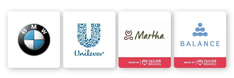
Considering symmetry and shape logos, why not combine them? Combining different forms of logo design can help the brand personality and communication message be better communicated.
Balance’s logo, for example, features stones piled on top of each other. This is a spiritual symbol that symbolizes patience and balance. However, it has a deeper meaning. If we look closely, we can recognize the image of a person meditating.
Or Martha’s logo is a combination of dynamic abstraction and line art. The logo is more peaceful and quiet than a simple descriptive image. This logo is also very versatile, as when the company wants to launch the yoga segment for pregnant women, the logo can be printed directly on exercise clothes.
The highlight of the combination logo lies in the fact that it is suitable for nearly every industry. Take for example the logos of BMW or Unilever: BMW chooses to combine design with symmetry and shape, while Unilever includes shapes plus layers of hidden meaning.
Benefits of abstract logo design:
Creating an abstract logo is not an easy task. A good logo needs to meet a lot of criteria. But hard work and perseverance always pays off. Here are a few things that can keep you motivated to perfect your abstract logo:
Uniqueness :
Abstract logo opens up a borderless creative land. There is really no limit to logo design. Therefore, you are completely free with bold ideas, as long as the logo instead of the brand “tells” their personality, story, values, ….
Memorability:
This level of creativity allows your business to create a niche in a monotonous market with the same images and buzzwords. By definition, an abstract logo is refreshing, interesting, and definitely grabs people’s attention.
Versatile features :
No matter how the brand continues to expand and improve its business model, the abstract logo remains the same value and longevity. In addition, they can be brand-customized in many forms to suit different purposes.
Flexible size :
Abstract logos can be processed in any format and size, from as small as a buttonhole to large enough to print for outdoor billboards.
Easy creation:
Designing a logo is of course not always smooth. But because of its free and unusual nature, abstract logos are sometimes simpler than a regular logo – because you don’t need to follow any rules. The limit is only in how far each person’s imagination is.
Message for you:
Sometimes a traditional logo is not enough to convey the brand’s message. If you want to connect with your customers more effectively, in a more engaging and fun way, then an abstract logo is the perfect choice.
The problem is that when you have so many options, you don’t know where to start. My advice is not to overthink things. Just complete a few drafts, consult with trusted people, and try to enjoy this artistic journey.
If you are looking for a reputable and experienced unit to be able to design a professional and impressive logo and brand identity system , then please contact us immediately by phone. 0988 622 991, or leave your information and requirements, Malu Design ‘s consulting department will contact you right away to answer all your questions!
————————
Malu Design – Branding Identity Agency
Hotline: 0988 622 991

