When starting a new business, logo design should be a priority for the brand. And opening a yoga studio or promoting yourself as a yoga instructor is no exception.
The perfect yoga logo will help you promote your yoga practice and attract the right potential audience. It will make your brand more memorable and different from your competitors.
Like any other industry, yoga logo design has quite a few styles that you can choose from. Most yoga logos are simple in their approach to customers with minimal design elements for clarity and focus on the main message.
Before you start designing a logo for your yoga brand, read a few design tips to make sure you get it right.
Mục lục bài viết
ToggleFactors to know when designing a Yoga logo
Having consistent elements in your yoga logo helps connect your brand to your style of practice and meditation. Here are some tips on how to combine those elements to represent the brand values you’re working towards.
Shapes in the yoga logo
The yoga logo has always been designed in a consistent shape, which represents peace, mindfulness and meditation. Here are three of the most popular shapes you can choose from.
Circles and curves
The circles in the logo represent unity and eternity. The circle is indicative of balanced and stable concentration. The graceful curves represent the union with nature. We often associate water and fluid motion when we see curves. You will find these gentle shapes popular in yoga logo designs as they represent the complete connection and flow of the practice.
Mandalas
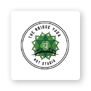
Mandala is the word for “circle” or “disc-shaped object” in Sanskrit. This geometric design represents a spiritual journey. Most mandalas are extremely complex and always have an axis of symmetry. They represent concentration and aid in meditation.
Some logos will refer to the mandala and not the actual form. Beneath the first logo in this group is a simplified version of the mandala combined with a lotus flower which also serves as a stylized symbol. The third logo is closer to a traditional mandala.
Lotus flower
The lotus flower has many meanings in Buddhism and Eastern thought. This flower symbolizes spiritual awakening and maturity. The lotus stem has to grow out of the mud and through the deep water to shine in the sun — this illustrates life’s journey of maturity and enlightenment for a meditator. This iconic flower symbolizes purity, self-regeneration and overcoming all circumstances.
Illustrated yoga poses
Above you’ve seen some examples of seasonal yoga logos, next let’s break down how they can add value to your business.
Color of yoga logo
Color has a lot of meanings in logo design. Humans always spontaneously generate feelings when they see colors. In yoga, all colors can be used because the chakras always align to each color. The problem here is to choose which color is best for your brand.
Before choosing a color, you should understand what the color means to yogis. Warm colors (yellow, orange and red) will represent the lower chakras responsible for functioning. The cooler colors (blue, indigo, and purple) represent the upper chakras responsible for concentration and mindfulness (throat chakra, third eye). Green symbolizes the heart chakra and openness to growth.
So, yoga studios can use red and orange, yoga Nidra (deep meditation) instructors should use purple or indigo. It all depends on what you want to show. Here are some common logo colors for a yoga brand.
Blue

Blue creates a feeling of calm and trustworthiness. Representing water and sky, blue is the color of constancy. This color can represent the throat chakra in a lighter tone and the third eye chakra in a dark blue tone.
Purple

Representing royalty and loyalty, purple is the opulent color of nature. This color represents originality and can represent the crown chakra where inspiration flows. When purple is combined with other colors, it takes on many different meanings. For example, purple and orange represent creativity, while purple and blue represent deep enlightenment.
Natural color

Yoga is considered a practice that helps practitioners become one with the Earth and all energies in the universe. Using soft colors will clearly show those bases. Images of nature (like the tree or crashing waves below) can further illustrate the concept of this focal point.
Typography in yoga logo
Typography is an extremely important part of logo design. Not all logos need to go together, but many logos will include their brand name that way. Even if you have a logo that represents the majority of your brand (like Gaiam), your brand name will still appear from time to time and should be consistent with the logo.
Fonts
The right font will help your layout look professional and help form a unified design. Inappropriate fonts will look confusing and often difficult to read. For the yoga logo, the font should be soft, even handwritten style can be used to show the flexible movement of the exercise.
Weight

The weight of the font means the thickness of the letters. You can use thick or thin lines to create accents and layer them in your logo. Adding a thicker or thinner line in part of the logo creates a more realistic feel. Always consider the weight/lightness of the lines to combine them with other elements more perfectly.
Connect
When you use more than one word in your design, you can think of using two fonts at once. When using multiple fonts, you should pay attention to how your fonts are paired. Not all fonts work together. Besides, there are many methods to combine fonts when designing yoga logos. As a general rule, it’s best not to use more than 3 fonts or the design becomes too cluttered and confusing.
For you
These tips will help you design the perfect logo for your yoga brand. You should also follow your competitors and get inspired by other fitness logos to better understand your industry.
Make sure your logo design appeals to your audience and matches the style of your personal instructor or studio. It will create a delightfully connected experience that is all rooted in a small visual image of your brand.
If you are looking for a reputable and experienced unit to be able to design a professional and impressive logo and brand identity system , then please contact us immediately by phone. 0988 622 991, or leave your information and requirements, Malu Design ‘s consulting department will contact you right away to answer all your questions!
————————
Malu Design – Branding Identity Agency
Hotline: 0988 622 991


