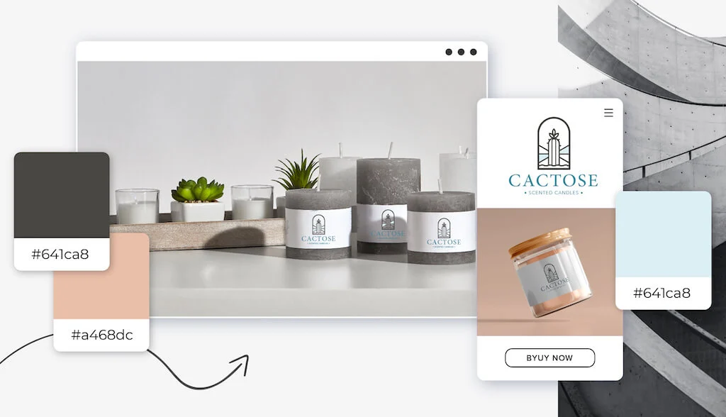
The colors you choose for your logo can make the difference between mediocre and striking. Now, you might not consider gray for your logo color as it has rather bleak connotations, but truth be told, gray might be the perfect color for you!
The color of your logo is an important decision, as it can communicate to your audience about your business and distinguish you from your competitors visually. So I’m here to help you decide if gray is the right choice!
Below, I’ll talk about what people think when they see gray, how you can use it in different contexts, and which industries use it most often in logo design. By the end of this post, you’ll know if it’s the right color for your business!
The Meaning Behind the Gray Logo
Color has a profound impact on our bodies, moods, and even emotions. However, it’s important to note that culture, experience, and upbringing all play a role in color interpretation.
If you want your logo to embody attributes like mystery, authority, sophistication, wisdom, strength, and maturity, then gray is the color for you. Take a look at how some famous brands use gray in their logos.

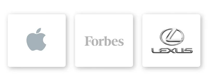
What do the Forbes, Apple, and Lexus logos all have in common? Each company has a gray icon to mark their authoritative ranking in their respective industries. Their gray logo also exudes a sense of luxury , sophistication and sophistication.
How to combine gray with other logo design elements
There are some design elements that pair well with a gray icon and others that don’t.
font
Choosing the right typeface for your logo can strengthen your overall brand. Review the 5 main font families to determine which one best suits your brand.
Serif – Using a serif font in your logo design lets your audience know that you are an established, traditional, and trusted brand.
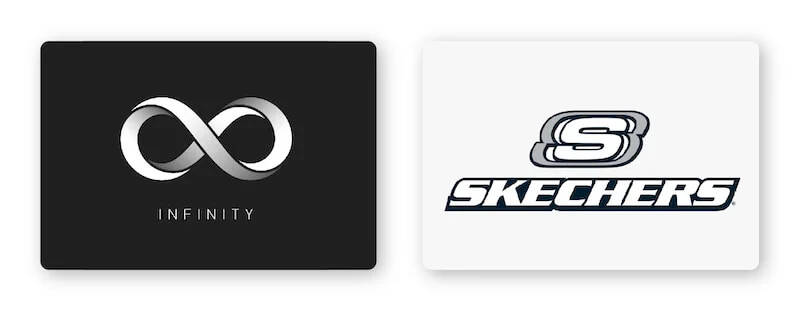
Sans serif – A simple, sleek and modern sans serif font that is great for any brand like Infinity that wants to be seen as cutting-edge, creative, bold and sophisticated.
Slab serif – Slab serif fonts create a bold impact and are commonly used by tech and automotive companies.
Script – Script fonts can feel whimsical and fun or traditional and old-fashioned, which makes it one of the most versatile font types.
Decorative – This is a loud, fun, and entertaining font, which is why it’s a great fit for companies like Skechers.
Of course, these are just general rules, but by no means are they fixed. Feel free to experiment with different font combinations .
Shapes and symbols
The right shape can help you build a psychological and emotional connection with your target audience. It is important to understand shapes and how they relate to your brand so that you can incorporate them appropriately into your logo design.
Since gray is a neutral color that can balance a design, nearly any shape is compatible with gray. In particular, the circular logo is very suitable to combine with gray because this is a shape that denotes mystery, balance, continuity and strength. From car companies like Volvo to electronics like LG, circular logos work in a variety of industries. Consider using circles in your logo if your brand focuses on balance, wisdom, and maturity.
Icons are another popular choice for logo design because they are symbols that convey instantly recognizable values. Animal images can help brands reinforce their values and ethos in the minds of their audiences. Animal logos work well with gray because they can represent elegance, mystery, wisdom, or virtually any other trait your brand is all about.
Is the gray logo for you?
As I mentioned before, color is subjective and there is no right or wrong way to use gray in a logo. However, certain colors are associated with specific meanings .
However, you should use gray if it fits one of your brand messages and/or values. Or, you can use gray to set yourself apart from your competitors’ logos.
If your brand is in one of these industries, here are a few ideas on how to use gray:
Gray logos for tech brands
As mentioned, gray symbolizes neutrality and balance, but it is also a glossy, luxurious and sophisticated color. For these reasons, it is a color that appeals to a mass audience. For tech companies, these are all attributes they want to associate with their brand. Think of the Apple and LG logos—the gray color accentuates the clean, polished look these companies want to convey.
Gray logos for auto brands
Auto companies need to convey several meanings through their logos: Safety, authority, sophistication and even charm. For luxury and high-end car brands such as Lexus, Mercedes, and Nissan, all use gray logos to highlight these characteristics.
Gray logos for financial brands
To make a positive impression on current and future clients, you need a strong financial brand. Many financial firms use gray to tell potential customers that they are a strong leader in the industry, intellectual and formal. These are all the attributes you want when trusting financial brands!
Gray logos for luxury brands
Gray is considered cool, elegant and conservative, even a bit mysterious. For luxury brands that want to exude a sense of affluence and luxury, gray is the color for them. Consider Swarovski and Longines—both with classy, timeless gray logos.
Gray logos for entertainment brands
Wii and Disney are entertainment franchises that almost everyone knows and has a personal relationship with. Gray is a balanced, dignified and stable color in logo design. What you see is what you get, so entertainment brands like the Wii and Disney are signaling to their customers that they can depend on them to consistently deliver quality, fun entertainment.
Gray logos for photography brands
If you are starting or already have a photography business, then you already know that you need a logo that speaks to your audience. And while it’s important to create a logo that represents who you are and stands out from the crowd, it’s also important to appeal to a wide variety of people and occasions. That’s why gray logos work so well for photography logos. Whether it’s a brand that specializes in outdoor and landscape or portraiture, gray is a classic color that inspires your customers to imagine their own vision.
Matching color matching gray
Gray can be quite versatile depending on the colors you combine it with. Let’s take a look at some examples of logo gray color combinations:
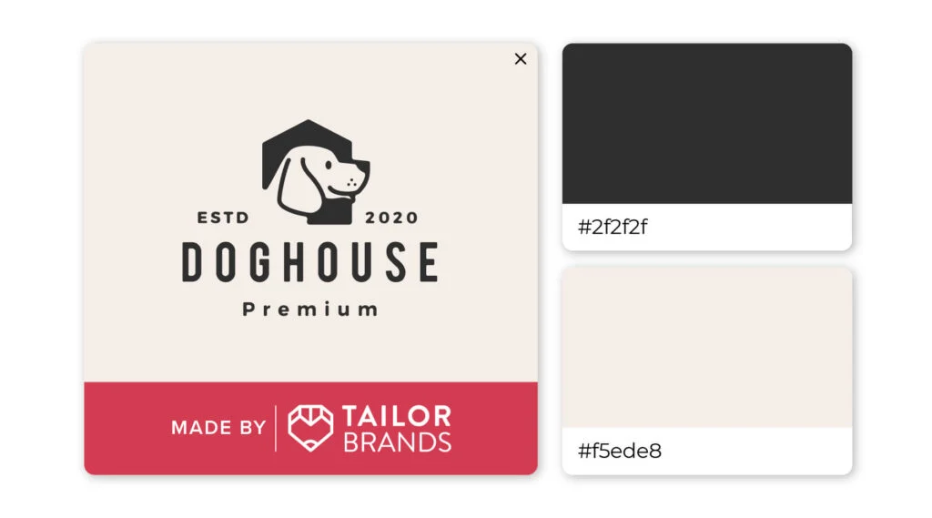
Perhaps gray and brown isn’t the first color pairing that you think to choose for your logo, but as you can see, it’s a successful combination! Dark gray and light brown provide the perfect contrast to help this logo stand out.
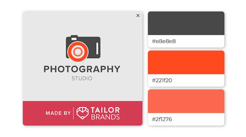
Both timeless and sophisticated, pairing red and gray together creates a complementary look. The overall effect is a very sleek look that exudes a professional and modern feel.
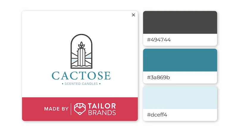
Any shade of blue—from sponge to deep navy—stands out against a neutral gray background. The dark gray in this logo helps the 2 shades of blue stand out more and accentuates many of the colors associated with the ocean.
For you
We have seen that gray represents authority, sophistication, wisdom and strength, but combining it with other design elements can create a unique and memorable logo.
If you are considering gray for your brand logo, you can contact our logo maker where you can experiment with different design elements, color combinations, etc. until you get a design that works for you.
If you are looking for a reputable and experienced unit to be able to design a professional and impressive logo and brand identity system , then please contact us immediately by phone. 0988 622 991, or leave your information and requirements, Malu Design ‘s consulting department will contact you right away to answer all your questions!
————————
Malu Design – Branding Identity Agency
Hotline: 0988 622 991

