Are you connecting with your online audience with your audio content? You can tell great stories or present a unique perspective on life that appeals to a wide variety of audiences. No matter what topic your podcast covers, the podcast must first have a beautiful logo to make a prominent mark in the eyes of the audience.
While podcasting isn’t as saturated as some other platforms (like YouTube and TikTok), there are still plenty of competitors vying for an audience.
That begs the question: How do you set your podcast apart from all the other podcasts?
You need a logo that is unique, eye-catching and grabs the attention of your customers. In this post, I’ll show why you need a podcast logo with 15 examples of podcast logos that will spark your creativity.
Why you need a Podcast logo
With that said, first impressions are extremely important. It’s the first thing potential listeners see when they search for a new podcast.
Logos will help your brand:
- Look professional, build trust with your audience.
- Illustrate compelling content to attract the right crowd.
- Create a memorable brand that people easily recognize.
- Catch the eye of people browsing for new podcasts.
And you must have a suitable image for your podcast to launch it on different streaming platforms.
15 Success Podcast Logos
Researching other successful podcast logos makes it easy to identify current trends, as well as providing you with logo design inspiration . You shouldn’t try to copy another logo, but looking at what other powerful podcasters are doing will help you get an idea of the colors, images, style, and shape for your own logo.
1. Today in Focus
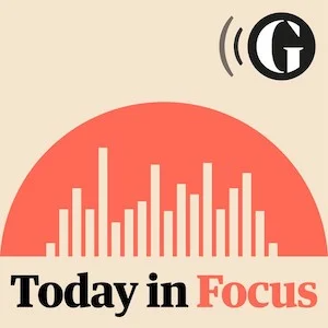
This logo is a great example of how the perfect font can help convey your story. This distinctive font is reminiscent of the news, which is what this podcast is all about. The presenter takes listeners to headlines to provide information on a range of current affairs. The logo is a combination of logo shapes : cityscape and soundbar encapsulated in a dome representing the globe. The illustration embodies these concepts perfectly, hinting that this is a talk show covering a wide range of hot topics that are making headlines on major news platforms.
2. Dear me
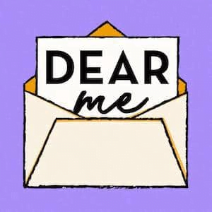
Hosted by a new guest each week, these podcast creators invite guests to tell about their childhood stories and current successes. The logo design is simple and quite childish, it reminds us of the younger days. Eye-catching and youthful colors highlight what they want to express.
3. The First Mile
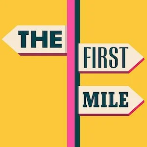
This adventure podcast explores everything about travel—from travel ethics, cultural exploration to making a living from travel. The logo is designed quite simply using only bright, youthful and interesting colors combined with a quirky directional symbol to hold the title of the podcast. Hilarious visuals make it clear this podcast has everything to do with travel.
4. Getting Emotional
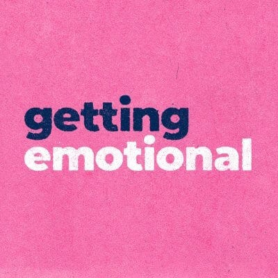
This symbol creates emotions mainly based on the logo color and font chosen. The design for this podcast is super simple, with a pink background paired with a blocky sans serif font. Pink is often a color associated with emotions, which is exactly the theme color of emotions. There are some obscure emotions that are hard for us to recognize that have been defined and named. For example, I don’t know words like vemödalen, presque vu and mudita well, but they are the names of the emotions I have felt.
5. Script Apart
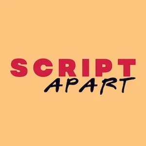
Combining two different fonts in the same logo is a bold design. The font for “SCRIPT” is a bold slab sans serif that feels solid. The font “APART” is quite bland and has a slightly “scribbled” feel. Yellow creates a great contrast between red and black. All of that contributes to the overall idea behind the podcast – look at the first drafts of great movies with the screenwriter behind the work.
6. Wild Thing
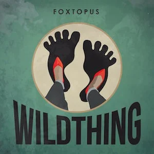
Interested in the wonders of this world? This podcast explores untold stories, starting with Sasquatch. The background of the logo for Wild Thing Season 1 shows a stylized nature scene with clouds and some trees. In the foreground and center, we can see the shadow of Bigfoot’s footprint and someone standing on its giant shadow.
In Season 2, the show swapped out the Bigfoot illustration for a circle depicting a UFO carrying a girl aboard its spaceship. From the wilderness to a garish blue band dotted with stars, the logo design change will notify their audience that they’ve spotted an anomaly at the time of the new post’s release.
7. Home Cooking
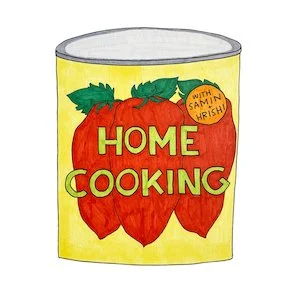
Cooking at home started as soon as the lockdown hit most Americans in March 2020. The premise of this podcast is to provide cooking ideas during their stay at home. A no-frills DIY logo that looks like a sketch someone drew in their home.
Each episode will feature a new recipe and with it a new logo design. To add some spice, it will include some more subtle creative elements like drawing in podcast creators Samin and Hrishi on Morton’s salt bucket instead of the little girl.
Creating a new logo for each podcast is a lot of work, but the dazzling effects set them apart from other cooking podcasts.
8. Lifers
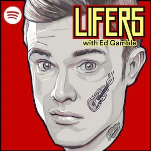
This podcast is about heavy metal fans who are eligible to win the title of “Liker”. If you pay attention, this logo can make it feel like you are looking at the cover of an album. The vintage vibe, scarlet background, and flaming guitar tattoo are signs that this podcast will be about music.
9. Switched on Pop
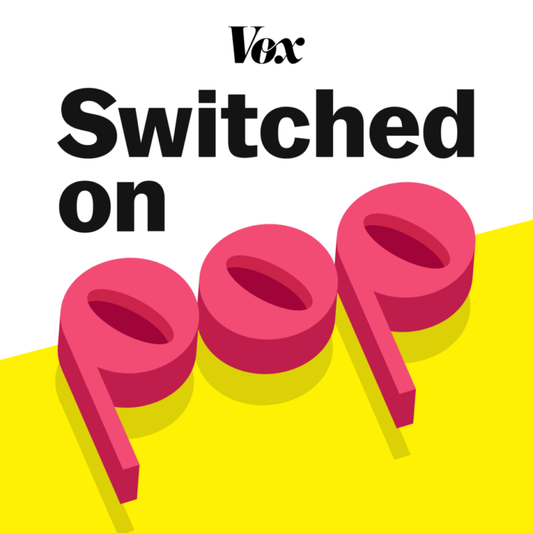
If you’ve ever wondered about the process of making music, this podcast is made for you. It analyzes the tunes that make certain songs catchy, starting with the pop genre. The colors are very bright and energetic, emulating the style of music you choose. Titles are cleverly placed on the bars of a track. “POP” is a slab serif font with a shadow to visually stand it out from the background. Overall, the logo design clearly looks like an album cover for the best pop hits of the year.
10. Out of Hours
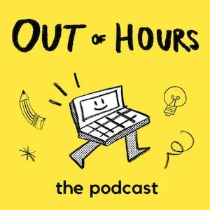
With the exception of a lucky few, most people don’t get the job they’ve been dreaming of for a long time (are you one of them?). Out of Hours set out to discover what drives people to pursue passion projects and who even turn their boring gigs into something much more valuable. The people who work at Out of Hours know that big ideas require out-of-the-box thinking, and have cleverly incorporated those big ideas into their logo design. The computer caricature appeared as if it were about to step out of a bright yellow box to run after its ideas.
11. Beautiful Anonymous
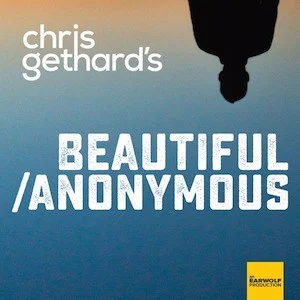
Started by comedian Chris Gethard, the concept of Beautiful Anonymous means unusual. He tweets a phone number, answers a call at random, and has an hour-long conversation with that stranger. Consequential conversations include strange stories from murders, painful memories of cheated spouses, and people with all sorts of odd jobs talking about life experiences. their.
To create an extra mysterious and intriguing atmosphere, an inverted shadow is the only thing permanently fixed on the logo. Both the title and hostname are faded white, while the background changes from orange to dark blue to distinguish light and shadow, temporary and permanent.
Beautiful Anonymous hits 250 episodes in 2021 and the logo continues to act as the face of this popular series.
12. The Birth Hour
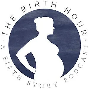
Inspiring birth stories are always fascinating and surprisingly hard to find. When you’re pregnant, most people tell you uninteresting stories. This podcast is full of stories about pregnancy, conception, breastfeeding and early motherhood, revolving around inspirational women who have a heartwarming story.
Silhouette of a pregnant woman in a circle represents unity and hints at the cycle of life. The slim design, light and airy font invites curious moms about the topic of this podcast.
13. Forever35
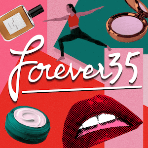
A podcast about everything you need to know as you turn 30 and try to stay youthful in your looks. As you can see, the illustration shows some of the topics covered such as beauty, exercise and night cream to fight wrinkles and aging. The colors of the original logo go back to the 80’s. After 427 episodes, their new logo is embellished even more on the cover of the 90’s magazine using the same color scheme and adding illustrations of people creative.
14. The Rewatchables
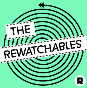
This podcast is for movie enthusiasts. Rewatchables is a podcast that discusses movies they can’t forget no matter how many times they’ve re-watched it.
Front and center, the dizzying hypnotic spiral feels like you’ve been hooked on Netflix for too long. When I first saw this icon, I called it a creative genius.
15. The Sporkful
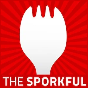
“Not for gourmets, it’s for foodies” is the tagline of this podcast. The fork is the perfect representation of someone who loves to eat but doesn’t take their appearance seriously. The radiant red lines indicate “glory” in the pig’s cheeks as it symbolizes eating whatever appeals to your appetite.
For you
As you know, form always follows function. That means your podcast logo should tell your potential audience who you are and what sets you apart from others. Now that you understand what makes successful podcast logos, get ready to create one of your own!
If you are looking for a reputable and experienced unit to be able to design a professional and impressive logo and brand identity system , then please contact us immediately by phone. 0988 622 991, or leave your information and requirements, Malu Design ‘s consulting department will contact you right away to answer all your questions!
————————
Malu Design – Branding Identity Agency
Hotline: 0988 622 991

