Are you trying to find logo inspiration for your brand? The circular design is one of the most commonly used logo shapes of all time.
Let’s learn about circular logos and how some big brands have successfully used this type of logo.
Mục lục bài viết
ToggleSymbolism of the Circle Logo
The circular logo shape has long been used to represent unity. That is why in many wedding ceremonies, people use the image of a ring to depict the unity of marriage.
Circles represent no beginning, no end, or no end. It often evokes feelings of energy and vitality.
Circles also tend to represent completeness, harmony, and eternity. The earth is round, so are the sun, stars, moon and other planets, fruits, flowers, seeds and vegetables are sometimes round.
Hope, growth, and even cyclical transformation are all represented in a circle.
Finally, circles also have a high visual aesthetic value. They have a soft look but still offer classic stability. Various objects can be designed as a circle that represents exaggeration, which we will see in some of the famous logos below.
Practical benefits of circular logo design
For starters, circular logos are extremely convenient for both online and offline branding. This type of logo is primarily used for social media profiles, and it can be easily added to everything — from shirts to business cards and website banners.
Round logos will also stand out much more than angular logos. They contrast with the angular and grid elements of the layout on marketing materials, websites, business signs, labels and more.
With that in mind, let’s take a look at 15 brands that are using their circular logos to spark trust and interest in their customers!
15 famous brands that use zigzag logos
Here are 15 globally famous circular logos:
Motorola
Extremely simple and geometric in nature, the motorola logo is a symbol that is easy to remember at first sight. The logo was changed from the brand name in the form of a word mark to a circle containing the letter “M” in 1955. It has now become a classic brand symbol.
The sharp tips of the “M” contrast with the smooth shape of the surrounding circle. They represent the brand’s desire to reach new heights.
And, flat shapes make it easy to distribute color and composition across any material, surface, or medium. Although, the colors in the motorola logo are sometimes changed to solid colors on different occasions.
NASA
Did you know that the National Aeronautics and Space Administration (NASA) logo in use today was created in 1959?
The circular NASA logo clearly shows the scene of a starry sky. The first part of the logo includes the name “NASA” with a red vron strip (the “V”) representing the aviation industry in the form of a wing or movement. Finally, there is a spaceship orbiting the symbol of space travel.
ABC
After seven years of using the American Broadcasting Company logo in a serif font, the broadcaster switched to a simple approach, designing three ABC letters on a circle.
The company has tried several gradients and sizes for its logo over the years. In 2007, the logo took on a shiny trend, and in 2013, the circular background changed to a soft gradient.
The logo used today was created by Paul Rand – the father of modern graphic design. He has applied his Swiss style to many logos of major corporate brands, including IBM and UPS.
By 2020, this content pinning site had 459 million monthly active users . Pinterest’s logo is extremely simple and has changed little since it launched the brand in 2010.
They used a circle around the outside of the letter “P”, this combination symbolizes a loosely drawn pin. This exemplifies the idea that content is pinned in one convenient place with a recognizable logo.
Tide
Tide wants you to remember that your clothes will always last as long as you use their brand. With this in mind, the logo uses some of the brightest and funniest colors (yellow-orange) as well as a contrasting royal blue against those two to show credibility.
Tide’s logo design has changed little since it was first created in 1946. The circles allude to a goal or may even represent a washing machine’s cycle. The outer golden circle of the logo makes the logo stand out more when printed on an orange washing powder bottle.
Spotify
The brand known for music, podcasts and other soundbites uses a circular shape to contain sound waves inside, which look like they are being emitted from a speaker of some kind.
This clever and modern logo design change was a much-needed update for the brand in 2013. It’s a drastic change, but it’s kept a few details intact. the original lines above the “o” in their first logo.

HP
What’s surprising is that HP hasn’t changed much about its logo since it first came out in 1939. Back then, the colors were mostly black and white, but the shapes were largely similar. The blue logo used today represents a classic and reliable brand.
The circle that fits the letter “hp” is broken down into ascending and descending lines. This creates an interesting shape that keeps it visually appealing for longer.
Mozilla Firefox
As the parent brand of Firefox, Mozilla has chosen to use actual images in its logo. The round globe is attractive and peaceful looking, and the fox wrapped around it is reminiscent of a fire.
Over time, the logo has lost some of its practicality. It has been switched from a blue orb to a magenta-purple, and the fox symbol from an abstract imprint has changed to a smoother and less detailed fox. However, this change still helps the logo clearly illustrate the meaning of the sharp fire that is covering the globe.
London Underground
The UK symbol for the express transit system is as simple as the symbols above. The attention-grabbing red circle combined with the blue rectangular bar looks like a train. The text uses a white sans-serif font as if emphasizing their message.
The logo carries the main color of the subway to help the logo become closer to the products and services that London Underground provides. It also feels like a traffic sign and is instantly recognizable to customers.
Virgin
What started as a record company has now grown to 40 companies spanning 35 countries. This includes airlines, mobile services, cruise lines, hotels, satellite, sports betting and more.
The design is still a very simple hand-drawn logo on a plain background frame. Virgin Megastore, Virgin Life Care, Virgin Orbit, Virgin Money, Virgin Wines and other products of the brand also use a circle to surround their branching logo designs.
Target
One of the most iconic circular logos of all time is Target. The simple red and white circles illustrate the literal meaning of the brand’s name. It is easy to recognize and almost very easy to change the design layout.
Timberland
The outdoor clothing retailer uses a tree symbol to describe the land where the trees grow (forest land). As a circular logo, it focuses on a simplified landscape: part of a tree and below it is a field of grass.
Using only one main color has allowed the brand to mix more colors with the background color (usually B&W or yellow and black).
Schindler
Schindler is the brand that makes elevators and escalators, so they used a 3D logo that repeats the elevator button with an upward arrow. After a series of significant changes to the logo, the current version was designed in 2006.
The company explained that “We represented movement by applying three-dimensional space to our design. Its color maximally reflects the technical precision and quality of the service.”
Starbucks
Another hugely popular brand with a circular logo is Starbucks. With over 30,000 stores spanning over 80 countries, this coffee brand has a more complex logo than most other cafes, but it’s also the difference that makes it easier to recognize.
Siren (which some confuse with mermaids) has been simplified and trimmed down over time. In 2011, the brand decided to ditch the Starbucks border around it, because customers were confident they would recognize the brand by the Siren image and its colors (green and white).
Pepsi
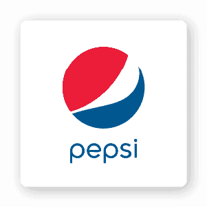
This red, white and blue logo has become the symbol of a beverage brand from the US that we are very familiar with. It was not until 1950 that a third color (blue) was added. Although the flow shapes have changed over the decades, the color and feel of the logo have remained consistent since that time.
The color bands give the impression of liquid moving in a circle, reminding viewers of what they will experience when using this brand’s products.
For you
Now do you know why circular logos are so useful and popular? Now it’s time to create your own design! If you’re interested in making your own circular logo, try our logo design service that arranges fonts, images and colors into a logo that represents your brand.
If you are looking for a reputable and experienced unit to be able to design a professional and impressive logo and brand identity system , then please contact us immediately by phone. 0988 622 991, or leave your information and requirements, Malu Design ‘s consulting department will contact you right away to answer all your questions!
————————
Malu Design – Branding Identity Agency
Hotline: 0988 622 991


