As the face of your brand, your logo needs to reflect your brand identity. That’s why every detail needs to be thought out carefully.
And if you choose the right ones, your logo colors can tell your target audience all the fascinating things about your business – pique their subconscious interest in learning more about what your business is all about. you provide.
Here, I will focus specifically on orange. What is the meaning of orange? Is it the right choice for your particular industry? How can you use it with other logo design elements to send the exact message you want to your audience?
Let Malu Design answer all these questions right now.
The Meaning Behind the Orange Logo
Each color has a significant effect on our behavior, mood, and even physiological responses. That being said, color associations rely heavily on culture, personal experience, and upbringing — the meaning of color is not a box of crayons that fits.
If you are looking for a logo that represents excitement, success, creativity and determination, then orange is the color for you.
Orange stands for thrill and a sense of risk, which is why it’s a great fit for famed motorcycle maker Harley Davidson. Interestingly, orange can produce physical effects such as increased hunger. This attribute makes orange a great choice for food brands, such as Fanta and Tangerine.
How to combine orange with other logo design elements
When it comes to orange logos, there are a number of design elements that combine well and those that should be avoided.
Typography – Typography
Choosing the right typeface in your logo can strengthen your overall brand. Review the 5 main font families to determine which one best suits your brand.
Serif – Great choice for brands that want to be seen as trustworthy, long-standing and trustworthy. The Etsy logo is a great example of pairing a serif font with orange. Orange evokes creativity and success, making traditional fonts look eye-catching and memorable.
Sans-serif – Casual, legible and modern, sans-serif is a popular choice among restaurants, startups, and tech businesses. Brands that want to bring people together like Eventbrite should combine sans-serif with orange to convey that message.
Slab serif – A bold and dramatic slab serif font commonly used by tech and automotive companies. When combined with orange, it can make a lasting impression. Consider using a slab serif in orange by French luxury designer Hermes for a striking effect.
Script – Great for businesses that want to show elegance and add a personal touch, such as photographers, coaches or any home brand. Pairing script fonts with orange works well when you want to express creativity and warmth.
Decorative – This is a loud, fun and entertaining font that pairs perfectly with orange! These fonts are flexible enough to allow businesses to decide which emotion to focus on.
Of course, these are just general rules, but by no means are they fixed. Feel free to experiment with different font combinations .
Shapes and symbols
In your logo design, different shapes can help create a clearer psychological and emotional connection between your brand and the consumer. It’s important to understand what each shape says about your brand and how you can effectively incorporate them into your design.
The circular logo combined with orange is designed to bring energy, symbolizing progress and modernity. Mastercard’s orange and red overlapping circles, their logo is one of the most famous in the world.
Even a simple shape of an arrow can make a design stand out. Think of the simple Amazon logo interrupted by a single orange splash in the arrow. However, the arrow holds the bulk of the logo’s message; it symbolizes that Amazon takes it all on—from ‘a’ to ‘z’—and puts a smile on customers’ faces for it!
Abstract shapes also work well with orange in logo design. Unlike other shapes, abstract logos combine recognizable shapes to form a logo with layers of meaning. SoundCloud’s bright yet simple visual identity evokes positive energy and good mood, just like the feeling music gives you. The icon is a cloud divided into 2 parts with the left half lying on vertical lines, representing the music beats on the equalizer. And the right part of the icon is snake.
Is the orange logo right for you?
As I mentioned before, color is subjective and there is no right or wrong way to use orange in a logo.
With that said, you should use orange if it aligns with one of your brand messages/values. Or, you can use orange to set yourself apart from your competitors’ logos.
If your brand is in one of these industries, here are a few ideas on how to use orange:
Orange logos for retail brands
The goal of retailers is to provide the best shopping experience to customers so that they leave satisfied (and will definitely return again). There is no better color to invite people into their store and make a purchase than orange.
Orange logos for food and beverage brands
Orange matches red and yellow to stimulate human appetite. It is also a common color found in citrus fruits and is often associated with health. This is why orange is a popular color for food and beverage brands, such as Fanta.
Orange logos for entertainment brands
Orange is the color of joy and creativity, so it’s no surprise that it works so well in the entertainment industry! It is a stimulating and vibrant color that stands out to you and attracts attention.
As the world’s first cable channel exclusively for children, Nickelodeon’s all-orange logo works for their young audience. Combined with their font, the Nickelodeon logo represents youth, freshness and joy, which are all things the channel wants to promote.
Orange logos for interior decoration brands
No other color can be as creative as orange! For interior brands, presenting you as a business is very important to potential customers. This is why orange can be a great choice if you are looking to convey joy, youth, and even a tropical feel.
Orange logos for fashion brands
You might not expect orange to be a popular color for fashion brands, but when done well, orange can make for a well-designed logo.
You will often see darker or deeper orange tones in fashion brand logos that want to appear timeless, which is what Hermes Paris did. Combined with images of horses and buggies and serif fonts, the logo exudes sophistication and class.
Orange logos for technology brands
Orange should be the color of choice for tech companies because it shows customers that you’re at the forefront of new and existing technology. As mentioned earlier, orange is a progressive color so it would be a perfect fit for a tech brand!
It’s important to note that there are no matching colors in the box. See what your industry competitors are doing and whether orange is too commonly used. If it’s overdone, you can think about using an alternate color to stand out. But if it’s not used enough, ask yourself if the psychology of the color is right for your brand before choosing it.
Which color goes well with orange?
Orange can be quite versatile depending on the color you combine it with. Let’s take a look at some examples of logo orange color combinations:
Orange is an incredibly (and surprising) complementary color to brown. Add a splash of tan to pale orange and you’ll have an idyllic, rustic look that the modern crowd will flock to.
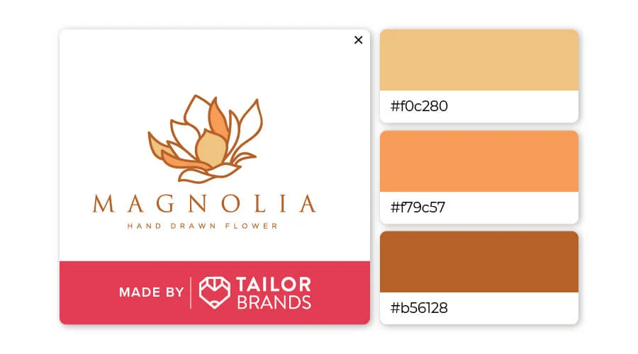
Burnt orange and beige is a seductive, soft and calming color combination. Orange, white and brown go well together because they are the natural colors of the earth and the seasons. Orange works well for a bit of contrast.
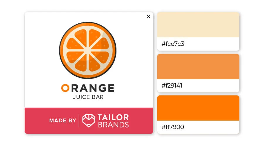
Who knew that pale yellow, orange and darker orange could work so well together? This trio would look great as a logo for any health or fitness brand, as well as a trainer or any business that works closely with their clients.
Famous brands with orange logos
Let’s see how 12 famous brands designed orange logos to send a message to their viewers.
1. JBL
If you’re a fan of music or quality audio, chances are you’ve heard of JBL.
Their speakers are one of the most famous and popular ones, JBL company has been in business since 1946 to present.
Note that their logo uses 2 basic geometric shapes (triangle and circle) to form an exclamation mark, a megaphone… The combination of orange and white helps convey strength and freshness.
2. Mastercard
This is one of the most popular logos in the world – Mastercard combines orange with other dynamic colors to show that they are a passionate, progressive and energetic person.
Although the logo has undergone a number of changes over the years, the color orange was repurposed in the 90s – marking it as one of the logo’s most distinctive features.
3. Fanta
When you want to remind people of the taste of food they experience, include that message in your logo.
Fanta is famous for its orange flavored soft drinks, their logo is presented in a rounded font that accentuates their brand identity. The green leaf on the orange circle reminds people of delicious, healthy oranges.
4. Firefox
The Firefox logo is an example of a seemingly simple design that achieves so much at the same time.
First, the combination of “flame” and “fox” creates the impression of speed and agility – which is exactly what the company wants people to think of when they first see their logo.
In addition, the blue orb – the symbol of the earth – combined with the image of an orange fox indicates prestige and abundant energy, which lets customers know that this is a brand they can trust. trust.
5. Nickelodeon
The world’s first cable channel dedicated to children – Nickelodeon is one of the few companies that uses orange for its entire logo.
Since their target audience is young people, they chose orange as the main color so that the logo exudes freshness and joy, which is all the channel wants to promote.
6. Blogger
The Blogger logo is a good example of how to use only a single letter in a business name (also known as an alphabetic mark) to build brand identity.
The white “B” on an orange background helps to showcase the qualities of the blogging platform – professionalism, creativity, and inspiration for users.
7. Crush
Fanta’s competitor Crush also shares the same logo design idea with them but is implemented in a different way.
Instead of placing the entire logo in an orange circle, they chose to create orange shadows around the text and symbols to draw customers’ attention to the business name.
Although they initially only distributed orange-flavored beverages, the company has since expanded to include other flavored products. With a green font combined with white, Crush claims that their drink is very fresh and healthy.
8. Harley Davidson
One of the most widely recognized motorcycle brands in the world – Harley Davidson has been on the market since 1903.
Their logo has undergone a series of changes over the years, but the current version is a powerful yet timeless symbol .
Notice how they used a darker orange to create a splash next to the black and white.
This combination helps the logo exude a very dramatic sense of adventure – reminding people of the experience they would get if they owned a motorcycle from the brand.
9. Hermes Paris
Orange in classic logo designs is still an under-appreciated aspect. You will often see orange tones (dark or light) used in logos of companies that want to create a timeless or traditional effect, such as the logo of Hermes Paris.
Combining symbolic images with serif fonts, the logo exudes class, sophistication and classicism, conveying to customers that this 180-year-old company will grow with time.
10. Amazing
Like its competitors (Crush and Fanta), this soft drink company has a different method of combining green and orange to make customers feel thirsty every time they see their logo.
Have you started thinking about color combinations to send the right message to your own logo?
11. Sony Walkman
If you are of the younger generation, you may not have been exposed to this once-popular cassette player.
Their original logo was white inside an orange box, although they later changed their entire logo by removing the white color to evoke music inspiration from users.
12. Science Channel
While Science Channel’s current logo is no longer orange (they’ve turned blue), we think it’s still worth mentioning.
The shape of the letters in the logo reminds us of the periodic table, this design is perfect for a science and technology channel! Orange has brought something new and interesting to a subject that has received little attention.
For you
Now that you understand how companies use orange to their advantage, have you thought about what you would do with your own logo design?
If you want to experiment with different styles of color combinations, use our logo design service !
If you are looking for a reputable and experienced unit to be able to design a professional and impressive logo and brand identity system , then please contact us immediately by phone. 0988 622 991, or leave your information and requirements, Malu Design ‘s consulting department will contact you right away to answer all your questions!
————————
Malu Design – Branding Identity Agency
Hotline: 0988 622 991

