When ideas are bound, go back in time. This is the mantra of brands in all fields and always brings unexpected results.
The style of clothes we wear? Not new. The music we make? Inspired by the past. What mistake do we make? It is not art, but it repeats itself throughout history.
We tend to look back decades past, take their ideas and mold them into our own creations.
Don’t get me wrong, we’re not copying the whole thing, but instead we’re aiming for times when art seemed new and interesting but was close enough to the viewer that it didn’t feel too foreign. We then imitate what we like, while adding our own modern style to this combination.
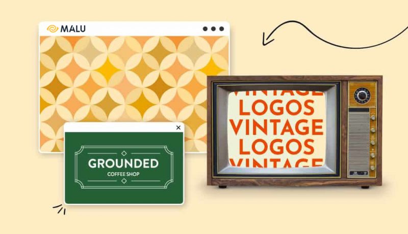
That’s why vintage logos have such a strong appeal to consumers – because they love what feels both familiar and foreign. Vintage looks safe and nostalgic, not to mention that past eras have inspired some interesting logo designs.
So who should use a vintage logo and what types of styles create a “vintage”?
Industries that love vintage logos
Vintage logos can be used effectively in almost any industry, but they tend to be dominant in certain industries. Let’s take a look at some of the most popular forums for vintage logos and the qualities they can convey to their audiences in each market.
Music
From garage band frontman to jukebox owner, anyone in the music world can benefit from a vintage icon. Most modern music takes ideas from the classics – whether it’s Miles Davis listening to an EDM track or Billy Joel-esque improvising on the piano – and uses a connected classical symbolism. your music with some great music.
However, it is not only when designing a new band logo that you should consider vintage style. If you own a bar with a tape recorder or have the coolest sounding studio in town, timeless icons are right for you.
Cafes and restaurants
Remember how it feels every time you walk in a diner at any hour of the day, sit in a chair, open a piece of paper and order your favorite milkshake from the counter? In-house cafes and grilled cheeses almost always bring a sense of nostalgia.
These styles aren’t just a breakfast or dinner experience, they’re familiar, relatable, and assure you that you’ll be served no matter what.
Vintage logos give the same sense of familiarity to cafes and restaurants. As diner-like experiences dwindle with the emergence of trendy cafes, places that want to evoke that laid-back feel go with simple, vintage designs.
Interior design
Vintage logos always give cafes a cozy, nostalgic and familiar atmosphere. Well, they give interior design companies a similar feel. Because interior design is about arranging everything in the house in a certain style, often customers will prefer a vintage layout.
These industry logos are often based on signature vintage script fonts, giving an elegant effect to the brands they represent (and promising their customers what they deliver). You can also opt for a simpler approach, focusing on evocative tones and typography to engage your audience.
Bars and breweries
Bars often use vintage logos to remind customers of the period when alcohol was still banned (1920-1930s). Not only do these symbols make us – subconsciously – feel grateful for the opportunity to display our wine in public. Not only that, they also create an exclusive atmosphere around any bar or pub.
Microfiber mills in particular prefer to utilize the classic look to emphasize nostalgia. Beer has been around for centuries, and vintage logos always remind us of its past. Also, beer aficionados know that aged beer is quality beer, so connecting your brewery to the past will give the impression that your beer is a high quality beer.
Clothes
Many famous clothing companies have stood the test of time, and so do their logos. While some clothing lines (like Levi’s or Nike) have ditched the vintage logo in favor of a more modern design, others have opted to harken back to the past, showing that the Their product is a line of timeless clothing.
Types of Vintage Logos
Vintage logos can be created in any shape and size and have many facets to your creativity. That said, vintage logo design always comes with its own unique trends and characteristics.
If you are interested in creating your own vintage logo, check out the different design styles to create a logo according to the standards we are used to seeing every day.
Frame
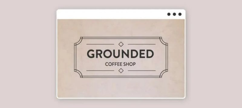
If you want to create a ’50th century’ vibe, then frames are the ideal choice for you. Simple geometric shapes with a bit of angularity make the icons reminiscent of the past. The reversed edges and corners as shown above enhance the value of both the logo and the brand that owns it. These logos have a timeless, captivating and versatile feel. They can be used to represent any line of products or services that want to build trust with customers.
He has

These vintage logos are often referred to as iconic or branded logos to create trust among customers. Note, however, that the icon in the image above is specifically a disc or a stamp. It is ideal for brands that sell products or use their logo to blur images or documents.
The beauty of the stamp lies in its simplicity, and the simple design gives more space for typography and color, which in turn helps the logo convey more of a message.
The Flourish
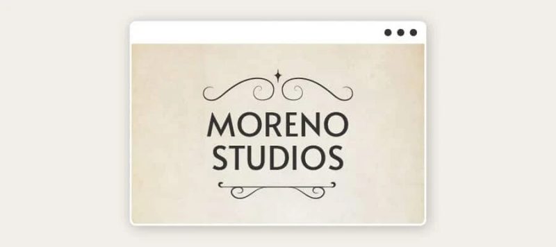
As we saw above, borders make an interesting impression on vintage logos of brands.
Notice how the symmetrical swirls around the frame are subtle and unobtrusive. They are used to highlight the typeface of the logo rather than occupy the full spotlight of the design. The flourish always brings a sense of balance, correctness and our overall desire is to keep everything luxurious in every detail.
Hand paint
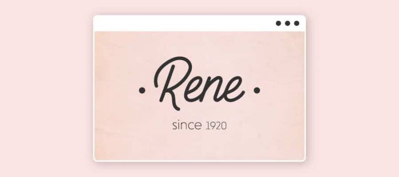
Handcrafted items give off a sense of authenticity and individuality – a common trend in logos in the past. The highlight of a “hand-drawn” logo is that it makes viewers feel like the brand they are interacting with is exclusive to them.
Following this trend, vintage designs are often favored by businesses that are providing premium services or want to emphasize their thoughtfulness to their customers.
Handwritten
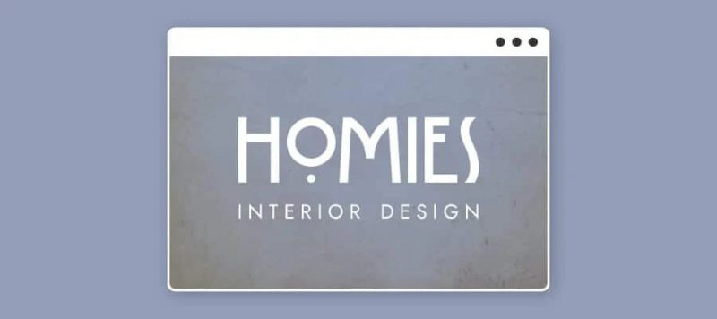
Typography is the key hallmark of any logo, and it’s often what gives vintage logos personality. Logo designers used to create fonts by hand to get the perfect look they wanted.
Therefore, large letters, shapes, expressive serifs, asymmetrical strokes or classic lettering are all favorite vintage logos, they are compatible with each type of logo that carries a meaning and relationship. different connections to the past.
Color
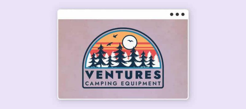
Vintage logos tend to be the opposite of the minimalism that is common in modern logo styles of the 21st century. Because sometimes simplicity doesn’t show the full value of a brand. The deep color palette is a hallmark of classic vintage logos, although sharp contrasts are sometimes applied.
You may have noticed that all of the icons above use a pop of color, but none of them are overused – and this is also something to keep in mind when you’re designing a vintage logo for your business. only me.
How to Create a Vintage Logo
Now that you have knowledge of the design techniques used to create a vintage feel, let’s get started on designing your own logo!
Think about the target audience
Above, we did a little analysis of the industries that tend to use vintage logos, so you should start thinking about whether it’s right for your brand. However, one of the most important parts of creating an ideal logo is understanding the audience it is intended to attract.
That’s because your logo must align with your customers’ values and desires. For example, if your target audience is people interested in new gadgets and obsessed with modern technology, a vintage logo probably won’t appeal to them. However, if loyalty and traditionalism are important to the client, all of that can be easily communicated through a timeless design.
Determine who your audience is, from their age to their desires and constraints. This helps with the process of finding and sifting through vintage design elements for your logo.
Convey your brand story
Once you know who your logo is trying to communicate with, the next important thing is to understand how to reach these audiences. A great logo is one that can communicate the story of the brand it represents, and vintage logos are no exception. In fact, vintage is all about storytelling – from recalling scenes like Walden Pond to depicting the sense of discovery of cowboys or pioneers.
So, before you start creating the overall look and feel of your logo, you should think about the message it has to convey. What aspects of the past do you want viewers to pay attention to? Be it capturing a sense of adventure or creating a sense of nostalgia for your audience.
Try to write your brand story in just one or two sentences. Are you delivering the best coffee in the neighborhood since 1981? Or use a traditional pizza recipe? These stories will be reflected in your logo when you’re done with the design!
Discover vintage typefaces
Now comes the fun part of creating vintage logos: putting your brand story in logos and realizing their message.
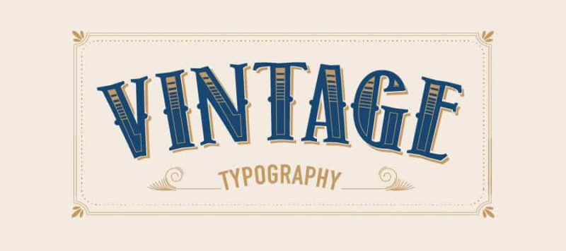
Typography is an important part of vintage logo design, the different styles have their own meanings and there is always a diverse connection to the past. Vintage designs compared to modern logos are often “imperfect” typefaces, mainly because they were hand-drawn or printed on an unsophisticated printer.
As a result, the strokes are often asymmetrical beyond the blocky typeface we’ve seen in some of the logos above.
Before you choose the typeface for your logo, try to think about the specific time period you want to recall. Then start Googling! Look for old signs, vintage photos, black-and-white film – or anything else that inspires you and visualizes what typeface was used during this time period. For example, in the early 20th century, it was common to use worn and stenciled letters.
As you list your options, think back to the characteristics that will most connect your audience with your product or service. Hand-drawn fonts are a great way to add an element of personalization to an icon, while uppercase serifs seem more traditional and aged.
Choose vintage color combinations
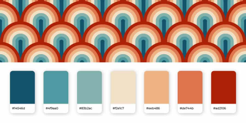
We generally advise people not to use more than 2 or 3 colors in their logo, as it can confuse the message your brand is trying to send. However, when it comes to vintage logos, you’ll often find the color combinations in this style a bit harsher than modern designs.
For example, you will come across vivid, psychedelic color combinations that are considered outlandish compared to most current brands.
What most vintage logo color palettes have in common is that there are plenty of contrasting colors to highlight some aspect of the design. For example, you can use pale yellows and blues with lighter background colors, or combine vivid reds, yellows, and pinks with dark blues.
You can also experiment with earth tones for a more classic and subdued look, which is a good choice for logos paired with highly detailed icons.
Consider an icon
Icons always give a lot to a vintage logo design. Unlike simple, flat logo icons, vintage icons always use highly detailed icons to create their own accent.
You often see vintage logos that contain images of wildlife, adventurers or other natural scenes depicted, in addition to antique objects that directly represent what a business has to offer. their customer.
So you should think about the emotion you want to evoke in your logo before deciding on the main symbol choice. Bar owners want their logos to be exclusive so they choose to use images reminiscent of horror pieces. Barbers that wanted to recreate the feel of a 19th-century hair salon opted for a mustache icon on the steering wheel.
Looking at the different icons will give you an overview of the direction of your business. You can design a logo with your business name or convey some kind of message that elicits an emotional response to your customers.
Just be aware that scale can be a headache if your design is too detailed, as it will be difficult to print on small items. If the logo is not attractive enough, add a border to it like the icons we saw above.
For you
Everything about vintage is great – and most great things can become vintage. Fortunately, vintage logo designs are all your own, as long as you want your brand to stand out from the competition.
Create your own vintage logo with our logo design service. With color and typography combinations, try different vintage techniques and see which vintage logo tells your brand story the best!
If you are looking for a reputable and experienced unit to be able to design a professional and impressive logo and brand identity system , then please contact us immediately by phone. 0988 622 991, or leave your information and requirements, Malu Design ‘s consulting department will contact you right away to answer all your questions!
————————
Malu Design – Branding Identity Agency
Hotline: 0988 622 991

