Design is a complicated and complicated business, but equally fun and exciting. When you are new to the profession, you will have a lot to learn, a lot to do and also a lot to consider. Not to mention the fact that today’s technology is constantly evolving, new software is constantly being released and new trends are emerging and changing every hour. All of the above may surprise you. So let’s learn step by step!
This article will bring 20 pocket principles of graphic design in the hope of giving you a smooth start in this creative environment. So feel free to follow along and let’s discuss some principles right away!
20 Design Principles
1. Line (Line)
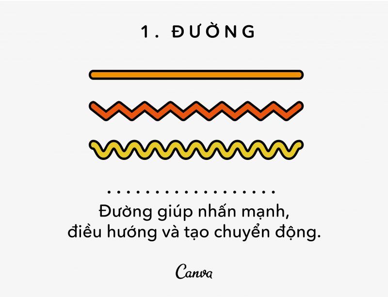
Surely we all know what a line is, and by definition a line is any line, including a zigzag or consecutive dots. So you can think of the line as the starting point of everything. Even the words you’re reading now are made up of thousands of curves, bends, and straights.
The lines also show some design ideas. Straight lines can suggest order and neatness, wavy lines can suggest movement, and zigzags can suggest tension or excitement.
A technique that is used a lot in photography is the use of “leading lines”, the method that will live up to its name as leading the vision. Finding and highlighting the dominant lines in your design can allow you to direct the viewer’s view to all or to certain focal points.
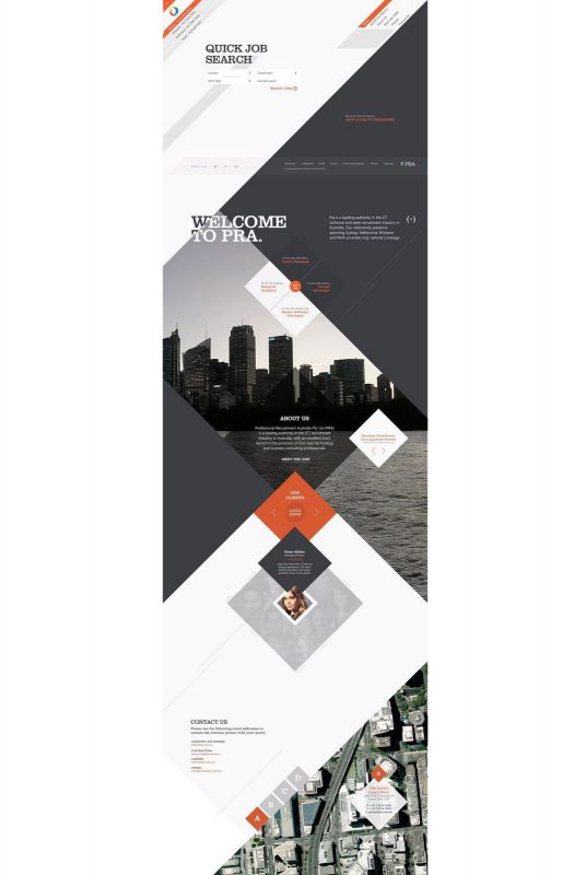
Let’s see an example of dominant lines in web design. This site contains a diagonal grid system with vibrant main lines, which will lead you to the bottom of the page, and from one section to another in a zigzag way.
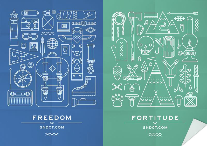
The strong road will be a great way to define your style. Take a look at the lace-up illustrations below by Ksenia Stavrøva for embroidered clothing brand SNDCT. By using white lines in each figure, the design created a distinct association and style. Consider increasing the use of sugar in your illustrations for a compelling effect.
Lines are such versatile, simple and effective graphic elements that you definitely shouldn’t take them lightly! Experiment with them today and see how much fun they can bring to your designs!
2. Scale (Scale)
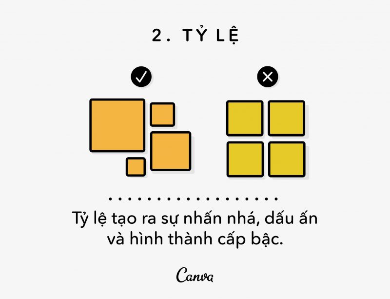
Scale is an important part of design, literally. As a basic definition, Scale requires caution when designing dimensions for individual objects.
Scale can help us understand designs as well as images. Think about how if you had to draw a mouse next to an elephant, you would probably draw the mouse much smaller than the elephant, which would help the viewer immediately understand the intent of your drawing.
In this way, Scale makes it possible for us to make sense of everything. However, sizing is not always based on practicality. You can size elements, make them very large or small for eye-catching effects and to emphasize which parts of your design are important and which are less.
For example, check out this poster by Gabz Grzegorz Domaradzki designed for the movie Drive. In this poster, the main character’s size has been increased significantly, in order to focus all the attention on him first, and then on the rest.
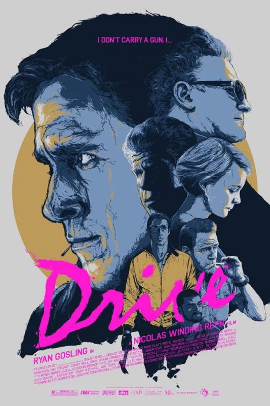
While this sizing isn’t based on reality as human faces are often the same size in real life (and Ryan Gosling isn’t a giant!), increasing the face size helps viewers capture the scale. importance of each character in the film, as well as for an effective design.
Sizing these elements emphasizes importance, often referred to as “visual hierarchy” which we will discuss in more detail later, don’t get confused! But, in the meantime, let’s go through an example of how size ratios are used to indicate importance.
This publication design by The Consult makes certain statistics, information and numbers large to draw attention to these data.

Read more about proportions in design >> Learn about proportions in design
3. Color
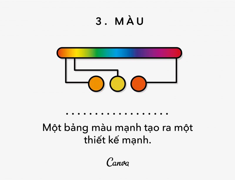
I know I don’t need to lecture on the importance of color to design, but I’ll still describe it for starters. Color is paramount. Colors create moods, atmospheres, govern emotions, and each shade has specific meanings associated with it. In short, color can make or break your design.
Or consider the following two branding examples. First, we have a design by Smack Bang Designs for a skin rejuvenation service for women “Lite Luxe”. This design is embellished with light, soft and cool colors. Whites, light grays, soft tones and bronze/gold if chosen as the background they complement each other gently to create a calm, elegant and feminine design.

On the other hand, we also have a branding design for Sagmeister & Walsh’s Frooti juice. Unlike the previous example, which had a soothing, complementary color palette that adorned itself, the brand opted for a strong contrasting palette, creating a design that is much more lively, energetic and playful. much.

Color is not just a simple rule or limited to its use in branding designs, color can be extended to everything, even images. Image filters and modifiers give us limitless possibilities to adjust the color and tone of our photos.
Are you designing a sleek and stylish poster? Why not run a filter that casts sharp, blacks on your image, like Canva’s “Street” filter. Or do you also want to add a touch of mystery? Then consider reducing the contrast on your photo a bit to soften its colors and make it softer and more mellow.
Read more about color >> Principles of color use
4. Repetition
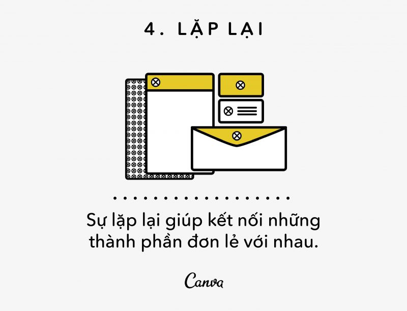
Think of the big brands, Coca-Cola, Google, Apple, Nike, I’m sure you’ll think of their logos, their generalization of the language and the color gamut they use. Why are these so hard to forget right away? Yes, you guessed it right! – It’s repetition.
Repetition is a big part of branding, both in terms of keeping your brand consistent and in terms of tying products together.
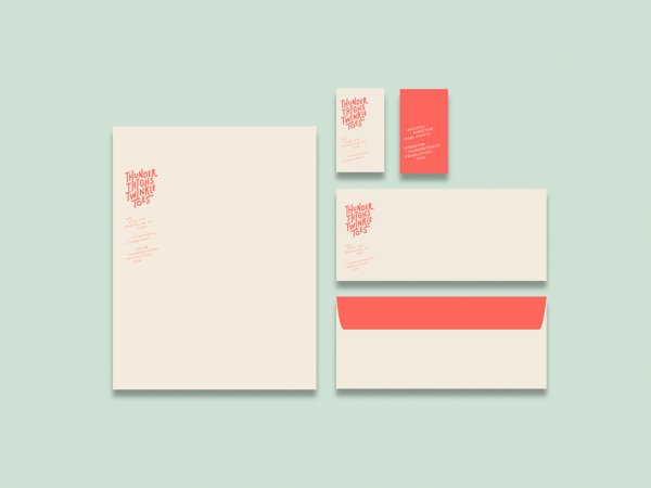
Let’s take a look at an example of Michelle Wang’s branding. As you can see, this identity is using the appropriate color palette and logo application, even the margin spacing needs meticulous alignment.
Repetition is an important element of branding, but it can also work for a single design. For example, repetition is an important part of creating patterns and textures.
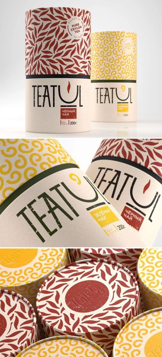
Check out Nastya Chamkina’s packaging design that uses repetition to create beautiful designs. Patterns are not always framed as painted with images of flowers and grass like old dusty curtains, they can be messy to create a sense of fun and efficiency. So why not make iterative patterns for your next design?
Read more articles >> Logo Design Using Repeat Icons
5. Negative Space
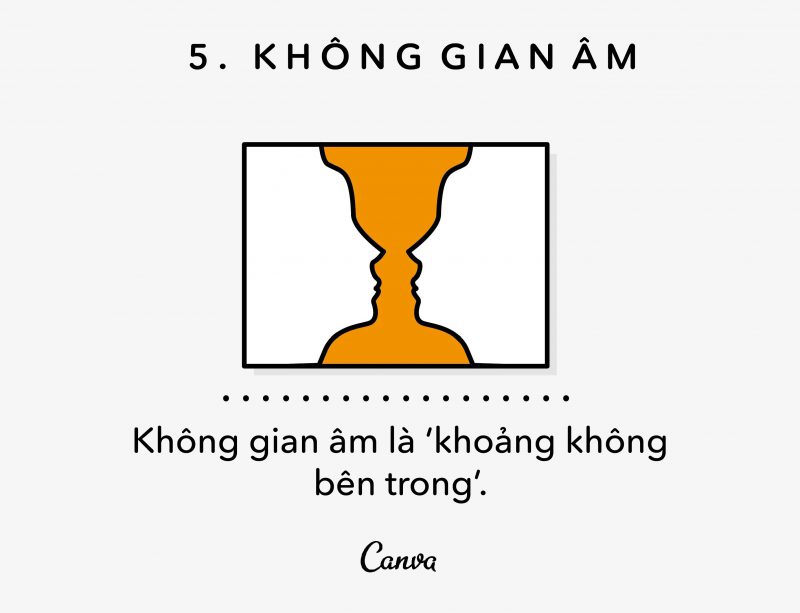
To be clear, negative space is the ‘space inside’, the area in between or outside of defined elements.
The king of laying the foundations of negative space is the artist MCEscher, whose works I’m sure you’ve seen before. Escher creates a large number of mosaics that focus on leading from image to image through yin and yang space, such as this woodcut “Sky & Water I”.
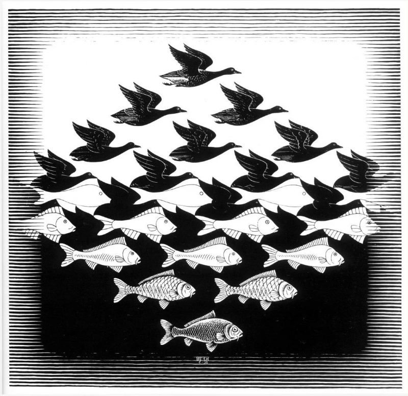
Did you see how Escher used the space inside the birds to create schools of fish? This is how negative space is applied to work – consider everything around and within your tangible design, and transform that space into something new.
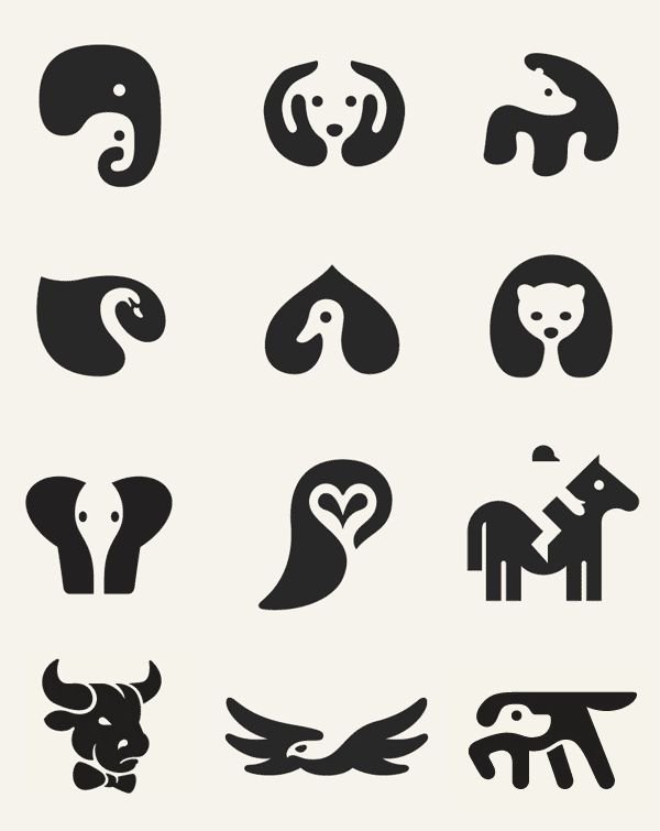
Negative space when used purposefully and skillfully creates a great and edgy design. Take a look at these simple animal icons by George Bokhua that use clean, simple shapes to clearly depict each animal.
Read more articles >> Utilize Negative Space in Logo Design
6. Symmetry
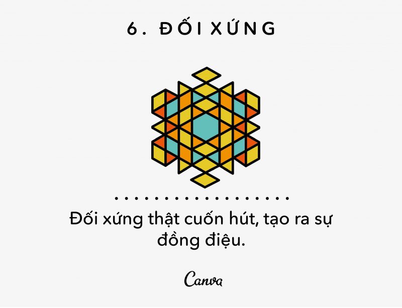
Like all living things, humans have been scientifically proven to be intrigued by symmetry. We find faces, patterns, and designs with which they have symmetry to be more attractive, attractive, and pleasing to the eye.
Symmetry is used a lot in icons to create a harmonious and balanced design. Some examples of big brands with symmetrical logos are Target, McDonald’s, Chanel, Starbucks, etc.
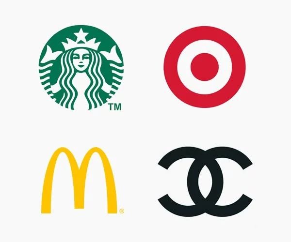
Of course, symmetry isn’t always an option for every design, nor is it a good idea. There is a fine line between a balanced and symmetrical design, and it can look like one side has been copied, rotated back and forth, and glued to the left. So instead of trying to achieve perfect symmetry, try instead to incorporate subtle elements of symmetry into your design.
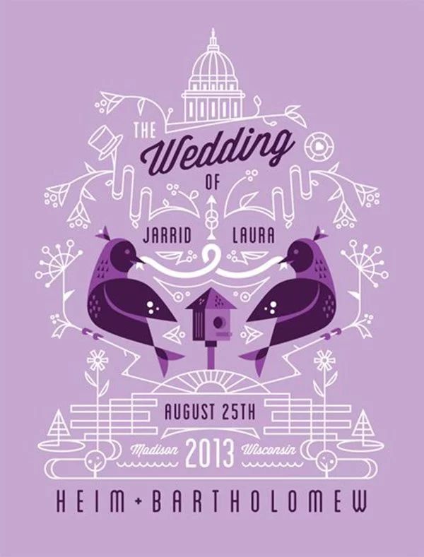
For example, this wedding invitation uses a high degree of symmetry, but it doesn’t quite repeat. Instead, the designer chose to subtly tweak the illustrations to match the style and message in order to keep the design balanced and orderly, but without too much repetition. , to create a design full of elegance, romance and balance.
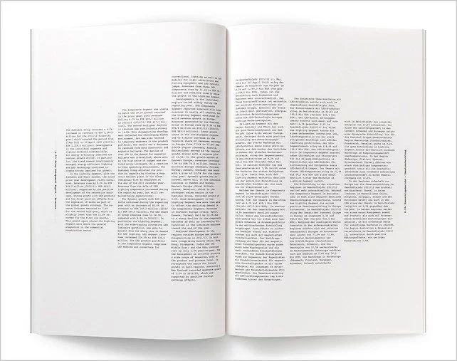
Symmetry isn’t always obvious, sometimes it’s hidden so you don’t even realize it exists. A major example of this seemingly invisible symmetry can be found in the editorial design, and more specifically in the text boxes. Look at any magazine around you and chances are right at a long article you will notice the content of the article has been divided into columns and these columns are usually symmetrically sized to hold. everything is clear, neat, as well as visually appealing.
Take a look at this year’s report by Brighten the Corners and Anish Kapoor, which drew attention to the symmetry of columns of text by mirroring them on two pages.
By using a little symmetry in your composition, you can create a sense of balance and order. So the next time you’re creating a design for publications or a design with a lot of style, pay attention to how much symmetry you’re using (more or less). If your design doesn’t look right, try applying symmetry, increase or decrease it up to you.
Read more articles >> Symmetry in logo design
7. Transparency
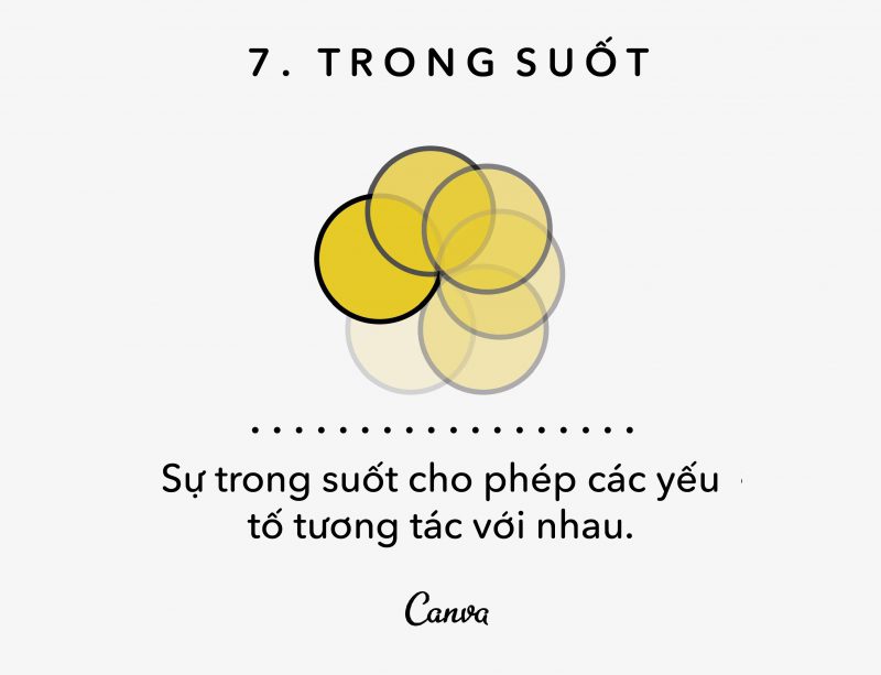
Also sometimes called ‘opacity’, Transparency refers to the way an object is seen through. The lower the density, the more blurred the object will be and less noticeable, the higher the density, the more visible the object will be.
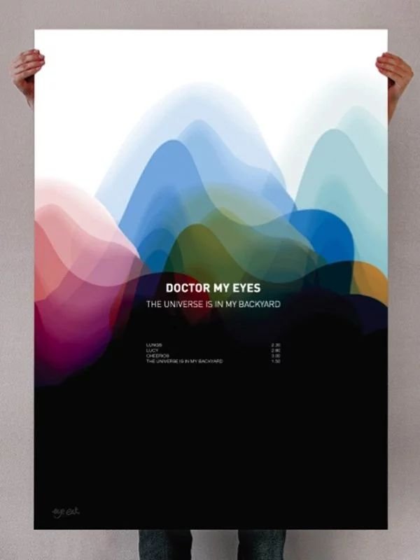
Let’s see an example of using Transparency. This great example by Jack Crossing has layered various shapes of different colors, sizes, and densities to create really beautiful graphics. In this way, tweaking and playing around with Transparency can allow you to emphasize your structural layers and shapes in a unique and striking way.
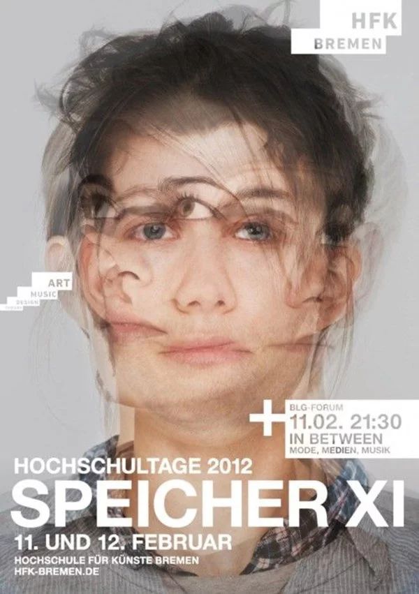
Transparency is also a great technique for creating a sense of movement in still images. For example, check out this poster by Filippo Baraccani, Mikko Gärtner, and Lorenz Potthast, which have layered with different images, with varying degrees of transparency to create a captivating and emotional effect. motion sense.
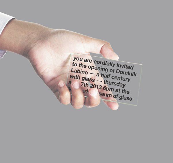
Transparency isn’t just limited to digital graphics. Take a look at the New York Museum of Glass invitation card cleverly printed onto a piece of clear glass, giving the design a distinctive and promising effect. Consider the material your design will be printed on, its transparency and the possible results, don’t be afraid to get creative with them.
8. Material (Texture)
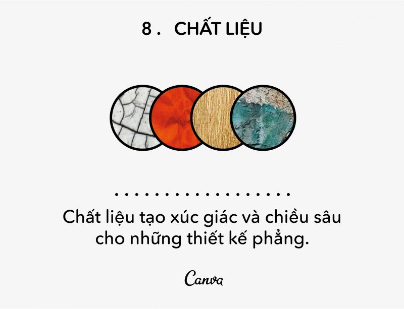
A clean, sharp and beautiful graphic design can be great, but sometimes a little change in texture can be even better. Textures can add depth and some pretty cool effects to your designs.
However with so many things, make sure to use this technique sparingly, as too many textures can quickly overwhelm your design. Remember: there is a fine line between the old and the old.
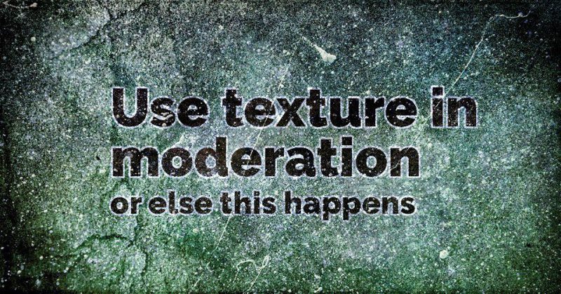
Have you seen that too many textures can create a cluttered effect? Many textures are applied with rigid formulas and other parts show up without a stroke effect around each letter.
Of course, if you’re looking for stylish sparkles, then Texture might be good for you, but if you’re looking for a way to incorporate textures in a less intense way, look no further.
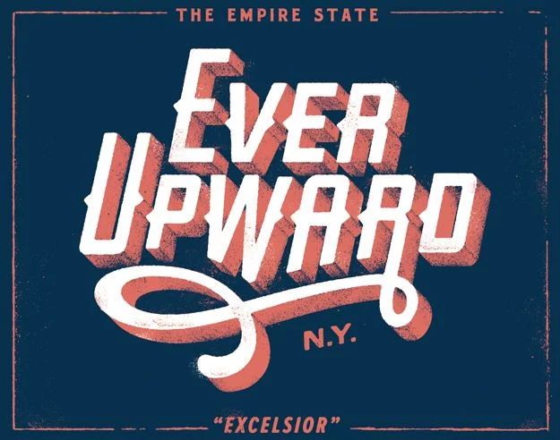
Let’s take a look at an example using texture in a way that refines this technique. Dan Cassaro’s print design creates a classic magnetic effect using texture. Note that the use of rough textures doesn’t distract you but helps to beautify the entire piece, giving it a more authentic vintage, handmade feel.
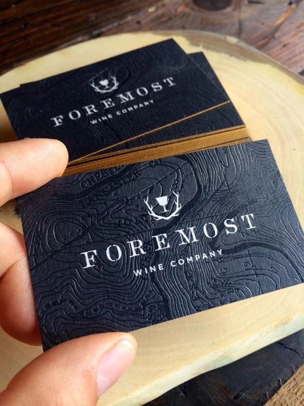
Take a look at this business card designed by Inkdot for Foremost Wine Company that takes the use of materials to the next level by embossing the topography on the card. By considering materials and evaluating how your design will turn out, you can create a memorable design that stands out from the crowd.
9. Balance (Balance)
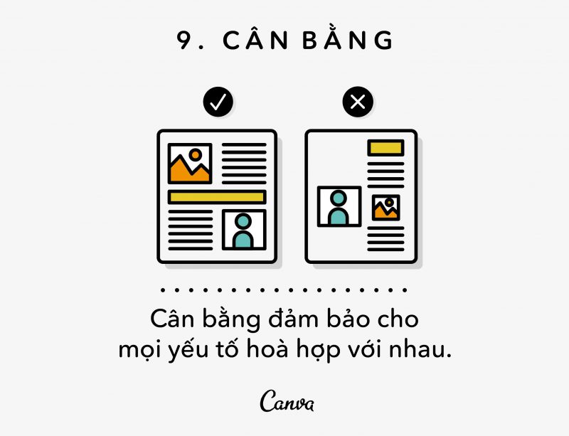
Balance is pretty important in life, and the same goes for design.
One way to create balance is to think of elements as if they had ‘mass’. From text boxes, to images, to columns of color, consider the size, shape and ‘mass’ they contain and their relationship to other elements on the paper.
Alternatively, imagine your design being printed into a 3D model. Will it be able to stand, or will it be tilted to one side?
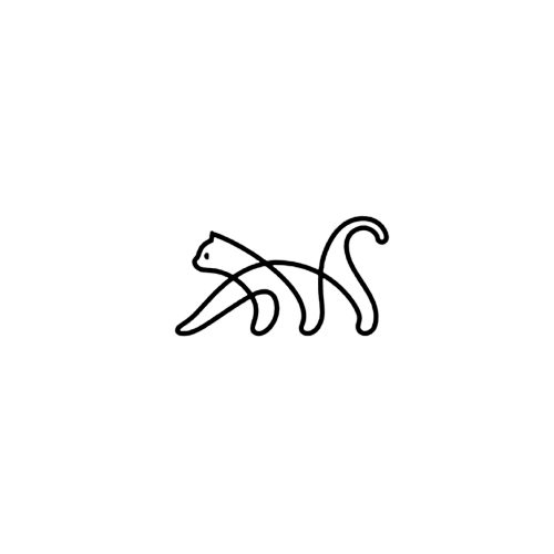
Take a look at George Bokhua’s cat logo, it strikes perfect balance. If it is formed into a block, there is a high chance that it will stand.
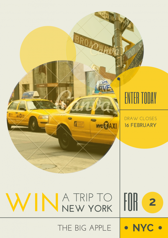
Another type of balance is the ‘asymmetrical balance’, which does not focus on the balance between left right or top or bottom, but focuses more on the distribution, size and alignment of elements to ‘mass’ ‘ their balance, let’s look at an example.
This brilliant work uses proportions and clever distribution between elements to create a harmonious design. Notice how this work achieves balance from left to right and top to bottom through the size of the elements. By balancing the image cluster and the text cluster.
10. Rank
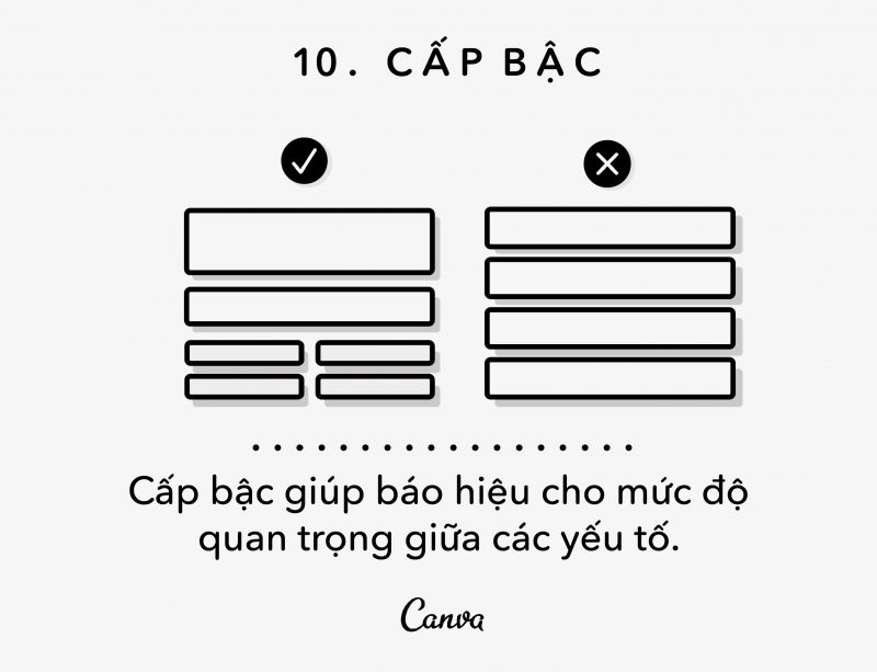
Hierarchy in design is like hierarchy in culture, both formed from the same background. The highest rank are the most important elements, as if they were the king. These elements will be the most ‘revealed’ and attract the most attention.
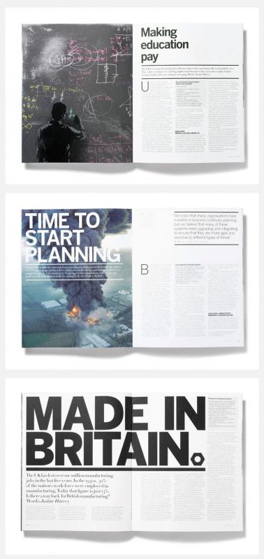
Take a look at the example below from A2 Magazine that demonstrates three ways to signal important headlines/headlines, from subtle, to loud and bold. Either way, make sure the consumer knows exactly what the title is without thinking.
Another layer of rank was the nobility – factors that were quite important – but did not require as much attention as the kings. These are things like subheadings, citations, additional information. Make sure they are conspicuous and eye-catching, but not too close to the eye-catching your headline is achieving.
Take a look at the Southern Fried Paper’s invitation card. Notice that the date (a very important element in the invitation) is enlarged, bolder and more eye-catching than the letters below. But they are not too attractive compared to the title “Audrey and Grant”.
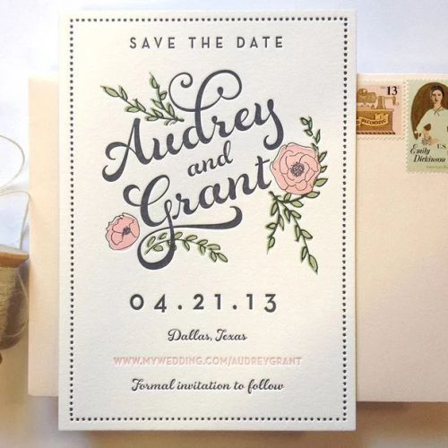
And the last layer of the hierarchy is the farmer, the most modest element in the design, creating the lowest visual appeal such as the body of the card, the link …
Take a look at the poster for The Night Market by Mary Galloway. You can easily recognize the title, subheading / date, and gradually down, the smallest letters of the information in the margins without being too necessary.
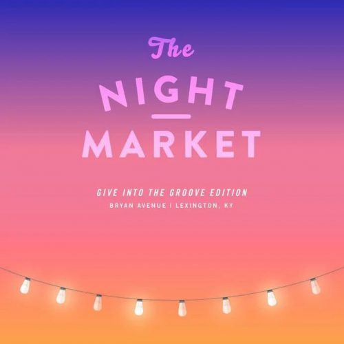
Of course, rank is not limited to the written word. Images also have hierarchy, remember for a moment about the proportions we talked about earlier. The larger the element, the more colorful or detailed, the higher your image will be compared to the small, flat, and less detailed elements.
11. Contrast
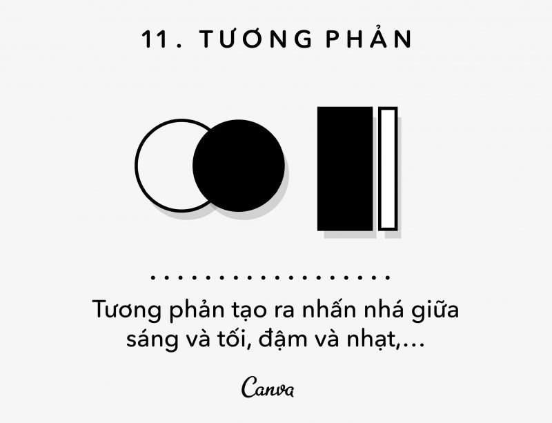
Contrast is the magic key ingredient that makes your design eye-catching, a (sometimes frustrating) request that is always asked by clients.
Basically, contrast is the difference between two elements in the design.
Some common forms of contrast are light/dark, thick/thin, big/small, etc.
Contrast has a dramatic effect on legibility and clarity, which is why you see many novels and publications printed on black and white paper. Imagine if they used light gray on a white background, the contrast would be very low and the text would become difficult to read. So, if you are using text, make sure you pay attention to this kind of contrast.
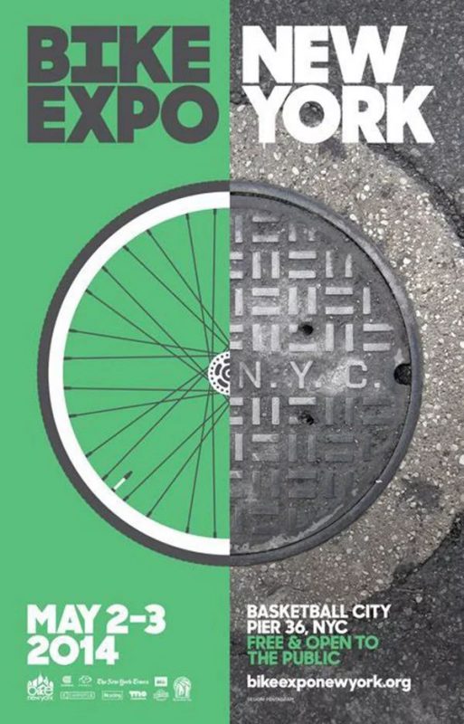
For example, the poster by Jonathan Correira and the way it ensures that there is a clear contrast between the image and the text. The frame is split in half, a prominent green on one side and a dark gray on the other, the font color has been adjusted to make each side easy to read. Imagine if the word “New York” was displayed in the same color as “Bike Expo”, the contrast level would be low and very difficult to read.
Another example of high contrast is the work of Robbie Cobb, not only is the contrast between light and dark, but also the contrast between the thin thickness that creates an extremely impressive design.
Contrast is not only the right element to enhance clarity, it also draws the eye to some fixed point. This technique is used a lot in web design, check out Audible’s homepage below.

Did you notice this design has darkened and blurred the image so that the red text frame contrasts sharply with the background image? This purposeful contrast helps direct attention to the main action – clicking on the account registration page.
So, use contrast to make your design more eye-catching, drawing attention to the elements you need.
12. Frame
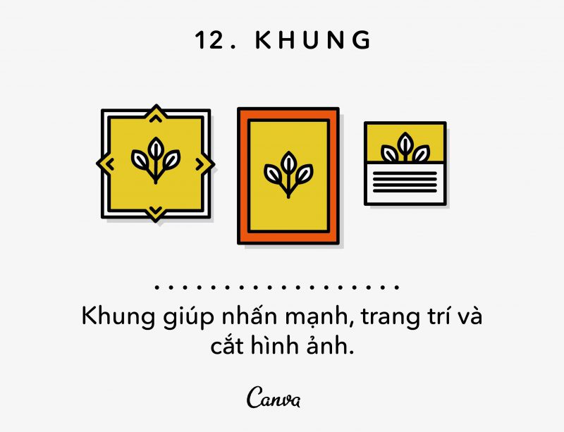
As with photography or painting, framing a design properly is an important factor. We often think of frames in the definition of photography – what to put in, what to put out, etc. However, frames are equally important in design.
A tangible frame like a dialog box or graphic element can enhance or draw attention to certain elements of a design.
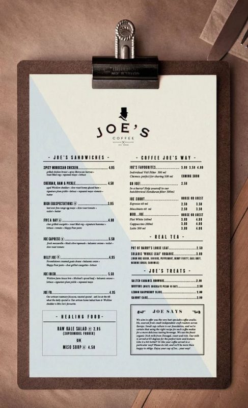
For example, check out Trevor Finnegan’s menu design that chose to frame a signature dish as well as the brand’s criteria to draw attention to these two ingredients that the naked eye could easily miss. A very simple way to emphasize specific elements of design importance.
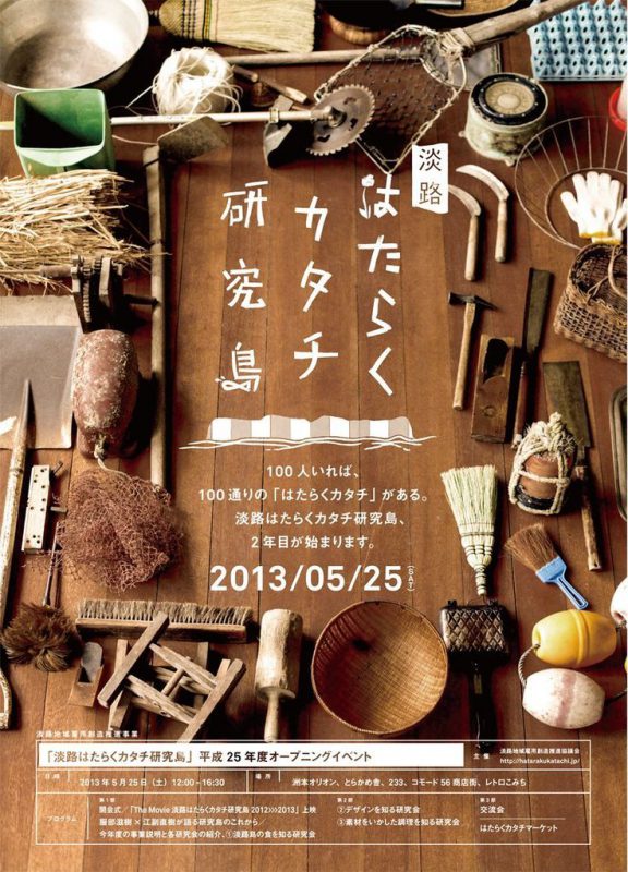
The frame also doesn’t have to be graphical. If you’re working with visual elements, why not consider using them as frames for your designs? Take a look at this poster that used a few random objects to frame the hieroglyphs. This way, you will draw attention to the work with the frame, and keep your eyes on the important things.
Read more articles >> Using Contrast in Logo Design
13. Grid
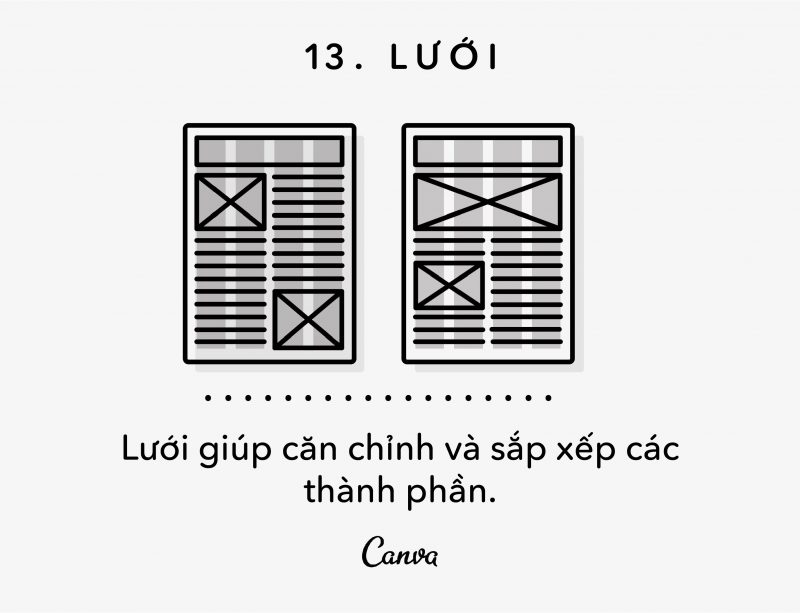
Grids are like the foundation of a home – they are the first vital step that allows you to build an aesthetic, functional project. They signal the builder/designer where what components should be placed, what needs to be aligned, and provide an overall yardstick for the project.
Grids are important, but often invisible in all designs. They contain a large number of rows and columns that you can align your elements on. Grids help you keep your content organized, neat, clear, and beautiful.
Let’s look at a few different examples of grid systems.
This example by Nikola from Magazine Designing includes 5 columns and lines. Some elements are in one column, while others stretch to two columns, sometimes three columns, yet the design is still very neat, clean and tidy.
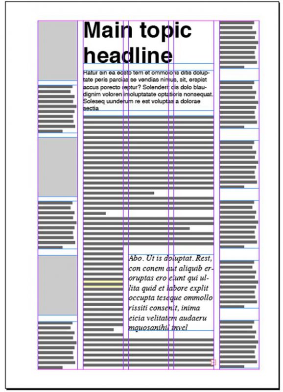
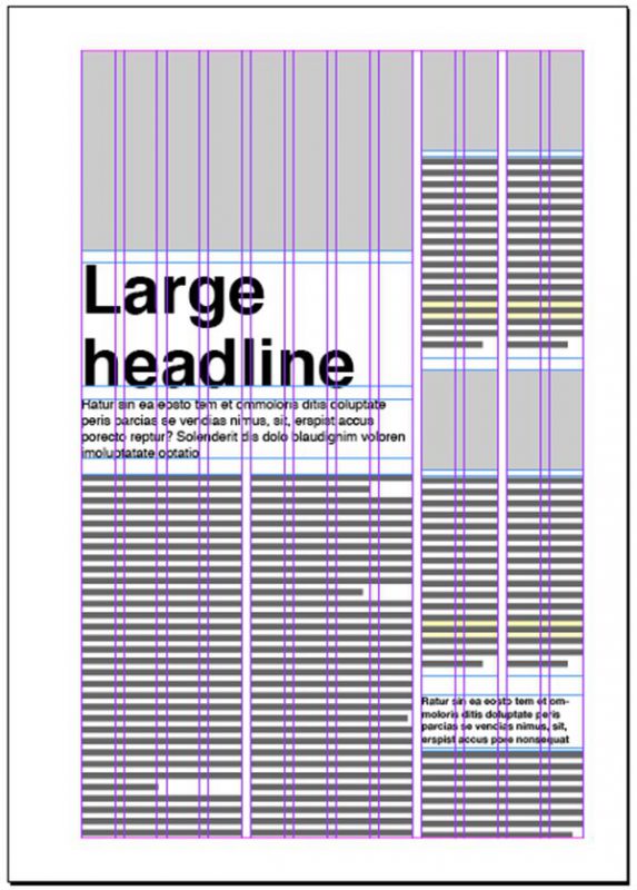
If you want more flexibility, add more columns, like this.
Below is the design of Nikola from Magazine Designing. The image shows how a 12-column grid can give you flexibility when it comes to aligning elements. Again, notice that some components span multiple columns, while others span only two columns. Don’t think of grids as something that needs to be colored in, they simply create a system to help you design better.
So, find a grid system that suits your design and move on.
We already know what a grid is, what it looks like, how it works, let’s look at some real-world examples. The design below was created by Matt Willey, and guess what, how many columns did he use in this design?
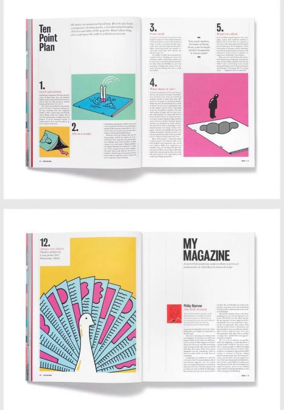
Did you just guess three? Or six? Either way, this example has a clean and precise grid system so each element can be aligned, creating an impressive, clean, and attractive design.
Grids are flexible, relevant and incredibly convenient, so consider using them for your next design and see what they can do!
14. Random
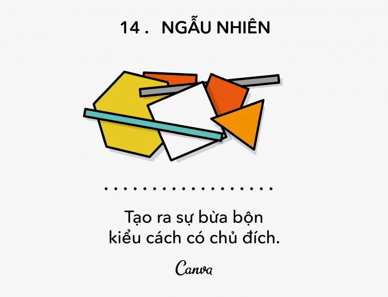
To this day, we still worship what is straight and orderly. But what about the rougher, more random designs? Randomness dominates the design, but should be a special kind of randomness.
The difference between ‘design randomness’ and normal randomness lies in purpose and expression. With design, your main goal will be communication – what does this piece say to the consumer? Is it clear? How to increase interactivity?
For example, look at the design below, which uses ‘random’ writing but with purpose and intent. Heath Killen’s poster for the movie “The Killer Inside Me” uses mostly rough hand-drawn handwriting, and where typefaces are used, letters are spaced unevenly.
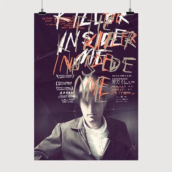
This work overlaps many layers of text with an unordered layout that makes it extremely difficult to read. But all are aimed at showing a sick person crawling in the dark.
Here comes the difference between ‘normal randomness’ and ‘design randomness’. If the design is for children with cute talking animals, it will seem random, and cannot communicate concisely with the audience. But, in this case the random design conveyed the content scene perfectly.
Take a look at Laura Berglund’s design, she used a series of “random” installations to create a natural look and collage effect. While the work feels trendy and sloppy, take a closer look and notice how many design principles this poster employs.
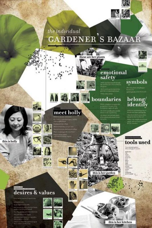
The elements in the poster are strategically structured, there is a path to navigate the eye around the work, and there is a balance between color – material – image.
Next up is a design by Juan Camilo Corredor. This design has used randomness with lots of quirky images, new materials, and interesting collages of unrelated illustrations.
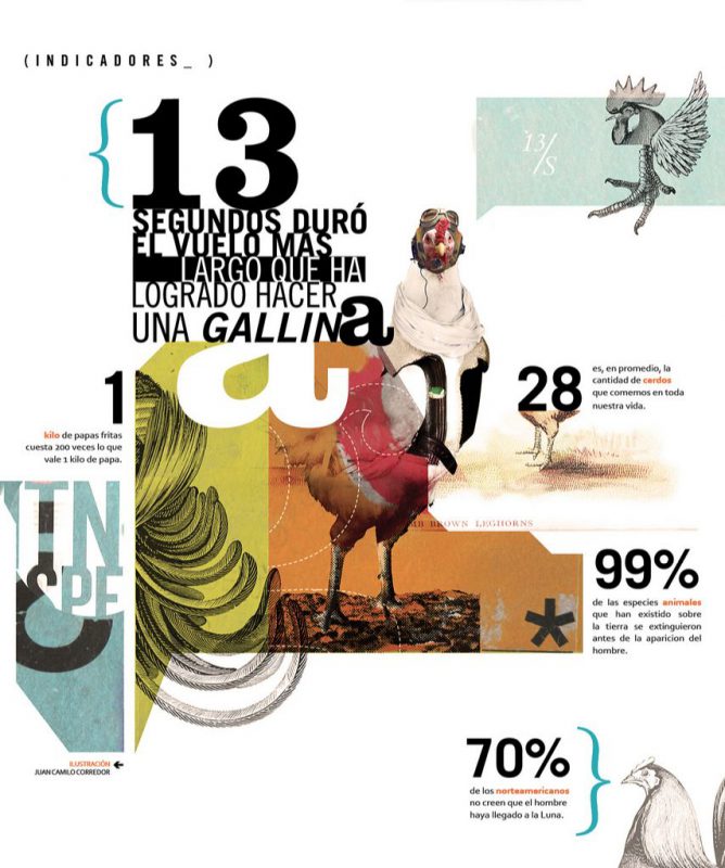
It contains randomness, but if you analyze each element, you’ll see that some elements of the design are aligned (the bottom left blue patch aligns with the blue spike next to it, etc.). ), this arrangement helps the eye scan the entire page and has some practical suggestions for using grids.
The point is – many things don’t have to be so neat and orderly to be called design. Using ‘random’ and playing around with some trendy designs can be fun and useful.
Try resizing elements in different ways, tossing them into the shape of an ‘a’, or cutting off a chicken’s head… have fun with them but only do this if and only if you have Be aware of design principles and understand your purpose.
15. Direction (Direction)
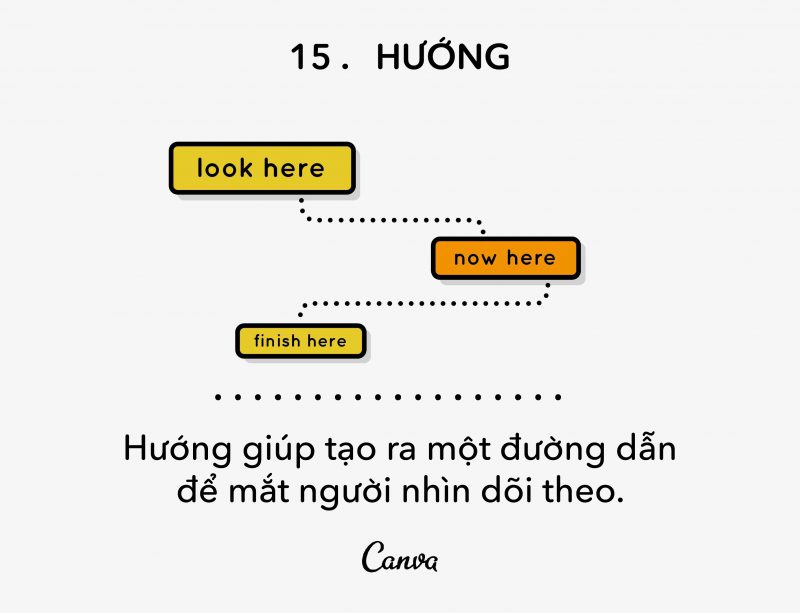
An important aspect of design is the way the eye moves across the surface of the paper, this is also known as ‘flow’. How do your eyes move on paper? Do your readers know what to look at next? Is the direction of eye movement reasonable?
Research has shown the habitual nature of eye movements and the trajectory they take when looking at specific objects. Take a look at the Nielsen Norman Group’s Eye Trajectory Table, which tracks users’ eyes while looking at the web interface to discover their trajectories. Below is a calorimetric map.
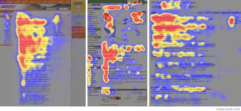
Research shows that most people’s eyes follow an ‘E’ or ‘F’ trajectory when looking at a web page, so placing the most important content to the left, or top, is best. Another common orbital is the ‘Z’ shape, as shown below.
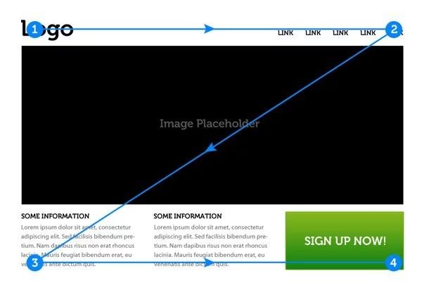
In general, the naked eye will move from the upper left corner to the lower right corner in a ‘sliding’ motion. This conjecture is best explained by the Gutenberg Diagram, and you can learn it here .
Instead of 100% following these trajectories, try to bring flow into your design on a case-by-case basis. Just remember to look from the top left corner of the paper and slide down, that’s all.
Let’s look at another very effective and distinctive use of direction.
The design by Atelier Martino&Jaña guides the viewer’s eye in a very smooth way, by bringing the border text to follow the curves and shapes of the image. The title and date are most prominent (thanks to the rank), then the eye will drift along the work along with reading the information and viewing the pictures.
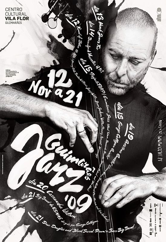
Thus, the flow of this work encourages the viewer to read and feel the writing while penetrating the image.
16. Rules (Rules)
This is the point that sparks much debate and divides any design team – half argue that there are no rules in design, the other argue that there are many. And indeed, they are all right.
Every field has a lot to learn with universal rules. For example: Make sure typography is legible, learn kerning, and don’t use grainy images… These are the basics of design, the things that help you create a simple design.
But as many arguments say: once you learn them, you have the right to break them.
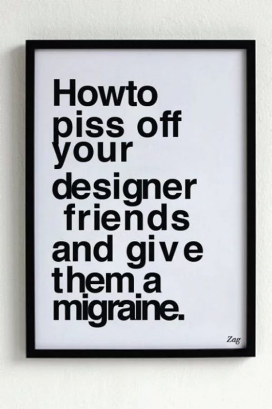
Let’s look at an example where the rules were removed. This poster by Shahir Zag omits the fundamentals of typography to create a (real) laugh.
Another example of rule-breaking that you’ve probably come across in your creative journey is David Carson’s design. Carson is a cutting-edge Grunge designer who often designs publications for Ray Gun Magazine, with many of the shocking, snappy, and rule-bending images still celebrated today.
One of the most beloved features of Carson is the layout for the interview with musician Bryan Ferry. Reading through the content and finding the interview rather boring, he decided to render the entire article in Zapf Dingbats style (like Windings, a font made up of symbols) in a completely unreadable form. Take a look at the page below.
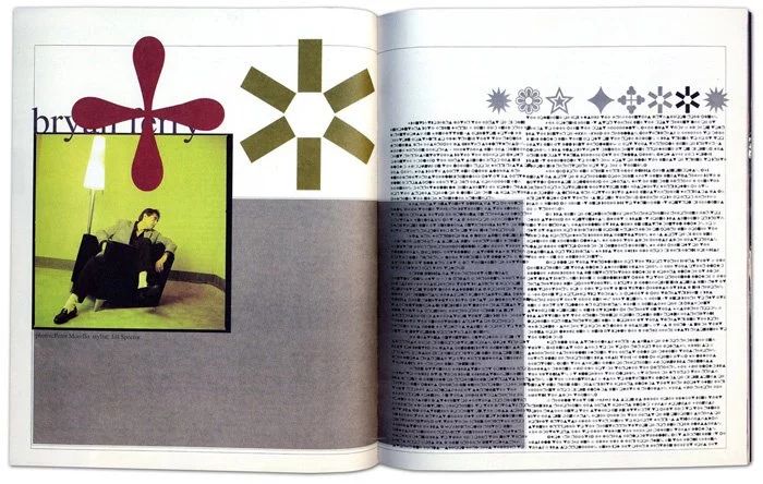
Carson’s basic idea when it comes to design is ‘don’t confuse readability with communication’.
Carson and many other progressive designers often choose to communicate novel ideas to their readers by breaking the rules. The Shahir Zag ‘headache’ poster we just discussed breaks the rules for fun, and Carson’s work breaks the rules to make a point about the interview.
So, while legibility looks more promising, communication doesn’t seem so docile.
Following the rules and breaking them both have their place in the design world. Consider and learn so you can break and bend the rules appropriately and create works of a lifetime.
17. Motion (Movement)
Have you ever seen someone describe a painting or artwork that contains “a lot of movement within”? You may have been confused by that description – after all, how can a still photo move? But, motion is a big part of the visual arts, including graphic design.
Earlier we discussed direction and flow, which play a large role in the movement of the design. If your final piece has a steady flow from top to bottom, left to right, corner A to corner B, etc., the work will ‘move’ smoothly.
But, what about those cases where you want to create a true movement? Maybe you want a moving ball, or an approaching car on the highway. There are many ways you can show this type of movement, so let’s go through a few examples.
First, let’s talk about transparency.
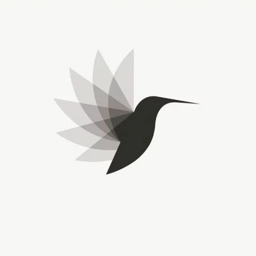
Here’s an example from Vladimir Mirzoyan’s logo design, which overlays sharp geometric patches with multiple levels of transparency to recreate the wings of a hummingbird in flight. This simple effect will create a sense of movement that is neat, smart, and logical.
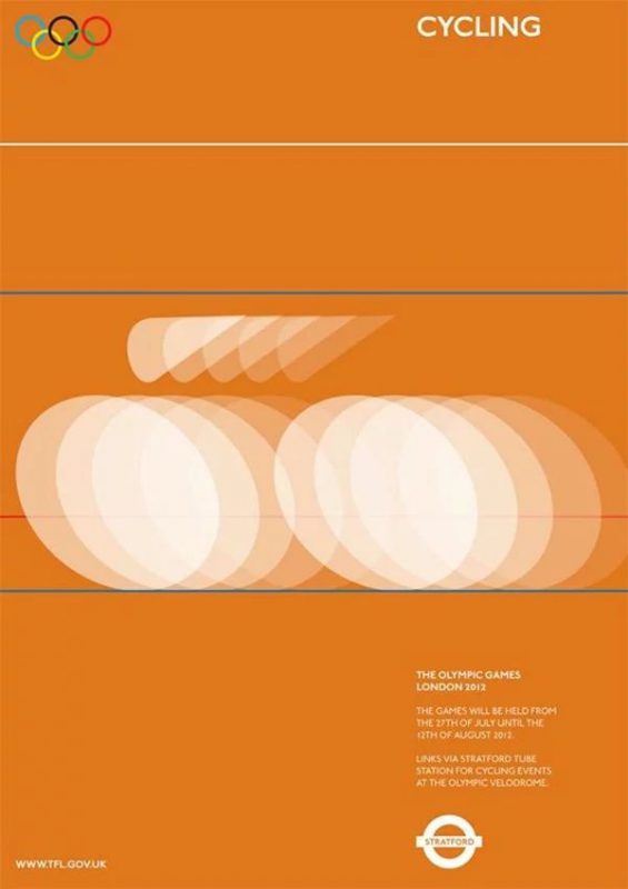
Similarly, check out the poster designed by Alan Clarke for the 2012 Olympic Games. By overlaying simple shapes with lots of transparency, this poster creates a strong sense of speed in motion.
Motion can also be achieved through a blur effect.
For this example, a book cover by German designers Anzinger, Wüschner, Rasp applied a very attractive edge blur to the edges and corners of the writing to create the illusion of movement.

And finally, displacement can be captured through the motion line. These are very popular in comics and illustration, when a character is running, or moving fast. So, study an illustrator you like, and see how they use motion. Try looking at the example below.
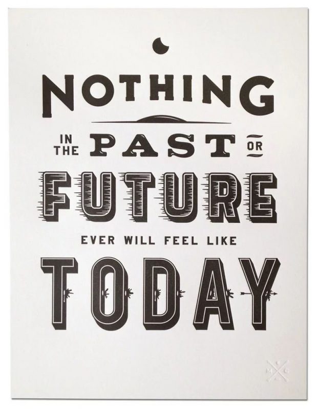
The example below by Matt Chase uses a gentle motion on the word ‘future’ to represent displacement. An effective yet subtle way to create a dynamic movement in design.
Read more articles >> Motion – Trends of Modern Brands
18. Depth
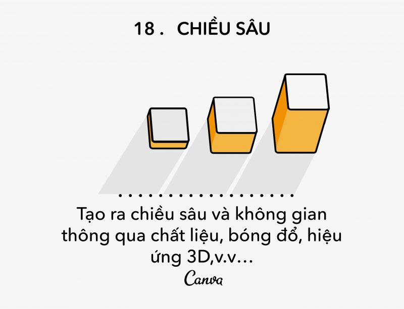
Depth is an important and interesting principle. Even with the flattest material, you can still create a sense of depth and openness in a two-dimensional world.
So how to create the illusion of depth in design? There are many techniques for you to use.
First, we have the most common technique – shading. Now, shaders can be cunning devils, as they don’t always cast in a straight line, sometimes stretched, bent, distorted, and skewed. So let’s explore the shadows of the real world, observe how light hits objects at various points and try to recreate them.
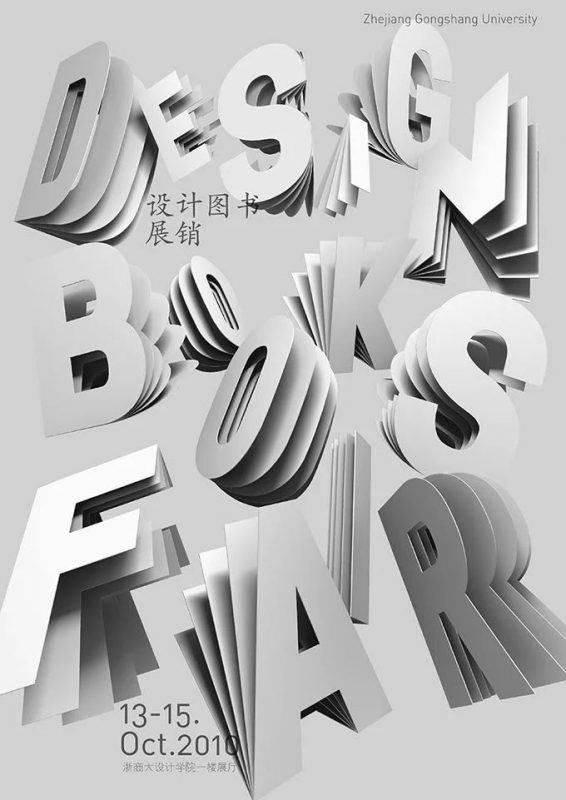
Let’s look at an example that effectively demonstrates a drop shadow to create depth. Poster for a book fair by Dominique Schmitz uses a lot of different and bold, but also very realistic. Let’s look at how each shadow is rendered differently and precisely for each object. Realism takes work, but it’s worth it!
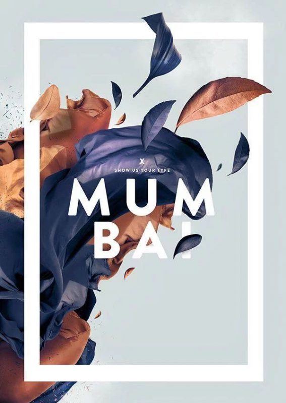
Another technique is overlapping components. This minimizes flat surfaces, creating a layered, multi-layered and structured feel. Take a look at Fabian De Lange’s design that overlays illustrations, text, and graphic elements (white edges) to create a layer of depth.
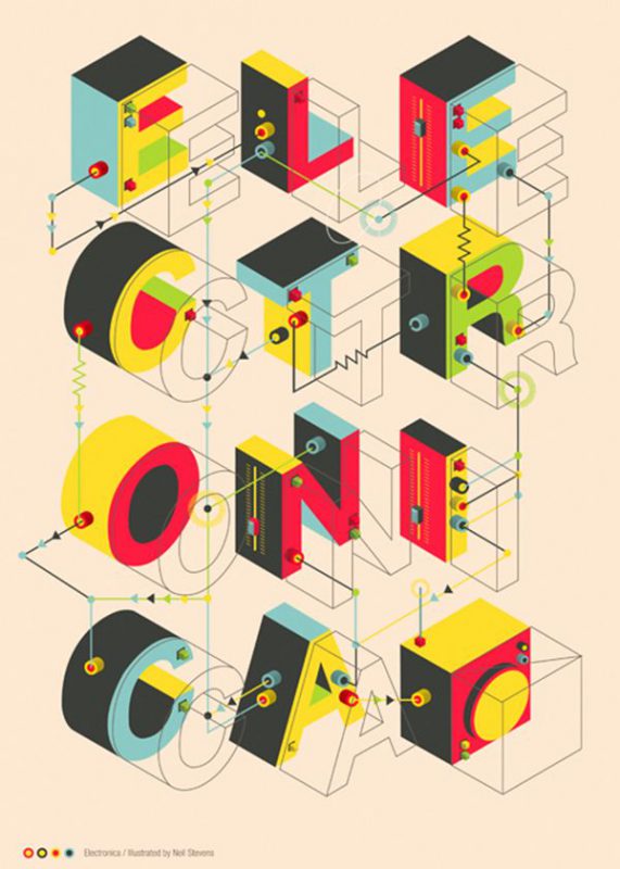
Another method is to play around with perspective, which is a technique that often creates a “3D effect”. By customizing the angle of view of some elements, you can create the illusion of building them out of the page, creating an instant depth. Let’s look at the example.
Neil Stevens’ electromechanical-inspired poster pulls each letter to the right a little and makes them a block. The simple illustration, shading and perspective adjustment of each element help create a dynamic, interesting design.
Of course, the other extreme is reducing depth in your design. This is a recent popular style, often referred to as ‘flat design’.
One brand loyal to this style is Apple. In September 2013, Apple released a new operating system with a completely new look that removed all the highlight and shadow effects and replaced them with flatter images such as icons, screens, apps…
19. Typography
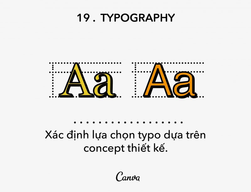
Typography is considered one of the greatest foundations of design. Handwriting says a lot (literally) and the way you choose to present your writing, whether it’s the title or the body of your post, can reveal even more.
Let’s look at an example of typography display. For those who don’t know, performance handwriting is usually nicer, more stylish. Think of the titles of movie posters, or magazines, etc.
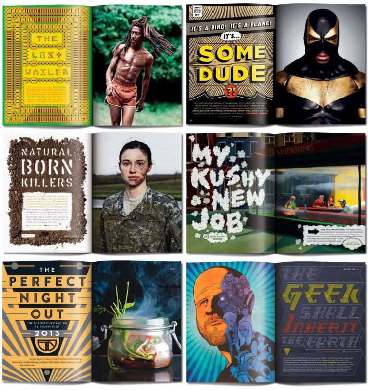
Take a look at the pages of the magazine designed by Benjamin Bours, each with its own intricately designed and effective headline. This type of showy detailed typography is called interpretive handwriting.
Next, we have the body. There is a battle in the body world between serifs and sans-serifs over legibility and clarity.
So what is the answer? Look, this is case-by-case, but in general, serif is perfect for print, and sans-serif is great for the web. Let me show you UrbanFonts’ great infographic to explain.

Once you’ve chosen between serif and sans-serif, move on to the detailed and sometimes time-consuming step that is your default handwriting.
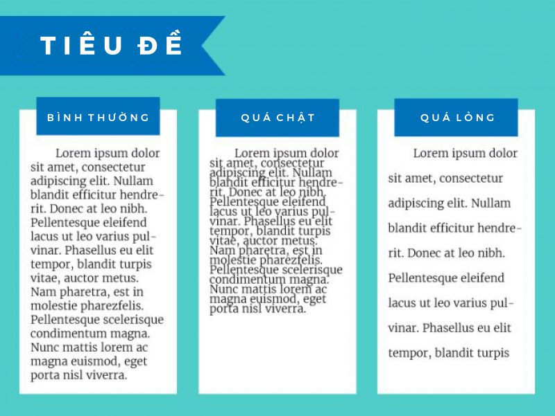
Even so, let me include some basics:
- Make your title kern;
- Make sure the body is not too large or too small for the material you plan to print;
- Try to avoid using too many typefaces at once;
- Left-aligned is the easiest way to read for very long body texts;
- If you’re not sure, print them out (you can always spot weird defaults on the page).
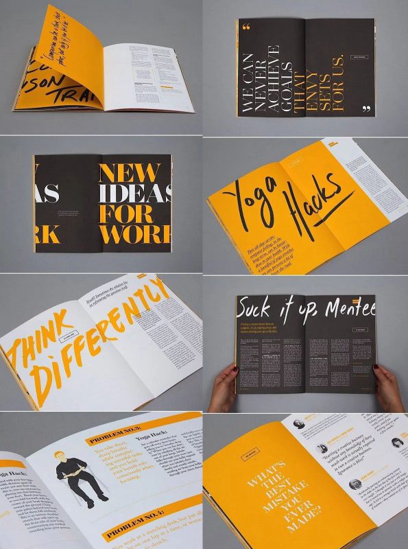
When it comes to typography, another barrier to overcome is the art of combining typefaces. This sounds easy, and sometimes it really is, but it can get tricky in some situations. Let’s look at an example of good typeface matching.
99U Magazine uses mainly typefaces but has combined them in a separate system. Efficient and beautiful! Look.
Read more articles >> Popular fonts and how to use them
20. Composition
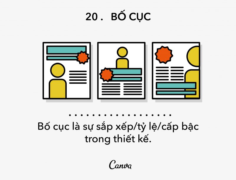
Composition is an important part to finish because it converges all the principles we talked about so far.
‘Composition’ is the general arrangement of elements in a design, which sounds a bit boring to explain, I know, but it’s a really fun rule of thumb. This is where you can play around, experiment, and make good design look better.
With that said, layout is the basic place where all the 19 principles we discuss come together. You can use proportions, repetition, typography, lines, randomness, etc. to create unique, effective and relevant.
Take a look at some of the designs and comment on their layout. First, we have the newspaper email to J.Crew. This design has placed emphasis on the number “30” using proportion and depth to emphasize it. It also draws attention to the title by taking proportions and placing it in the upper center of the page, making it larger than the rest of the text, and framing it.
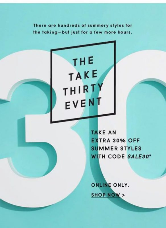
Only a few techniques are shown in this simple design. Notice how they all work together to create a powerful, eye-catching, and very effective design.
Here’s another random example – this time, a poster by Lab B Design Office. Design uses the same techniques and principles as above, but produces a completely different result. This work uses scale and depth by adjusting the size of the text blocks, placing them around and behind the photo to create depth. It also has very powerful hierarchies, framing text in boxes and framing images with text.

Overall, by using different methods, techniques, and content, you can create countless layouts.
Think of them as the ‘re-mi’ note. Once you have the foundation, you can use different combinations of these notes with any song you want.
For now, the Sound Of Music movie example aside, and look at a few tips to master your composition skills. Here are a few important things to consider when thinking about composition:
- Is the design balanced?
- Does the design have a logical hierarchy?
- Is scanning the page easy and logical?
- Is my communication clear to the audience?
Read more articles about layout >> Learn about the rules of layout in design
Conclude
Design is a complex profession filled with principles, tips, techniques, some things you can learn from others, and some things you have to learn on your own.
Appreciate every ‘rules’ you read, apply them where appropriate, and ignore those that don’t. Design is an ever-evolving, ever-changing field, and each case is different, unique and interesting.
But, for the rookies among us, keep these 20 principles in mind. Every time you go out, pay attention to the posters, menus, and signs you see, and try to determine which principles are being used and how they are being used. Develop an ‘eye in design’ and keep in mind (or record) interesting uses and store them for rainy days, when you feel a lack of creativity.

In short, take it easy. Play, experiment, but with purpose and care.
Good luck!


