You want your brand to stand out and always create an instant connection with your customers. You have to make sure that within the first second or two after seeing your logo, customers understand certain messages about your brand.
When designing a logo, consider symbolism, images, colors, and different design styles to see how to combine them.
A great logo is always based on symbolism to create expectations for viewers and make your brand more memorable. This post will cover symbolism used in logo design and give examples of symbols you might want to apply in creating your own logo.
Mục lục bài viết
ToggleWhat is Symbolism?
For thousands of years, humans have used images to represent conceptual concepts and in communication. Egyptian hieroglyphics is an ancient language consisting entirely of small symbols to represent different words or ideas. Simple symbols are engraved on the thousands of years old walls in the caves and they depict animals, people, hunter-gatherers and more.
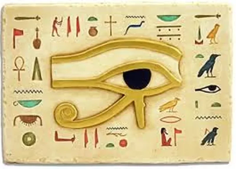
In today’s world, icons are everywhere. From colors, shapes to themes, icons often communicate ideas quickly. Here are some of the most common symbols:
- Street signs (such as stop signs)
- Emoticon.
- Toilet sign.
- Religious and political symbols (cross, donkey, elephant)
- Parking sign.
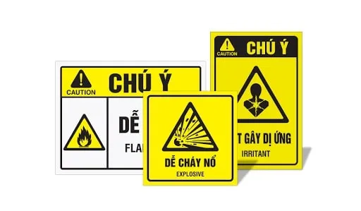
Symbols in everyday life help us to know what was, is and will happen. This is also a general concept when we talk about symbolism in graphic design.
How are symbolic icons used in graphic design?
There are different types of symbols that can communicate a concept as soon as someone sees it. In graphic design, symbols can be used to help communicate identities, services, products, and more. Brands can use logos to communicate aspects of their company in both direct and indirect ways.
How to take advantage of doodles when designing your logo
The logo is supposed to represent the entire brand. They are blueprints that cover every message in a miniaturized, memorable and understandable way.
Using symbolism in logo design can help convey the salient elements of the brand to the target audience quickly and effectively. These icons can include your choice of shape, color, or symbol.
Define your brand: The best way to determine the right direction for logos is to start by defining your brand concept. You need to know what you’re trying to accomplish and what sets you apart from the competition. Defining your brand will include your ethos, development goals, and brand voice.
Understand your audience: Understanding who is viewing your logo is important. Different groups of people, races, cultures and religions will have different views on the meaning of certain symbols. It is important to know clearly what you are communicating with the group of people you are trying to attract with your logo.
Understand logo history: Sometimes, a logo that looks too similar to other brands can confuse the brand and create unintended consequences. Pandora and PayPal have had very similar “P” logos (cubic, blue, and no center) for a while, even though they are two different companies. Pandora then changed the letter P in blue to add red lines that resemble sound waves to make the logo more consistent with their branding. Pinterest, Target, Beats by Dre, and Bebo all have very similar logos, and they’re pretty easy to confuse.

What styles do logo icons have?
If this is your first time designing a logo, you should make a list of colors, fonts, and objects that include your brand characteristics. Then, narrow down the list above by choosing ideas that resonate with customers but still stand apart from the competition. You can completely enhance the spread and connection of the icon with the style of your choice.
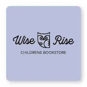
As you can see below, an owl symbolizes intuition and wisdom. An owl with a bold color block conveys a different style (modern, tech, art – HootSuite or Trip Advisor) than a real-life owl (traditional, earthy, authentic – think about it. Rice University or the Manifest Building). While both logo styles will convey ideas of excellence and depth, they will appeal to different target audiences and imply different brand characteristics.
So choosing your icon is not as simple as just selecting an object. Symbolic logos are meant to include both the style and color scheme that you use. An ideal logo will look very simple but hide a lot of meaning behind the feelings it evokes in the subconscious at first sight.
Examples of symbolic symbols for logo design
When it comes to using symbolic symbols in logo design, there are several areas that you need to consider and consider carefully. Below are examples of specific types of symbols and their meanings.
Animal icons
Animals are very popular symbols in logo design. They can add an element of personalization without putting too much emphasis on your brand to only appeal to a specific target audience . Here are some of the most common animals used in logos and their meanings.

Butterfly – Represents change and transformation, often they represent flexibility or creativity. The butterfly can also represent beauty and peace. In a logo, the butterfly symbol is often designed in a detailed style or extremely simple in nature.
Owl – The owl symbolizes intuition and wisdom. An owl logo can represent their brand expertise or knowledge of their organization.
Swans – The beauty and elegance of swans is something that no one can deny. Beautiful creatures like swans can make great jewelry logos. The swan can also depict the process of growing up by incorporating the story of the Ugly Duckling. The swan silhouette is inherently elegant and can add a simple flair to your logo.
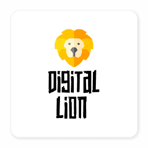
Lion – As the king of the jungle, the lion image symbolizes strength, courage, justice and power. A logo that uses a lion can represent a brand’s persistence or strength in that area.
Flower icon
Plants and flowers can convey messages of life, hope, and growth. There are many specific plants that can add meaning to your logo. Here are some common plants used to make their symbols in logo designs.

Olive Branch – Throughout history, the olive branch has been a symbol of peace and hope. It was used in the Bible and ancient Greek culture to symbolize these meanings. “Extending olive branches” is a term often associated with this image. In logo design, olive branches can form a border/frame like a wreath or be incorporated into other images (like pigeons).
Red Rose – The characteristic of red roses is the flower of love and passion. Since red is the color of romance, changing the color of the rose in the logo can change its meaning. Yellow usually denotes friendship, while white stands for chastity or innocence. The rose is seen as a beautiful thing that is not easy to obtain (because of its thorns); it is a very fragile flower but not weak. A rose also offers a classic sense of timeless beauty, which is great for fashion brands. Tulips and peonies also have a similar meaning as symbols in your logo design.
Trees – For brands that want to represent life, growth, prosperity and value, the tree symbol would be the ideal choice for their logo. Trees are a wonderful resource that we consider an important part of our environment. A brand can use a tree to signify growth (like a property management company) or nature (like a camping supply company). Fir and pine trees often represent nature, while deciduous trees make a difference with their branches (like Ancestry.com).
Each type of tree will represent a different meaning. The acacia tree symbolizes renewal and resilience, while the oak tree symbolizes growth and strength. The willow tree can symbolize sadness or suffering, while the fruit tree can symbolize work productivity. Choosing to display some tree (forest) or its roots, flowers, or fruits can change the symbolic meaning of your logo dramatically.
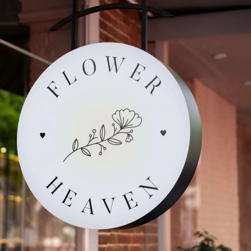
Daisy – Simpler flowers, such as daisies, zinnias, cosmos or hydrangeas are used to symbolize friendliness, goodness and harmony. Flowers are favored in florist logos, but they are also used in wellness, beauty and wellness brands.
Lotus – Representing purity, enlightenment and rebirth, this flower is popularly used for quite a few industries. Lotus flowers are popular in mental health facilities, yoga studios, rehabilitation centers and spa icons.
Four-leaf clover – Known as a symbol of good luck, the four-leaf clover is a common symbol for Irish and Celtic brands in particular. Baileys Irish Cream uses two “B”s to create a kind of four-leaf clover for their logo. Red clover flowers and even clover can be used to symbolize other meanings in the logo. The 4-H clover symbol was chosen to represent Midwest agriculture because clover is a common plant in the local grasslands.
Geometric symbols
For more modern brands, geometric shapes are often quite popular. Creating clear shapes can help simplify your logo. Shapes themselves are often filled with symbols that inspire your brand because those shapes are used elsewhere in nature and society.

Circle – The circle will represent unity, integrity and permanence.
Triangle – Triangle logos can be used to represent power or delicate balance. The upward triangle represents a solid background or masculine elements. In contrast, the downward-facing triangle logo exudes feminine elements.
Square – Solid, reliable and shows stability. Square logos can be used to cover the outside of circle icons.
Heart Shape – The heart symbol represents love, compassion, care and kindness. Brands and organizations can incorporate heart into their logos to signal that there is an element of altruism or compassion in their message.
Celestial Icons
The celestial elements in outer space existed long before humans were present on earth. Humans have assigned meaning to celestial symbols in most cultures throughout the ages. Here are some examples of the meanings currently associated with the most common celestial symbols.

Star – The pentagram symbolizes perfection, luck and fame. The asterisk can also be used to show navigation or set directions. An upside down star (pentagram) is often used to represent magic, occult and mystical realms. The six-pointed beginning is often connected with religion (like the Jewish Star of David).
Sun – The nearest star always gives us life, strength, energy and warmth. The symbol of the sun in logo design can represent clarity and strength for brands that want to illuminate the world. The sun is a necessary part of our existence and brands can use this to represent their position in the market.
Moon – The moon provides balance and renewal for people. It also signifies mystery and nature. The moon can exude a mysterious, unique, seductive feel to any type of logo. It is also used to symbolize sleep, nature, and attraction.
Color icon
Color adds a lot of meaning to any type of font, shape, or symbol you choose to use in your logo design. The meaning of colors in logo design can also change based on the lightness, darkness, and lightness of the colors.


Red – An eye-catching and vibrant symbol that can express passion, anger, and excitement. Red is often used to speed up decisions by increasing our natural sense of energy and passion – that’s why red is used in many fast food restaurants or to promote push transactions and sales.
Blue – Representing wisdom, loyalty and sophistication, blue logos are the top choice of many brands. Blues come in a range of shades that can range from pastel pastels to deep navy blues. Blue can also take on some tints when you mix more purple (periwinkle) or more green (teatle) to change their inherent meaning. While periwinkle represents the quirky, teal is a calming color that represents innovation and creativity.
Green – This is the color that represents nature, health and growth. Green can be mixed brightly to show vitality or more monotonous to symbolize mother nature. Green is a symbol of security – especially in relation to wealth. Green is often suitable for natural brands, healthy foods or supplement companies and financial advisors.
Yellow – The friendliness, fun, youthfulness and energy of yellow in logos is often eye-catching and surprising. Because yellow doesn’t contrast with a white background, you can choose a darker color in combination with yellow in your logo. Sonic, Lays, and McDonald’s all combine yellow with red. IKEA uses yellow with blue, while Best Buy, Post-It, and Sprint all use black to accentuate their yellow.
Black and white – Black and white logos are easy to print and always stand out in the right setting. Both white and black are symbols of power, reliability, safety and straightforwardness. Adidas and Nike logos are usually printed in either black or white. Chanel is a brand that uses simple black on a white background to represent stunning simplicity.
For you
If you’re planning on designing your own logo, finding the right logo without being overly complicated will really give you a good idea of what you’re going to do. The more you can use your logo to quickly communicate your brand’s mission and values to your customers – in other words, the logo will help you communicate and connect with them in the best possible ways.
If you are looking for a reputable and experienced unit to be able to design a professional and impressive logo and brand identity system , then please contact us immediately by phone. 0988 622 991, or leave your information and requirements, Malu Design ‘s consulting department will contact you right away to answer all your questions!
————————
Malu Design – Branding Identity Agency
Hotline: 0988 622 991

