Header 3 1536x887 1

Creating a photography logo for your business will help people focus on your brand.

With so many opportunities to present yourself and your business – on social media platforms and the like – it is important to give your customer base the best view of who you are. who and what do you do.

These days, anyone can snap a photo with just a tap of the screen, so it’s important to show your values ​​with good branding.

To make yourself stand out, you’ll want people to focus on your photography and build your brand in an accessible way. You want your brand to speak for your specific industry and show professionalism.

There’s nothing stopping you from building your brand and creating a photography brand, so dive into the following article so you can build your own photography brand.

What makes a good photography logo?

You will need more than a good image, fonts, and a standard color scheme to make your brand stand out.

To begin with, your logo needs to attract attention. You want your brand to be noticed by the people YOU want. If you’re a wedding photographer, you’ll be catering to a specific group of people, but if you’re a portrait or landscape photographer, your client base will be different.

In other words, your logo should be relevant to your customers. Using colors and images that appeal to your target audience will help them notice your brand and feel it’s right for them.

There’s no point in having a logo that’s easily forgotten; When someone sees your logo, you want to make sure they don’t glance and ignore it.

Your logo should tell your audience what you do or what they can get from you. Don’t make your audience try and guess what your brand does; Try to use different design elements like colors, images, icons and fonts to tell the story of your brand.

For some ideas for logo designs, check out some of the top photography logos below!
Types of Logos Photography

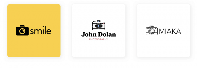
1. Camera themed photography logo

The best way for your logo to speak for itself is to include some kind of image that makes it clear to anyone looking at it that you are a photographer.

There are different ways you can do this. For example, if your business is called Shutter Studios, you could include a lens shutter as part of your logo design. Or, if you’re short, try to find a way to design them so that they’re legible, but also give off some sort of photographic vibe.

Camera themed photography logos

Choosing a camera-themed icon will be your simplest choice and the most basic way to make sure your customers know you’re a photographer.

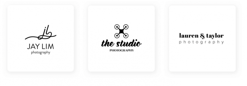
2. Photography logos like signatures

rebecca logo 100 1

If you are a working photographer – or want to work – in a more professional setting, consider using a  text-only logo that represents your brand name.

For example, if you specialize in photographing company events and speakers, you’ll want a logo that’s similarly impressive. To do that, use solid classic fonts like serifs and sans-serifs.

Serifs, like Times New Roman, give it a very classy feel and sans-serifs, like Arial, give it a professional vibe while at the same time being a bit more modern.

Choose fonts that match your brand personality so customers can know what to expect from your work. With just a glance, potential customers looking at your website, business card or Instagram page will understand how you work and photograph because your logo will give the feeling of being at an event of nature. there.

3. Nature-inspired photography logo

This type of logo is great if your field of photography is nature or landscape photography.

It’s always a good idea to let your logo represent what you do. You can leave a bit of a mystery, but consider the color and background of your logo and how you want it to appear on your branded platforms.

Elie scaled 1

Nature photography requires a sharp eye, so incorporate that in your logo design. You can use an icon that represents your style. If you often work with florists, consider including flowers, or if you photograph animals, you could include dogs or wild birds in your logo.

4. Robust photography logo

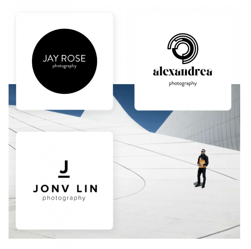
If you are an architecture photographer, consider using the structure of buildings in your logo design. A good way to do this is to choose your logo form in some sort of frame or border. Straight lines give a sense of structural integrity.

Screen Shot 2021 12 20 at 18.21.39

5. Newborn photography logo

Pregnancy, newborn and newborn photos have a certain nuance to categorize. The photos you see in this category often have soft tones and give off a feeling of lightness and calm.

Let your logo speak for your brand in the same way. Use a soothing palette in your logo design by choosing pastels and warm tones.

newborns

You can also choose a softer typeface to support your brand message as it will give it a softer feel. If you don’t want to combine with pale pink or light blue, consider the gender neutral colors that often appear in baby photography, such as baby yellow, green or any other shade. in that color family.

6. Wedding photography logos

Wedding photography is often elegant with a break. There are many styles of wedding photography logos, but you can get the perfect logo by following these key points.

Let elegance play a part in your logo design. To do that, you can choose a font that feels regal.

Thin typography with a cursive font usually works well here, but try looking at your specific wedding photography market and find what works best for your brand and style.

wedding 1 2048x1634 1

Also consider the style of wedding photography you do and the current colors. If you’re having a more hipster wedding in a wooded location, play with ochre and green. However, if your wedding is more classic, use a clean and crisp white tone

7. Nostalgic photography logo

If your photography style leans towards a vintage vibe, you’ll want your logo to reflect that.

Again, you’ll want to give customers a sense of your style just by looking at your logo. Use vintage fonts or film-style particles in your logo design for a suitable nostalgia touch.

Think of stamps and icons that show your customers that you are classy in a great way. The stamped style gives an older and more classic look.

Nostalgic 1

8. Smart and creative

Using a more abstract style may be more suitable for your photography business logo.

Can your business name be used as a pun in photography or can you use some metaphor? Go in this direction to really grab the customer’s attention.

Clever and punny 1

Maybe you’re a drone photographer so you might consider somehow incorporating an abstract drone symbol into your logo.

There are countless ways to make your logo appealing and professional, so stick with what you feel really speaks to your brand and what makes you stand out from the crowd.

9. Modern photography logos

Do you have a modern photography style? Choose modern logo design.

Think about symmetry and strong lines to help guide your logo. Take a look at the layout, spacing, lines, and aesthetics of your logo, just like you would a photo setup and create the right feel for your brand.

You don’t need a logo that is rigid and uninteresting, but keep in mind the elements you often use in photography and the appropriate ones to incorporate them into your design.

10. Your photography star should be in your logo

Making photography a part of your logo will ensure that your customers know exactly what you are offering.

Whether you’re a fashion, landscape, sports, art or animal photographer, incorporating a subject into your designs is sure to send a positive signal to you and your clients.

This is a surefire way to make sure your potential new customers know what they’re doing, and it helps your personal branding efforts with minimal interaction from you. Just remember to choose a style that suits the way you take your photos.

If you’re photographing professional dancers, you won’t want the text on your logo to be bulky and rough, instead, you’ll choose something lighter like a cursive font.

11. Bright photography logo

Super saturated photography style can mean that you should choose a bright and colorful logo to match.

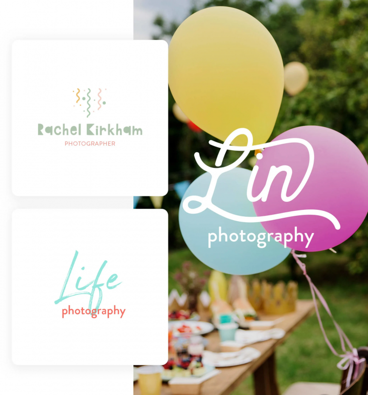
Let your logo represent what you do by expressing your joy at work and your photos giving a feeling of happiness.

Your inner rainbow can shine here – just make sure your color combinations make sense and set a limit of around 3 colors so as not to make your logo too distracting. Choose colors that complement – ​​opposite – or similar – neighbors on the color wheel – colors for the best combination.

Bright 1907x2048 1

12. Photography logos with custom fonts

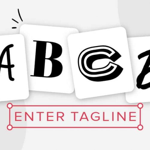
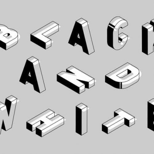
Sometimes your logo typography needs to be the star. To help your brand stand out from others in your industry and niche, choose a custom font that gives your brand and logo personality. Bold fonts will create strength and structure and lighter fonts will show off your elegant style.

You want your customers to be able to relate to you and the best way to do that is to show them who you are through your logo design. Unique will help them recognize your brand no matter where they see your logo.

You can find font manufacturers online or outsource a designer. Make sure that whatever you choose evokes the style and feel of your photography.

13. Sports photography logos

If you’re a major player in the sports industry, you’ll want a logo that represents your customer base well.

Use dumbbells, leash or any os photographer in your field for anyone to see your logo.

On the other hand, you might be taking a yoga photo, so you’ll want to match your logo with the versatility of the people you photograph. Consider flexible-looking curves and typography to make sure your customers know what they can get from your service.

14. Photojournalism’s photography logos

Photojournalism is another area in the world of photography. While it can be broken down into more specific categories, you will feel a certain kind of visual realism and insight when viewing these photos.

Think of Newsweek and how striking photographs can capture an entire story that has been frozen in time for generations to see.

You’ll want your logo to be of the same nature – sturdy but not so stiff that anyone looking at the logo can experience your brand’s story but also trust its integrity.

Choose a font that gives that structure and consider a classic color scheme to avoid loud and irrelevant colors.

15. Still life

Think stock photos or inanimate objects. If that’s where you shine, you’ll want to show it off with a very professional logo.

This type of photography is often what you’ll see in commercials, so composition, arrangement, lighting, and subject matter are all important to getting the perfect shot.

Leverage these elements when you create your logo so customers can clearly see the quality of your work and your image. Here, balance is key.

For you

Remember to keep your photography logo unique, memorable and true to your brand when designing it.

Why not try Malu Design logo design service?
banner 1280 x 800 shame 04

If you are looking for a reputable and experienced unit to be able to design a professional and impressive logo and  brand identity system , then please contact us immediately by phone. 0988 622 991, or leave your information and requirements, Malu Design ‘s consulting department  will contact you right away to answer all your questions!

————————

Malu Design – Branding Identity Agency

Hotline: 0988 622 991